Wall Art Guide, Wall Art Tutoriels
3 Dimensional Wall Art: Layered Relief Sculptural Designs
Mar
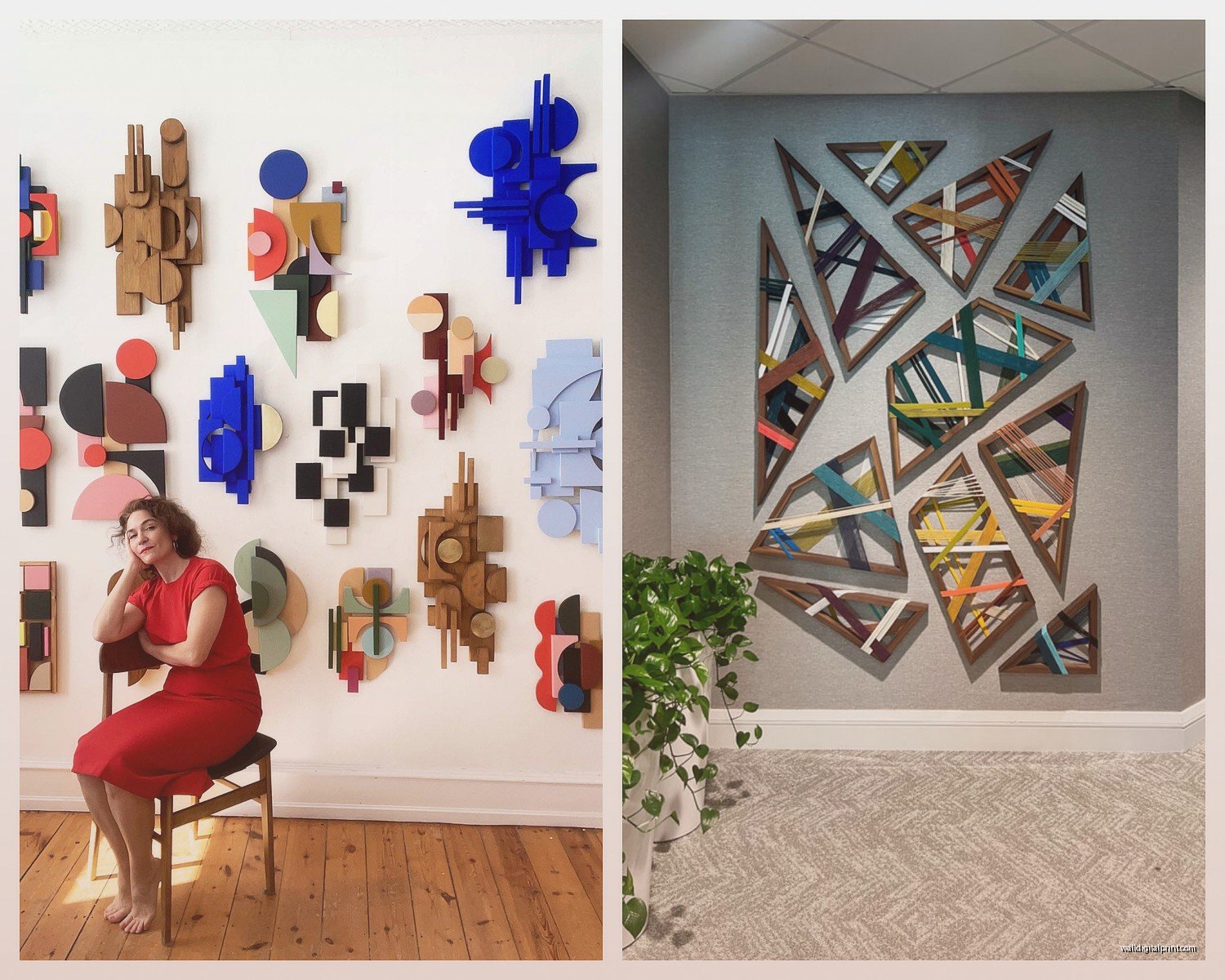
So I’ve been absolutely obsessed with layered relief wall art lately and honestly it started because a client wanted something “architectural but soft” which made zero sense until I started playing with dimensional pieces. Let me tell you what actually works because I’ve made some expensive mistakes here.
Materials That Actually Hold Up
Okay so first thing, you need to think about weight distribution because I learned this the hard way when a gorgeous plaster piece literally fell off my studio wall at 2am and scared the hell out of my cat. The base material matters SO much.
MDF boards are gonna be your best friend for layered work. They’re cheap, they don’t warp like regular wood, and you can stack multiple layers without things getting too heavy. I use 1/4 inch thickness for most layers, sometimes 1/8 inch for the really delicate top layers. Home Depot cuts them for free if you’re nice about it.
Birch plywood is the upgrade option. It’s lighter than MDF, has that gorgeous edge grain that you can actually show off if you stain it, but it costs like three times more. I only use this when the edges are visible in the design or when a client has a serious budget.
Foam board works for lightweight projects but it dents if you look at it wrong. My assistant convinced me to try it for a huge commission piece and… it actually worked? But only because we sealed everything with like five coats of gesso. Not recommended unless you’re doing something massive where weight is a real issue.
Surface Materials for Texture
This is where it gets fun. The top layer needs texture and dimension, right? Here’s what I’ve actually tested:
- Joint compound from the hardware store is criminally underrated. Mix it with a tiny bit of acrylic paint and you can create these incredible organic textures. Costs like $12 for a huge bucket.
- Modeling paste is basically fancy joint compound but it doesn’t crack as easily. Worth it for pieces you’re selling or gifting.
- Paper clay if you want to actually sculpt elements. Air dries, super lightweight, but you gotta seal it properly or it’ll absorb moisture and get weird.
- Textured wallpaper sounds crazy but stick with me… there are these embossed varieties that you can cut into shapes and layer. I did a whole series using vintage ceiling tin patterns printed on heavyweight paper.
Adhesives That Won’t Fail You
This is crucial because nothing’s sadder than layers peeling apart six months later.
Wood glue for wood-to-wood. Titebond II is my ride or die. Clamp it, let it dry overnight, it’s not going anywhere. I learned to stop being impatient with drying times after… yeah, let’s not talk about that project.
E6000 for anything weird. Mixed materials? E6000. Adding metal elements? E6000. It smells absolutely terrible so open your windows, but it bonds everything and stays slightly flexible so it doesn’t crack.
Hot glue is actually fine for temporary mockups or if you’re layering really lightweight materials like paper. Don’t let anyone shame you for hot glue. But also don’t use it for anything structural because it gets brittle over time.
Oh and another thing, construction adhesive in a caulk gun works amazingly for heavy pieces. I used it to attach a 3-foot sculptural piece made of stacked wood layers and it’s been on the wall for two years with zero issues.
Creating Depth Without Making It Heavy
The trick with relief sculpture is making it look substantial without it actually weighing 50 pounds. I usually work in odd numbers of layers because it just looks better? Like three, five, or seven distinct depth levels.
Start with your base layer flat against the wall. This is your foundation and it should be the largest layer. Then each subsequent layer gets smaller and sits on top, creating that stepped effect.
Spacers are everything. You can buy foam mounting tape in different thicknesses, or just cut small blocks of wood. I keep a bin of wood scraps in 1/4″, 1/2″, and 1″ sizes. Sometimes I’ll vary the spacer heights within one piece to create uneven depth which looks way more organic.
Wait I forgot to mention shadow gaps. If you leave intentional gaps between layers, the shadows create this incredible visual depth even in flat lighting. I usually aim for at least 1/4″ between major layers. The light has to be able to get in there and create contrast.
Playing With Scale and Proportion
So this is gonna sound weird but I keep a folder on my phone of architectural details. Corbels, crown molding, art deco buildings, whatever. When I’m stuck on proportions for a relief piece, I literally look at how classical architecture handles layering and depth.
The golden ratio actually matters here. If your base layer is 24″ wide, try making the next layer about 15″ wide (roughly 0.6 ratio). It just works visually in a way that’s hard to explain but easy to see.
Finishing Techniques That Make It Look Professional
Okay so you’ve got your layers stacked and glued. Now what? The finishing is what separates DIY from “wait you made that?”
Sanding the edges is non-negotiable. Even if you’re going for a rough aesthetic, you gotta sand enough that there aren’t splinters or sharp corners. I use 120 grit for shaping, then 220 for smoothing. My hands are basically always covered in tiny cuts because I skip this step when I’m rushing.
Primer everything before painting. I cannot stress this enough. Even if you think the raw wood looks fine, primer seals it and gives you a consistent surface. I use Zinsser BIN shellac-based primer for anything with mixed materials because it sticks to literally everything.
For paint, matte or eggshell finishes work better than glossy because they don’t create weird reflections that flatten the dimensional effect. Although… I did one piece in high-gloss black that was stunning because the shadows were so dramatic. So maybe break that rule sometimes.
Adding Texture and Interest
This is where you can really make it your own. I’ve tried so many techniques:
- Dry brushing with metallic paint over a dark base creates this aged, archaeological look
- Stippling with a stiff brush and thick paint adds organic texture
- Dripping watered-down paint down the layers creates movement
- Crackle medium if you want that deliberately distressed look (very popular right now)
- Gold leaf on just the raised edges… chef’s kiss
I watched that documentary about Anselm Kiefer while working on a commission last month and got totally inspired by his layering technique. Started incorporating sand and sawdust mixed into the paint for this incredible rough texture. Game changer.
Mounting Heavy Pieces Securely
Let’s talk about actually getting these things on the wall because I’ve had some near-disasters.
For anything under 10 pounds, regular picture hanging strips work fine. The Command brand heavy-duty ones hold more than you’d think.
For medium weight pieces (10-30 pounds), I use Z-bars or French cleats. You screw one part into the wall studs and one part to the back of your piece. It’s incredibly secure and the piece just hooks on. Plus you can easily remove it for moving or photographing.
Heavy pieces over 30 pounds need serious hardware. I drill into studs with 3-inch screws and use heavy-duty D-rings on the back of the piece with picture wire. Sometimes I’ll use two separate hanging points for really wide pieces so the weight distributes evenly.
Finding Studs and Wall Anchors
Okay real talk, invest in a decent stud finder. The cheap ones are useless. I have a Zircon that cost like $40 and it’s saved me so much trouble.
If you can’t hit a stud, toggle bolts are your answer for drywall. They distribute weight across a larger area behind the drywall. I’ve hung 40-pound pieces on toggle bolts with zero issues. Just make sure you’re using the right size for your wall thickness.
Design Approaches That Actually Work
I’ve found that certain compositional strategies just work better for dimensional wall art.
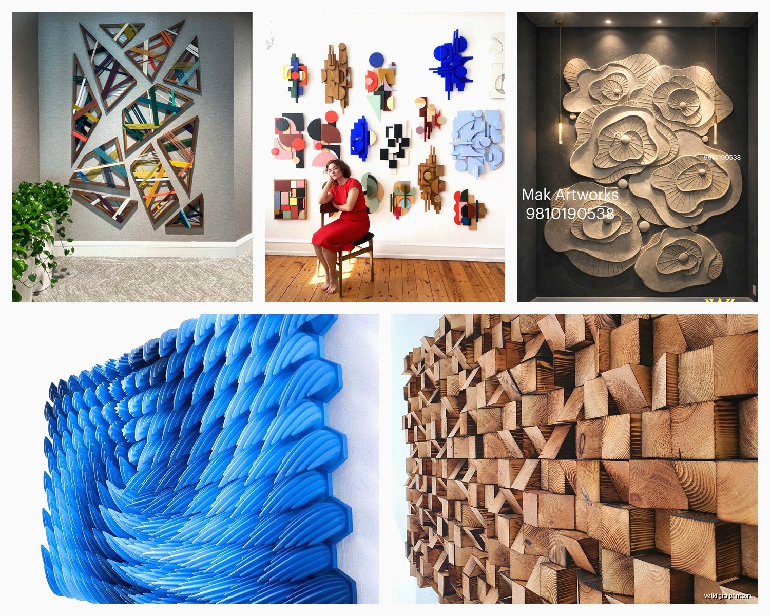
Geometric abstracts are the easiest starting point. Overlapping circles, rectangles, triangles. You can’t really mess it up and it looks intentional. I did a whole series of these in graduated blues and sold them immediately.
Organic shapes are harder but more interesting. Think topographic layers, like you’re looking at elevation changes on a map. I trace shapes freehand, cut them out, then arrange and rearrange until it feels right. Sometimes this takes days and my studio floor is just covered in cut shapes while I’m watching reality TV and moving pieces around.
Architectural elements translated into abstract relief. Take a Gothic arch or an art deco sunburst pattern and break it down into layers. Add your own interpretation. These sell really well to people who want something sophisticated but not too modern.
Oh and nature-inspired stuff obviously. Layered mountain ranges, wave patterns, tree rings. But everyone’s doing mountains right now so maybe wait on that trend.
Color Strategies
Monochromatic schemes work really well because the focus stays on the dimension rather than color contrast. All whites and creams, or all grays, or all navy blues in different shades.
But also? Really bold contrasting colors between layers create this pop art effect that’s super fun. I did one with hot pink, orange, and yellow layers that I was sure would be too much but people went crazy for it.
Metallic accents sparingly. Like just the edges of the top layer, or just one layer in copper while everything else is matte white. Too much metallic and it looks like a Christmas decoration.
Mistakes I Made So You Don’t Have To
Let me just save you some pain here:
Don’t use regular Elmer’s glue for anything structural. I mean you probably already know this but I tried it once because I ran out of wood glue and… no. Just no.
Test your adhesives with scrap materials before committing to the final piece. Some glues react with certain paints or finishes and create weird bubbling or discoloration.
Account for weight from the start. I’ve had to completely restart pieces because I built them too heavy to safely mount. Now I weigh everything as I go.
Don’t skip sealing paper or wood elements. Humidity changes will make unsealed materials warp and your careful layering will look wonky.
And honestly? Sometimes a design just doesn’t work and you gotta scrap it and start over. I probably abandon one out of every five pieces I start. It’s part of the process and it doesn’t mean you’re bad at this.
Where to Source Materials Affordably
Hardware stores for basics obviously. But also:
- Craft stores when they have 40-50% off coupons
- Online restaurant supply stores for bulk modeling paste and gesso
- Architectural salvage places for interesting found objects to incorporate
- Thrift stores for frames you can disassemble and use the backing boards
- Facebook Marketplace for people getting rid of craft supplies
I probably spend $20-40 on materials for a medium-sized piece that I can sell for $200-300, so the margins are actually pretty good once you figure out your process.
Tools You Actually Need
You don’t need a full workshop but these make life easier:
A decent utility knife with fresh blades. Dull blades are dangerous and give you ragged cuts.
Some kind of saw for cutting wood layers. I use a jigsaw for curves and a circular saw for straight cuts. A miter saw if you’re getting fancy with angles.
Sandpaper in various grits. Buy the variety packs.
Clamps. You can never have too many clamps. I have like 20 and still wish I had more.
A level because eyeballing it never works as well as you think it will.
Anyway I gotta go walk the dog but hopefully this helps? Feel free to send pics if you make something, I love seeing how people interpret this stuff differently.