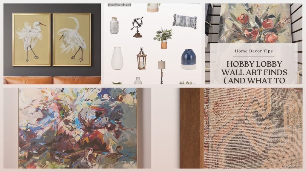
Wall Art Guide, Wall Art Tutoriels
Kirkland’s New Wall Art: Latest Store Collection Arrivals
Feb
Okay so I literally just got back from Kirkland’s like two days ago and spent way too much time looking at their new wall art because I’m redoing my client’s living room and also maybe my own hallway but that’s another story. The thing about their latest arrivals is they’re actually doing some interesting stuff with texture this season which I wasn’t expecting.
The Textured Canvas Pieces Are Where It’s At Right Now
So first thing you’re gonna notice when you walk in is they’ve got these massive textured abstract canvases that are like… I don’t even know how to describe them. They’re using this heavy gel medium or something that creates actual dimension. I picked one up and it’s got real weight to it, not that flimsy canvas-over-cardboard situation they sometimes do. The one I’m obsessing over has these gold and navy layers that catch light differently depending on time of day.
My dog knocked into one while I was examining it in the store and nothing happened to it btw, so they’re sturdy. The price point is around $79-$129 for the larger ones which honestly isn’t bad considering you’re getting something that looks custom. I’ve seen similar pieces at those bougie galleries for like $400.
What Actually Works in Real Spaces
The abstract pieces with the cream and terracotta color schemes are everywhere right now but here’s the thing – they actually work. I was skeptical because I’m so tired of that color combo but I hung one in a client’s dining room last week and it pulled together blues, greens, and woods in a way that shocked me. Sometimes the trendy stuff is trendy for a reason I guess.
They’ve also got these new botanical prints that are NOT your grandmother’s botanical prints. They’re printed on this almost linen-like textured paper and the frames are thin black metal instead of that chunky wood everyone was doing. Comes in sets of three usually, ranging from $45-$89 for the set depending on size.
The Gallery Wall Sets They’re Pushing
Wait I forgot to mention – they’re really pushing these pre-curated gallery wall sets which could either be genius or lazy depending on how you look at it. Each set has like 5-7 pieces in coordinating styles and they show you exactly how to hang them with a template.
I bought one to test it out because a client wanted a gallery wall but was terrified of getting the spacing wrong. The template is… fine. It’s printed on regular paper so it’s kinda flimsy and my client’s husband accidentally ripped it, but we just measured it and marked the walls ourselves. The actual pieces in the set are a good mix of sizes and the frames are decent quality.
Here’s what I learned from hanging it:
- The spacing they suggest is a bit wider than I would normally do – like 3-4 inches between frames instead of 2-3
- You’re gonna need more hooks than you think because some pieces are heavier than they look
- The wire hanging mechanism on the backs isn’t always centered so double-check before hammering
- Start with the middle piece first no matter what their template says, trust me on this
Specific Pieces Worth Looking At
The “Coastal Minimalism” collection just dropped and okay so funny story, I thought it would be boring beach stuff but it’s actually these really subtle ocean-inspired abstracts. Lots of horizontal lines, muted blues and grays, texture that mimics water movement without being literal about it. There’s one piece that’s like 40×30 inches with actual sand mixed into the paint or medium or whatever. You can see the granules up close. It’s $119 and I’m pretty sure it’ll be sold out soon because when I went back yesterday to show my friend, half the display was gone.
There’s also this whole section of black and white photography prints that are actually new images, not the same Eiffel Tower and London phone booth stuff they’ve been recycling for years. Street scenes from what looks like Japan, architectural details, some moody landscape stuff. The frames on these are really nice – substantial wood with a matte finish. Ranging from $39 for smaller prints to $149 for the large framed ones.
The Metallic Accent Pieces
This is gonna sound weird but the metal wall art they’re doing now isn’t terrible? I’ve always been skeptical of metal wall decor because it can look cheap real fast, but they’ve got these new pieces that are more sculptural. There’s one that’s like overlapping circles in brushed gold and oil-rubbed bronze that I… might have bought for myself. It was $89 and I justified it by saying it’s research for work.
The trick with the metal pieces is they need the right wall color. I tried one in my hallway which has cream walls and it disappeared. Moved it to my bedroom which has this deep gray-blue situation going on and suddenly it’s the focal point of the whole room.
What to Actually Skip
Not everything in the new collection is worth it though. Those inspirational quote signs are still happening and they’re still not great. The “Live Laugh Love” era needs to stay dead. They’re trying to make it edgier with quotes about coffee and wine but it’s giving 2015 vibes.
The LED backlit pieces are also… I mean they’re interesting but where are you actually gonna put that? My client wanted one for her basement bar and it’s fine there I guess, but it draws SO much attention that it becomes the only thing you look at. Plus you gotta plug it in which means cord management becomes a whole thing.
Sizing Mistakes Everyone Makes
Oh and another thing – people always go too small with wall art. I see it constantly. You think a piece is gonna be big enough and then you get it home and it looks like a postage stamp. Kirkland’s has all the dimensions listed on the tags but actually measure your wall space before you go or at least know roughly what you’re working with.
I usually tell people your art should take up about 2/3 to 3/4 of the furniture width beneath it. So if you’ve got a 90-inch sofa, you want art that’s roughly 60-70 inches wide total. That can be one large piece or a gallery wall arrangement, but that’s the general rule. I learned this the hard way after buying a piece I loved that ended up looking ridiculous over my client’s sectional.
The Frame Quality Situation
Let’s talk frames for a sec because it matters. The newer collections have noticeably better frame quality than stuff from like six months ago. I think they switched suppliers or something. The corners are actually mitred properly, the backing is secured better, and the hanging hardware is sturdier.
That said, I still reinforce the hanging wire on pieces over 24 inches. Just take some picture hanging wire from the hardware store and double it up. Takes two minutes and you won’t wake up to crashed art at 3am. That happened to me with a Kirkland’s piece about a year ago and now I’m paranoid.
The frames with the distressed wood finish are having a moment in their current collection. There’s this whole rustic-meets-modern thing happening. I grabbed one with a weathered gray frame that has these subtle white undertones. It’s got a abstract landscape print that works in basically any room. Those are running about $69-$99 depending on size.
Seasonal Rotation Strategy
Here’s something I started doing that maybe sounds extra but actually makes sense – I buy smaller pieces from Kirkland’s seasonal collections and rotate them out. Like I’ll get some autumn-ish stuff, switch it out for winter pieces, etc. The smaller frames in the $20-$35 range are perfect for this because you’re not breaking the bank and it keeps your space feeling fresh.
I’ve got a whole bin in my closet now with wall art organized by season which my sister thinks is insane but whatever, it works. Plus when clients ask how to update their look without major purchases, this is an easy solution.
The Abstract Landscape Category
Okay so the abstract landscape pieces they just brought in are probably my favorite of the whole new collection. They’re not trying to be realistic paintings and they’re not completely abstract either – they’re that perfect in-between where you see like… the suggestion of mountains or a horizon line but it’s mostly about color and movement.
There’s this one series in particular with deep burgundy, rust, and cream that I keep thinking about. Three pieces, each 20×20 inches, sold separately at $45 each or you can buy them as a set arrangement. I spilled coffee on one of the display models while examining it which actually tested the finish accidentally – wiped right off, no damage. So that’s good to know.
The canvas texture on these is really nice, almost like a fine weave linen. And the paint has enough variation that it doesn’t look mass-produced even though obviously it is. I think they’re using some kind of printing technique that mimics actual brushstrokes because you can see dimensional variation.
Installation Tips Nobody Tells You
Wait I should mention installation stuff because I’ve hung probably hundreds of these things at this point. First, most Kirkland’s art comes with sawtooth hangers or wire, sometimes both. The sawtooth hangers are fine for lightweight pieces but I don’t trust them for anything over like 5 pounds. Use the wire or add your own.
Get a proper level. Your phone app is not accurate enough, I don’t care what anyone says. I used my phone app once and everything was slightly off and it drove me crazy until I fixed it. A $8 level from the hardware store will save you so much frustration.
Also that trick about using painter’s tape to mark your nail holes before hammering? Actually works. I was skeptical but my assistant showed me and now I do it every time. You can adjust the tape way easier than filling holes and starting over.
Color Coordination Without Overthinking It
The new collection has a lot of pieces that work together even if they’re not from the same “set” which is kinda smart. Like you can mix the botanical prints with the abstract textures if they share a color palette. I did this in my client’s bedroom – three different styles of art but they all had navy and brass tones so it looks intentional instead of random.
If you’re worried about colors clashing, stick to pieces that share at least one or two colors. Or go monochromatic – all black and white, all blues, all neutrals. That’s harder to mess up. I’m currently watching The Crown while I write this and even their walls follow this rule, everything coordinates without being matchy-matchy.
The warm neutral collection they just released is basically foolproof for this reason. Everything is in shades of cream, tan, terracotta, and muted gold. You could literally close your eyes, grab three pieces, and they’d work together.
Price Points That Make Sense
Let’s be real about money for a sec. Kirkland’s pricing is usually reasonable but sometimes certain pieces are overpriced for what you’re getting. The sweet spot is that $49-$89 range where you’re getting decent size, good quality, and something that doesn’t look cheap.
Under $49 you’re often getting smaller pieces or lighter materials. Not necessarily bad, just know what you’re getting. Over $120 and I start comparing to other stores because at that price point you’ve got more options. HomeGoods, local art fairs, even Etsy sometimes has comparable stuff.
That said, their new premium collection with the hand-embellished pieces (where artists add actual paint over prints) is worth the higher price if you want something more unique. Those range from $129-$199 but each one is slightly different because of the hand-painted elements. I bought one for above my fireplace and people always think it’s an original painting.
Mixing New Arrivals With Existing Decor
You don’t have to redo your whole wall when they release new stuff obviously. I’ve been gradually adding new pieces to my existing gallery walls and it keeps things interesting. The key is balancing styles – if most of your current art is traditional, add one modern abstract piece as an accent. If everything is minimalist, throw in something with texture or color.
I’ve got this whole mix going on in my living room now where there’s vintage botanical prints I’ve had forever, some new Kirkland’s abstracts, a piece from a local artist, and some family photos in coordinating frames. It shouldn’t work but it does because the frames and matting tie everything together.
Oh and another thing – don’t be afraid to use new Kirkland’s pieces in unexpected rooms. Everyone focuses on living rooms and bedrooms but I just hung one of their new geometric pieces in my laundry room and it makes me slightly less annoyed about doing laundry. Bathrooms, hallways, stairwells – these spaces need art too.
What’s Actually Selling Out Fast
Based on what I’m seeing in stores and hearing from the staff I’ve gotten friendly with, certain pieces are moving really quickly. Anything in the sage green and cream palette is flying off shelves. The large-scale abstracts with gold leaf accents are also going fast. And weirdly, the small botanical prints in black frames are constantly sold out – I think people are buying multiple sets.
If you see something you really like, just get it. I’ve learned this lesson too many times. I once hemmed and hawed over a piece for three days, went back, and it was gone. Took me weeks to find something I liked as much. Kirkland’s does restock but new collection items can disappear fast, especially if they end up on social media.
The clearance section is also worth checking because sometimes brand new stuff ends up there if it’s like a return or slightly damaged. I found a piece last month with a tiny scratch on the frame, got it for 40% off, and the scratch was on the back anyway so who cares.
Styling the New Boho-Adjacent Pieces
There’s this whole section of new arrivals that’s like… boho but not full bohemian if that makes sense. Macrame wall hangings mixed with modern prints, woven textural pieces with clean lines. I’m not usually a boho person but some of these are actually versat