Wall Art Guide, Wall Art Tutoriels
IKEA Wall Art: Swedish Furniture Store Budget Decor
Feb
Okay so I just spent like three weekends at IKEA because I’m redoing a client’s apartment and honestly their wall art situation is way better than people give them credit for. Everyone acts like you need to drop $500 at a gallery but like…you really don’t.
The Frames Are Actually The Secret Weapon
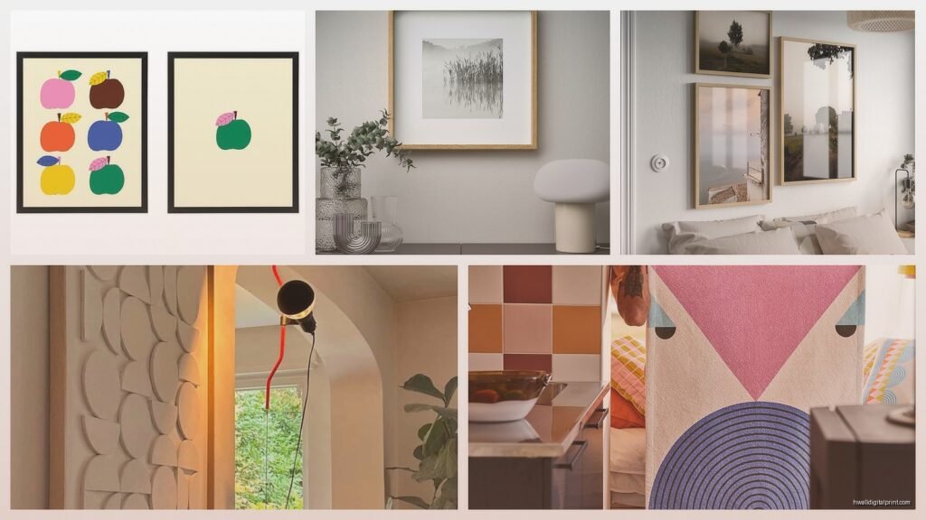
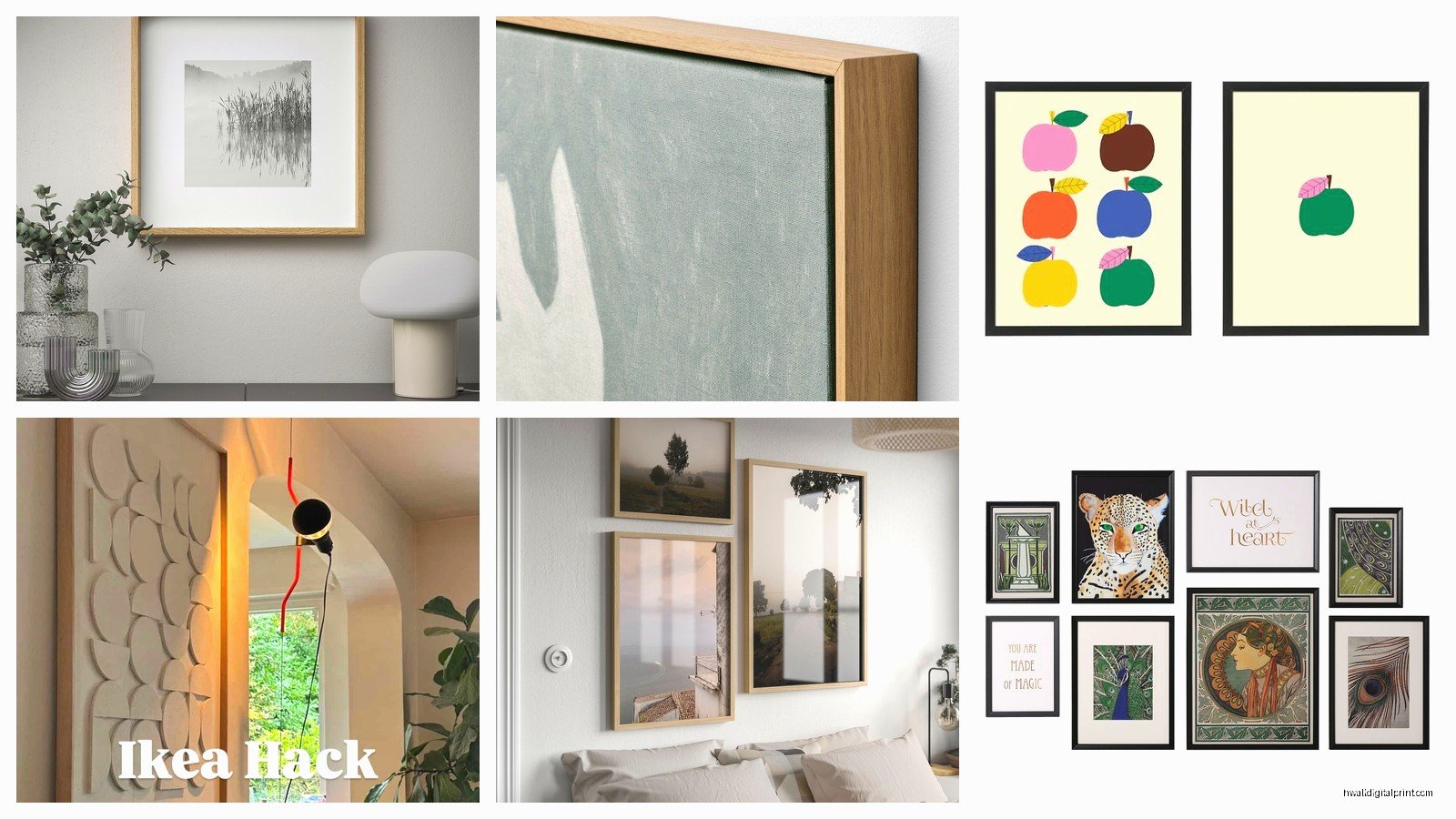
Start with the RIBBA frames, I’m serious. I know they’re super basic and literally everyone has them but there’s a reason for that. They’re like $15-20 depending on size and the thing is you can swap out whatever terrible print comes with them. I did this whole gallery wall last month where I printed custom stuff from Etsy and just…put them in RIBBA frames. My client thought I spent a fortune and I’m not gonna tell her otherwise.
The HOVSTA series is newer and honestly prettier if you want something that looks more expensive. They’ve got this slightly thicker frame profile that reads more custom. I used the dark brown ones in my own hallway and people always ask where I got them. They’re like $25-30 which is still nothing.
What Actually Looks Good From Their Print Selection
Okay so their actual art prints are hit or miss. The botanical ones are safe and they work literally everywhere. I’ve used those fern prints in probably five different projects and they never look bad. The abstract stuff though…you gotta be careful because some of it looks very 2015 in a bad way.
The photography prints can be really good if you avoid anything too obvious. Like don’t get the Eiffel Tower one unless you’re decorating a college dorm. But they have these minimalist landscape shots that are actually lovely. I got this one of a foggy coastline for my bedroom and my sister was shocked it was from IKEA.
Mixing The Cheap Stuff With Real Art
Here’s what I do and what I tell everyone – you don’t need ALL expensive art. You need like one or two good pieces and then fill in with IKEA stuff. I have a small original painting I got from a local artist ($200, worth it) and surrounded it with three IKEA prints in RIBBA frames. The whole setup looks cohesive and collected and it cost maybe $300 total instead of like $1500.
Oh and another thing – their mirror art pieces are actually super useful. The MALMA mirror comes in different colors and you can create this whole geometric situation on a wall. My friend did her entryway with like six of them in the white and it looks very fancy. They’re $15 each which is insane.
The Canvas Print Thing
So IKEA sells those pre-stretched canvas prints and look…they’re fine? The quality isn’t gallery-level but if you’re putting something high up on a wall or in a spot with softer lighting, you honestly can’t tell. I used their abstract canvas prints (the PJÄTTERYD series) in a client’s dining room last year and they’re still holding up fine.
The trick is to not buy anything with faces or detailed photography on canvas because that’s where the quality issues show. Stick to abstracts, typography, or high-contrast images.
Actually Making It Look Expensive
Gonna be real with you – it’s all about the arrangement. You can have the most expensive art in the world and if you hang it wrong it looks bad. IKEA art in the right layout looks intentional.
I always do the paper template thing first. Cut out paper shapes the size of your frames and tape them to the wall. Move them around until it feels right. Takes like 20 minutes but saves you from putting 15 nail holes in your wall. My dog kept trying to eat the paper templates which was annoying but whatever.
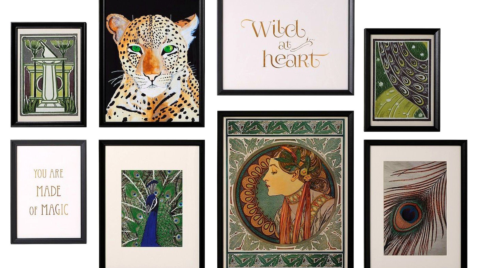
For gallery walls, I keep the spacing between frames consistent – usually 2-3 inches. And this is gonna sound weird but I always include one piece that’s slightly different. Like if everything is black and white photography, throw in one small botanical print. It makes the whole thing look more collected and less matchy-matchy.
The KNOPPANG Series Is Underrated
Wait I forgot to mention these – the KNOPPANG framed prints with the super wide white mats. They’re like $40 and they look SO much more expensive than they are. The wide mat thing is key because that’s what fancy galleries do. I used four of them in a grid above a sofa and everyone asks about them.
They only come in specific prints though so you’re limited, but if one of them works for your space, grab it.
What To Actually Skip
Don’t buy their metal wall art sculptures. I tried one once and it looked very…2008? Like when everyone was putting metal flowers on their walls. Maybe they’ll come back around but right now, no.
The really huge canvas prints (like the 55-inch ones) can look cheap because the image quality gets stretched weird. If you need something that big, honestly just get a frame and have something custom printed at a photo lab. It’ll be better quality and not much more expensive.
Also skip anything that’s too trendy. They had these rose gold geometric things last year and I guarantee everyone who bought them is regretting it now. Stick to classic stuff – black and white photography, botanicals, simple abstracts.
The Custom Printing Hack
Okay so funny story – I discovered you can just buy their frames empty. Like without the included print. So what I’ve been doing is buying frames, then going to places like Minted or downloading prints from Etsy, and printing them at like Staples or a local print shop. The print costs maybe $5-10 and you get exactly what you want.
This works especially well with the SILVERHÖJDEN frames which have this thin gold profile. They’re $40-ish but they look really elevated. I printed some vintage botanical illustrations and put them in those frames for my entryway and people literally think they’re antique.
Making Small Spaces Work
If you’ve got limited wall space, the YLLEVAD frames are great because they’re small (like 8×10) and you can group three or four of them without overwhelming a space. I used them in a tiny apartment bathroom with simple line drawings and it made the space feel more finished without crowding it.
Oh and another thing about small spaces – one larger piece usually works better than a bunch of small ones. I know that’s like the opposite of what I just said but it depends on the wall. A single 24×36 print above a console table looks more intentional than three small ones in a small room.
Seasonal Swapping
Because IKEA frames are cheap, you can actually swap art seasonally which sounds extra but it’s kind of nice? I have like two sets of prints – one more neutral for most of the year and one set with warmer tones for fall/winter. Takes 10 minutes to swap them out and it makes my space feel different without buying new furniture or whatever.
Just store the off-season prints flat under your bed or in a closet. Don’t stack them on top of each other without protection though – I learned that the hard way when two prints stuck together.
What Actually Lasts
I’ve had IKEA frames and prints for like five years now and honestly they hold up fine. The prints don’t fade if you keep them out of direct sunlight, which is true for any art really. The frames stay square and the glass doesn’t get weird.
The only issue I’ve had is with the clips on the back sometimes getting loose, but that’s an easy fix with a screwdriver. Takes two seconds.
For high-traffic areas or homes with kids, definitely put glass in the frames even if they come with plexiglass. Real glass looks better and doesn’t scratch as easily. You can get custom cut glass pretty cheap at hardware stores.
Combining With Other Stores
I mix IKEA frames with stuff from Target, HomeGoods, and vintage stores all the time. As long as you stick to a consistent color palette for the frames (all black, all wood, all white, or all gold), it looks cohesive even if the frames are different styles.
My living room has two IKEA frames, one vintage frame I found at an estate sale, and one from West Elm, and you genuinely cannot tell which is which unless you look super close. The art is what people notice, not where the frame came from.