Wall Art Guide, Wall Art Tutoriels
IKEA Large Wall Art: Oversized Swedish Budget Decor
Feb
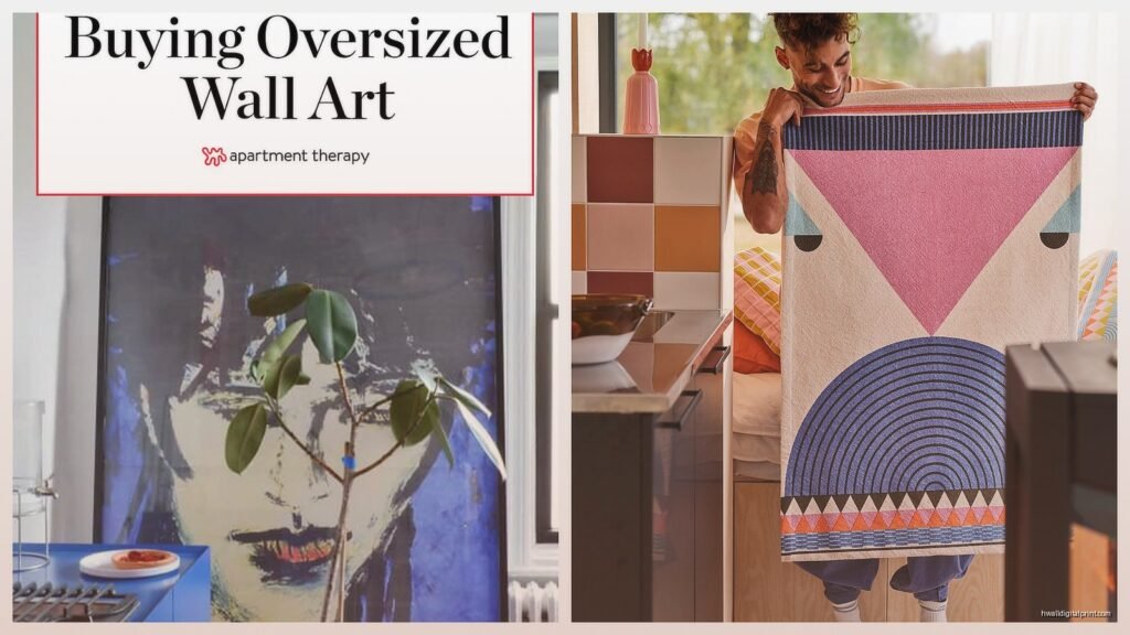
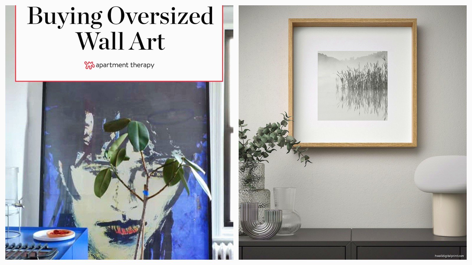
Okay so I just rearranged my entire client’s living room around one of those massive IKEA canvas prints and honestly the whole “Swedish budget decor” thing is kinda genius when you know what to look for. Let me break down what actually works because I’ve tested most of their oversized pieces at this point.
The Actual Good Ones Worth Your Money
The BJÖRKSTA series is where you wanna start – these are their proper large format prints and they come in like 78¾x55 inches which is HUGE. I have the “Meadow” one in my studio and people always think I spent hundreds on it. The frame quality is surprisingly decent for what you pay. My dog knocked into it last month and it didn’t even budge from the wall which… impressed me more than it should have.
Here’s the thing about BJÖRKSTA though – the images themselves are hit or miss. The abstract ones and landscapes photograph way better than they look in person sometimes. I learned this the hard way with a client who ordered the poppy field one online and when we unboxed it the reds were so saturated it looked like a screensaver from 2005.
What I Actually Recommend from Their Current Collection
- The black and white photography prints – these age better and don’t compete with your existing color scheme
- PJÄTTERYD series for that slightly smaller but still impactful size (55×39 inches works in SO many spaces)
- Any of the botanical prints if you’re into that whole maximalist look everyone’s doing right now
- The marble texture ones are surprisingly chic if you’ve got a minimalist thing going
How to Make Them Look Expensive
This is gonna sound weird but the way you hang these makes like 80% of the difference. I see people centering everything at exact eye level and it just looks… catalog-y? Instead, hang them slightly higher than you think you should – about 8-10 inches above your sofa or console table. Creates this floating effect that reads as more intentional.
Oh and another thing – ditch the frame they come with sometimes. I know that defeats the “budget” purpose but hear me out. Those aluminum frames from IKEA’s SILVERHÖJDEN series cost like $30 extra and suddenly your $80 print looks like a $400 art piece. I did this for a rental property I was staging and the photographer actually asked where we got the “gallery quality artwork.”
The Hanging Situation Nobody Talks About
These things are LIGHT which is great for your walls but terrible for looking substantial. You gotta use their proper mounting hardware – don’t just slap a nail in there. Get the FIXA picture hanging kit if you don’t have a proper tool situation happening. The wire system they include is fine but I always add these little bumper pads on the bottom corners so it doesn’t sit flat against the wall. Gives it like a quarter inch of depth and the shadows make it look more three-dimensional.
Wait I forgot to mention – measure your wall space BEFORE you go. I cannot tell you how many times I’ve seen people bring home the 78-inch one for a wall that’s only 72 inches wide. Seems obvious but when you’re in the store those room mockups are deceptive as hell.
Styling Multiple Large Pieces
So funny story – I was watching The Crown the other night while planning a gallery wall for this loft space and noticed how they do art in those palace scenes. It’s never symmetrical. That’s the move with IKEA’s oversized stuff too. Don’t try to match everything perfectly.
I did three PJÄTTERYD prints in different sizes last month – the 55×39, a 39×39 square, and a vertical 39×55. Arranged them in this organic cluster on a huge blank wall and it looked like we’d been collecting art for years. Total cost was like $180 for all three WITH frames.
The Layout Formula That Works
Start with your largest piece slightly off-center. Then build around it with smaller stuff – and this can be IKEA mixed with other things, vintage finds, whatever. The big piece anchors everything so the rest can be more eclectic. I keep those paper templates from their packaging and tape them to the wall first because I’ve definitely put too many unnecessary holes in walls during my “eyeballing it” phase.
Which Ones to Actually Skip
The ones with like inspirational quotes or obvious graphic design trends – those date themselves SO fast. I staged a condo in 2019 with one of those geometric copper triangle prints and it already looks tired. Same with anything that’s too matchy-matchy with current throw pillow designs.
Also gonna be real with you – some of their nature photography is just… not good. The resolution looks fine in the store but once you get it home under normal lighting you can see the digital artifacting. The waterfall ones especially. I returned one because it genuinely looked like someone printed out a Windows wallpaper.
Making Budget Look Curated
Here’s what I do and what I tell everyone who asks – mix your IKEA oversized pieces with one or two actually expensive or vintage items. Like I have a BJÖRKSTA abstract print next to a small original painting I got at an estate sale for $40. Nobody knows which is which and honestly it doesn’t matter because the composition works.
The matting trick also helps. You can get custom mats cut at most frame shops for like $25-40 and put them behind the IKEA print in the IKEA frame. Suddenly you’ve got this professional looking border situation that adds perceived value. Did this for my own bedroom with the “Golden Gate Bridge” print and my sister asked if it was from that fancy gallery downtown.
Color Coordination Without Looking Matchy
Pull one accent color from your room and make sure it appears SOMEWHERE in your oversized art – doesn’t have to be the dominant color. I had this client with navy velvet chairs and we found a mostly neutral IKEA landscape that had just this thin strip of evening sky in deep blue. Connected the whole room without being obvious about it.
Oh and another thing – black and white photography is your friend if you’re commitment-phobic about color. The VILSHULT series has some really good architectural shots that work in literally any space. I’ve used the New York skyline one in three different projects with completely different aesthetics.
The Texture Solution
One issue with any budget canvas print is they can look flat. Like obviously printed. What I started doing is layering – prop a smaller framed piece in front of part of your large IKEA print on a console table or shelf. Or hang a macrame piece so it slightly overlaps. Creates depth and distracts from the “this is clearly a mass-produced print” vibe.
I spilled coffee on one of the GRÖNBY prints once which actually tested the canvas quality accidentally – it wiped right off which was great but also confirmed these are definitely coated polyester not actual canvas canvas. Good for durability and cleaning, less good if you want that authentic art texture. Just something to know going in.
Where to Actually Use Oversized IKEA Art
Living rooms obviously, but I’ve had the most success with these in unexpected places. Dining rooms above a buffet or credenza – huge impact for minimal effort. Primary bedrooms over the bed instead of a headboard (use the hanging rail method for this, not wire). Even saw someone use a massive botanical print in their bathroom and it was genuinely stunning.
My client canceled last week so I spent an hour comparing the VILSHULT and BJÖRKSTA quality side by side in the store – BJÖRKSTA is noticeably better if you’re going bigger than 55 inches. The image clarity holds up better at that scale. But for smaller “oversized” pieces like the 39×55 range, VILSHULT is perfectly fine and usually cheaper.
Rental-Friendly Hanging Options
If you can’t put holes in walls – the Command picture hanging strips rated for like 16 pounds actually work for these. I was skeptical but tested it in my own rental and a PJÄTTERYD stayed up for eight months before I moved. Just make sure your wall texture is relatively smooth, doesn’t work great on that heavy orange peel texture.
The other option is leaning – get a picture ledge shelf (IKEA has these too, the MOSSLANDA ones) and just lean your oversized art against the wall on the shelf. Very casual and you can switch things out easily. Works best with the framed options not the canvas-only ones.
Seasonal Switching
This is probably extra but I keep a few different large prints and rotate them seasonally for some clients. The light summery ones in warm months, moodier darker pieces for fall and winter. Since they’re so affordable you can actually do this without feeling wasteful. Store the off-season ones under beds or in closets – they’re thin enough that it works.
Currently have the “Boat on Beach” print up in my entryway and it’ll probably get swapped for something with autumn colors next month. Makes the space feel intentional and curated even though the whole rotation cost less than one piece from an actual gallery would.