Wall Art Guide, Wall Art Tutoriels
Wall Art with Red Accents: Pops of Color Design
Feb
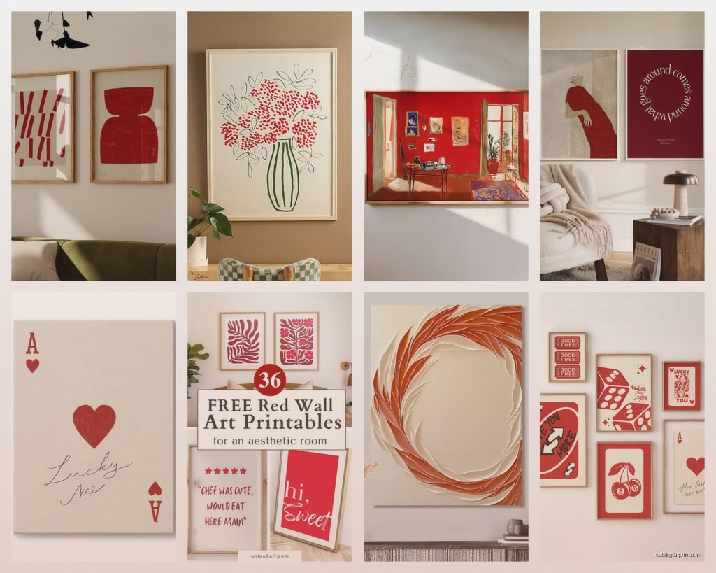
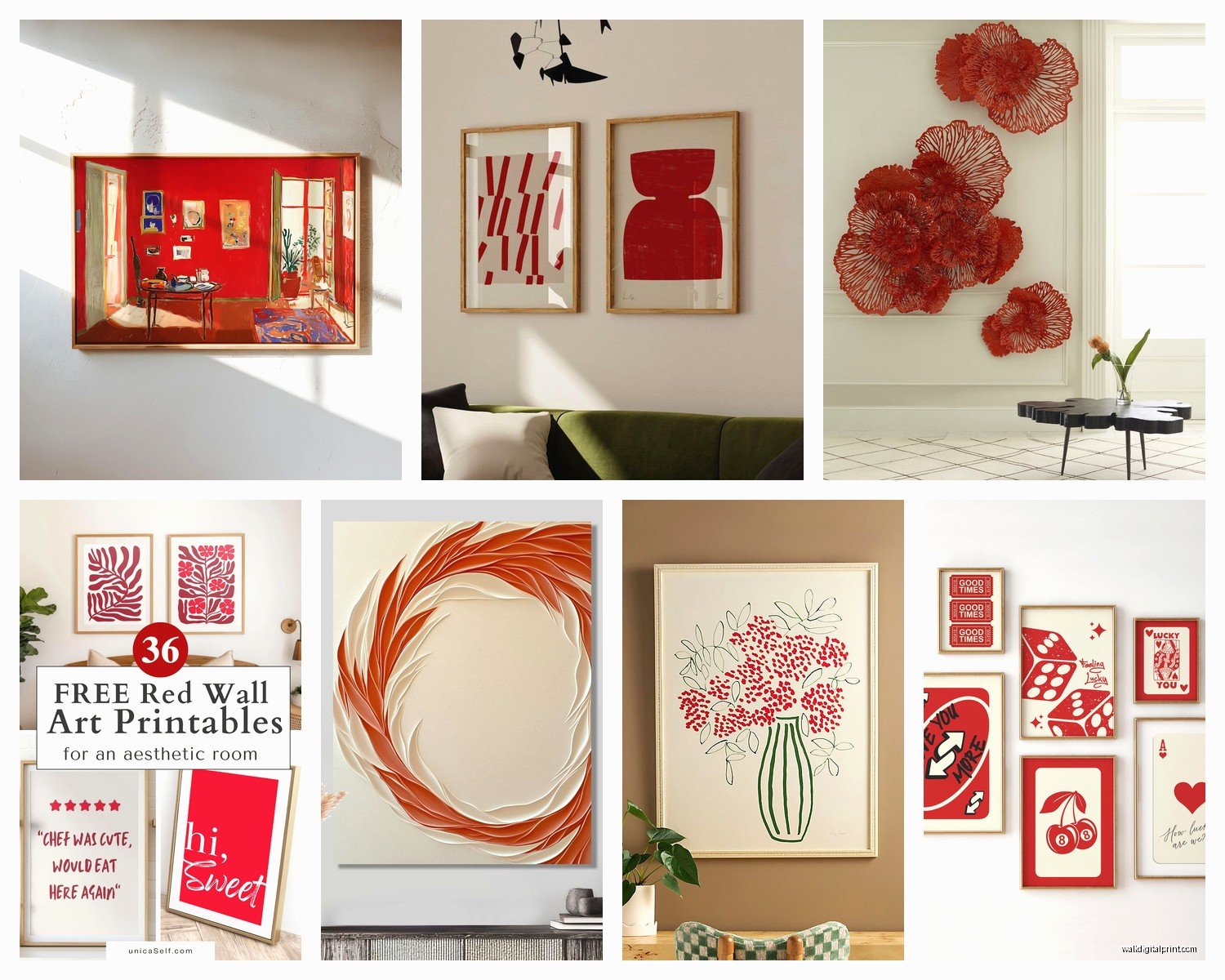
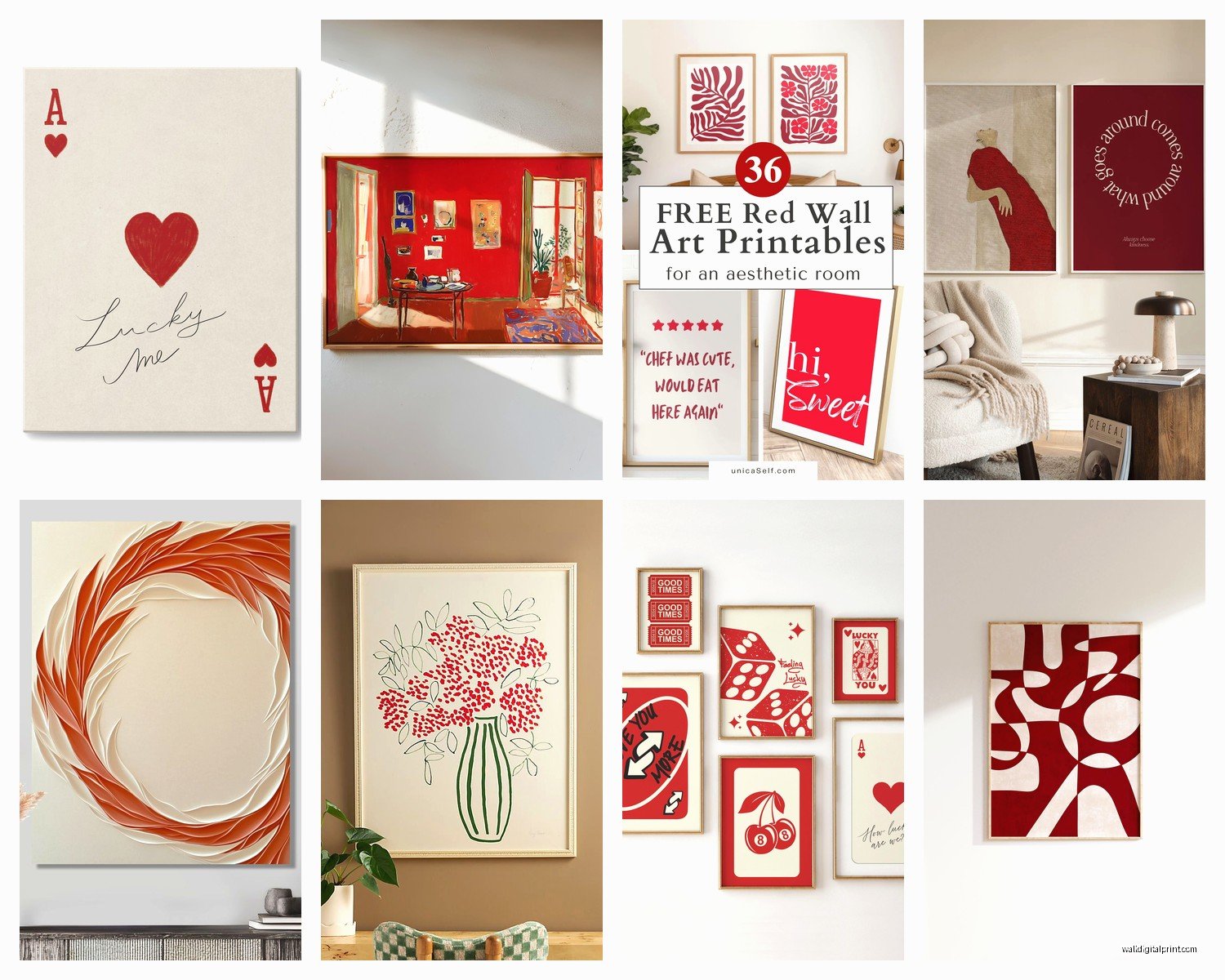
So I’ve been working with red accent art for like three years now and honestly it’s one of those things that sounds way easier than it actually is until you figure out the tricks, so let me just dump everything I know here.
Understanding Your Red First
Okay this is gonna sound weird but you need to figure out if you’re a warm red person or a cool red person. I learned this the hard way when I bought this gorgeous abstract piece for a client’s living room and the red had blue undertones and their entire space was decorated in warm terracotta and brass and it looked absolutely terrible. Like we’re talking $400 mistake terrible.
Warm reds have orange or yellow undertones – think brick red, tomato red, that classic fire engine color. Cool reds lean purple or pink – burgundy, wine, that deep cherry color. Your room probably already has a temperature situation going on with your existing furniture and fabrics so you gotta match that.
Where Red Actually Works Best
People always think red is this aggressive color that only works in certain rooms but that’s not really true? I’ve used red accent art in literally every room including a bathroom once (my client thought I was insane but it turned out amazing). The trick is the amount and the shade.
Dining rooms are honestly the easiest place to start. Red stimulates appetite which is why so many restaurants use it, and a bold red abstract or even a vintage food poster with red elements can anchor the whole space. I did this thing last year where I found three small square canvases with different shades of red geometric patterns and hung them in a row above a credenza and my client still texts me photos of dinner parties because apparently everyone asks about them.
Living Room Placement
Living rooms need more strategy. If you’ve got a neutral couch situation – grays, beiges, whites – a large red accent piece above the sofa is like the classic move but here’s what nobody tells you: the red needs to be repeated somewhere else in the room or it looks like you just randomly stuck it there. Could be throw pillows, could be a vase, could be the spines of books on your shelf, whatever. Just needs an echo.
Oh and another thing, if your living room gets a lot of natural light, be careful with super bright reds because they can feel overwhelming by like 2pm when the sun is streaming in. I learned this in my own apartment actually – had this beautiful poppy print that I loved at night but during the day it was just too much and I ended up moving it to my bedroom.
Bedrooms Are Tricky
Speaking of bedrooms – this is where you wanna go deeper and richer with your reds usually. Those burgundy and wine tones I mentioned? Perfect for bedrooms. There’s something moody and cozy about a dark red abstract behind a bed with white bedding. I did one with almost a rust-red botanical print for a client who was worried it would be too stimulating for sleep but she said it actually made the room feel more cocoon-like.
Mixing Red with Other Colors in Art
This is where people get nervous but it’s actually pretty forgiving. Red plays well with more colors than you’d think.
Red and navy is like foolproof. Classic, sophisticated, works in traditional or modern spaces. I’ve got this vintage travel poster in my office that’s mostly navy with red accents and it’s been there for three years because I genuinely never get tired of it.
Red and gold or brass – very luxe, very warm. Think Renaissance painting vibes or modern abstract with metallic elements. Just finished a dining room where we used a piece that had red and gold leaf details and paired it with brass light fixtures and it elevated the entire space.
Wait I forgot to mention red and pink together which sounds insane but actually works really well if you do it right. Like a watercolor piece with both hot pink and deep red can be really stunning in a feminine space or even a modern bedroom. My friend Jamie did this in her daughter’s room and I was skeptical but the key is making sure there’s white space in the art to let your eye rest.
Scale and Proportion Stuff
Okay so funny story, I once ordered a piece online that I thought was 24×36 inches and it arrived and was 24×36 centimeters and it taught me to always double-check dimensions but also it made me think differently about using multiple small red accent pieces instead of one large one.
If you’ve got a big wall – like 10 feet or wider – one single piece of art needs to be substantial. I’m talking at least 40 inches wide, maybe bigger. Otherwise it looks like a postage stamp. But if you’re working with a smaller budget or you found a piece you love that’s smaller, doing a gallery wall where red is the connecting element across different pieces totally works.
The Gallery Wall Approach
For gallery walls with red accents, I usually go with like 5-7 pieces where maybe 2-3 have prominent red and the others have tiny red touches or are neutral. This keeps it from being overwhelming. Also mixing frame colors – some black, some wood, maybe one gold – actually helps the red pop more than if everything matches perfectly.
My cat knocked over a whole gallery wall layout I had on the floor once while I was planning it for a client and honestly the random arrangement looked better than my careful planning so sometimes just laying everything out and seeing what speaks to you works better than being too precise about it.
Art Styles That Work With Red Accents
Abstract is obviously the easiest because you can find abstract art with literally any color combo and red is super popular in abstract work. Those loose brushstroke pieces with red, white, and maybe gray or black are everywhere right now and they’re popular for a reason – they’re versatile.
But don’t sleep on photography with red elements. A black and white photo with one red element (the classic red umbrella, a red door, red lips) can be really striking. Just make sure it doesn’t veer too much into college dorm poster territory – quality of the print matters here.
Botanical prints with red flowers are having a moment. Poppies, roses, hibiscus – these work beautifully in kitchens and dining areas especially. I found this vintage botanical illustration series at an estate sale last month with different red flowers and I’m hoarding them for a project because they’re just perfect.
Typography and Graphic Design Pieces
Red works really well in graphic design art and typography pieces. Like a bold black and white graphic with a pop of red in one element. These are great for home offices or modern spaces. Just finished a home office where we used a vintage-style graphic poster with red typography and it gave the whole room energy without being distracting while working.
Frame Choices Matter More Than You Think
I spent way too much time thinking about frames honestly but it does make a difference. Black frames make red appear more vibrant and modern. Wood frames warm it up and make it feel more organic. White or cream frames soften the red which can be good if you’re worried about it being too bold.
No frame – just canvas – is very contemporary and casual. I do this in more relaxed spaces like family rooms or casual dining areas. The lack of frame actually makes the red feel less formal and more approachable somehow.
Lighting Considerations
This is something I wish someone had told me earlier – red looks completely different under warm light versus cool light. Warm bulbs (the yellowy ones) make red look richer and deeper. Cool bulbs (the blue-white ones) can make red look more pink or orange depending on the undertones.
I always recommend picture lights or directional lighting for red accent art if you’re really investing in a piece. It brings out the depth and makes it a focal point especially in the evening. Did this in a client’s hallway with a large red abstract and the picture light transformed it from nice to wow.
Budget-Friendly Options That Don’t Look Cheap
Look, not everyone has $500 to drop on original art. I get it. Society6 and similar sites have tons of options where you can get red accent art printed on canvas or as framed prints. The quality is actually pretty decent for the price – I’ve used them for clients who are budget-conscious.
Thrift stores and estate sales are goldmines for vintage pieces with red accents. That botanical series I mentioned? Cost me $30 total for six pieces. You might need to reframe them but even with framing costs you’re usually coming out ahead and you have something unique.
Oh and another thing – DIY abstract art is actually really doable if you’re willing to spend like an afternoon on it. Get a canvas, some acrylic paint in red plus a couple neutrals, watch one YouTube tutorial, and just go for it. I did this when I was staging my own house to sell and honestly people thought it was a real piece from a gallery.
Common Mistakes I See All The Time
Too much red is the biggest one. If your art has a ton of red AND you have red furniture AND red curtains it’s just gonna feel like too much. The art should be the pop of color, not part of a red explosion.
Hanging it too high – this isn’t specific to red art but art should generally be at eye level which is like 57-60 inches from the floor to the center of the piece. I see so many people hang art way too high and it throws off the whole room.
Not considering the undertones I mentioned earlier. This is such an easy fix but makes such a huge difference. Just hold your potential art piece up near your existing decor and see if the reds harmonize or clash.
Choosing red art because you think you should have a pop of color but you don’t actually like red. Like if you naturally gravitate toward cool, calm spaces maybe red isn’t your accent color and that’s totally fine? I had a client insist on red because she read it was trendy and she ended up hating it and we replaced it with teal accents which she actually loved.
Seasonal Rotation Ideas
This might sound extra but I actually rotate some of my red accent pieces seasonally. The brighter, warmer reds come out in fall and winter – they feel cozy and festive without being explicitly holiday-themed. In spring and summer I either swap them for cooler reds or just different colors entirely.
I was watching this home makeover show while doing this with my own art last spring and realized that treating art as changeable rather than permanent makes decorating way more fun and less stressful. You’re not making a forever decision, you’re just trying something.
Working With Existing Red Elements
If you already have red in your space – maybe a red accent chair or red dishes on open shelving – your red art needs to either match pretty closely or be different enough that it’s clearly intentional. The worst thing is two slightly different reds that look like you tried to match and failed.
I did a kitchen last year where the client had collected red vintage Pyrex and we found art that had the exact same shade of red repeated in it and it tied everything together so perfectly. But when you can’t match exactly, go contrasting – like if you have bright cherry red accessories, go with burgundy or rust in your art.
My dog ate the corner of a print I was gonna use for this exact situation which honestly was probably a sign that piece wasn’t right anyway, but also taught me to keep art away from the couch where he hangs out.
Textural Elements in Red Art
Something I’ve been really into lately is red art with actual texture – like thick paint applications, mixed media with fabric elements, or even metal wall sculptures with red accents. The texture adds dimension and makes the red feel more sophisticated and less flat.
Three-dimensional red elements especially work well in modern and contemporary spaces. I used a metal wall sculpture with red powder coating in a client’s entryway and it catches the light differently throughout the day which keeps it interesting.
Testing Before Committing
Here’s my actual practical advice – before you buy anything expensive, get a cheap poster or print in a similar shade of red and size and tape it up where you’re thinking of putting the real piece. Live with it for a week. See how it looks at different times of day, how you feel about it, whether it works with your lifestyle.
I skipped this step once and bought a piece I loved in the store that I ended up returning because it just didn’t work in my actual space with my actual lighting and actual furniture. Now I always test first, even if it’s just with a printed photo taped to the wall.