Wall Art Guide, Wall Art Tutoriels
Vibrant Wall Art: Bold Colorful Statement Pieces
Mar
So I’ve been completely obsessed with vibrant wall art lately and honestly it started because a client wanted to “make their dining room less beige” and that sent me down this rabbit hole of testing every bold piece I could get my hands on.
Finding the Right Scale Without Losing Your Mind
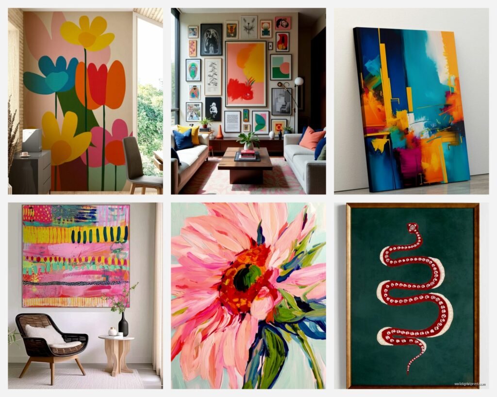
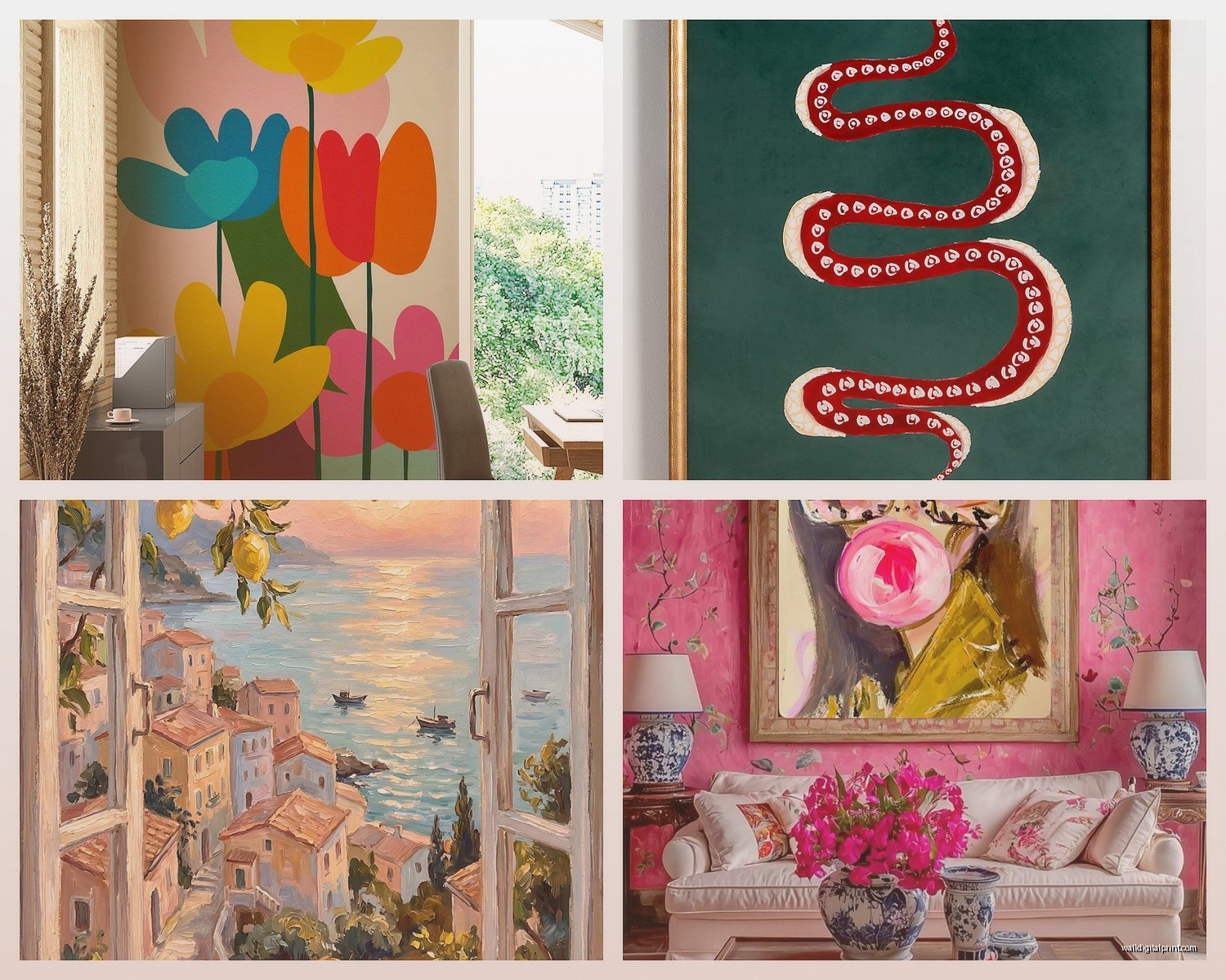
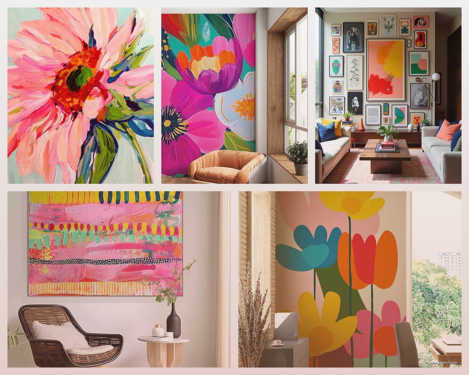
Okay so the biggest mistake I see people make is buying art that’s way too small. You want a statement piece? Think bigger than feels comfortable. I’m talking at least 40×60 inches for a standard living room wall, maybe 30×40 minimum for smaller spaces. Last month I hung this gorgeous abstract piece that my client swore would be “too much” and when we finally got it up she literally texted me at like midnight saying she couldn’t stop staring at it.
Here’s what I do now – I tape out the dimensions on the wall with painter’s tape before buying anything. Sounds basic but you’d be surprised how many times I skipped this step and regretted it. Your brain lies to you about size when you’re scrolling online.
The Whole Gallery Wall vs Single Statement Thing
Look, gallery walls are cute but if you want actual impact, one large vibrant piece beats fifteen small ones every single time. I tested this in my own living room – had a gallery wall of like 12 pieces, swapped it for one massive colorful abstract and the room finally felt intentional instead of cluttered.
That said, if you‘re gonna do multiple pieces they need to be LARGE multiples. Three 24×36 inch pieces in a row, all with coordinating vibrant colors. Not those tiny 8×10 frames from Target, I mean we’ve all been there but it just reads as filler.
Colors That Actually Work Together
This is gonna sound weird but I keep a photo album on my phone of every room I’m working with. Then when I’m looking at art online I hold my phone up to my screen to see if the colors vibe. Super low-tech but it works better than trying to remember if your couch is more gray-blue or blue-gray.
Colors I’ve had the most success with for statement pieces:
- Coral and navy – this combo never fails, adds warmth without being aggressive
- Emerald green with gold accents – feels expensive even when it’s a $200 print
- Deep burgundy with blush pink – unexpected but so good in dining rooms
- Bright yellow with charcoal – high contrast, very modern, makes white walls look intentional
- Burnt orange with teal – I resisted this for years but it’s actually incredible
The trick is picking art where one of the colors already exists somewhere in your room, even if it’s just in a throw pillow. That creates cohesion. The other colors can be completely new – that’s what makes it a statement.
Where to Actually Buy This Stuff
Oh and another thing – I’ve tested so many sources at this point. Minted has been consistently good for quality, their colors print true which matters SO much. Nothing worse than ordering this vibrant coral piece and it shows up looking like sad salmon.
Etsy is hit or miss honestly. I found this incredible artist who does custom abstract pieces and her colors are insane – so saturated and rich. But I’ve also received straight up pixelated prints that were garbage. You gotta read reviews obsessively and ask for photos of the actual print quality.
Saatchi Art is where I go when clients have bigger budgets. Original pieces, the colors are obviously perfect because you’re getting the actual painting, but we’re talking $800+ usually. Worth it for a main living area if you can swing it.
The Print Quality Thing Nobody Talks About
Okay so funny story, I ordered three “giclée prints” from different vendors to test quality and the difference was wild. One was from a fancy art print site, one from Etsy, one from Society6. The fancy one and the Etsy one were basically identical – rich colors, nice texture. The Society6 one was noticeably flatter, less dimensional.
Here’s what actually matters: you want giclée printing on cotton canvas or fine art paper, minimum 300 dpi. If the listing doesn’t specify this stuff, don’t buy it. I learned this the hard way with a “bright abstract geometric” piece that showed up looking like a desktop printer made it.
Framing Without Spending Your Entire Paycheck
Custom framing is stupid expensive, like $400 for a single frame sometimes. What I do now is buy standard sizes (24×36, 30×40, 40×60) so I can use ready-made frames from Framebridge or even Target’s project 62 line which is actually pretty decent for simple modern frames.
For really vibrant art you usually want a simple frame anyway – thin black metal, natural wood, or white. Anything ornate competes with the colors. I did this whole test where – wait I forgot to mention – if you’re buying canvas prints you might not need a frame at all if the edges are finished. Gallery wrapped canvas can go straight on the wall and it’s way cheaper.
My dog knocked over a framed piece last week which actually reminded me to mention: use proper hanging hardware. Those sad little sawtooth hangers that come with frames are not enough for large pieces. Get D-rings and picture wire rated for the actual weight. I use two hooks on the wall for anything over 20 pounds.
Placement Stuff That Actually Matters
Center your art at eye level, which is basically 57-60 inches from the floor to the center of the piece. This is an actual museum standard and it works. I see so many pieces hung way too high and it makes the whole room feel off.
For art above a sofa, leave 6-8 inches between the top of the sofa and the bottom of the frame. More than that and they look disconnected, less and it feels cramped.
Lighting Makes or Breaks Vibrant Art
This is critical – you need proper lighting or your bold colorful piece will look muddy. I installed these simple picture lights from Amazon (like $35 each) above two client pieces and the difference was dramatic. The colors suddenly popped the way they were supposed to.
Or if you don’t wanna deal with installation, get a floor lamp that you can angle toward the piece. I use this trick in my own place because I rent and can’t hardwire stuff. Natural light is obviously great but you need artificial light for evenings or the whole investment is wasted half the time.
Testing Colors Before You Commit
Some sites let you order small prints first – do this if you’re on the fence about colors. I spent $15 on a small version of this bright abstract before committing to the $300 large version. Looked at it in the space for a week, moved it to different walls, checked how it looked in different lighting.
Or honestly just use the return policy. Most places give you 30 days and yeah it’s a hassle to repackage and ship back but it’s better than living with a $400 mistake. I’ve returned probably 30% of the pieces I’ve ordered over the years and I don’t feel bad about it at all.
Mixing Styles Without It Looking Chaotic
You can totally mix a vibrant abstract piece with more traditional furniture, but you gotta commit to it. One bold colorful piece in an otherwise neutral room looks intentional. Three different styles of colorful art looks like you couldn’t make a decision.
I worked with this client who had very traditional furniture – like proper tufted sofa, wingback chairs – and we hung this massive vibrant geometric piece and it was perfect. The contrast made both elements look better. But we kept everything else fairly neutral so the art could be the star.
The Whole “Matching Your Decor” Myth
Stop trying to match your art to your throw pillows exactly. I mean you can pull colors from the art for accessories but buying art to match existing stuff usually results in boring choices. Let the art lead, then build around it with smaller elements.
I literally chose a bright pink and orange abstract piece first for my bedroom then found bedding that worked with it. Way better result than trying to find art that matched my existing gray duvet which was impossible and depressing.
Original vs Print Debate
Look, originals are amazing if you can afford them. The texture and depth you get from actual paint is unmatched. But a high-quality print of vibrant art is still gonna make an impact, especially from across the room. Most people can’t tell the difference beyond like six feet away.
I have both in my home – originals in high-traffic areas where people get close (entryway, above the dining table) and prints in the living room where people mostly view them from the sofa. Nobody has ever commented on which is which, they just respond to the colors and composition.
Quick Fixes When Something Feels Off
If you hung your vibrant piece and it’s not working, before you return it try these things: move it to a different wall (seriously the light might just be wrong), add a simple mat if it’s a print (creates breathing room), or add one smaller complementary piece nearby to balance the colors.
I had this bright teal and coral piece that felt overwhelming on my main wall but when I moved it to a narrower wall in the hallway it was perfect. Sometimes it’s not the art, it’s the location. Oh and another thing – make sure there’s not too much other stuff on the same wall. Vibrant art needs space around it, so clear off some of those floating shelves maybe.