Wall Art Guide, Wall Art Tutoriels
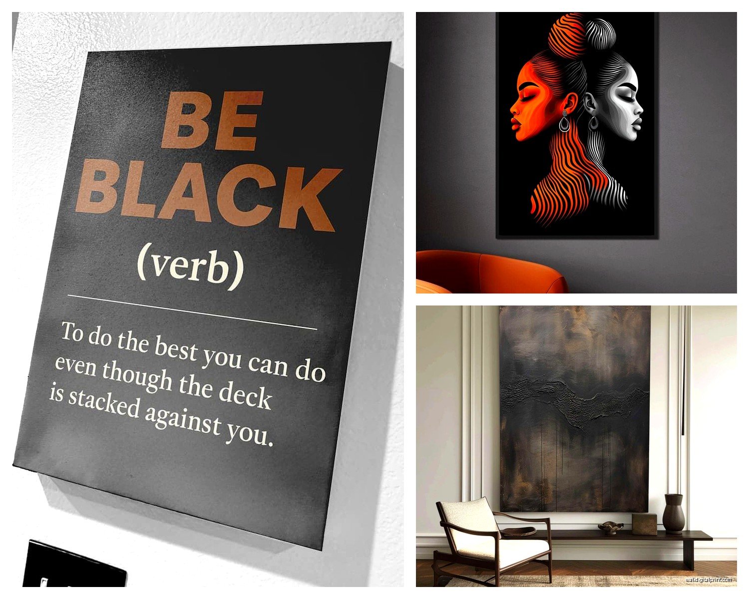
Black Wall Art: Dark Bold Moody Gothic Designs

Mar
So I’ve been obsessing over black wall art lately and honestly it started because a client wanted to do this whole moody bedroom thing and I was like okay, how dark can we actually go before this feels like a cave, right? And then I fell down this rabbit hole of gothic designs and now half my studio has black artwork everywhere while I’ve been testing what actually works.
Why Black Art Hits Different Than You Think
First thing – black wall art isn’t just regular art printed on black paper or whatever. The really good stuff uses black as an actual design element, not just a background. I learned this the hard way when I ordered like five pieces from different Etsy shops and three of them were literally just dark grey backgrounds with white text and I’m like…this is not it.
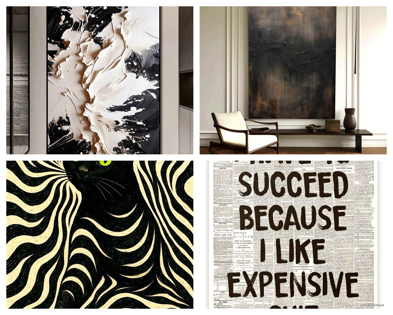
The pieces that actually work have layers. You’ve got your matte blacks next to glossy blacks, or metallic elements that catch light differently throughout the day. There’s this one print I got that looks completely different at 2pm versus 8pm and my cat keeps staring at it which is either really cool or slightly concerning.
Matching Black Art With Your Wall Colors
Okay so this is where everyone screws up including me initially. You’d think black goes with everything and like…technically yes but also very much no?
White or Light Grey Walls
This is your safe zone. Black gothic art on white walls = maximum drama, very Scandinavian-meets-Victorian vibes. I did an entire gallery wall for myself using black and white botanical prints but like, dead flowers and moths instead of the usual cheerful stuff. The contrast is *chef’s kiss*.
What actually works here:
- Black frame, black matting, black and white print – super cohesive
- Ornate black frames with architectural drawings
- Black typography prints with gothic fonts
- Line art in black ink on white paper within black frames
The white walls bounce light around so even heavy black art doesn’t feel oppressive. My studio is bright white and I’ve got this massive black raven print that should feel intense but instead it just feels…elegant? Moody but in a good way.
Dark or Charcoal Walls
This is riskier but oh my god when it works it WORKS. You need texture and dimension here or everything disappears into the wall. I spent three weeks testing this in my client’s dining room and here’s what I figured out:
You want black art that has:
- Metallic accents – gold, silver, copper foiling
- Glossy or resin finishes that reflect light
- Embossed or textured elements
- Subtle color accents peeking through (deep burgundy, forest green, navy)
I found this insane piece with black moths printed on black paper but with gold leaf details and it literally glows against charcoal walls. Cost way more than I wanted to spend but sometimes you gotta just do it.
Colored Walls – Deep Jewel Tones
Emerald green, sapphire blue, deep plum – black art on these is *everything*. The colored walls add the mood, the black art adds the edge. I did a client’s powder room in this dark teal and we hung three small black-framed vintage anatomy prints and people literally take photos in there.
Best combinations I’ve tested:
- Hunter green walls + black botanical prints with gold frames
- Navy walls + black and white photography in black frames
- Deep burgundy + black Victorian-era illustrations
- Charcoal blue + black abstract geometric designs
The Gothic Design Elements That Actually Matter
So gothic doesn’t just mean skulls and crosses everywhere unless that’s your thing then cool. But there’s like, sophisticated gothic that works in actual homes where real people live.
Architectural Gothic
Think cathedral windows, arches, ornate ironwork. I’ve been collecting black prints of gothic architecture and they’re so much more versatile than you’d expect. They read as elegant and historical rather than spooky.
Where to use these:
- Formal dining rooms
- Home offices – gives that library vibe
- Long hallways where you need vertical interest
- Above mantels
I have this triptych of black cathedral window line drawings in my entryway and everyone asks where it’s from. Got it on Etsy for like $45 total, printed at a local place for $60. Sometimes the affordable route is the right route.
Natural Gothic – Dark Botanicals and Memento Mori
This is my personal favorite category and where I’ve spent way too much money testing options. We’re talking dead flowers, moths, beetles, ravens, black feathers, snake skeletons, that whole aesthetic.
The trick is getting pieces that are detailed enough to be interesting up close but still read clearly from across the room. I bought this beautiful print of black roses that turned out to be so detailed it just looked like a black blob from my couch. Had to return it.
What works:
- High contrast black and white botanical illustrations
- Vintage entomology prints with black specimens on cream backgrounds, black frames
- Black silhouettes of twisted branches or thorny plants
- Pressed flower art but make it dark – black flowers in black frames with museum glass
Oh and another thing – museum glass is worth it for these pieces. Regular glass creates glare and you lose all the detail in the shadows. I tested the same print with regular glass versus museum glass and the difference is honestly dramatic.
Typography and Text-Based Gothic
Gothic fonts, medieval calligraphy, Edgar Allan Poe quotes, Victorian mourning verses. This category is super hit or miss because it can veer into dorm room poster territory real fast.
Rules I follow:
- The font matters more than the quote – ornate blackletter fonts feel more sophisticated than plain text
- Keep it short – long paragraphs of text as art rarely work
- Mix sizes – one large word with smaller text creates better visual hierarchy
- Consider foreign languages – Latin phrases, French poetry, it adds mystery
I did a client’s reading nook with three small prints: “Nevermore” in huge gothic lettering, and then two smaller prints with Poe quotes in delicate script. All black on cream, black frames. She texts me photos of it like once a month because she’s still obsessed with it.
Framing Black Art Without Screwing It Up
Okay so framing is where I see people waste money or ruin perfectly good art. Let me save you some trouble.
Frame Colors That Work
Black frames are obvious but they’re not always the answer. I’ve been testing this extensively because I thought black art = black frame always, but actually:
Black frames work when:
- Your art has white or light elements in it
- Your walls are light colored
- You want a cohesive gallery wall vibe
- The art itself has color accents you don’t want to compete with
Gold/brass frames work when:
- Your walls are dark or jewel-toned
- You want to add warmth to balance the darkness
- The art has vintage or Victorian vibes
- You’re mixing with other gold accents in the room
I did a whole wall in my bedroom with black botanical prints in thin gold frames against charcoal walls and honestly I just sit there sometimes looking at it. My dog thinks I’m weird but whatever.
Silver/metallic frames work when:
- You want modern gothic versus vintage gothic
- Cool-toned rooms with greys and blues
- Mixing with chrome or stainless steel fixtures
Natural wood frames (dark walnut or ebony):
- Warming up black art that might feel too stark
- Rooms with other wood elements
- When you want organic gothic versus dramatic gothic
Matting Decisions
This is gonna sound weird but matting color changes everything with black art. I spent an entire weekend – like my client canceled and I literally had nothing else to do – comparing the same black print with different mat colors.
White/cream matting: Creates maximum contrast, makes the black feel blacker, very gallery-like. This is my default for most pieces.
Black matting: Super dramatic, only works if your art has lighter elements or metallic touches. Otherwise it just blends together and you lose definition.
Grey matting: Underrated honestly. It softens the transition between black art and light walls without losing the moody vibe. I use medium grey mats more than I ever expected to.
Colored matting: Risky but occasionally perfect. I did deep burgundy matting for a black anatomy print and it added this subtle richness that white matting wouldn’t have achieved.
No matting: Sometimes the right call for modern pieces or if you want maximum impact. The art goes right to the edge of the frame. Works well for photography or minimalist designs.
Sizing and Placement Strategy
Black art has different visual weight than lighter art and I keep forgetting this which causes problems. A black piece at the same size as a colorful piece will feel heavier and more dominant.
Single Statement Pieces
For one large black artwork, I follow the same basic rules as any art but I go slightly smaller than I would with lighter pieces. Like if I’d normally do a 40×60 inch colorful print, I’d do 36×48 for black art in the same space.
Best locations I’ve tested:
- Above the bed – go for 2/3 the width of your headboard, centered
- Above a sofa – similar rule, 2/3 to 3/4 the sofa width
- Dining room – across from windows so it doesn’t darken the space too much
- Entryway – creates immediate drama but make sure there’s good lighting
I have this huge black print of gothic cathedral ruins above my living room sofa and everyone thinks it’s dark but then they sit down and they’re like oh actually this is cool. Lighting is key here which I’ll get to in a sec.
Gallery Walls With Black Art
This is my jam lately. I’ve done probably fifteen gallery walls in the past six months with varying amounts of black art and here’s what actually works:
All black art gallery wall: Incredible impact but you need variety in subject matter, frame styles, or sizes. All the same size black prints in identical frames can feel flat. Mix:
- Different frame finishes (matte black, glossy black, gold, brass)
- Various sizes following a grid or organic layout
- Different art styles (photo + illustration + typography)
- Some pieces with color accents to break it up
Mixed gallery wall (black art + other): This is more approachable if you’re nervous about going full dark. I typically do 40-60% black pieces mixed with:
- Black and white photography
- Cream or white prints in black frames
- Mirrors with black frames
- Subtle color prints that complement the palette
Layout tips that I’ve learned the hard way – and by hard way I mean I’ve patched so many nail holes in my studio walls:
- Lay everything out on the floor first, take a photo from above
- Keep 2-3 inches between frames for breathing room
- Start with your largest piece and build around it
- Maintain relatively consistent outer perimeter even if the interior is organic
- Use paper templates taped to the wall before committing to nails
Wait I forgot to mention – there’s this app called Gallery Wall that lets you plan layouts and honestly it’s saved me so much time. I still do the paper template thing because I’m paranoid but the app helps with initial planning.
Lighting Black Art Properly
This is crucial and where most people fail with dark art. Black absorbs light so you need way more illumination than you’d think.
Natural Light Considerations
Don’t put black art in dark corners or poorly lit hallways unless you add artificial lighting. Sounds obvious but I keep seeing people do this and then wonder why their art looks like a black hole.
Best natural light scenarios:
- Across from windows rather than next to them
- On walls perpendicular to windows where they catch indirect light
- In rooms with multiple light sources
- Away from direct sunlight that can cause glare on frames
I have black art in my bathroom which gets tons of natural light and it looks completely different throughout the day. Morning light makes the metallics pop, evening light makes it feel moodier.
Artificial Lighting Setup
You gotta