Wall Art Guide, Wall Art Tutoriels
Custom Acrylic Wall Art: Personalized Plexiglass Prints
Mar
So I’ve been totally obsessed with acrylic prints lately and honestly they’re way more complicated than anyone tells you upfront. Like everyone’s just posting these gorgeous floating glass panels on Instagram but nobody’s explaining that you can’t just order any image and expect it to look good, you know?
The Thickness Thing Nobody Warns You About
Okay so first thing – thickness matters SO much more than I thought. I ordered a 1/8 inch acrylic print for my studio last year thinking I’d save some money and it looked…cheap? Like it warped slightly and you could see it wasn’t sitting flush against the wall. Ended up giving it to my sister for her office where nobody really looks at the walls anyway.
Now I only do 1/4 inch minimum. It’s heavier, costs more, but the clarity is just different. The thicker material refracts light better so colors actually pop instead of looking flat. For anything bigger than 16×20, you really gotta go 1/4 inch or people will notice that bendy quality when light hits it from the side.
When to Consider 1/2 Inch
If you’re doing statement pieces – like over a console table or behind a bed – 1/2 inch is worth it. I did a 40×60 of this abstract piece I found at a gallery show and the 1/2 inch thickness makes it look like an actual art installation instead of a print. My neighbor asked if it was from a museum gift shop which was…actually a compliment the way she meant it.
Face Mount vs Direct Print
This is where it gets technical but stay with me. Face mounting is when they print your image on photographic paper or another material, then mount it to the back of the acrylic. Direct printing is literally printing straight onto the back surface of the acrylic itself.
Face mount looks more professional. The colors are richer because you’re looking at a photograph THROUGH glass essentially. But it costs like 40% more and honestly for most residential stuff, direct print is fine. I’ve done both in my own place and guests can’t tell the difference unless they’re standing there analyzing it.
The one exception – if you’re printing anything with a lot of white or light colors, go face mount. Direct printing can sometimes show slight texture or the print pattern becomes visible in light areas. Found that out the hard way with a minimalist beach photo that looked amazing online but you could see these tiny dots in the sky when it arrived.
Finish Options Are Confusing
Glossy is standard and honestly it’s what most people should get. It’s that glass-like reflective surface that makes acrylic prints distinctive. BUT if you’re hanging it opposite a window or anywhere with direct light, you’re gonna get glare. Like bad glare. I had to move a print three times in a client’s living room because every seating position had some reflection issue.
Matte finish exists but then you’re kind of losing the whole point of acrylic? It looks more like a regular print just…on plastic. The depth isn’t there.
Image Selection Is Where Most People Mess Up
You need high resolution. Like actually high, not just “looks good on my phone” high. Minimum 150 DPI at the final print size, but I aim for 300 DPI because I’m paranoid about pixelation.
Here’s what works really well on acrylic:
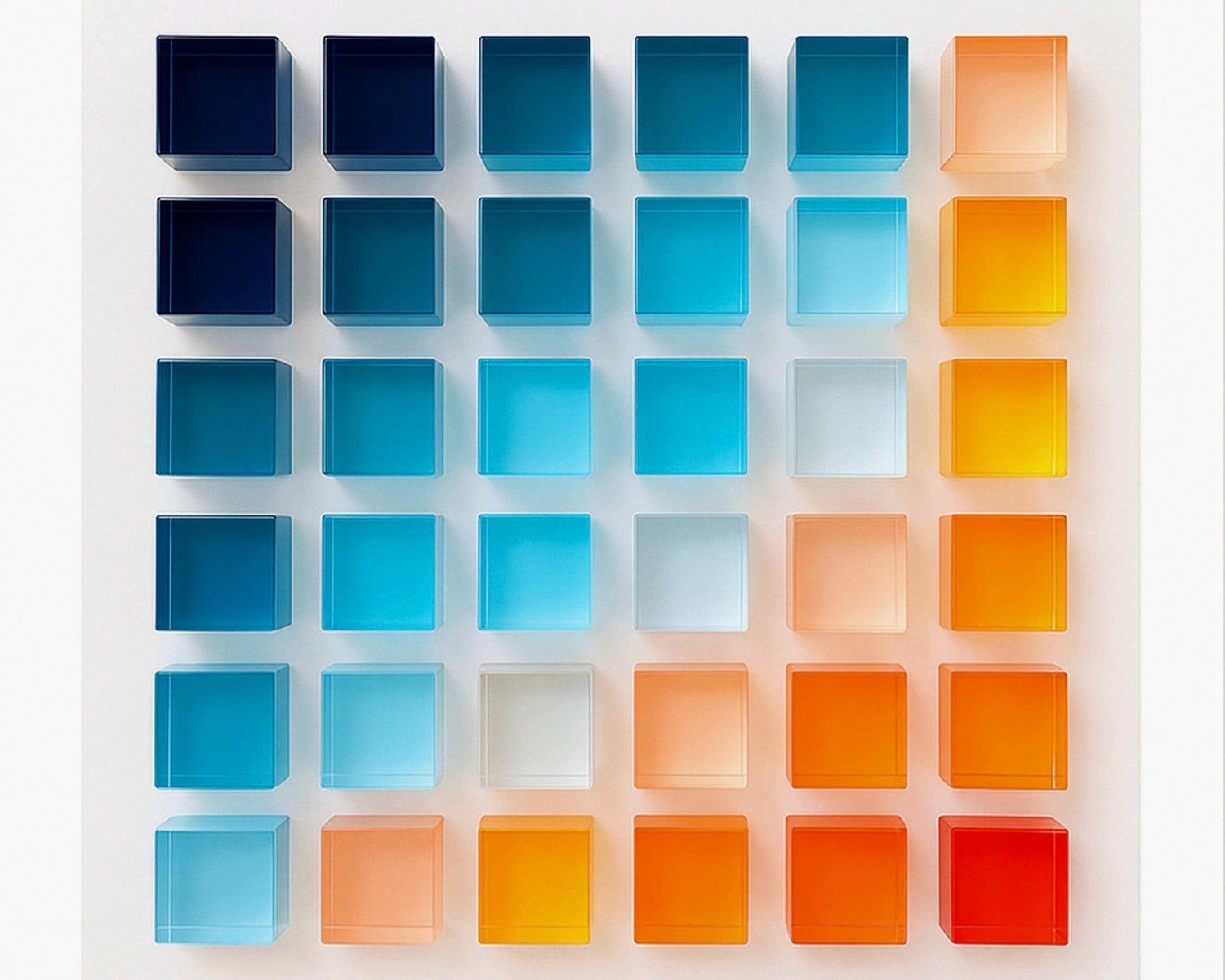
- High contrast images with deep blacks and bright colors
- Anything with water or glass elements because the acrylic enhances that liquid quality
- Bold graphics and typography
- Night photography or anything with dramatic lighting
- Abstract art with saturated colors
What doesn’t work:
- Super detailed portraits where you want to see every eyelash
- Vintage or intentionally faded photos – they just look washed out
- Anything with a lot of subtle mid-tones
- Images that are already low contrast
I made the mistake of printing this really soft, dreamy photo of my dog Pepper and it just looked blurry even though the file was fine. The glossy acrylic surface needs punchy images to work with its reflective quality.
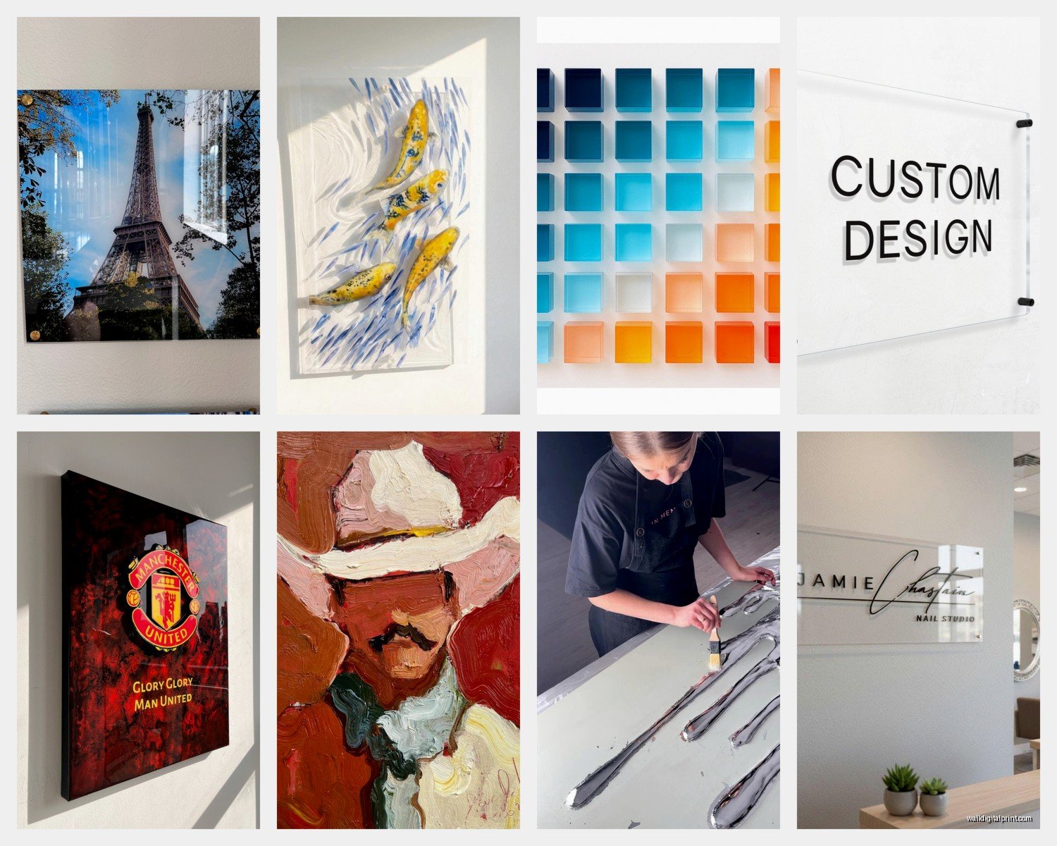
Mounting Systems Actually Matter
Most companies offer a few options and this affects how the final piece looks on your wall way more than you’d think.
Standoff Mounts
These are those metal hardware pieces that go through the acrylic and hold it off the wall. They look super modern and architectural. The print floats about an inch from the wall and you can see the shadow behind it which adds dimension. This is my favorite for contemporary spaces.
The downside is you’re drilling through your art basically. There are visible silver or black discs in the corners. Some people hate that look but I think it’s part of the aesthetic. Just don’t do standoffs on images where the corners contain important visual information.
French Cleat
This is a wooden or metal bar attached to the back. It’s invisible from the front and super secure. Good for heavy pieces or if you’re worried about the print falling. Less dramatic than standoffs though – it hangs closer to the wall.
Floating Frame
Some companies offer thin metal frames that hold the acrylic. Honestly this feels like defeating the purpose to me? The whole appeal of acrylic is that frameless floating look. But I have used these for clients who wanted something more traditional or needed the frame to tie into other elements in the room.
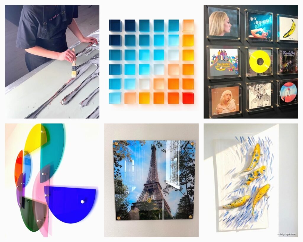
Size Considerations and Cost Reality Check
Acrylic gets expensive FAST as you scale up. An 8×10 might be like $40-60, but a 30×40 can easily hit $400-600 depending on thickness and finish options.
I usually tell people to go bigger than they think on acrylic specifically because the material has such presence. A tiny acrylic print looks kinda gimmicky, like why bother with this material for something so small? Start at 16×20 minimum for wall art.
For gallery walls I actually don’t love mixing acrylic with other mediums. It’s such a specific look that it clashes with canvas or framed paper prints. If you’re gonna do acrylic, commit to it for the whole arrangement or make it a standalone statement piece.
Where to Order and What to Watch For
I’ve used probably six different companies at this point. The quality variance is real.
Look for companies that specifically show the backing options – like do they use white backing, clear, or metallic? White backing makes colors more vibrant but you lose some of that depth. Clear backing gives you that see-through edge quality which looks expensive. Metallic backing (usually silver or gold) adds this subtle shimmer behind the image.
Read reviews about packaging. Acrylic is fragile and I’ve had pieces arrive with corner chips twice. Good companies use custom boxes with foam corners and protective film that’s easy to peel off. Cheap companies just wrap it in bubble wrap and hope for the best.
Questions to Ask Before Ordering
- What’s the actual material – is it acrylic or plexiglass (they’re similar but plexiglass is technically a brand name and sometimes lower quality)
- Do they use UV-resistant inks that won’t fade
- What’s the turnaround time – custom acrylic usually takes 7-14 days
- Do they offer color proofing or is what you upload what you get
- What’s the return policy if it arrives damaged
Caring for Acrylic Prints
They scratch easier than glass. Like way easier. I learned this when I tried to clean one with a paper towel and left these tiny surface scratches. Now I only use microfiber cloths, same ones I use for my laptop screen.
Regular glass cleaner is fine but don’t use anything with ammonia if you wanna be careful. I just use water with a tiny bit of dish soap most of the time. Spray the cloth, not the print directly, because liquid can seep into the edges if you’re not careful.
Don’t hang them in direct sunlight long-term. Even with UV-resistant inks, the acrylic itself can yellow over years of sun exposure. I made this mistake in a sunroom and after about 18 months there was a noticeable warm tone to the edges.
The DIY Route
You can technically buy acrylic sheets and print on them yourself if you have the right printer but honestly…don’t. I tried this during lockdown when I had way too much time and the results were so mediocre compared to professional printing. The ink doesn’t bond right without special treatments and it starts peeling after a few months.
If you want to save money, go smaller on size rather than compromising on the printing quality.
Color Calibration Issues
This is gonna sound annoying but your monitor is probably lying to you about what colors actually look like. Acrylic tends to make colors slightly more saturated and cooler in tone than they appear on screen. Blues get more intense, reds get deeper.
I now adjust my images before uploading – I slightly desaturate and add a touch of warmth knowing the acrylic will shift things back. Most people don’t bother with this and then are surprised when their print looks different than expected. Not worse necessarily, just different.
Some companies offer soft proofing where they show you what the print will look like with their specific process. Use this if it’s available, especially for important pieces or if you’re picky about color accuracy.
Weird Tips That Actually Help
If you’re printing typography or text-heavy designs, make the font weight slightly bolder than normal. The glossy surface can make thin letters look even thinner and harder to read.
Border or no border is a personal choice but I usually add a small white border (like half an inch) in the image file itself before uploading. It creates a clean edge and hides any slight misalignment in the printing process. Without a border, if the image bleeds to the edge, any tiny cutting variance becomes really obvious.
For photos with people, slightly increase the contrast and clarity before printing. Acrylic can make skin tones look too smooth or plastic-y otherwise. This is subtle but makes a difference in the final result.
Multiple Panel Prints
You can split one image across multiple acrylic panels for a modern look. I did this with a panoramic landscape – three 20×30 panels with small gaps between them. Looks amazing but the spacing has to be perfect when you hang them or the image won’t line up.
Use a level and measure multiple times. I mean like obsessively measure. Even a quarter inch off and the image will look disjointed. Painter’s tape to mark positions before drilling is your friend here.
When Acrylic Isn’t the Right Choice
Look, sometimes canvas or framed prints are just better. If you’re going for a cozy, traditional, or rustic vibe, acrylic will look out of place. It’s inherently modern and sleek. I had a client insist on acrylic for her farmhouse-style dining room and it just…didn’t work. We ended up switching to canvas wraps.
Also if you have very curious toddlers or large dogs who might knock into walls, acrylic can shatter. It’s not likely but it’s possible. Canvas is more forgiving for high-traffic family areas.
The other thing is weight – large acrylic prints are legitimately heavy. Make sure your walls can handle it and use appropriate anchors. I once hung a 36×48 on drywall with basic picture hangers and came home to it on the floor. Luckily it didn’t break but it could have. Toggle bolts or wall studs are necessary for anything over 24×36.
oh and another thing – if you’re renting and have restrictions on wall damage, the mounting systems for acrylic usually require more substantial hardware than a simple nail. Something to consider before ordering.