Wall Art Guide, Wall Art Tutoriels
Wall Art Posters: Affordable Prints & Framing Guide

Mar
So I’ve been helping people pick wall art for like a decade now and honestly the whole “affordable prints” thing has gotten SO much better than it used to be. Like, you don’t have to drop $300 on something anymore to make your walls look good.
Where to Actually Buy Prints That Don’t Look Cheap
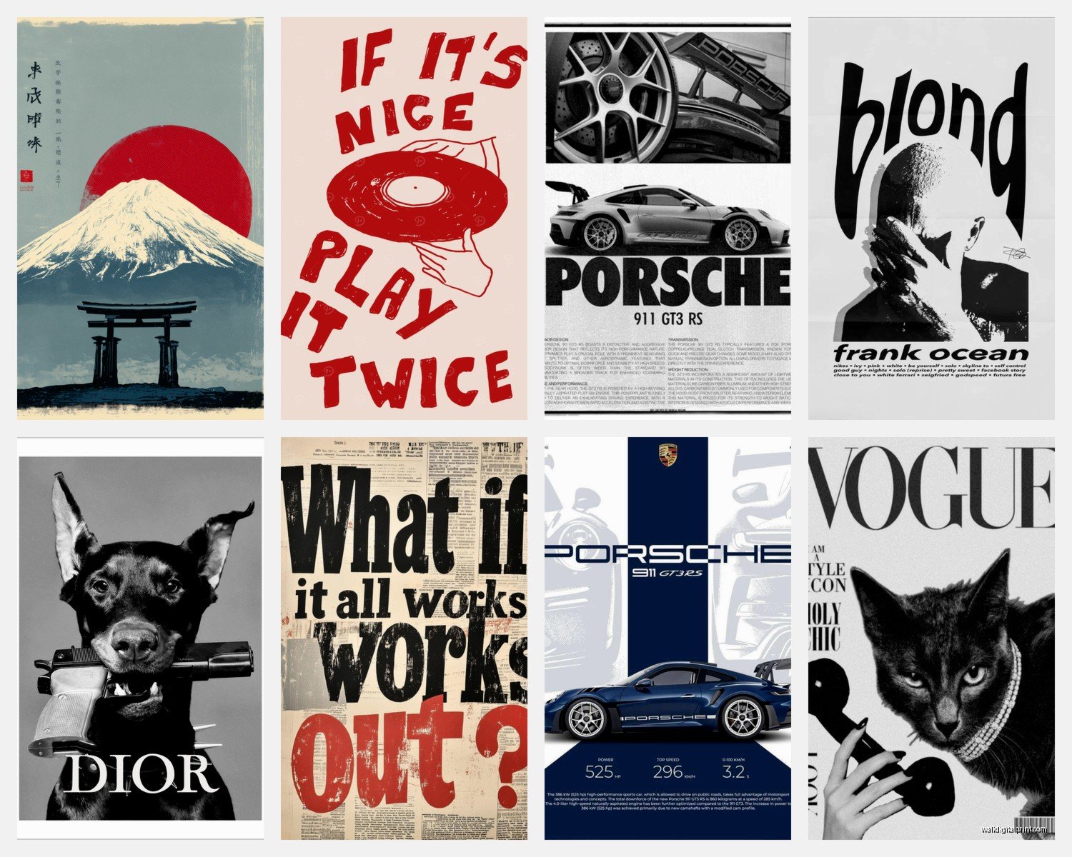
Okay so first off, Society6 is gonna be your friend here. I know everyone talks about them but they’re popular for a reason – artists upload their work and you can get it printed on basically anything. The quality is solid, I’ve ordered probably 50+ prints from there over the years. The paper stock is thick enough that you’re not getting that flimsy poster feel.
Etsy is obviously another one but you gotta be more careful there. Some sellers are just reselling stuff they found on Pinterest which… don’t do that. Look for shops that say “original artwork” or have the artist’s actual portfolio linked. I found this amazing line art artist on there last month and got three prints for my client’s bedroom, came out to like $60 total.
Oh and another thing – Minted is pricier but they do sales ALL the time. Sign up for their emails (I know, I know, but actually do it) because they’ll send you 25-30% off codes constantly. Their artist community is curated so the quality is consistently good.
Desenio if you want that minimal Scandinavian look. Super affordable, like $5-15 per print sometimes. The catch is shipping from Europe takes a minute and the paper is thinner than Society6, but for the price it’s hard to complain.
Print Quality Stuff You Actually Need to Know
This is gonna sound boring but paper matters more than you think. Giclée prints are the gold standard – it’s basically a fancy inkjet process that uses archival inks. They last forever without fading. Most good print shops will specify if something’s giclée.
For paper weight, you want at least 200 GSM (grams per square meter). Anything under that and you’re getting into flimsy territory where the print might warp in the frame or show wrinkles.
Matte versus glossy is personal preference but I’m gonna say matte like 90% of the time. Glossy shows every single fingerprint and gets weird reflections depending on your lighting. Matte just looks more… intentional? More gallery-like.
The Resolution Thing Nobody Explains Well
If you’re downloading prints from anywhere – Etsy digital downloads, artists’ websites, whatever – you need at least 300 DPI at the size you want to print. So if you want an 11×14 print, the file needs to be 3300×4200 pixels minimum.
I learned this the hard way when I printed something at like 150 DPI and it looked pixelated and terrible. My dog literally knocked it off the table before I could hang it which was honestly a blessing because it was bad.
Framing Without Spending Your Entire Paycheck
Custom framing is EXPENSIVE. Like stupidly expensive. I’m talking $150-300 per frame sometimes. So here’s what you actually do:
IKEA frames are completely fine. The RIBBA and SILVERHÖJDEN lines are solid. I use them in client homes all the time and nobody has ever been like “wow is that from IKEA” in a bad way. They’re clean, simple, and they work.
Target’s Threshold frames are also good, especially the brass ones if you want something a bit more elevated-looking. They go on sale constantly.
Michaels if you’re willing to wait for a sale – they do 50% off frames pretty regularly. Sign up for their emails too (your inbox is gonna hate me but your walls will look good).
Amazon has some okay options but it’s hit or miss. Read the reviews carefully and look at the customer photos because the product photos lie. I ordered these black metal frames once that looked sleek online and they arrived looking like they were made from tin foil.
The Matting Question
Okay so matting (that border thing between the print and frame) makes EVERYTHING look more expensive. Just… it does. A $15 print in a $20 frame with a mat looks like a $200 piece.
You can buy pre-cut mats from Michaels or online. Standard sizes are 11×14 with an 8×10 opening, or 16×20 with an 11×14 opening. White or off-white is the safest bet.
If your print is a weird size, you have two options: get a custom mat cut (Michaels does this, costs like $15-30) or just frame it without a mat in a frame that fits exactly. Both work fine, just depends on the look you want.
Actually Hanging the Things
Command strips work for lightweight frames under like 5 pounds. I know they say they work for more but don’t push it. Nobody wants a frame falling on their head at 3am.
For anything heavier, you gotta use actual picture hanging hardware. Get a stud finder (the tool, not… yeah). If you can hang on a stud, use a regular nail or screw. If you’re going into drywall, use anchors. The plastic screw-in anchors are fine for most frames.
Gallery walls are their own whole thing but the basic trick is: lay everything out on the floor first, take a photo, then recreate it on the wall. Use painter’s tape to mark where frames go before you start making holes.
I usually start with the center piece and work outward. Keep spacing consistent – like 2-3 inches between frames looks intentional, random gaps look messy.
Height Matters More Than You Think
Center of the artwork should be at eye level, which is roughly 57-60 inches from the floor. This is like… official gallery standard. But if you’re short (I’m 5’3″) or tall, adjust accordingly to what feels right when YOU look at it.
Over a sofa, leave 6-8 inches between the furniture and the bottom of the frame. Over a console table, 4-6 inches. These aren’t hard rules but they’re good starting points.
Making Affordable Prints Look Expensive
Okay so this is the actual secret – it’s all about how you style them. A $10 print can look amazing if you do it right.
Group similar styles together. Like all black and white photos in one area, or all botanical prints, or all abstract stuff. Mixing too many styles in one space looks chaotic unless you really know what you’re doing.
Frame consistency helps a TON. All black frames, or all natural wood, or all white – it creates cohesion even if the art itself is varied. I did this in my living room and people always assume I spent way more than I did.
Size variation keeps things interesting. Mix large statement pieces with smaller ones. A good ratio is like one big piece (16×20 or larger), a couple medium pieces (11×14), and some small ones (5×7 or 8×10).
The Triple Threat Layout
Three matching frames in a row is foolproof. Same size, same frames, evenly spaced. Works over a couch, in a hallway, above a bed. It’s almost impossible to mess up.
You can do three different prints or a triptych (one image split across three frames). Either way it looks intentional and put-together.
Protecting Your Prints
UV-protective glass or acrylic is worth it if you’re hanging something in direct sunlight. Regular glass will let your prints fade over time, especially with bright colors.
Acrylic is lighter than glass and doesn’t shatter, which is great if you have kids or are generally clumsy. It scratches easier though, so there’s a tradeoff.
Most budget frames come with regular glass or no glass at all (just plastic). For high-traffic areas or valuable prints, consider upgrading. You can buy UV-protective acrylic sheets cut to size online.
Digital Downloads vs Physical Prints
Digital downloads are super affordable – usually $5-15 – but then you gotta print them yourself. Costco and Staples both do photo printing and the quality is actually pretty decent for the price.
FedEx Office (used to be Kinko’s) does larger format prints. I’ve gotten 24×36 prints done there for like $8. The paper isn’t archival quality but for something trendy that you might swap out in a year or two, it’s perfect.
The benefit of buying physical prints is that the artist handles the printing quality. The benefit of digital is you can print it at whatever size you need and reprint if something happens to it.
When to Splurge vs Save
Save on: trendy pieces you’ll probably change out, kids’ rooms, rental apartments where you can’t paint so you need MORE art to compensate
Splurge on: original art from local artists (supports actual humans and you get something unique), statement pieces for main living areas, bedrooms where you want something meaningful
I try to do like an 80/20 split – 80% affordable prints and 20% investment pieces. Keeps things interesting without breaking the bank.
Fixing Common Problems
Print arrived with a crease: If it’s minor, you can sometimes flatten it by placing it under heavy books for a few days. If it’s bad, contact the seller – most will reprint.
Frame is crooked: Get a level. Seriously. Eyeballing it never works as well as you think it does. I watched an entire episode of that baking show while holding a level against frames because I kept thinking they looked straight and they WEREN’T.
Colors look different than online: Monitors display colors differently than prints. This is just… a thing that happens. If it’s drastically different, that’s a quality issue. If it’s slightly different, that’s normal.
Glass keeps getting dusty: Microfiber cloths are your friend. Don’t use paper towels, they leave streaks. Also acrylic is slightly better for this than glass.
Can’t decide between two prints: Buy both and live with them for a week. Seriously. Most places have good return policies. See which one you actually notice and enjoy versus which one just fades into the background.
My Current Favorite Sources
I’m really into this artist on Society6 right now who does these abstract landscapes that are like $20 for an 11×14. The colors are amazing.
Juniper Print Shop on Etsy for typography and quotes if that’s your thing – I usually think quote prints are cheesy but hers are actually good.
Printable Wisdom has digital downloads that are surprisingly sophisticated for the price point.
The Frame USA website for frames – better quality than IKEA, still way cheaper than custom framing. Shipping takes forever though so plan ahead.
wait I forgot to mention – thrift stores sometimes have great frames with ugly art. Buy them, toss the art (or donate it back), keep the frame. I’ve found some really good wood frames this way for like $5.
The Actual Process I Use
Pick your prints first, then find frames. Not the other way around. I know it’s tempting to buy cute frames and then figure out what goes in them, but you’ll end up with weird sizes that are hard to find prints for.
Measure your wall space before buying anything. Tape out the dimensions if you need to visualize it. I’ve definitely bought pieces that were way too big or way too small for the space I had in mind.
Order one print first if you’re trying a new source. Make sure you’re happy with the quality before you order six more.
Keep all your packaging until things are actually hung and you’re sure about them. Returns are way easier when you have the original box.
And honestly that’s most of what I’ve learned from doing this for years. The main thing is just to start – a wall with imperfect art is still better than a blank wall. You can always swap things out later when you find something you like better.