Wall Art Guide, Wall Art Tutoriels
Large Black and White Photography Wall Art: Monochrome Prints
Mar
So I just spent like three hours yesterday reorganizing a client’s gallery wall and honestly, large black and white photography is having such a moment right now. Let me tell you what actually works because I’ve made basically every mistake you can make with these prints.
Paper Quality Makes or Breaks Everything
Okay first thing – the paper matters SO much more than anyone tells you. I learned this the hard way when I ordered what I thought was gonna be this stunning architectural print and it arrived looking like a fancy office poster. Not the vibe.
You want to look for these specific paper types:
- Fine art paper (cotton rag) – usually 100% cotton, around 300gsm weight minimum. This is what museums use and yeah it’s pricey but the blacks are actually BLACK, not gray
- Baryta paper – has this slight gloss that makes the tonal range insane. My favorite for anything with lots of texture or contrast
- Matte photo paper – more affordable, still looks professional if you get at least 230gsm
I usually tell people to skip anything under 200gsm because it feels flimsy and you can literally see the wall texture through it sometimes. Not cute.
The Thing About Giclée Prints
Everyone throws around “giclée” like it automatically means quality but like… it just means inkjet printing with archival inks. What you actually need to check is whether they’re using pigment-based inks (which last 100+ years) versus dye-based inks (which fade in like 5-10 years especially near windows).
I always ask sellers directly: “Are these pigment or dye inks?” If they can’t answer immediately, that’s your red flag.
Size and Scale – Where Everyone Messes Up
Okay so funny story, my dog knocked over my coffee right onto my planning sketches last week but anyway – size is where I see people freeze up the most.
Here’s what actually works in real spaces:
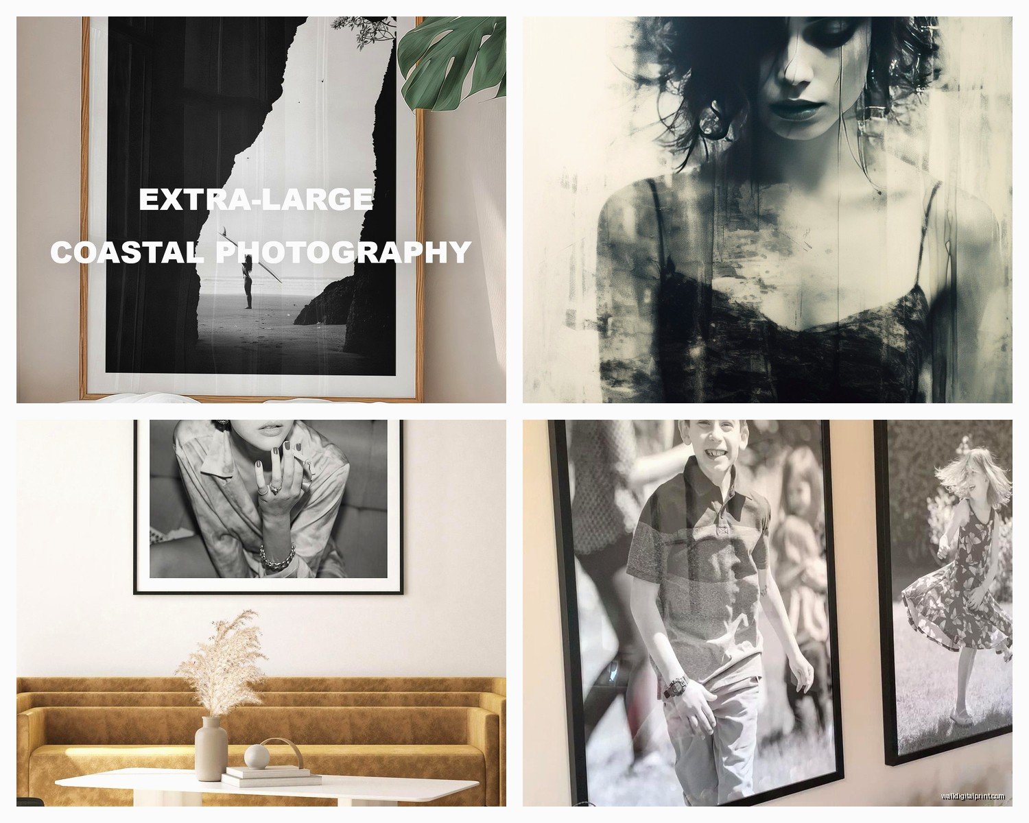
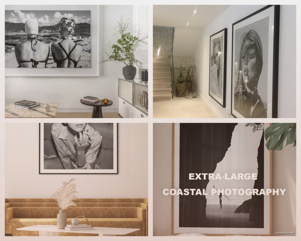
For above a sofa or bed: You want the print to be roughly 2/3 to 3/4 the width of your furniture. So if your sofa is 84 inches, you’re looking at 56-63 inches of art width. You can do one massive piece or a diptych/triptych that adds up to that width.
For a focal wall: Go bigger than feels comfortable. I’m serious. A 40×60 inch print seems huge when you’re ordering it online but once it’s on a 12-foot wall with furniture and everything else competing for attention, it needs that presence.
Hallways and narrow spaces: Vertical orientation, 24×36 or 30×40 works beautifully. Horizontal makes narrow spaces feel more cramped.
I just finished a project where the client insisted on 16×20 prints for their massive living room and… it looked like a doctor’s office waiting room. We went back and ordered 48×72 prints and suddenly the whole room felt intentional and curated instead of like an afterthought.
Framing Options That Don’t Cost Your Rent
Real talk – custom framing is gonna run you $200-500+ per large print. It’s wild. But there are workarounds that still look expensive.
Ready-Made Frames
IKEA’s RIBBA frames are honestly solid for prints up to 24×36. The black ones especially – they’re simple, the matting looks clean, and they’re like $25. I’ve used them in $2 million homes and no one’s ever questioned it.
For larger sizes, check out:
- Frame Destination – they do ready-made sizes up to 40×60 in simple black or white profiles
- American Frame – slightly pricier but better quality, and they have sales constantly
- Framebridge – if you need custom but want it easy, though you’re paying for that convenience
The Float Mount Look
This is gonna sound weird but my favorite budget-friendly option for large prints is actually mounting them to 3/4 inch foam board and hanging them unframed. You use offset clips so the print floats about an inch off the wall. Super gallery-like, costs maybe $40 for a huge print, and you can DIY it or most print shops will do it for cheap.
The key is making sure your print has clean edges – like a white border or the image bleeds to the edge intentionally. Don’t try this with a print that just… ends randomly.
Where to Actually Buy These Prints
I’ve ordered from like thirty different places at this point so let me save you the trial and error.
Etsy sellers – hit or miss but when you find a good one, bookmark them forever. Look for shops that show actual photos of prints in homes, not just digital mockups. Read reviews that mention paper quality specifically. My go-to shops right now are… wait I need to check my orders… okay so Little Ink Empire and Whales and Wolves both consistently deliver.
Society6 and Redbubble – convenient, tons of artists, but the quality is just okay. Fine for a rental or if you’re still figuring out your style, but the paper is thin and I’ve had color consistency issues (the blacks can look really washed out).
Saatchi Art – if you want actual limited edition photography from real photographers. Pricier but you’re getting archival quality and supporting artists directly.
Print shops like Mpix or Nations Photo Lab – if you have your own digital files, these places are incredible. I upload images here all the time for clients. The baryta prints from Mpix are *chef’s kiss*.
Oh and another thing – a lot of photographers sell directly through their websites and you can sometimes negotiate on larger prints, especially if you’re buying multiple. Just email them. The worst they can say is no.
Choosing Images That Actually Work Large-Scale
Not every black and white photo translates to wall art. I learned this when I printed what looked like a stunning iPhone photo of my friend’s architecture shot and at 30×40 it was just… pixelated and sad.
Resolution matters: For a 24×36 print, you need at minimum 3600×5400 pixels. For anything larger, you’re looking at 4000+ pixels on the short side. Most print shops will tell you if your file is too small, but double-check before ordering.
Subject matter for large prints:
- Architecture and geometric patterns – scale up beautifully, all those lines and shapes create impact
- Landscapes with strong contrast – think dramatic skies, stark trees, mountains
- Close-up textures – fabric, weathered wood, water, leaves. These get really interesting when huge
- Minimalist compositions – negative space is your friend at large sizes
What doesn’t work as well:
Busy, detailed scenes with tons of tiny elements. From far away (which is how you view large art), all that detail just becomes visual noise. Also portraits where you can see every skin texture at 48 inches… most people don’t love that vibe in their living room.
Hanging and Placement Strategy
My client canceled yesterday so I spent an hour comparing mounting hardware because apparently that’s my idea of fun now, but seriously – hardware matters.
For prints under 30 pounds: Basic picture hanging hooks rated for the weight are fine. I like the OOK brand from hardware stores.
For larger pieces (30-50 pounds): Get proper wall anchors if you’re not hitting studs. Those butterfly anchors or toggle bolts. Do NOT trust those plastic expansion anchors with your $300 print.
Over 50 pounds: You gotta find studs or use French cleats. Non-negotiable. I watched a 60-pound framed print fall off a wall once and it was dramatic and expensive.
Height Rules
Center the print at 57-60 inches from the floor – this is standard gallery height and where most people’s eye line naturally falls. If you’re hanging above furniture, leave 6-8 inches between the furniture top and the bottom of the frame.
For gallery walls with multiple pieces, lay everything out on the floor first. Take a photo. Live with that photo as your phone background for a day or two. Trust me on this – what looks good on the floor doesn’t always translate to the wall and you don’t wanna be putting 47 holes in your wall.
Mixing Prints and Creating Cohesion
If you’re doing multiple black and white prints in one space, here’s what keeps it from looking chaotic:
Stick to one framing style – all black frames, all white, all natural wood, or all unframed. Don’t mix unless you really know what you’re doing.
Keep a consistent mat situation – either all prints have white mats, all have black mats, or none have mats. This creates visual rhythm.
Vary your subjects but keep a tonal consistency – like all high-contrast prints, or all soft and ethereal. Mixing a super contrasty architectural shot with a soft, gray-toned beach scene usually feels off.
I’m actually watching this documentary about photography right now and they just said something about Ansel Adams’ zone system which is totally relevant here – he thought about black and white in terms of these eleven zones from pure black to pure white, and the best large-scale prints usually have a full tonal range. Not just grays, but true blacks and true whites with everything in between.
Diptychs and Triptychs
When you split one image across multiple panels, leave 2-3 inches between each panel. Any closer and it looks like a mistake, any wider and they read as separate images.
Make sure the panels are precisely level with each other. Like, use an actual level. I’ve seen so many almost-perfect installations ruined by panels that are 1/4 inch off from each other.
Maintenance and Longevity
Okay practical stuff – keep your prints away from direct sunlight. Even archival inks will fade eventually with UV exposure. If you have a south-facing window situation, either use UV-protective glass in your frame or hang the print on a different wall.
Dust with a microfiber cloth, not those feather dusters that just move dust around. For unframed prints, be gentle – the surface can scratch.
If you’re in a humid environment, make sure there’s airflow behind the print. I’ve seen mold grow between print and wall in a bathroom situation and it was not salvageable.
The Budget Breakdown
Since people always wanna know what things actually cost:
Budget option: $30-80 for a large print from Etsy + $40-150 for a ready-made frame or DIY mounting = $70-230 total
Mid-range: $150-300 for a quality giclée print on fine art paper + $200-400 for decent framing = $350-700 total
Investment piece: $400-1000+ for limited edition photography + $400-800 for custom framing = $800-1800+ total
I usually tell people to invest in one or two really good pieces for main spaces and fill in other areas with more affordable options. Nobody’s judging your hallway art as closely as your living room focal point.
Honestly the biggest mistake I see is people going too small or too cheap on the one piece of art that’s supposed to anchor their whole room. Like if you’re gonna splurge, splurge on that statement piece above your sofa. The random art in your bedroom can be the Ikea print.
Just make sure whatever you choose, you actually love looking at it, because you’re gonna see it every single day and trends change but your walls stay the same until you feel like repainting and rehanging everything which… nobody wants to do more than necessary.