Wall Art Guide, Wall Art Tutoriels
Personalized Photo Wall Art: Custom Family Picture Prints
Apr
So I’ve been deep in the personalized photo wall art rabbit hole lately because honestly, regular generic prints just don’t hit the same anymore, and my clients keep asking about this stuff. Let me just dump everything I know because I’ve tested like… way too many options at this point.
Print Quality Actually Matters More Than You Think
Okay so first thing – the paper or material you choose is gonna make or break the whole thing. I learned this the hard way when I ordered what I thought was a canvas print and it showed up looking like someone ironed a bedsheet with a photo printed on it. Not cute.
For family photos, you’ve basically got these options:
- Canvas prints – these are the classic choice, they hide imperfections in lower-res photos pretty well
- Metal prints – super modern, the colors pop like crazy, but they’re pricey
- Acrylic prints – glossy and dimensional, makes colors really vibrant
- Fine art paper – if you’re framing anyway, this is my go-to
- Wood prints – trendy right now, gives this rustic vibe
I’ve used Shutterfly, CanvasPop, Mixtiles, Artifact Uprising, and Nations Photo Lab. Nations Photo Lab has the best color accuracy hands down, but their interface is… let’s just say it’s not winning design awards. Artifact Uprising is gorgeous if you want that minimal aesthetic and don’t mind paying extra. Mixtiles are great if you’re commitment-phobic because they’re lightweight stick-on tiles, so you can rearrange without putting holes everywhere.
The Resolution Thing Everyone Gets Wrong
Your phone photos are probably fine for prints up to 16×20, maybe even 20×30 if the lighting was decent. The rule is 300 DPI for crisp prints, but honestly 200 DPI works for stuff you’re hanging on a wall that people aren’t gonna examine with their nose pressed against it.
Here’s what I do – I upload the photo to the print site and if it gives me a quality warning, I size down. Most sites have this indicator that shows if your image is too low-res. Don’t ignore it. I did once and got a blurry mess that I had to hide in the guest bathroom.
Choosing Photos That Actually Work
This is where people stress themselves out for no reason. You don’t need a professional photographer for this to look good – you just need decent lighting and actual expressions that aren’t forced.
The best family photos for wall art are the candid ones where people are actually doing something or laughing at something real. Not the stiff “everyone look at the camera” shots unless that’s genuinely your vibe. I did a whole gallery wall for my sister using photos from their camping trip last summer, and it looks way better than the formal portraits she paid someone $400 for.
Black and White vs Color
Okay so funny story – I was watching The Bear the other night (have you seen it? so stressful but so good) and noticed how they use black and white photos in the restaurant scenes, and it made me realize… black and white is way more forgiving. It hides color casts from bad lighting, makes different photos look more cohesive together, and honestly just reads as more intentional even when it’s not.
But if your photos have really beautiful color – like sunset beach photos or fall foliage or whatever – keep the color. You can always edit them to have a consistent filter or tone so they look good together on the wall.
Layout Planning Without Losing Your Mind
Don’t just start hammering nails into your wall. I mean you can, but you’ll probably regret it.
I use painter’s tape to map out where frames will go. Cut pieces of tape the size of each frame and stick them on the wall. Live with it for a day or two. Move stuff around. My cat keeps trying to attack the tape pieces which is annoying but also kinda helps me see if the layout works since I’m constantly looking at it.
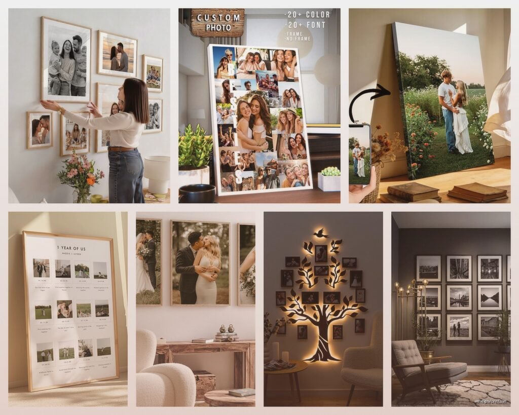
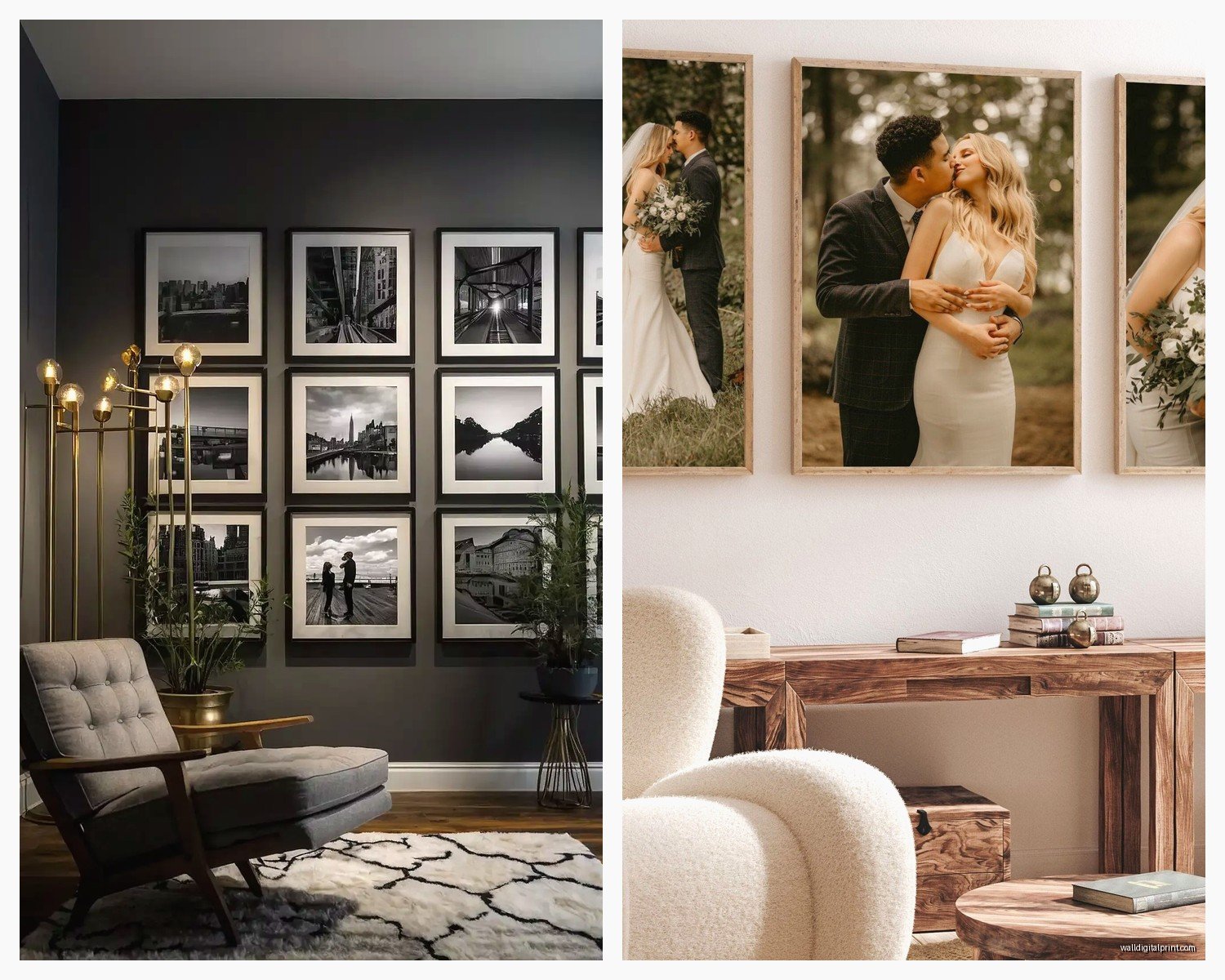
Gallery Wall Formulas That Work
- The Grid – same-size frames in rows and columns, super clean and modern
- The Salon Style – different sizes all clustered together, more eclectic
- The Statement Piece – one large print (like 30×40 or bigger) with smaller ones around it
- The Linear – frames in a horizontal line, easy and classic
For spacing, I stick with 2-3 inches between frames. Some people go tighter, but I need breathing room or it looks chaotic to me.
Customization Options Worth Paying For
So personalization can mean a lot of things. Most print companies let you add text, dates, locations, quotes… whatever. Some of this is cute, some is tacky, it depends on execution.
What I actually recommend:
Minimal text overlays – like a date in small text at the bottom corner, or coordinates of where the photo was taken. Minted does this really well. Their designs are clean and don’t overwhelm the actual photo.
Custom cropping and filters – more important than text honestly. Being able to crop to the perfect composition and apply a consistent filter across multiple photos makes everything look intentional.
Border options – white borders around photos create this Polaroid effect that I’m kinda obsessed with right now. It also makes different-sized photos look more cohesive when you group them.
Things I Skip
Cheesy quotes about family – unless it’s genuinely meaningful to you, skip it. Those generic “family is everything” type things feel very 2012 Pinterest to me.
Too much text – if I have to read a paragraph on your wall art, it’s not wall art anymore, it’s a poster.
Overly filtered photos – a little editing is good, but don’t make everyone’s skin look like plastic. Keep it natural.
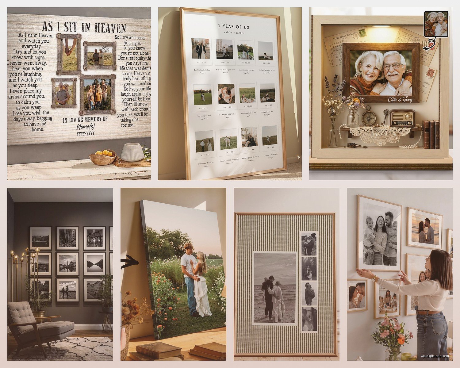
Framing Decisions
Okay wait I forgot to mention – framing matters SO much. You can get prints framed by the print company (convenient but expensive) or frame them yourself (cheaper but more effort).
If you’re doing it yourself, IKEA Ribba frames are perfectly fine for most situations. They’re cheap, they come in tons of sizes, and they look clean. I’ve used them in client homes that cost more than my car, and nobody’s ever called me out on it.
For something fancier, Framebridge is great – you send them your print, pick a frame style online, and they send it back framed and ready to hang. It’s pricier but takes away the hassle of measuring and hoping you got the mat cut right.
Frame Color Strategy
All the same color creates cohesion. I usually stick with either all black, all white, or all natural wood. Mixing frame colors can work but it’s harder to pull off – you need a really good eye for it or it just looks like you grabbed whatever was on sale.
Black frames = modern, crisp, dramatic
White frames = light, airy, traditional
Wood frames = warm, casual, versatile
Actually Hanging Everything
Get a level. Like actually. Don’t eyeball it. I learned this after hanging an entire gallery wall that looked fine until I stepped back and realized everything tilted slightly right. Had to redo the whole thing.
For hanging, I use these 3M Command picture hanging strips for anything under 8 pounds. They’re genuinely amazing – no holes, no damage, and they actually hold. For heavier stuff, proper picture hanging hooks or anchors if you’re going into drywall.
Pro tip that’s gonna sound weird but works – hang the middle of your frames at eye level, which is usually around 57-60 inches from the floor. This is the museum standard and it actually makes everything look more professional.
Print Companies I’ve Actually Used
Since I’ve tried way too many of these, here’s my honest breakdown:
Nations Photo Lab – Best color quality, professional-grade prints, but the website feels like it hasn’t been updated since 2008. Great for fine art paper prints.
Artifact Uprising – Beautiful, minimal aesthetic. Their wood prints are stunning. Pricey but the quality matches the cost. Packaging is also really nice if you’re gifting.
Mixtiles – Super convenient stick-on foam boards. Not the highest quality prints, but perfect for renters or people who like changing things up. I have like 15 of these in my office.
Shutterfly – Good for when they have sales (which is constantly). Quality is decent, tons of options, but some of their design templates are kinda dated. Wait for a 50% off deal.
CanvasPop – Solid canvas prints, good value. Their split canvas option where one photo is printed across multiple canvases is cool for really large installations.
Minted – Beautiful designs, great for styled prints with text or borders. More expensive but their design team clearly knows what they’re doing.
Editing Photos Before You Print
You gotta edit before you print. Even just basic stuff makes a huge difference.
I use Lightroom for most editing, but honestly even the editing tools in your phone’s photo app are fine for this. Here’s what I adjust every time:
- Brightness – make it slightly brighter than you think, prints often come out darker
- Contrast – a little boost makes photos pop
- Saturation – be subtle here, oversaturated prints look cheap
- Crop – get rid of distracting elements, focus on the important parts
If you’re printing multiple photos for a gallery wall, edit them all with similar settings so they look cohesive. Most editing apps let you copy settings from one photo and paste them onto others.
Color Correction Matters
If your photos have weird color casts – like everything looks too orange or too blue – fix that before printing. Most editing apps have a white balance tool. Just tap on something that should be white or gray in the photo, and it’ll correct the colors automatically.
Cost Breakdown Reality Check
This can get expensive fast or stay pretty reasonable depending on your choices. Here’s roughly what you’re looking at:
Small prints (8×10 or smaller) – $5-20 each depending on material
Medium prints (11×14 to 16×20) – $20-60 each
Large prints (20×30+) – $50-200+ each
Framing adds – $15-100+ per frame depending on size and quality
My sweet spot is usually ordering during sales, going with mid-range materials (canvas or fine art paper), and framing myself with IKEA frames. A whole gallery wall of 9-12 photos usually runs me around $200-400 total.
Common Mistakes to Avoid
Printing photos that are too dark – they’ll be even darker printed. Brighten them first.
Choosing photos with different color temperatures – warm-toned and cool-toned photos don’t look great together unless you’re intentionally going for that.
Ordering one size only – variation in sizes makes gallery walls more interesting.
Not testing with one print first – if you’re ordering from a new company, get one print before you commit to 15.
Hanging things too high – seriously, eye level is lower than you think.
Forgetting to clean the glass – fingerprints on framed prints drive me crazy, wipe them down before hanging.
The Gift Angle
Oh and personalized photo prints make really good gifts if you do it right. I made one for my parents’ anniversary with photos from their wedding day next to recent photos of them, same poses. They cried, it was very sweet.
For gifts, I usually go with either a single large statement piece or a set of smaller coordinating prints. Include the frame so they can just hang it immediately. Nobody wants to receive a rolled-up print they have to deal with framing themselves.
Shutterfly and Snapfish are good for this because they always have deals and you can usually get stuff made pretty quickly if you’re a last-minute person like me.
Okay I think that covers most of it… the main thing is just start with one or two prints to test quality before you commit to a whole wall situation. And don’t stress too much about making it perfect – family photos are supposed to be personal and a little imperfect anyway, that’s kinda the whole point.