Wall Art Guide, Wall Art Tutoriels
Free Printable Wall Art Flowers: Botanical Downloads
Apr
So I’ve been downloading free printable flower art for like three years now and honestly it’s become this weird hobby where I probably have 400+ files saved that I’ll never print but anyway, let me tell you what actually works because I’ve wasted so much paper and ink figuring this out.
Where to Actually Find the Good Stuff
Okay so the obvious places are Pinterest and Etsy but here’s the thing – Pinterest is basically just a redirect maze half the time. You click through like five links and end up at some site that wants your email for a “free” download that’s actually 72dpi and looks pixelated as hell when you print it. Been there too many times.
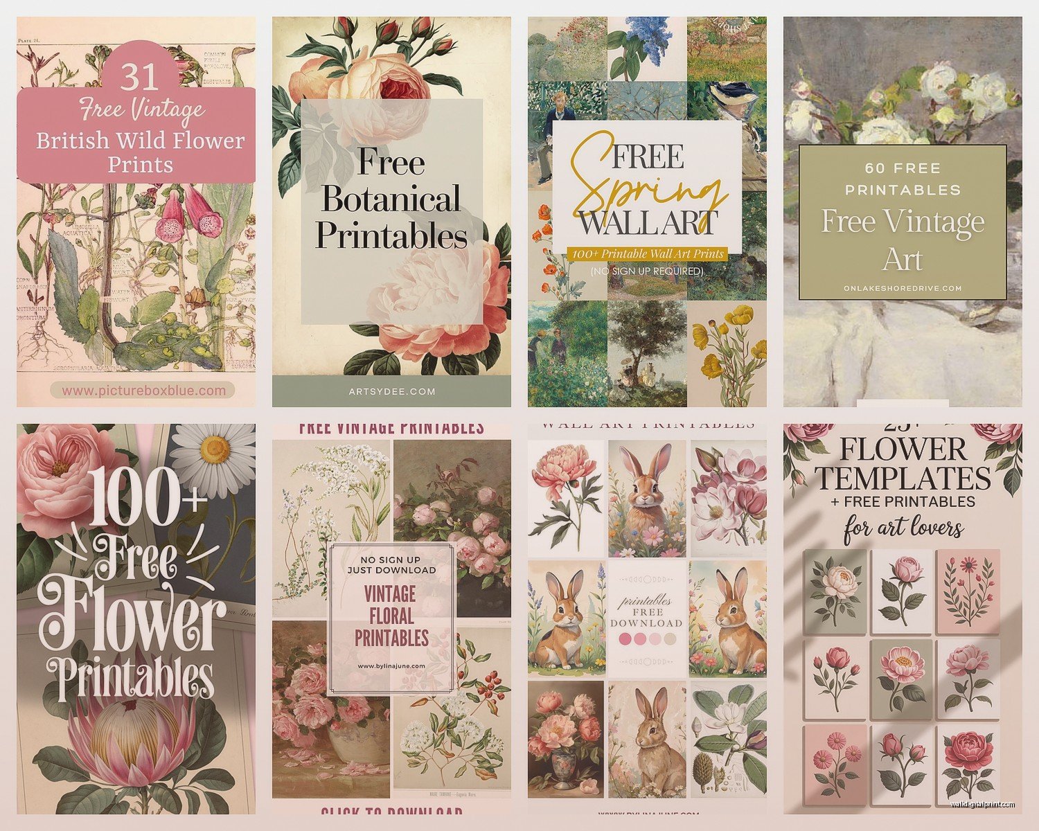
The sites I actually use: Unsplash has botanical photography that’s technically not “printable art” but if you download the high-res versions they print beautifully. I did a whole gallery wall in my hallway with just rose photos from there. Public domain collections are your friend – the New York Public Library has this insane digital collection with vintage botanical illustrations. Like proper 1800s stuff that looks expensive but costs nothing.
Oh and the Met Museum. Their collection is ridiculous. You can download ultra high-res images of actual paintings and botanical prints. I found this incredible peony illustration there that I printed on 16×20 and everyone thinks I bought it from some fancy art dealer.
The Resolution Thing Nobody Explains Properly
This is gonna sound technical but it’s actually simple – you need 300dpi minimum for printing. That stands for dots per inch and basically if the file is less than that it’ll look blurry or grainy when printed. I learned this the hard way after printing what looked like a beautiful tulip image on my screen that came out looking like a newspaper photo from 1982.
Here’s how to check: right-click the image file, go to properties (or Get Info on Mac), and look at the dimensions in pixels. For an 8×10 print you need at least 2400×3000 pixels. For 11×14 you want 3300×4200 pixels. I keep a note in my phone with these numbers because I can never remember them.
Wait I forgot to mention – some sites list the dpi in the download info but a lot don’t. If you’re not sure, download it anyway and check the file size. Anything under 1MB is probably not gonna print well at larger sizes.
Printing Options Because Not All Methods Are Equal
Your home printer is fine for smaller prints if you’ve got a decent inkjet. I have an Epson EcoTank that I bought specifically for this and it’s paid for itself probably ten times over. But here’s what nobody tells you – the paper matters MORE than the printer.
Regular copy paper makes everything look cheap. Like craft-project-at-summer-camp cheap. You need cardstock at minimum. I use 110lb cardstock from Staples for most things, but if I want something that looks really professional I get matte photo paper. The Epson Premium Presentation Paper Matte is like $20 for 50 sheets and worth every penny.
When to Use Print Shops Instead
For anything bigger than 11×14 I just send it to a print shop. Trying to do large format at home is… it’s not worth it. FedEx Office does good work and they’re everywhere. I upload the file online, pick it up same day usually. Their cardstock printing is solid.
But here’s a secret – Costco’s photo center is weirdly good for botanical prints. They’re set up for photos obviously but if you upload a high-res botanical image and order it as a “photo print” on their luster paper it comes out looking amazing. And it’s cheap. Like $7 for a 16×20 cheap.
My cat just knocked over my coffee all over my notes but whatever I remember the important stuff.
File Formats and Why PDFs Can Be Annoying
Most free printables come as JPG or PNG files, some as PDFs. JPGs are fine, PNGs are actually better because they don’t compress the image quality as much. PDFs are hit or miss – sometimes they’re vector files which means you can scale them infinitely without losing quality, but other times they’re just JPGs wrapped in a PDF which is… pointless.
If you get a PDF, open it in Adobe Reader and check the file size and properties before printing. I’ve downloaded “printable” PDFs that were clearly just low-res images someone converted.
Oh and another thing – some printables come in CMYK color mode instead of RGB. This matters for printing. CMYK is what professional printers use and will give you more accurate colors. If you’re printing at home your printer probably wants RGB, but print shops prefer CMYK. You can convert between them in Photoshop or even in free programs like GIMP but honestly most of the time I just print whatever I downloaded and it’s fine.
Color Accuracy Is Kinda Impossible
This is gonna sound weird but I’ve completely given up on getting colors to match exactly what I see on screen. Every screen shows colors differently, every printer prints them differently. That gorgeous coral pink peony might come out more salmon, that deep burgundy dahlia might be brighter red.
What I do now: I print one test copy on regular paper first before committing to expensive cardstock. Saves so much waste. If the colors are way off you can adjust them in your computer’s photo viewer usually – just tweak the saturation or brightness before printing.
The Actual Process I Use Every Time
Okay so here’s my workflow that I’ve refined after printing probably hundreds of these things:
Find the image and download the highest resolution available. I create folders on my desktop by color scheme because I’m weirdly organized about this one specific thing even though the rest of my life is chaos.
Check the resolution and dimensions like I mentioned earlier. If it’s too small for what I want, I either find a different image or plan to print it smaller.
Open it on my computer and look at it at 100% zoom. This shows you actual print size basically. If it looks sharp at 100% it’ll print sharp.
Adjust colors if needed. I usually bump up the contrast slightly because prints tend to come out a bit flatter than what you see on screen.
Print a test on cheap paper. Cannot stress this enough.
If it looks good, print on nice paper or send to print shop.
Framing Makes or Breaks the Whole Thing
You can have the most beautiful botanical print in the world and if you put it in a crappy frame it’ll look like dorm room decor. Which is fine if that’s the vibe you want but probably not.
IKEA frames are actually decent for this. The RIBBA series comes in tons of sizes and they’re simple enough that they don’t compete with the art. I bought like 12 of them during my last gallery wall project.
But for nicer presentations I order frames from Frame It Easy online. They do custom sizes and you can pick the mat color and everything. More expensive but worth it for statement pieces. I did a set of three vintage rose prints in gold frames with cream mats and they look like I spent $500 at an art gallery. Total cost was maybe $80 including printing.
Target also has surprisingly good frames in their Threshold line. The quality is better than the price suggests.
My Favorite Types of Botanical Prints
Vintage scientific illustrations are my absolute favorite. Those detailed drawings with Latin names and little notation marks. They have this sophisticated look that works in literally any room. The Biodiversity Heritage Library has thousands of these available for free download.
Watercolor flowers are everywhere right now and some are gorgeous but a lot look too… Etsy shop if that makes sense. Like too intentionally pretty. The ones that work best are either super loose and painterly or really detailed and realistic. The middle ground often looks crafty.
Pressed flower styles – where it looks like an actual pressed flower specimen – these are having a moment. They’re minimalist enough to work in modern spaces but still soft and organic. I found amazing ones in the Smithsonian archives.
Black and white botanical line drawings. These are foolproof honestly. They work with any color scheme, any style, any room. And they’re easier to print because you don’t have to worry about color accuracy.
Mixing and Matching Without It Looking Chaotic
This is where I see people mess up most. They download random flower prints in different styles and colors and throw them on a wall and it just looks… scattered.
What actually works: pick ONE style and stick with it. All vintage scientific illustrations. Or all black and white line drawings. Or all watercolors. The flower types can vary but the style should be consistent.
OR pick one color story. All pink tones. All botanical prints with cream/beige backgrounds. All bold colorful flowers but in the same palette.
I did a whole wall in my client’s bedroom – well former client, she moved – with just different pink flowers. Peonies, roses, cherry blossoms, dahlias. All different illustrations from different sources but all in that blush to deep rose range. Looked intentional and cohesive.
Sites I Actually Bookmark and Use Regularly
The Graphics Fairy has tons of vintage botanical stuff. It’s all public domain so truly free. The site design looks like it’s from 2005 but the content is gold.
Rawpixel has a free section that’s really good. They have both vintage and modern botanical images. You gotta sort through some stuff but the quality is high.
New York Public Library Digital Collections like I mentioned. Their search function is weird but once you figure it out there’s so much there.
The Met Museum collection. Just search “botanical” or specific flowers.
Unsplash and Pexels for modern flower photography. Not illustrations but the photos are so good and high-res.
Oh wait, also the Rijksmuseum in Amsterdam has their collection online. Insane quality scans of Dutch flower paintings. I printed one of those classic overflowing flower arrangement paintings and it’s the centerpiece of my dining room.
The Printables I Avoid
Anything that’s clearly AI-generated. And there’s a lot of that now. You can usually tell because the flowers look almost right but something is off. Weird petal counts, leaves that don’t make botanical sense. Also just ethically I’d rather support actual artists or use genuine public domain stuff.
Super trendy quote prints with flowers. Like “bloom where you’re planted” with some roses. They date themselves so fast and honestly they’re kinda corny.
Anything with a watermark still visible. Some free sites put these on and expect you to print them anyway which is just tacky.
Really low contrast pastel-on-white designs. They look pretty on screen but disappear on the wall. You need some visual weight for art to actually register from across a room.
Troubleshooting the Common Issues
Colors look different when printed – this is normal, do a test print and adjust brightness/saturation before the final print.
Image looks pixelated – the resolution is too low, find a higher quality file or print it smaller.
White borders around the image – your printer settings are probably set to “fit to page” instead of “fill page” or borderless printing. Check your print dialog box settings.
Paper jams with cardstock – make sure your printer can handle the weight you’re using. Some printers max out at 80lb cardstock.
Print looks faded – you might need to replace your ink cartridges or use the “best quality” setting instead of “normal.”
Making It Look Expensive
Okay so the whole point of free printables is saving money but you still want it to look good right? Here’s what actually makes a difference:
Good paper or professional printing. This is where you spend money.
Proper frames with mats. The mat especially makes things look gallery-quality.
Hanging them at the right height. Center of the image should be at eye level, which is usually around 57 inches from the floor.
Grouping them thoughtfully if you’re doing multiple. Grid arrangements look modern and intentional. Salon-style gallery walls are cool but harder to pull off.
Using matching frames for a cohesive look. They don’t have to be identical but similar style and color.
I’m realizing this is getting long but there’s just so much to cover with this stuff. Last thing I’ll mention is that you gotta just start printing things and seeing what works in your actual space. I’ve downloaded prints that looked perfect online and printed them and they just didn’t vibe with the room. And vice versa – stuff I wasn’t sure about that ended up being perfect.
The beauty of free printables is you can experiment without risk. Print it, frame it, live with it for a week. If you hate it, swap it out. No big investment lost. I probably rotate my botanical prints every few months just because I get bored and want to try new ones.