Wall Art Guide, Wall Art Tutoriels
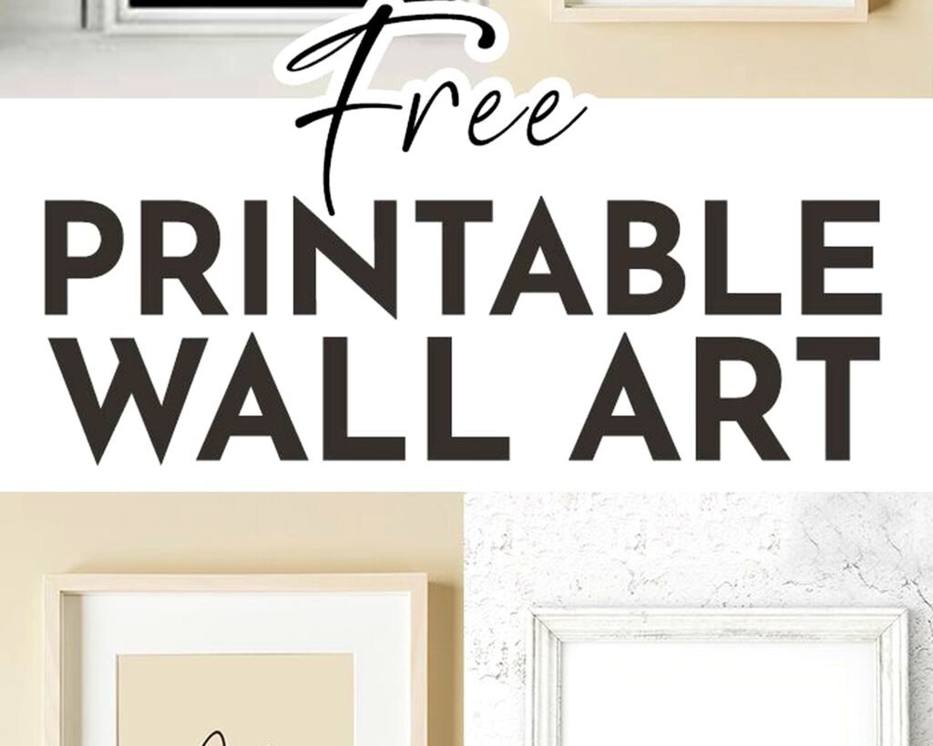
Printable Boho Wall Art: Free Bohemian Downloads
Apr
So I’ve been downloading and printing boho wall art for like three years now and honestly it’s one of those things that sounds too good to be true but actually works if you know where to look and how to print properly.
Where to Actually Find Good Free Boho Printables
Okay so first off, not all free downloads are created equal. I learned this the hard way when I printed what looked like a gorgeous macrame-style print and it came out pixelated and weird. The resolution matters SO much.
Etsy has tons of free downloads but you gotta search specifically for “free boho printable” or “freebie boho art” because otherwise you’ll just get the paid ones. Some sellers offer freebies to get you on their email list which… fine, I get it. I actually found this amazing terracotta arch print that way last month.
Creative Market does First Friday Freebies and they sometimes have boho stuff. You need an account but it’s free to sign up. The quality here is usually really good because these are professional designers just giving away samples basically.
Unsplash and Pexels aren’t technically printable art sites BUT you can find amazing boho photography there. Like pampas grass shots, desert landscapes, that whole neutral aesthetic. Just download the highest resolution and you’re good to print. My cat knocked over my coffee while I was browsing Unsplash last week and I almost lost a whole mood board I was making.
The Pinterest Rabbit Hole
Pinterest is honestly overwhelming but if you search “free boho wall art printable” you’ll find links to blog posts where people share their designs. The trick is clicking through to the actual source because sometimes the pin just leads to… another pin. Which is annoying.
I usually look for pins that say “instant download” or have “free printable” right in the image. Also check the comments because people will call out if a link is broken or if it’s not actually free.
Resolution and File Types You Actually Need
This is where people mess up constantly. You need at least 300 DPI for printing. That stands for dots per inch and basically means the image has enough information to look crisp when printed.
If you’re downloading a file and it’s only like 72 DPI or the dimensions are 800×600 pixels, that’s gonna look terrible printed larger than maybe 4×6 inches. For an 8×10 print you want at least 2400×3000 pixels at 300 DPI.
PDF files are usually the best because they maintain quality. JPG works too if it’s high resolution. PNG files are great especially if there’s transparency involved, like if you want to layer designs or add text yourself.
Testing Before You Commit
Print a small version first on regular paper. I cannot stress this enough because I’ve wasted good cardstock on prints that looked different than I expected. The colors on your screen don’t always match what comes out of the printer and it’s gonna sound weird but I always test print in the afternoon when there’s natural light so I can see the true colors.
What Kind of Printer and Paper to Use
So you don’t need a fancy printer honestly. I use just a regular HP inkjet that cost like $80. The key is the paper more than the printer.
For boho prints I love matte cardstock. It gives that organic, handmade vibe that works with the whole aesthetic. Glossy looks too polished for boho stuff in my opinion. I get the heavyweight cardstock from Staples or sometimes Amazon, usually 80lb or heavier.
Textured watercolor paper is amazing if your printer can handle it. Some printers get jammed with thick paper so check your manual. But that texture adds so much character to botanical prints or abstract designs.
The Color Calibration Thing
Your printer probably prints colors slightly different than what you see on screen. This drove me crazy until I figured out you can adjust it. On most printers there’s a color management setting where you can make things warmer or cooler, more saturated or less.
I usually bump up the warmth slightly for boho prints because they tend to be in those terracotta, rust, sage green tones and printers sometimes make them look too cool or gray.
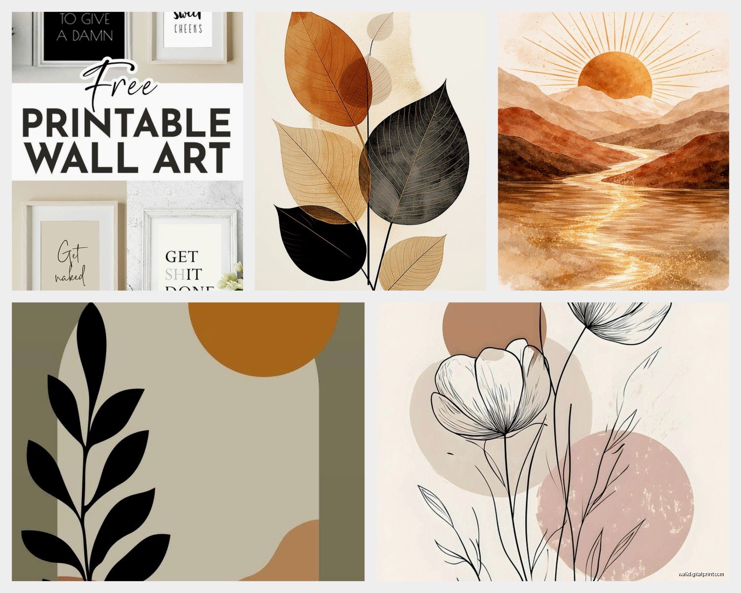
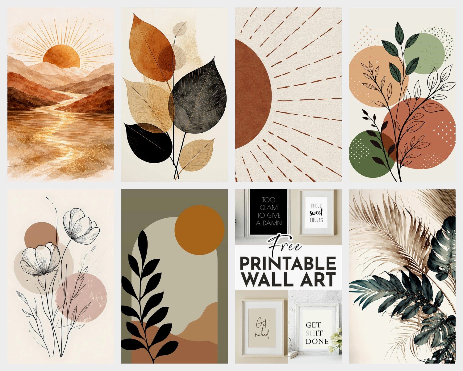
My Favorite Types of Boho Printables That Work
Abstract line art is probably the easiest to print and always looks good. Those minimalist face drawings, the continuous line designs, geometric shapes. They’re usually black and white or simple colors so there’s less room for color issues.
Botanical prints and pampas grass designs are super popular right now. I have like six different pampas prints in my office alone. They layer really well together if you use different frame sizes.
Sun and moon phases prints are very boho and they’re everywhere for free. Some are more witchy-boho and some are minimal-boho depending on the style.
Text-Based Prints
Quotes in boho fonts can be hit or miss. A lot of the free ones use fonts that are just… not great. But if you find ones with simple typography and neutral colors they work. I’m not huge on inspirational quotes personally but “Stay Wild” or “Let It Be” type stuff fits the vibe.
Oh and another thing, abstract watercolor prints sometimes don’t translate well from digital to print. The colors can get muddy or the subtlety gets lost. I’ve had better luck with bolder watercolor designs that have more contrast.
Framing on a Budget
Okay so you’ve got your prints, now what. IKEA frames are your friend. The RIBBA and KNOPPANG frames come in all the standard sizes and they’re like $5-15 each. They look way more expensive than they are.
Thrift stores sometimes have frames but you gotta be picky because a lot of them are dated looking. I found three matching gold frames at Goodwill last year for $2 each and just spray painted them matte black.
For a really boho look, clip frames or even just clipboards work. Like those wooden or brass clip hangers where the print just hangs loose. Very casual and you can switch out the art easily.
Creating a Gallery Wall
I always lay everything out on the floor first. Take a picture with your phone so you remember the arrangement. Start with the largest print in the center or slightly off-center and build around it.
Mix sizes but keep the spacing consistent, usually 2-3 inches between frames. Unless you’re going for that really eclectic look then spacing doesn’t matter as much.
Specific Sites I Actually Use
TheNavagePatch has free boho printables and they’re actually good quality. She does a lot of neutral-toned abstract stuff.
FreePrintableWallArt.com is literally what it says. Navigation is kinda clunky but they have a boho category. Download quality varies so check the file size before printing.
MountainModernLife offers freebies sometimes, very much that desert boho aesthetic. You have to sign up for emails but you can unsubscribe after.
Wait I forgot to mention Canva. If you have a free Canva account you can actually create your own boho prints using their templates and elements. Some elements require Pro but there’s enough free stuff to work with. I made a custom sage green and terracotta abstract print last month that way.
Instagram Accounts That Share Freebies
Some artists share free downloads through their Instagram stories or posts. Search hashtags like #freeprintableart #bohoprintable #freewallart and you’ll find accounts. The catch is you usually have to follow them and they might delete the download link after a few days.
Troubleshooting Common Problems
Colors look washed out when you print? Your printer might be low on ink or you need to adjust the color density settings. Also make sure you’re selecting the right paper type in your printer settings because it adjusts ink distribution based on that.
Print is cutting off at the edges? Check your printer’s margin settings. Most printers can’t print all the way to the edge so there’s always a small border. If the design has important elements at the edges it might get cut off.
File won’t download or is corrupted? Try a different browser. Sometimes Chrome does weird things with PDFs that Firefox doesn’t and vice versa.
The Blurry Print Issue
If your print comes out blurry even though the file looked fine on screen, it’s almost always a resolution problem. The file just doesn’t have enough pixels. You can’t fix this by adjusting printer settings unfortunately. You need a higher quality source file.
One workaround is printing it smaller than you planned. An image that’s too low-res for 11×14 might work fine at 5×7.
Making It Look Intentional Not Cheap
The thing about free printables is they can look DIY in a bad way if you’re not careful. Using nice frames helps obviously. But also being selective about what you print matters.
I stick to a cohesive color palette for each room. Like my bedroom has all warm neutrals, terracotta, rust, cream, sage. I don’t throw in a bright turquoise print just because it’s free and boho.
Matting makes everything look more professional. You can get pre-cut mats at craft stores or cut your own if you have a steady hand and a craft knife. White or cream mats work with basically everything boho.
Mixing Free with Purchased Art
Nobody needs to know what’s free and what’s not. I mix free printables with art I’ve bought and stuff I’ve made myself. It all looks cohesive if the style and colors work together.
Actually funny story, I had a client ask where I got this print in my portfolio photos and I was like “oh I downloaded it free from this blog” and she seemed almost disappointed? Like she thought it should be some exclusive thing. But that’s the whole point, you can get the look without spending hundreds on art.
Seasonal Switching
One benefit of printables is you can change them out seasonally without feeling guilty about the cost. I have a whole folder on my computer organized by season.
Fall boho is obviously pampas grass, rust colors, dried florals. Spring is more fresh botanicals, sage and cream. Summer I go for more abstract and minimal. Winter I add in some moody darker prints.
Just store the prints flat in a portfolio case or large envelope so they don’t get bent.
Legal Stuff Nobody Talks About
Technically if something is offered as a free printable for personal use, you shouldn’t sell the prints or use them commercially. Most people offering freebies specify this. It’s fine to print for your own home but not to print a bunch and sell at a craft fair.
If you’re a designer or stylist like me and you’re using them in client projects, that’s a gray area. I usually reach out to the artist if it’s gonna be in photos that I share publicly, just to be respectful.
Images from Unsplash and Pexels are different because they have commercial licenses, so those you can use more freely. Always check the specific license though because some photographers opt out of commercial use.
Anyway that’s basically everything I know about printing boho art for free. It’s honestly one of the easiest ways to update your space without spending a ton of money and once you get your printer settings figured out it’s pretty foolproof.