Wall Art Guide, Wall Art Tutoriels
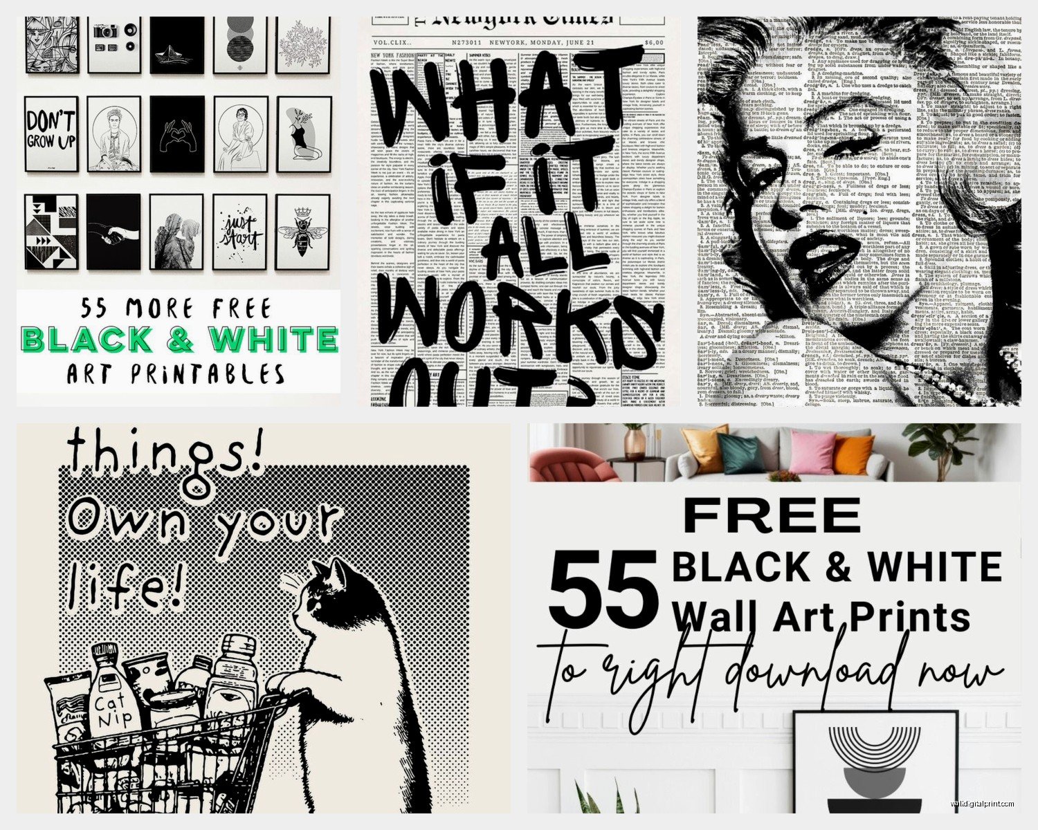
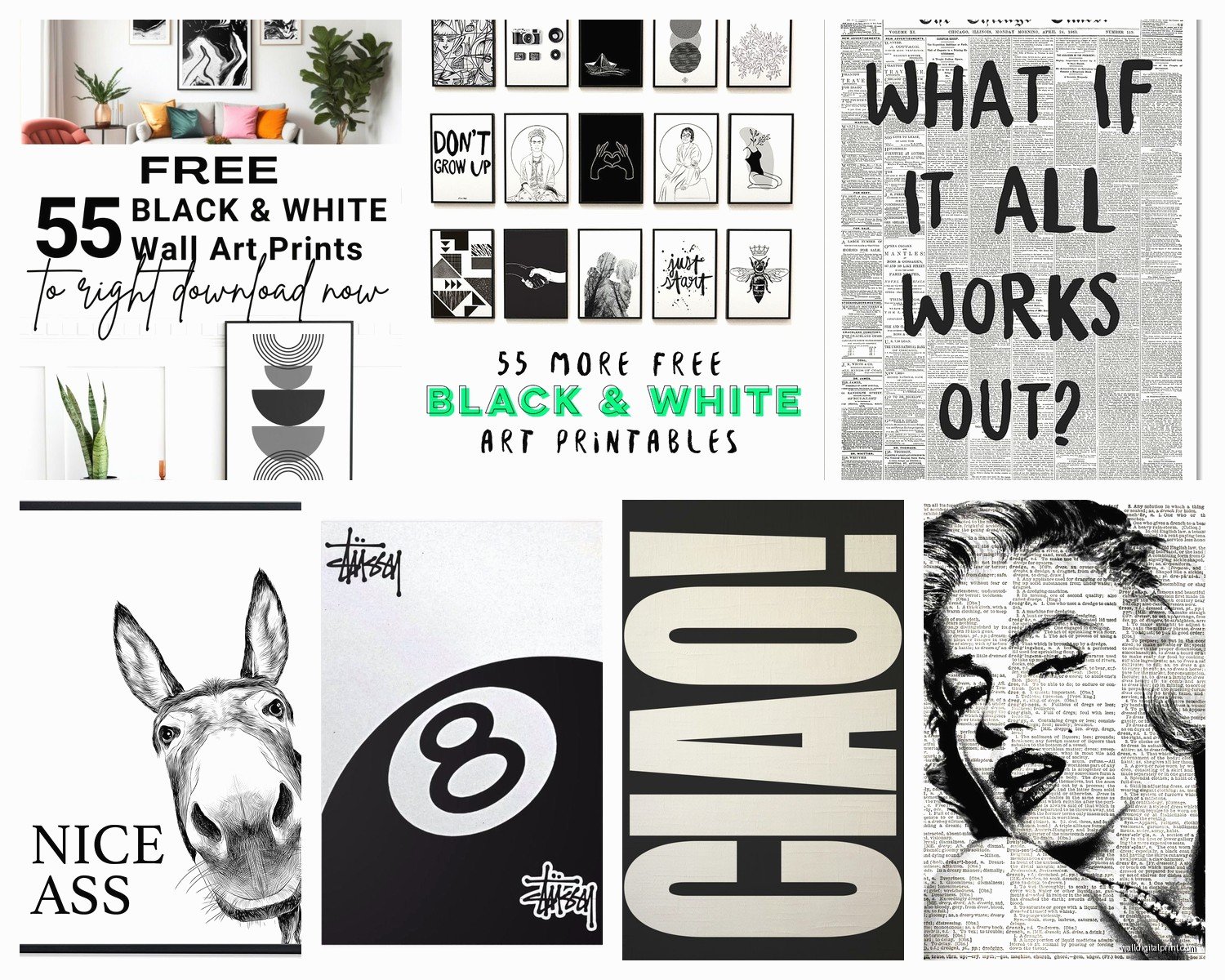
Black and White Wall Art Printable: Free Monochrome Downloads
Apr
So I’ve been downloading and printing black and white art for like three years now and honestly it’s become kind of an obsession. My living room wall basically gets rearranged every few months because I keep finding new pieces and can’t help myself.
Where to Actually Find Quality Free Printables
Okay so first things first – not all free downloads are created equal. I learned this the hard way when I printed something at Staples and it looked like a pixelated mess. You need at least 300 DPI for printing, preferably higher if you’re going bigger than 8×10.
Unsplash is my go-to for abstract black and white photography. The resolution is insane – like I’ve printed their images at 24×36 and they still look crisp. Just search “black and white abstract” or “monochrome minimal” and you’ll fall down a rabbit hole. I spent my entire Sunday doing this instead of meal prepping like I planned.
The Met Museum has this whole open access collection that nobody talks about enough. You can download high-res scans of actual artwork from their collection. I printed this Hokusai wave piece (yeah I know it’s originally colored but they have b&w versions) and my neighbor asked if I bought it at an art gallery. It’s completely free and legal to print for personal use.
Rawpixel has a public domain section that’s pretty solid. The search function is kinda clunky but once you figure out the filters it’s great. They have vintage botanical prints, line drawings, all that good stuff.
Library of Congress – okay this is gonna sound weird but their digital collections are incredible. Old maps, architectural drawings, vintage photographs. I found this 1920s city skyline photo that I printed for my home office and it’s like my favorite piece now.
File Formats That Won’t Screw You Over
Download PDFs or high-res JPEGs whenever possible. PNG works too but the files are huge. I once tried to print a low-res PNG I grabbed from Pinterest and… just don’t do that to yourself. It looked fine on my phone screen but printed it was a blurry disaster.
Check the file size before you download – if it’s under 1MB for something you want to print large, that’s a red flag. My general rule is I want at least 3-5MB for an 8×10, more for anything bigger.
The Pixel Situation
For an 8×10 print at 300 DPI you need 2400×3000 pixels minimum. For 11×14 you need 3300×4200 pixels. I keep a note in my phone with these numbers because I can never remember them when I’m actually browsing.
Printing Options Because Your Home Printer Probably Won’t Cut It
I mean unless you have like a fancy photo printer, but most of us are working with basic inkjet printers that are gonna eat through your black ink cartridge in approximately 2.5 prints.
Staples or FedEx Office – cheap and fast. Their regular paper prints are fine for testing layouts before you commit to nicer prints. I usually do 8x10s there for like $3 each when I’m experimenting with a gallery wall arrangement.
Costco Photo Center – if you have a membership this is hands down the best value. Their prints are actually really good quality and cheap. I’m talking like $7 for an 11×14. The only annoying part is you gotta order online and pick up, can’t just walk in with a USB drive.
Nations Photo Lab – okay so this is more expensive but their matte finish is *chef’s kiss*. When I want something to look really professional I go here. They have this premium matte paper that doesn’t have that glossy sheen which I hate for wall art.
Oh and another thing – always check if places have first-time customer discounts. I got 50% off my first order from several online print shops just by googling “[company name] coupon code.”
Paper Types Matter More Than You’d Think
Glossy is gonna show fingerprints and glare. Just skip it for wall art unless you’re specifically going for that photo print look.
Matte is your friend. It’s sophisticated, doesn’t reflect light weirdly, and makes even simple prints look expensive.
Cardstock if you’re not framing immediately – it’s sturdier and won’t curl as much. Regular photo paper can warp over time especially in humid climates (learned that one the hard way living in Florida for a year).
I’ve also experimented with printing on watercolor paper at a local print shop that does custom work and holy wow the texture adds so much dimension. It’s pricier but for a statement piece it’s worth it.
The Frame Situation
IKEA frames are fine. Like genuinely fine. I have probably 15 RIBBA frames on my walls and they look good. The black ones especially work with any black and white print.
Target’s Threshold line has affordable frames that look more expensive than they are. The brass ones are nice if you want to add warmth to a monochrome print.
For larger prints (16×20 and up) I actually buy frames on Amazon. Way cheaper than craft stores. Just read the reviews because some are flimsy.
Wait I forgot to mention – measure your wall space BEFORE you decide on print sizes. I got excited and printed a bunch of 11x14s only to realize they were too big for the wall I had in mind. Now they’re in my bedroom which is fine but still.
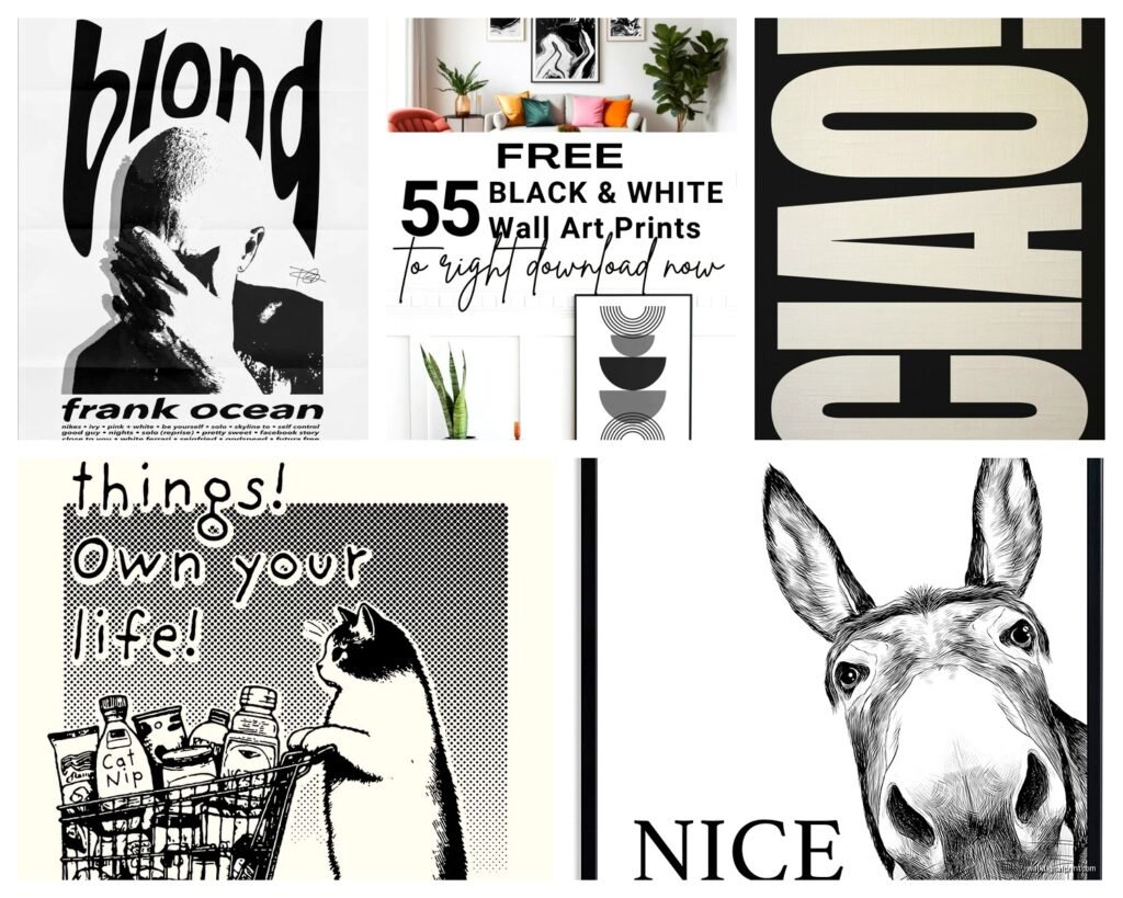
What Actually Looks Good (From Testing Way Too Many Styles)
Line art is having a moment and it’s easy to pull off. Female figure drawings, face line art, abstract continuous lines. They look modern and clean. I have three line art prints above my couch and people always ask where I got them.
Typography prints can go either way. Minimalist quotes in simple fonts? Yes. That “Live Laugh Love” energy? Please no. I printed this one that just says “REMAIN SEATED” in helvetica for my bathroom and it makes me laugh every time.
Botanical prints – the vintage scientific illustration kind, not the trendy leaf prints everyone has. Search for “botanical line drawing” or “vintage plant illustration” in those museum databases I mentioned.
Architectural drawings or blueprints look insanely cool and sophisticated. I found free ones from historic buildings and they’re such conversation starters.
Abstract geometric stuff works if you keep it simple. Too busy and it just looks chaotic on the wall.
My Actual Process Start to Finish
I browse during my morning coffee which is probably why I have like 200 saved images on my computer. My cat always tries to walk across my keyboard during this so that’s fun.
When I find something I like, I check the resolution first thing. Then I download it and open it on my computer – not my phone – to see how it actually looks at full size.
I usually sit with images for a few days before printing. What looks amazing at 11pm sometimes looks meh in the morning light.
Once I decide, I edit in Photoshop or even just Preview on Mac to adjust contrast if needed. Black and white prints can look washed out if the contrast isn’t strong enough. I bump up the blacks and brighten the whites usually.
Then I either upload to Costco’s site or take my USB drive to Staples depending on my timeline and budget.
The Gallery Wall Approach
I lay everything out on the floor first. Always. Trying to hang things and figure out spacing at the same time is a recipe for a million nail holes in your wall.
Take a photo of your floor arrangement so you remember the layout when you’re actually hanging.
Use paper templates taped to the wall before you commit. Trace your frames on kraft paper, cut them out, tape them up with painter’s tape. Move them around until it looks right.
The spacing between frames should be consistent – I do 2-3 inches between each frame. Any closer looks cramped, any further looks disconnected.
Troubleshooting Common Issues
Print looks too light: Increase contrast before printing. Most print shops let you adjust settings but doing it beforehand gives you more control.
Colors look off even though it’s black and white: Some printers add a slight color tint. Ask for true grayscale printing or adjust your RGB values to equal numbers (like R:50 G:50 B:50 for a medium gray).
Paper curling: Store prints flat under heavy books for 24 hours before framing. Or buy a print that’s already mounted on foam board which costs more but eliminates this issue.
Image is blurry when printed: Resolution was too low. There’s no fixing this except reprinting with a higher quality file. This is why I always check pixels before committing to a print size.
Styling Tips That Actually Make a Difference
Don’t hang things too high. The center of your artwork should be at eye level, which is usually around 57-60 inches from the floor. I used to hang everything way too high and it made rooms feel off.
Mix frame sizes in a gallery wall but keep the style consistent. All black frames or all natural wood – mixing metals and colors gets messy fast.
Odd numbers look better than even. Three prints or five prints instead of four. I don’t make the rules, it’s just a design thing that works.
Leave some wall space empty. You don’t need to fill every inch. Negative space makes the art you do have stand out more.
Oh and if you’re renting and can’t put holes everywhere, command strips work for lighter frames. I’ve used them for 8x10s with no issues. Anything heavier needs real nails though.
Seasonal Rotation Because Why Not
I swap out maybe 30% of my prints seasonally. Summer I go more minimal and airy. Winter I add darker, moodier pieces. It keeps things interesting and I don’t get bored.
Store prints you’re not using in a portfolio case or flat in a closet. Don’t roll them – it can damage the paper and they’re impossible to flatten again.
This is gonna sound extra but I keep a spreadsheet of what I’ve printed and where I got the files. Otherwise I forget where things came from and waste time searching again later.
Anyway that’s basically everything I’ve figured out through a lot of trial and error and probably too much money spent at print shops. The nice thing about black and white is it’s forgiving – even if you’re not sure about your design skills, monochrome is hard to mess up. Just start with one or two prints and see how you feel. You can always add more or change things up, which is kinda the whole point of doing printables instead of buying expensive art.