Wall Art Guide, Wall Art Tutoriels
Christmas Printable Wall Art: Free Festive Downloads
Apr
So I’ve been downloading Christmas printable wall art for like three years now and honestly it’s become this whole thing where I can’t stop myself. Last week I was supposed to be reorganizing my storage closet but instead spent two hours finding the perfect vintage Santa print and I have zero regrets.
Where to Actually Find the Good Free Stuff
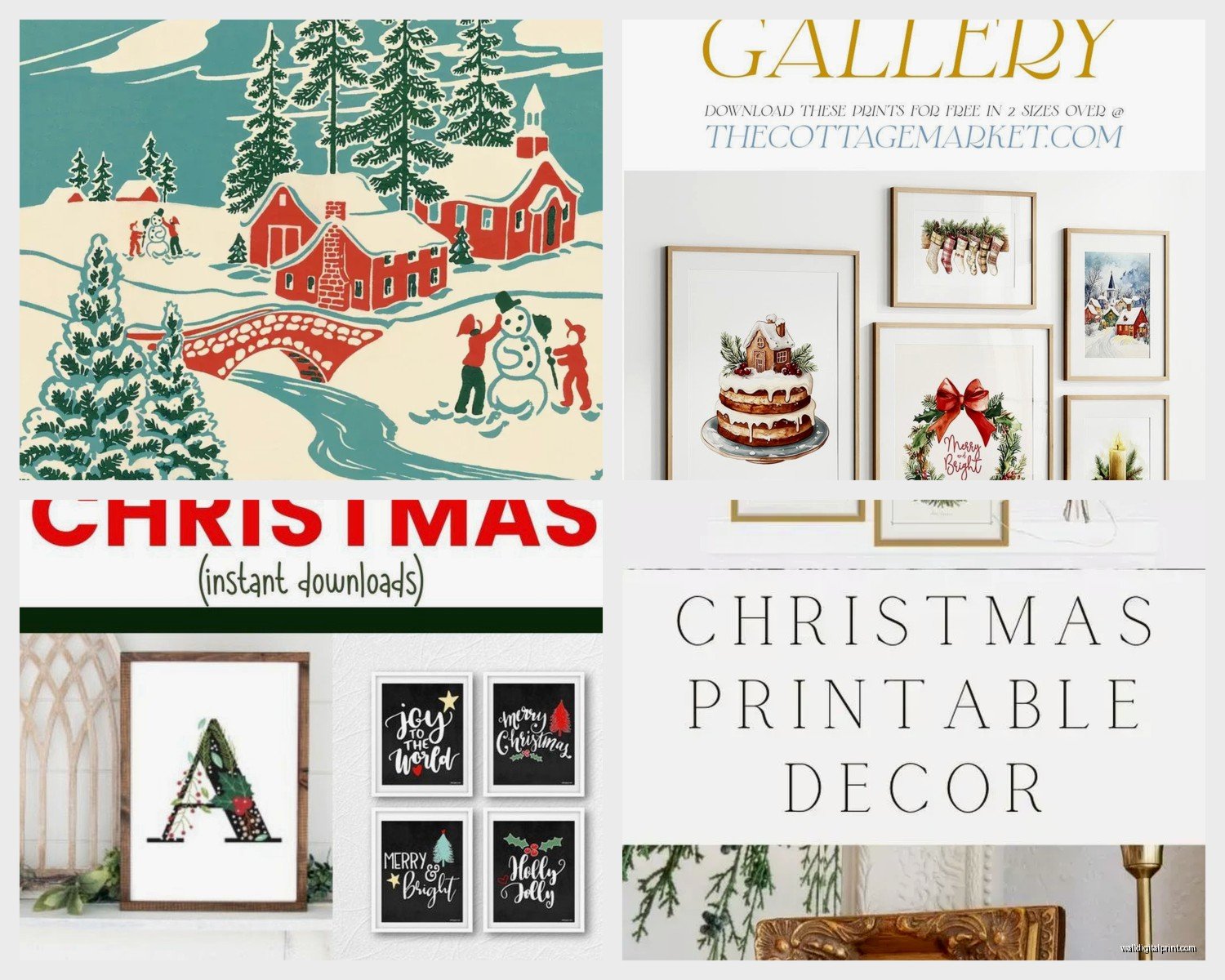
Okay so here’s the thing about free printables – you gotta know where to look because there’s SO much garbage out there. Like pixelated clipart that looks like it’s from 2003.
Etsy is my first stop but you need to search specifically “free Christmas printable” and filter by price (free). A ton of sellers offer freebies to get you on their email list. I do this all the time and yeah my inbox is a mess but whatever, I get beautiful art.
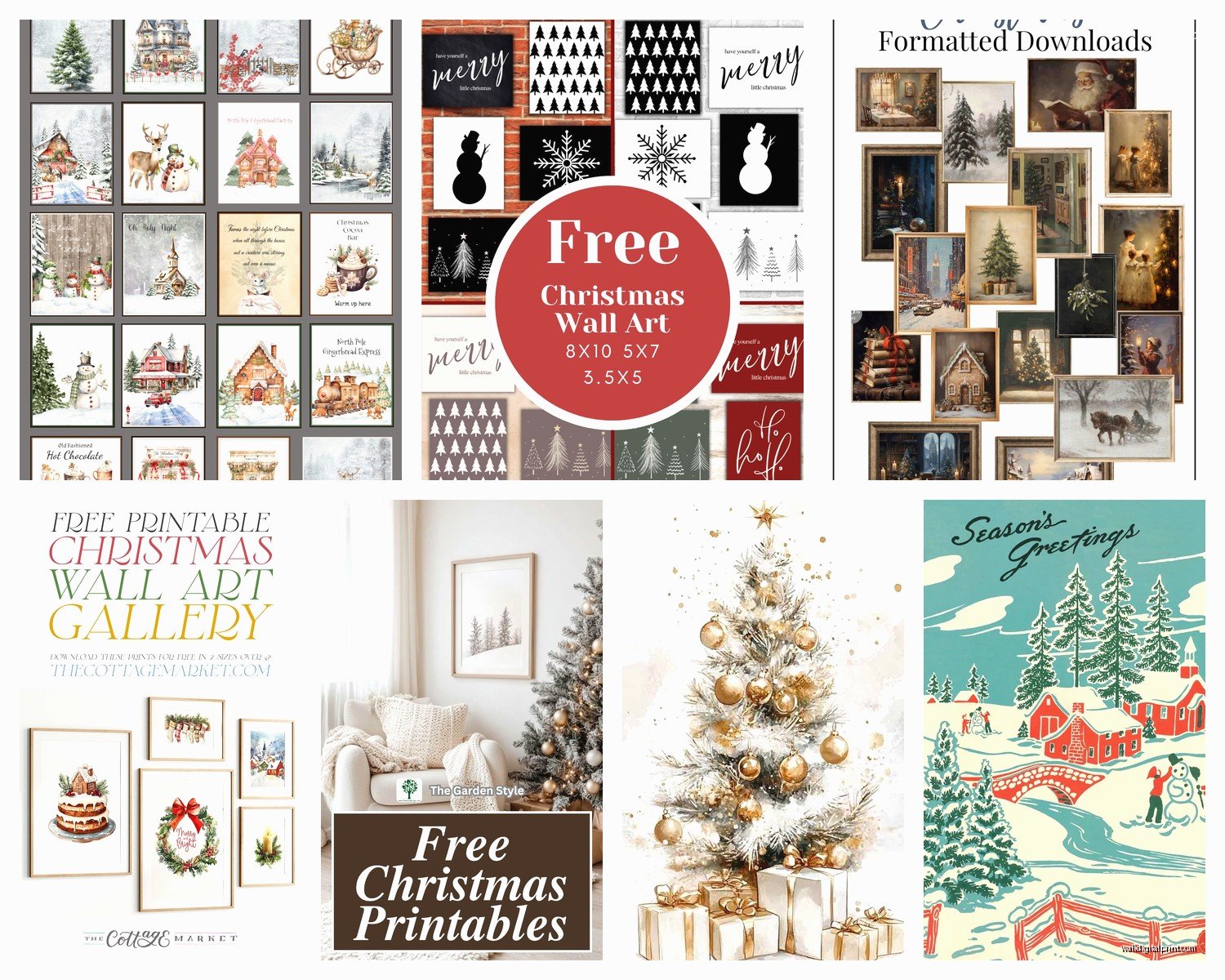
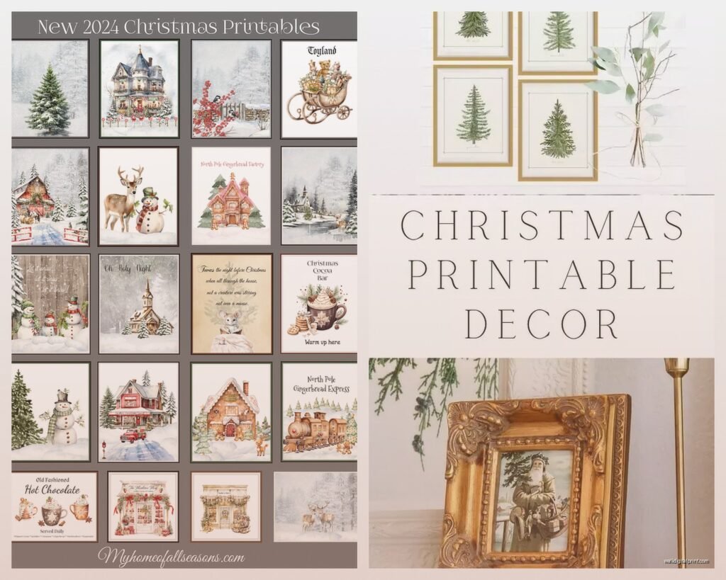
Creative Market does free goods every Monday. Set a reminder on your phone because the freebies change weekly and sometimes there are Christmas designs. I’ve snagged probably 15 prints this way over the years.
Pinterest obviously but here’s the trick – when you find a pin you like, actually click through to the original source. Half the pins lead to dead links or sketchy sites that want your credit card for “free” downloads. If the link seems weird, bounce.
Oh and another thing, check out Canva. They have templates you can customize and download for free. The free account limits your options but honestly there’s still plenty to work with. I made this “Merry and Bright” print last year by just changing the colors on a template and my sister-in-law asked where I bought it.
File Types and What Actually Matters
This is gonna sound boring but you need to know this stuff or you’ll end up with prints that look terrible.
PDF files are your best friend. They maintain quality when you resize them and any print shop can work with them. Most freebies come as PDFs.
JPG files are fine too but check the resolution. You want at least 300 DPI (dots per inch) for printing. Anything less will look blurry when printed, especially if you’re going bigger than 5×7. I learned this the hard way when I printed an 8×10 at like 150 DPI and it looked like someone smeared Vaseline on it.
PNG files are great if you want to layer things or if the design has a transparent background. Not as common for wall art but useful if you’re getting creative.
Wait I forgot to mention – always download the highest quality version available. Storage space is cheap, bad prints are not worth it.
What Size to Print
So this depends on your wall space but here’s what I’ve figured out through trial and error (mostly error).
For a gallery wall, mix sizes. I usually do a combo of 5×7, 8×10, and one 11×14 as the focal point. Odd numbers look better – three or five prints instead of four. Don’t ask me why, it’s just a design thing.
Above a console table or mantle, go bigger. 11×14 or 16×20. You want it to feel substantial, not like you just slapped up a greeting card.
Smaller spaces like bathrooms or that weird narrow wall by the stairs, 5×7 or 8×10 works perfectly.
My living room has this massive empty wall and I did three 16×20 prints in matching frames and it looks intentional instead of like I’m trying to cover a stain (which I was, my dog knocked over a plant last spring).
Standard Frame Sizes You Can Actually Find
- 5×7 – everywhere, super cheap at Target
- 8×10 – the most common, tons of frame options
- 11×14 – still easy to find, Ikea has good ones
- 16×20 – getting pricier but available at craft stores
- 18×24 – harder to find cheap frames, might need to order online
Don’t be like me and fall in love with a 12×18 print because frames in that size are annoying to find and cost twice as much for no reason.
Where to Print Them
Okay so you’ve downloaded your files, now what?
Staples or FedEx Office – I use these for quick prints. Upload online, pick up same day. Quality is decent, pricing is reasonable. An 8×10 is usually like $3-4. They run sales around the holidays too.
Costco Photo Center – if you have a membership, this is the cheapest option. The quality is actually really good and an 8×10 is under $2. You can order online and pick up in store. The only downside is the website is kind of clunky.
Shutterfly or Snapfish – always have coupon codes. Like always. Google “Shutterfly coupon code” before ordering. I’ve gotten 50% off so many times. Quality is great, shipping takes about a week.
Your home printer – this is tricky. If you have a decent photo printer and good quality cardstock or photo paper, go for it. But regular printer paper looks cheap and flimsy. I tried this once with regular paper and it was so obviously DIY in a bad way. The colors were also way off because my printer settings were wrong.
This is gonna sound weird but I’ve had the best luck printing at Costco. The paper quality is thick and the colors are vibrant. Plus I can grab a rotisserie chicken while I’m there so it’s efficient.
Paper Type Actually Makes a Difference
Matte paper – no glare, looks more sophisticated, hides imperfections better. This is what I use 90% of the time.
Glossy paper – makes colors pop more but shows fingerprints and can have glare depending on your lighting. Better for photos than art prints in my opinion.
Cardstock – if you’re printing at home, get heavyweight cardstock (at least 80lb). Regular copy paper will look cheap and might wrinkle in the frame.
Frame or No Frame
Frames obviously look more polished but they add up cost-wise. Here’s my budget breakdown:
If you’re doing a gallery wall of five prints, you’re looking at:
- Prints: $10-15 total
- Cheap frames from Target: $5-10 each = $25-50
- Nice frames from West Elm: $20-40 each = $100-200
I mix frame sources. Dollar Tree actually has decent 5×7 frames for literally $1.25. They’re basic black or white but fine for a gallery wall. Ikea’s Ribba frames are my go-to for 8x10s – they’re like $5 and come in black, white, or wood.
Oh and another thing, you can do clipboards or binder clips for a casual look. I have a whole Pinterest board of this aesthetic but haven’t actually tried it yet because I keep buying frames instead.
Design Styles That Don’t Look Cheap
Not all free printables are created equal. Some look obviously free if you know what I mean.
Vintage botanical Christmas – think old-school botanical drawings but with holly, pine branches, mistletoe. These look expensive and sophisticated. No one would guess they’re free downloads.
Minimalist line art – simple black line drawings of Christmas trees, ornaments, wreaths. Very modern farmhouse. Goes with everything.
Typography prints – classic Christmas quotes or song lyrics in nice fonts. “Let it Snow” or “Joy to the World” but make it chic. The key is good typography, not cutesy fonts that look like Comic Sans had a baby with Papyrus.
Watercolor designs – soft, artistic, pretty. These work well in bedrooms or dining rooms where you want something festive but not aggressively Christmas-y.
What to avoid: anything with too much clip art, overly busy designs with fifteen different fonts, anything that says “Merry Christmas Y’all” unless that’s specifically your vibe (no judgment).
My Actual Favorite Free Sources
Okay so I’m gonna share my secret stash because apparently I’m feeling generous tonight.
TheHaus of Party on Etsy has a free printables section that’s actually good. Modern, clean designs.
Chicfetti offers free party printables including Christmas stuff. Very on-trend, colorful without being chaotic.
The Craft Patch blog has a whole category of free Christmas printables. I’ve used their stuff for years. It’s more traditional but well-designed.
Yellow Bliss Road does free farmhouse-style printables. If you’re into that neutral, rustic look, check them out.
There’s also this designer on Creative Market whose name I’m totally blanking on right now but she does watercolor Christmas prints… okay I just checked, it’s Graphic Box. They rotate freebies but the paid stuff is cheap too, like $3-5 per print.
How to Make Them Look Intentional
The difference between “cute DIY project” and “why does this look like a Pinterest fail” is honestly just a few small things.
Stick to a color scheme. If you’re doing multiple prints, keep them in the same color family. All traditional red and green, or all neutral with black and white, or all pastel. Don’t mix neon pink Christmas with rustic plaid unless you really know what you’re doing.
Frame consistency matters. All black frames, all white frames, or all natural wood. Mixed frame colors can work but it’s harder to pull off. I tried mixing gold and black frames once and it looked like I grabbed whatever was on sale (which I did).
Mat or no mat – mats make everything look fancier. A $5 Ikea frame with a white mat suddenly looks like it cost $30. You can buy pre-cut mats at craft stores or cut your own if you’re feeling ambitious. I am never feeling that ambitious, my cat knocked over my coffee while I was watching The Great British Baking Show and that was the end of my crafting energy.
Spacing on gallery walls – keep 2-3 inches between frames. I use painter’s tape to map it out on the wall before committing to nail holes. Sounds tedious but it’s way better than seventeen holes in your wall because you kept adjusting.
Seasonal Storage
Wait I forgot to mention storage because you’re probably not gonna keep Christmas prints up year-round unless you’re that person (again, no judgment).
I store mine in a large flat art portfolio case from Amazon. It was like $15 and holds everything without bending. Before that I was shoving them in a closet and they got wrinkled.
You could also leave them in the frames and store the whole frame, but that takes up more space. I swap out the prints and reuse the frames for other seasonal stuff.
Quick Styling Tips
- Layer prints on a shelf or mantle instead of hanging them – super easy to change out
- Mix in some greenery around the prints – real or fake garland makes everything more festive
- Add string lights behind or around frames for ambiance
- Lean larger prints against the wall on a console table – no holes required
The leaning thing is my favorite because I’m lazy and also indecisive. I can move stuff around without spackle and paint touch-ups later.
Common Mistakes I’ve Made So You Don’t Have To
Printing at the wrong size and trying to trim it myself. Just pay the extra dollar to get the right size printed. My scissor skills are not that precise.
Downloading low-resolution files because I didn’t check before clicking. Now I always zoom in on the preview before downloading.
Printing everything at once and then realizing I hate the color scheme when they’re all together. Print one or two first to test.
Using regular Scotch tape to attach prints to the mat board inside the frame. It yellowed and looked terrible after a few months. Use photo corners or acid-free tape.
Not measuring my wall space and buying frames that were way too small for the area. Measure first, decide on sizes, then find prints. Or do what I actually do which is the opposite and then get frustrated.
Honestly the whole printable wall art thing is pretty forgiving though. If something doesn’t work, you’re out like $5 max. That’s less than a fancy coffee.
The best part is you can completely change your holiday decor style every year without spending a fortune. Last year I was all in on vintage botanical vibes. This year I’m thinking minimalist black and white. Next year who knows, maybe I’ll go full maximalist traditional red and green.
Just start with one or two prints in spaces that feel empty and see how you like it. You can always add more or swap them out. That’s literally the whole point of this being cheap and temporary.