Wall Art Guide, Wall Art Tutoriels
Vintage Free Printable Wall Art: Retro No-Cost Downloads
Apr
So I’ve been downloading vintage printables for like three years now and honestly it’s gotten kind of addictive? Like my laptop has this folder with probably 400+ images that I keep meaning to organize but here we are.
Where to Actually Find Good Vintage Printables
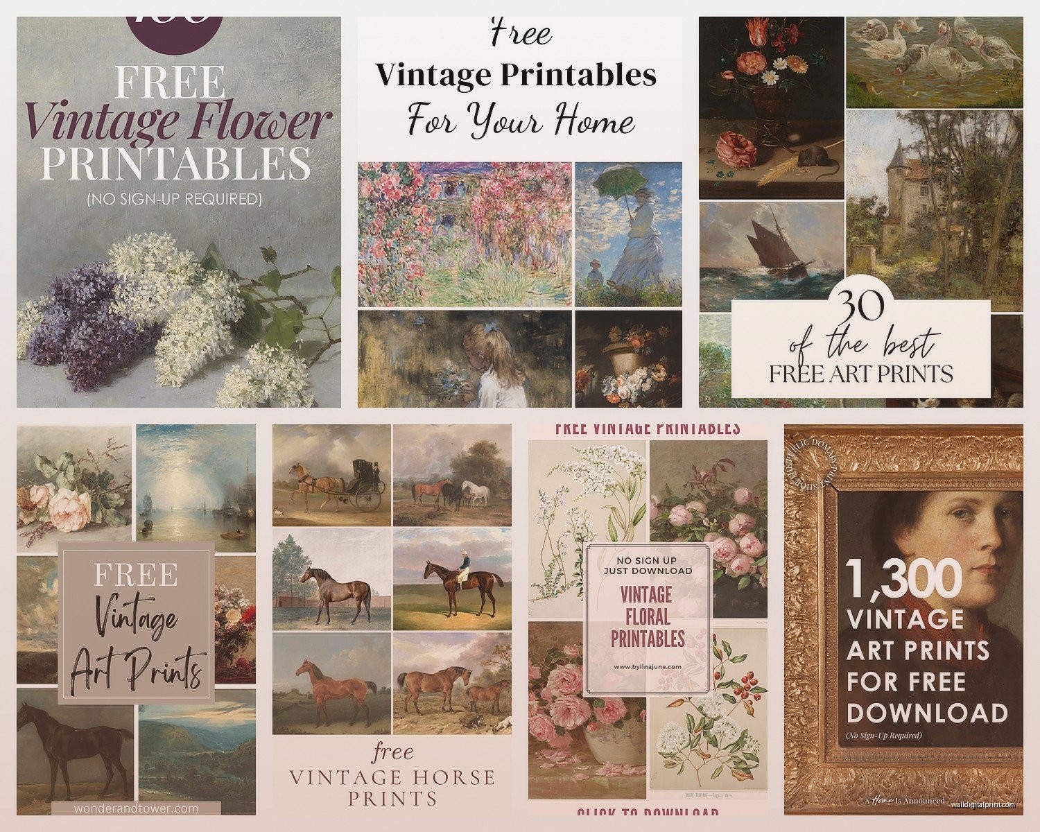
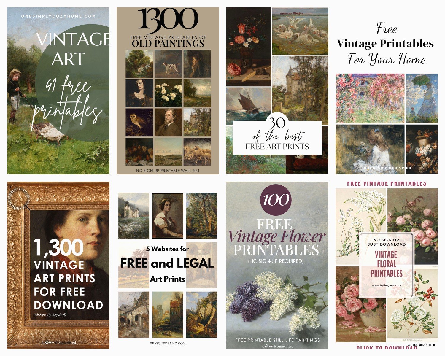
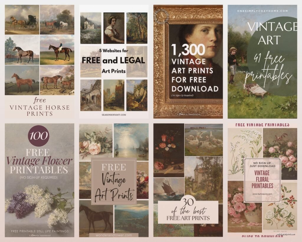
Okay so the Library of Congress website is absolutely insane for this. Their digital collections section has thousands of vintage posters, botanical prints, maps, all that stuff. The search function is kinda clunky though, you gotta be patient with it. I usually search terms like “botanical illustration” or “vintage poster” and then filter by images that are free to use. The resolution is usually amazing because they’re scanned from actual archives.
The New York Public Library Digital Collections is another one I hit up constantly. They have this whole section of vintage menus which sounds random but some of them are gorgeous art deco designs that look incredible framed. Also vintage fashion illustrations, old advertisements, theater posters. You can filter by “public domain” which makes it easy.
Rawpixel has both free and paid stuff but their free vintage collection is actually really solid. They’ve done a lot of work cleaning up old public domain images so they’re ready to print. Like they’ll take an old botanical print and remove the yellowing and spots so it looks crisp. Saves you the Photoshop work.
The Obscure Ones That Are Actually Gold
Biodiversity Heritage Library sounds boring but it’s full of incredible vintage nature illustrations from old scientific books. Think detailed bird drawings, butterflies, flowers. The kind of stuff that looks expensive in a frame but costs you nothing except ink.
Old Book Illustrations is this website that’s basically some person’s passion project where they’ve uploaded tons of engravings and illustrations from 19th century books. The interface looks like it hasn’t been updated since 2005 but who cares, the images are beautiful. Lots of fairy tale illustrations and classical mythology stuff.
Smithsonian Open Access just dumped like 2.8 million images into the public domain a few years ago. Their search can be overwhelming but if you search specific things like “Art Nouveau poster” or “vintage travel” you’ll find amazing stuff.
What Actually Prints Well vs What Looks Good on Screen
This is gonna sound obvious but I learned this the hard way… just because an image looks cool on your laptop doesn’t mean it’ll print well. You need at least 300 DPI for decent print quality. Most of the library sites will tell you the resolution – look for files that are at least 3000 pixels on the longest side if you want to print 11×14 or bigger.
I made the mistake early on of printing this gorgeous vintage Paris poster at 16×20 and it came out pixelated and blurry because the file was too small. Wasted like $8 at Staples plus I felt dumb.
Some vintage images have this yellowish aged paper look which can be charming but sometimes it just looks dingy when printed. If you want to clean that up, you can open it in a free program like GIMP or even Canva and adjust the brightness and saturation. I usually bump up the brightness slightly and increase contrast a bit.
File Formats That Matter
TIFF files are the best quality but they’re huge. If you see the option to download as TIFF, do it, especially for larger prints. JPG is fine for most stuff though. PNG works too. Just avoid anything that’s like 72 DPI or “web quality” because that’s only good for screens.
How to Actually Print These Without Spending a Fortune
Okay so if you’re printing one or two things, honestly just go to a local print shop. I use a place near me that charges like $3 for an 11×14 print on decent cardstock. Way better quality than my home printer and the color is more accurate.
For home printing though – and I do this a lot when I’m testing layouts – you gotta invest in decent paper. Regular printer paper looks cheap and flimsy. I buy cardstock in bulk from Amazon, the 110lb weight. It’s thick enough that it doesn’t curl and feels substantial when you hold it.
My cat knocked over my coffee onto a whole stack of prints once and I wanted to cry but anyway…
If you’re printing multiple pieces, Costco photo center is shockingly cheap. You can upload files online and pick them up same day usually. Their prices for larger prints are way better than craft stores. An 11×14 is like $2.99 there versus $8+ at Michael’s.
Color Accuracy Is Weird
Your screen and the printer see colors differently. This is annoying but just something to know. Prints usually come out slightly darker and less saturated than what you see on your monitor. I’ve started adjusting my images to be like 10% brighter before printing and it helps.
Also some vintage prints have really specific colors – like old advertising posters with those specific retro oranges and teals – and getting those exact shades is tricky. Test print on regular paper first if the color is really important to you.
Framing Without Going Broke
Thrift stores are your best friend here. I’ve found so many frames for $2-5 that just needed a quick clean. Sometimes the existing art is terrible but the frame is perfect. You can also spray paint frames if you want them all to match – I did this whole gallery wall where I painted mismatched thrift store frames all matte black and it looks way more expensive than it was.
IKEA frames are fine for the price. The Ribba and Hovsta lines are decent quality and cheap. The thing is their mattes are kinda flimsy, so if you want it to look more polished, get custom mattes cut at a frame shop. Usually costs like $10-15 but makes a huge difference.
Target’s Threshold frames are actually pretty nice for the price too. I’ve used their brass-finish frames for vintage botanical prints and they look good.
Standard Sizes Make Life Easier
Print in standard frame sizes: 8×10, 11×14, 16×20. Otherwise you’re stuck getting custom frames which gets expensive fast. Most vintage images can be cropped or resized to fit standard dimensions without looking weird.
If an image is an odd ratio, I’ll sometimes add a border in Canva to make it fit a standard size. Like if something is naturally 10×13, I’ll add white space to make it 11×14.
My Favorite Types of Vintage Prints That Always Work
Botanical prints are probably the easiest to work with because they go with everything. Those old scientific illustrations of plants and flowers just always look classy. Pierre-Joseph Redouté’s rose prints are all public domain and they’re stunning.
Vintage maps are really good too, especially if you do a place that means something to you. Old maps of cities, constellation maps, those decorative maps with little illustrations. The Library of Congress has tons.
Art Nouveau posters from like 1890-1910 have this amazing flowing style that feels retro but also kinda modern? Alphonse Mucha’s stuff is all public domain now and prints beautifully. Those can be statement pieces.
Old patent drawings are weirdly cool. There’s something about the technical line drawings with all the annotations that looks interesting on a wall. The US Patent Office has searchable archives. I printed a vintage camera patent once for my workspace.
Stuff That’s Trendy Right Now
Vintage mushroom and fungi illustrations are having a moment. Those old mycology textbook drawings with different species arranged on a page. They have this earthy cottagecore vibe people are into.
Old theater and opera posters, especially European ones from the early 1900s. Bold typography, interesting compositions.
Vintage fashion illustrations – like those elegant drawings of women in 1920s or 1950s clothing. These work really well in bedrooms or closets.
How to Edit These If You Need To
Sometimes you’ll find a perfect image but it has some damage or spots or whatever. Canva’s free version can handle basic stuff like cropping, brightness adjustments, removing slight discoloration. For more serious editing you’d need Photoshop but honestly most vintage prints don’t need that much work if you’re downloading from reputable sources.
If an image has text in a language you don’t want or a date or something, you can sometimes crop it out or use Canva’s background remover/editor to clone over it. I did this with a French advertisement where I wanted the illustration but not all the text about whatever product it was selling from 1890.
You can also flip images horizontally if that works better for your space. Like if you’re doing a gallery wall and need the composition to face a certain direction.
Making Sets That Look Cohesive
If you’re printing multiple pieces for one wall, think about what ties them together. Could be:
- Same color palette – like all prints with blues and greens
- Same subject matter – all botanical, all animals, all architectural
- Same era – all Art Deco posters from the 1920s
- Same style – all detailed engravings or all watercolor-style
I usually open like 10-15 images in separate tabs and see which ones feel good together before committing to printing. The frames and mattes help unify things too – if the prints themselves are varied, matching frames make them feel like a collection.
Sizing and Layout Planning
Before you print anything, tape up paper templates on your wall to figure out the layout. I use newspaper or kraft paper cut to size. This saves so much headache because you can see the spacing and arrangement before making holes in your wall.
For gallery walls, I usually aim for 2-3 inches between frames. Closer than that feels cramped, further apart and it doesn’t read as a cohesive grouping.
One large statement print (like 16×20 or bigger) with several smaller ones around it usually looks more interesting than all same-size prints. Creates visual hierarchy or whatever the design term is.
The Actual Hanging Part
Command strips work fine for lighter frames. I use the picture hanging strips rated for like 16 pounds and haven’t had issues. For heavier frames or if you’re renting and want it super secure, regular picture hangers with nails are better.
Measure 57 inches from the floor to the center of your frame – that’s supposedly average eye level and where art “should” hang. Though honestly I just eyeball it based on the furniture in the room. Like above a sofa, you want the bottom of the frame about 8-10 inches above the sofa back.
Weird Tips That Actually Help
If you’re printing at home, let the prints sit for like 10 minutes before handling them too much. The ink needs to dry fully or it can smudge.
Store digital files organized by subject or color so you can find them later. I finally did this last month after my client canceled and I had free time, and it’s made my life so much easier. Before that I was just scrolling through hundreds of random images trying to find that one botanical print I downloaded in 2022.
Some vintage images look better in black and white than color, even if they were originally colored. If a print has weird faded colors, try converting it to grayscale – sometimes that makes it look more intentional and classic.
You can print the same image in different sizes and create a layered look with frames. Like the same botanical print in 5×7, 8×10, and 11×14 arranged together.
oh and another thing – watermark removal. Some sites have faint watermarks on preview images. Obviously download the actual file without watermarks, but if you accidentally save a preview (I’ve done this), most watermarks can be removed in GIMP with the clone tool. Takes like five minutes if you watch a YouTube tutorial.
The whole vintage printable thing is honestly one of my favorite budget decorating hacks because it looks way more expensive than it is. Like you can completely change a room’s vibe for under $50 if you already have some frames. And there’s something cool about having actual historical pieces on your walls, even if they’re prints. That botanical illustration was in some textbook from 1847 and now it’s in your living room, you know?