Wall Art Guide, Wall Art Tutoriels
Printable Kitchen Wall Art: Free Download Cooking Space

Apr
So I’ve been obsessed with printable kitchen wall art lately because honestly who wants to spend $80 on something from West Elm when you can get the same look for basically free? Like I started doing this for my own kitchen after my cat knocked over this expensive framed print I had and shattered it everywhere, and I was like… why am I even buying this stuff.
First thing you gotta know is that not all free printables are actually good quality. I’ve downloaded SO many that looked amazing on the website and then I printed them and they were pixelated or the colors were completely off. The key is looking for files that are at least 300 DPI (dots per inch) and preferably in PDF or high-res JPG format. PNG works too but sometimes the file sizes get weird.
Where to Actually Find Good Free Kitchen Printables
Okay so there are a few sites I always check first. Unsplash and Pexels aren’t technically printable sites but they have massive collections of high-res food photography that you can download for free and just… print. I made this whole series of herb photos for above my stove and it cost me nothing except the paper and frames from IKEA.
The Creative Fabrica freebies section is actually pretty solid if you can navigate their site (it’s kinda clunky honestly). They have themed kitchen art every month and you just need to create a free account. I downloaded this vintage cookbook page collection last month that looks SO expensive framed but literally free.
Oh and another thing – Canva has a printable template section where people upload free designs. The quality varies wildly but if you search “kitchen wall art printable” you’ll find hundreds. Just make sure you’re filtering by free only because they sneak in paid templates constantly.
Pinterest is obviously where everyone starts but here’s the thing… half those pins lead to dead links or sites that want your email address seventeen times before letting you download anything. I usually reverse image search the ones I really like to find the original source.
File Formats and What Actually Matters
This is gonna sound boring but it matters SO much. When you’re downloading, you want:
- PDF files for anything with text or graphics – they scale better
- JPG or PNG for photography-based prints
- Minimum 8×10 inches at 300 DPI if you’re printing that size
- RGB color mode if you’re printing at home, CMYK if you’re using a print shop
I learned that last one the hard way when I sent a bunch of files to Staples and everything came back looking muddy and weird. The colors were totally different. Turns out most free printables are in RGB (screen colors) not CMYK (print colors) so you gotta either convert them or just print at home where RGB is fine.
Paper Makes a Huge Difference
Regular printer paper looks cheap. I’m just gonna say it. I tried it thinking no one would notice and literally everyone noticed. You need cardstock at minimum – I use 110lb cardstock from Amazon (the Neenah brand) and it’s like $15 for 250 sheets so it lasts forever.
But wait if you want it to look REALLY expensive, try matte photo paper or even better, textured watercolor paper. I ran some botanical kitchen prints on this cream-colored textured cardstock I found at Michael’s during a sale and people thought I bought them from Anthropologie. The texture makes such a difference.
My printer is just a basic Canon Pixma (I think the TS6420?) and it handles cardstock fine as long as I adjust the paper settings. Most home printers can do up to 80lb cardstock in the regular tray and up to 110lb if you feed it through the back.
Design Styles That Work Best in Kitchens
Okay so I’ve tried basically every style at this point because I get bored easily and change my kitchen art like every season. Here’s what actually works:
Vintage botanical prints of herbs and vegetables look good in literally any kitchen. They’re classic, they don’t clash with anything, and there are TONS of free ones available from museum collections. The New York Public Library digital collection has thousands of public domain botanical illustrations you can download for free in huge sizes.
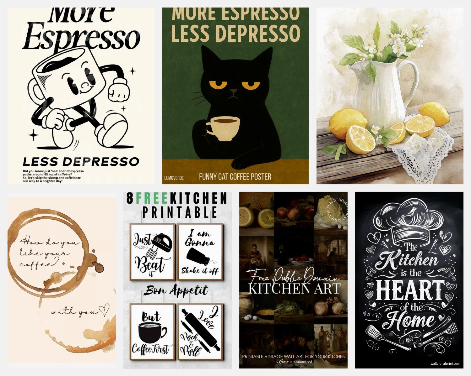
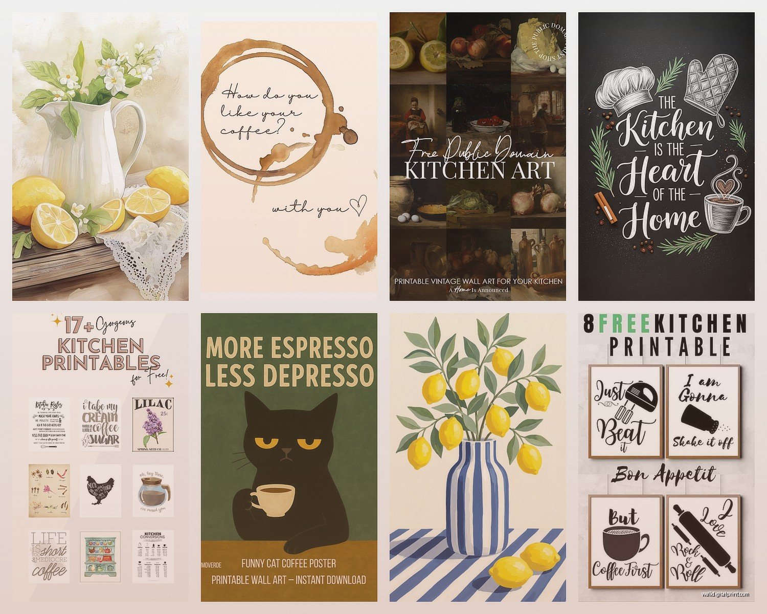
Typography prints are hit or miss. Like “But First Coffee” and stuff like that can look cute but also very 2015 Pinterest if you’re not careful. I prefer more subtle text prints – recipe cards, vintage menu pages, that kind of thing. There’s this site called Vintage Printable that has old advertising and labels that are really cool.
Abstract geometric stuff in kitchen-appropriate colors (sage green, terracotta, cream, black) works surprisingly well if your kitchen is modern. I made a whole gallery wall of abstract veggie-inspired shapes and it looks way more sophisticated than cutesy food puns.
Oh and food photography but make it artistic – like close-ups of citrus slices, overhead shots of ingredients, that moody dark food photography style. Way better than cartoon avocados or whatever.
Sizing and How Many You Actually Need
This is where I messed up initially. I printed a bunch of random sizes thinking I’d figure it out and then nothing looked cohesive. Here’s what I learned:
For a gallery wall above a table or counter, stick to 2-3 sizes max. I usually do a mix of 8×10 and 5×7, or sometimes all 8×10 if it’s a bigger space. Odd numbers look better visually – like a cluster of 3 or 5 prints instead of 4.
For a single statement piece above the stove or sink, go bigger. 11×14 or even 16×20 if you can find frames that size. The thing is most free printables are designed for 8×10 so if you size up you need to make sure the resolution can handle it. I use this formula: take the DPI (usually 300) and multiply by the inches. So for a 300 DPI file to print at 16×20, you need a file that’s at least 4800×6000 pixels.
My kitchen has this weird narrow wall next to the fridge and I did a vertical stack of three 5×7 prints in matching frames – all vintage herb illustrations – and it filled the space perfectly. Sometimes you gotta work with weird dimensions.
Frame Options That Don’t Cost a Fortune
IKEA Ribba frames are like the gold standard for a reason. They’re cheap (usually under $10), they come in standard sizes, and they have that clean modern look. I have probably 20 of them throughout my house at this point.
Dollar Tree actually has decent basic frames for literally one dollar. They’re not gonna last forever but for a rental or if you change your decor a lot (hi it’s me) they’re perfect. I spray painted a bunch of their black frames in brass and they look way more expensive.
Thrift stores are hit or miss but sometimes you find really good vintage frames. I found this set of matching wood frames at Goodwill for $3 each and they’re solid wood, probably from the 80s or something. Painted them white and they’re perfect.
Oh wait I forgot to mention – if you’re doing a gallery wall, you don’t need to frame everything. Some prints look really good just clipped to a board or pinned up, especially in a more casual kitchen. I have this cork board situation above my coffee station where I rotate seasonal prints without dealing with frames.
Printing Options If You Don’t Have a Printer
Not everyone has a printer that can handle nice paper and I get it. Here’s what works:
Staples or Office Depot will print from a USB drive and their cardstock options are decent. It costs like $1-2 per print depending on size which is still way cheaper than buying art. Just make sure you’re checking the color settings before they print because they will NOT fix it if it comes out wrong (learned this the hard way).
Walgreens and CVS photo printing is surprisingly good for photography-based prints. You can upload files online and pick them up same day. I’ve done herb photos and citrus slices there and the quality was actually really nice. Plus they always have coupon codes.
If you need bigger sizes or want really high quality, Nations Photo Lab or Mpix do online printing and ship to you. More expensive but the quality is noticeably better. I used them for a 16×20 kitchen print and it looked professional.
Your local library might have free printing but it’s usually limited to regular paper. Still worth checking if you just need something temporary or you’re gonna frame it under glass anyway where the paper quality matters less.
Actually Hanging the Stuff Without Destroying Your Walls
Command strips are your friend but you gotta use the right weight rating. I’ve had frames fall off the wall at 2am and scare the crap out of me because I used the wrong ones. For an 8×10 frame, use the medium strips (holds up to 3 lbs). For anything bigger, use the large (holds up to 5 lbs) or even double up.
For gallery walls I always tape out the arrangement on the floor first and take a photo, then use that as a guide. Sounds extra but it saves you from putting 47 holes in your wall trying to get the spacing right. I keep the spacing between frames at about 2-3 inches usually.
Level app on your phone works fine but honestly I just eyeball it at this point which probably shows. If you want it actually perfect get a small level from the hardware store.
Protecting Your Prints From Kitchen Stuff
Kitchens are humid and greasy and generally not great for paper. If you’re hanging stuff near the stove, definitely frame it under glass or acrylic. I have some prints on the opposite wall from my stove that aren’t under glass and they’re fine, but anything close to where you cook needs protection.
You can also laminate smaller prints – like recipe cards or herb labels – which makes them wipeable. I did this for a set of measurement conversion charts I keep inside a cabinet door and it’s super practical.
Avoid direct sunlight if possible because even printed on good paper, stuff will fade eventually. My kitchen window faces east so I keep the art on the other walls mostly.
My Current Favorite Free Sources
Rawpixel has a huge public domain collection – old botanical drawings, vintage food illustrations, all high-res and free. You can search by color which is SO helpful.
The Rijksmuseum (it’s Dutch) has their entire collection online for free download including tons of still life paintings with food and flowers. Very classical and sophisticated looking.
Library of Congress has vintage food advertising and cookbook pages that are really cool if you’re into that retro kitchen aesthetic. Takes some digging but worth it.
The Met Museum open access collection – similar to Rijksmuseum, lots of classical artwork you can download and print. I made a series of fruit still life prints from there.
GraphicsFairy is specifically vintage graphics and printables. Very cottage-core, farmhouse style if that’s your thing. All free.
Color Coordinating With Your Kitchen
This matters more than I thought it would. I initially just printed stuff I liked and then realized nothing went together or with my actual kitchen colors. Now I think about it first.
If you have a neutral kitchen (white, gray, wood tones), basically anything works. You can go bold with colors or keep it neutral. I’d pick one or two accent colors and stick with those throughout your prints.
For colorful kitchens or kitchens with a strong color scheme, pull colors from your existing palette. My kitchen has sage green cabinets so I look for prints with green, cream, terracotta, and soft pink tones. Everything feels more cohesive.
Black and white prints are the safe choice and honestly they always look good. If you’re unsure or your kitchen colors might change, stick with black and white or sepia tones.
The thing about printables is you can literally just print new stuff whenever you want. I change mine seasonally sometimes – more citrus and bright colors in summer, cozy herbs and darker tones in fall. It’s like $5 worth of paper to completely refresh your kitchen vibe.
Anyway I think that covers most of what I’ve figured out over the past year of doing this. It’s honestly kinda addictive once you start because there are so many options and it costs basically nothing to experiment.