Wall Art Guide, Wall Art Tutoriels
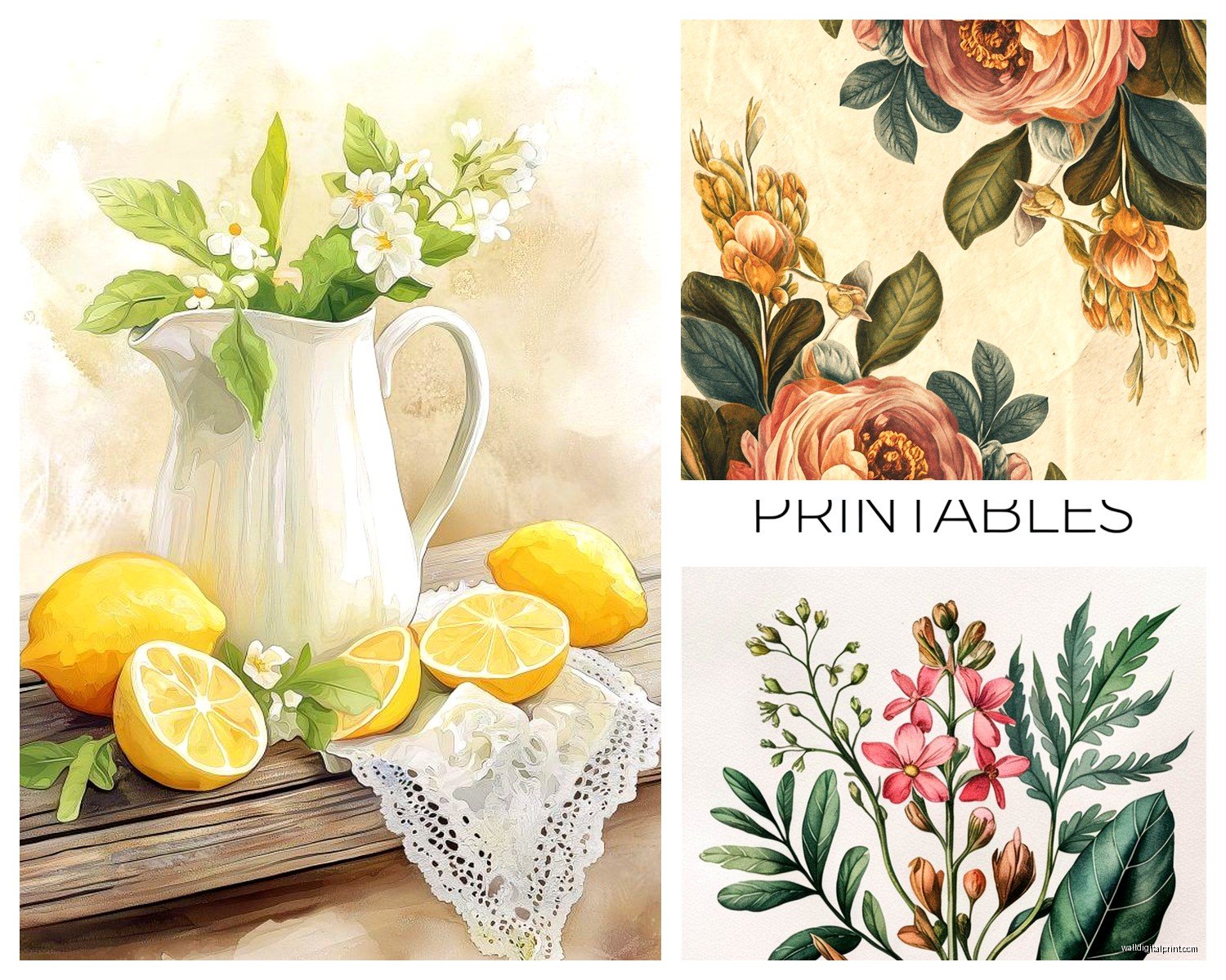
Printable Floral Wall Art: Free Download Flower Designs
Apr
So I’ve been downloading and printing floral wall art for like three years now and honestly it’s become this whole thing where clients ask me about it constantly. Let me just dump everything I know because I literally just finished printing a set this morning while my cat kept walking across the paper tray.
The Paper Situation Nobody Tells You About
Okay first thing – the paper matters SO much more than you’d think. I wasted probably $50 on prints that looked amazing on screen and then came out looking like a sad office memo. You’re gonna want cardstock, but not just any cardstock. The 110lb stuff is perfect – thick enough to feel substantial but not so thick your printer has a meltdown. I use Neenah Classic Crest in Natural White most of the time, but honestly the Staples brand heavyweight cardstock works fine too and it’s like half the price.
For matte vs glossy – this is where I have opinions. Matte always looks more expensive and gallery-like. Glossy can look cheap really fast unless you’re doing something super modern. I learned this the hard way when I printed these gorgeous peony designs on glossy photo paper and they looked like they came from a hotel lobby circa 2003.
Where to Actually Find Good Free Downloads
So everyone’s like “just Google it” but that’s how you end up with pixelated garbage. Here’s what I do: Unsplash has this whole collection of high-res floral photography that you can legally download and print. The resolution is usually 4000px or higher which means you can print pretty large without it getting fuzzy.
Rawpixel is another one – they have tons of vintage botanical illustrations that are public domain. The William Curtis botanical prints? *Chef’s kiss*. They’re from like the 1700s so copyright isn’t an issue and they have that expensive cottage core vibe everyone wants right now.
Oh and Smithsonian Open Access just dropped their entire collection online. I spent an embarrassing amount of time last Tuesday just browsing their botanical illustrations when I was supposed to be working on a mood board. They have these incredible detailed flower studies that look insane when you print them large.
Metropolitan Museum of Art’s collection is also fully downloadable now. Their Japanese woodblock prints of cherry blossoms and chrysanthemums are stunning. Just make sure you’re downloading the highest resolution available – there’s usually a dropdown menu.
File Types and Why Your Prints Look Blurry
This is gonna sound technical but stick with me. You need at least 300 DPI (dots per inch) for printing. Anything less and you’ll see pixels when you look at it up close. When you’re downloading, look for files that are at least 3000×4000 pixels if you want to print an 8×10 or larger.
JPEGs are fine for most stuff but if you can find PNG files, even better – they handle color better. TIFF files are like the premium option but they’re huge and honestly overkill unless you’re printing poster-size.
I made a spreadsheet once (my boyfriend thinks I’m insane) matching pixel dimensions to print sizes:
– 8×10 needs minimum 2400x3000px
– 11×14 needs minimum 3300x4200px
– 16×20 needs minimum 4800x6000px
Wait I forgot to mention – always check the image orientation before you download. Nothing worse than falling in love with a design and then realizing it’s square and you needed portrait orientation.
Printer Settings That Actually Matter
Your printer settings are where most people screw this up. I print on “Best” quality, never “Draft” or even “Normal.” Yeah it uses more ink but the difference is night and day. Set it to cardstock or heavy paper in the media type – this tells your printer to use more ink and adjust the feed.
Color management is its own whole thing but basically: print in RGB if you’re using a home inkjet printer. CMYK is for professional printing. And turn off any “auto color correction” your printer tries to do – it always makes things too saturated and warm.
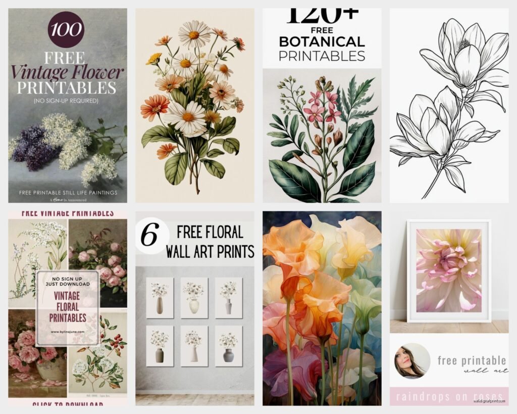
Free Download Sources I Use Weekly
Okay so beyond the museum collections, there are some design sites that offer freebies. The Graphics Fairy has vintage botanical prints that are free for personal use. Her stuff tends to be more Victorian illustration style which works great for farmhouse or traditional spaces.
Freepik has free downloads but you gotta be careful – some require attribution and some are only for premium members. Read the licensing. I usually filter by “free license” to avoid confusion.
Public Domain Review has curated collections and they’re all definitely free to use. Their botanical section is smaller but everything is gorgeous and unusual.
Oh and this is gonna sound weird but Etsy shops sometimes offer free samples. I’ve downloaded several free floral prints from shops that sell bundles – they give you one or two free to show the quality. Just search “free printable floral wall art” on Etsy and filter by price: free.
Editing Before You Print
Sometimes you find the perfect image but it needs tweaking. I use Canva for this because I’m not about to learn Photoshop for wall art. You can upload your downloaded image, adjust the brightness and contrast, crop it to your frame size, even add a subtle texture overlay if you want.
For vintage prints that look yellowed or faded, I boost the contrast and sometimes desaturate the background slightly. Makes them look cleaner without losing that antique vibe.
If you’re printing multiple florals as a gallery wall, try to match the color temperature across all of them. Nothing looks more amateur than three prints where one is super warm-toned and another is cool. Canva’s filters can help make them cohesive.
The Actual Printing Process
My printer is just an HP OfficeJet Pro – nothing fancy. I used to think I needed some expensive photo printer but honestly a decent inkjet with separate color cartridges works great. The separate cartridges thing is key though because you go through cyan SO fast with floral prints.
Before you print your final version, do a test print on regular paper. I learned this after wasting three sheets of expensive cardstock on prints that came out too dark. Your screen always looks brighter than the print will be, so adjust accordingly.
Feed the cardstock one sheet at a time. Don’t load a whole stack because they can stick together and jam. Been there, spent 20 minutes with tweezers pulling paper bits out of my printer.
Let the prints dry for like 10 minutes before you touch them. The ink needs to set, especially if you’re using cardstock. I stack mine with plain paper between each print so they don’t stick.
Framing on a Budget
IKEA frames are actually perfect for this. The RIBBA and KNOPPÄNG frames come in standard sizes and they’re cheap enough that you can do a whole gallery wall without crying about the cost. I usually spray paint the frames if I want a specific color – the white and black options are fine but sometimes you need brass or sage green or whatever.
Thrift stores and yard sales are goldmines for frames. I found six matching vintage frames for $2 each last month and just replaced the gross prints that were in them. Sometimes the glass is dirty or the backing is falling apart but that’s easy to fix.
For a more elevated look without actual framing, you can mount your prints on foam board and clip them to those gold bulldog clips. Very editorial, very “I’m an art curator.” I do this in my own apartment because my landlord won’t let me put holes in certain walls.
Common Mistakes I See All the Time
Printing too small is the biggest one. People get nervous about going large but a tiny 5×7 floral print just looks lost on a big wall. Go bigger than you think – 11×14 minimum for most spaces.
Using the wrong color palette for the room. I downloaded these beautiful bright pink peonies once and printed them for a client’s bedroom before remembering her whole color scheme was blue and gray. Had to reprint in a different colorway. Now I literally hold my phone up to the wall and check before printing.
Not considering the style of the florals with the room style. Super detailed botanical illustrations look weird in a minimalist modern space. Abstract watercolor florals look out of place in a traditional room. Match the vibe.
Oh and spacing – when people do gallery walls with printable art, they either space them too far apart or too close together. I use painter’s tape to map it out on the wall first. 2-3 inches between frames is usually right.
Seasonal Rotation Strategy
This is where printable art really shines. I have a whole folder on my computer organized by season. Spring gets cherry blossoms and tulips, summer is peonies and wildflowers, fall is dahlias and dried flowers, winter is amaryllis and evergreen sprigs.
I print sets of 3-4 and swap them out every few months. Costs maybe $5 in paper and ink per season vs buying new art constantly. My bathroom has been through like six different floral themes this year alone.
For holiday-specific stuff, I’ll print florals in themed colors – red and white flowers for Christmas, pastels for Easter, orange and burgundy blooms for Thanksgiving. It’s subtle but makes spaces feel seasonal without being cheesy.
Making Them Look Expensive
The secret is really in the matting. A simple white mat between the print and frame makes everything look more professional. You can cut your own mats with a craft knife and ruler if you’re patient, or buy pre-cut mats from craft stores. The mat creates visual breathing room and makes even a basic print look gallery-worthy.
Grouping in odd numbers always looks better – three prints, five prints, seven if you have the wall space. Even numbers feel too symmetrical and formal unless you’re going for that specific look.
Layering works too – I prop larger prints on picture ledges with smaller ones in front, slightly overlapping. Very “I collected these over time” even though you printed them all yesterday.
Color Correcting for Your Space
Lighting changes how prints look dramatically. What looks perfect in bright daylight might look muddy in warm lamplight. I actually take photos of printed samples in the actual room where they’ll hang, at different times of day. Sounds extra but it prevents disappointment.
If your space has warm lighting, go slightly cooler with your print selections to balance it out. Cool lighting needs warmer prints. This is design theory stuff but it really works.
Organizing Your Digital Collection
I have folders within folders now – “Florals – Pink/Blush,” “Florals – Neutral/Cream,” “Florals – Vintage Botanical,” etc. Makes it so much easier when a client or friend asks for recommendations and I can just scroll through organized options.
I also keep a notes file with which images I’ve printed before, what size, what paper, how they turned out. Sounds obsessive but I’ve reprinted favorites multiple times for different projects and it helps to remember what worked.
Backup your files. I learned this when my laptop died and I lost like 200 saved images I’d spent months collecting. Everything goes in cloud storage now.
Legal Stuff Real Quick
Public domain means you’re totally clear to print and use however you want. Creative Commons varies – some allow personal use only, some allow commercial use. If you’re printing for your own home, you’re basically always fine. If you’re selling prints or using them in a business, check the specific license.
Museum collections that are marked as public domain or CC0 are safe. Just don’t download from random Pinterest pins without checking the source – Pinterest is terrible for copyright confusion.
Honestly I just stick to verified public domain sources and I’ve never had an issue. Smithsonian, Met Museum, Library of Congress, Biodiversity Heritage Library – all good.
The whole printable floral art thing has saved me probably thousands of dollars over the years and I can change my walls whenever I want without commitment. Print quality keeps getting better with regular home printers too, so it’s easier than ever to get professional-looking results. Just gotta use the right paper and settings and actually download high-res files instead of screenshot from Instagram or whatever people try to do.