Wall Art Guide, Wall Art Tutoriels
Cinema Room Wall Art: Home Theater Movie Poster Decor
Apr
So I’ve been setting up cinema rooms for like three years now and honestly the wall art situation is where most people completely overthink things or go way too minimal. Let me just dump everything I know about movie posters and cinema wall decor because I literally just finished a home theater project last week.
The Actual Materials You Should Care About
Okay so first thing – not all poster prints are created equal and this matters more in a dark room than anywhere else in your house. Regular paper posters? They look cheap the second you turn the lights down and then back up. The texture shows, they curl at the edges even in frames, and if you’re running any kind of mood lighting they just… fall flat.
What actually works: museum-grade giclée prints on heavyweight paper or canvas. I know that sounds fancy but you can get them on Etsy for like $40-60. The difference is the ink saturation shows up even in low light. My go-to is 230gsm matte photo paper or higher. Anything under 200gsm and you’re gonna see the frame backing through the print if you backlight it at all.
Canvas is interesting because it adds this texture that can look really premium BUT and this is important – it only works for certain poster styles. Vintage movie posters from the 40s-60s? Amazing on canvas. Modern minimalist prints? They look better on smooth paper. I learned this the hard way with a Blade Runner print that just looked muddy on canvas.
Frame Materials That Don’t Suck
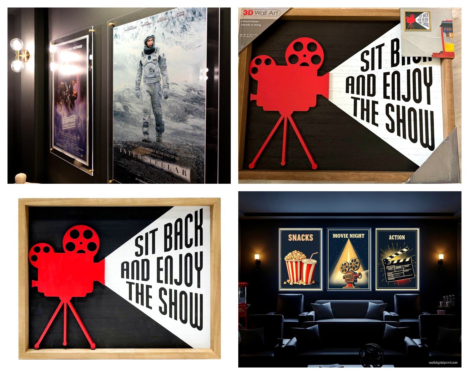
Metal frames – specifically black aluminum or brushed steel – are your baseline. They disappear in low light which is exactly what you want. The room should feel like the posters are floating on the wall, not sitting in obvious frames.
Wood frames can work but here’s the thing nobody tells you: they need to be dark walnut or black-stained. Natural wood or light oak reads as “I’m trying to make my theater feel homey” and it breaks the immersion. Unless you’re specifically going for like a vintage screening room vibe, then yeah, dark wood with those corner details works.
I’ve been using these snap frames from a commercial supplier – they’re meant for retail displays but they’re perfect for home theaters because you can swap posters super easily. No taking the whole frame apart. My client last month wanted to rotate his display seasonally and these were a game changer.
What About Backlighting
Oh and another thing – backlit poster frames are having a moment and they’re actually not as gimmicky as they sound. The LED ones that mount flush to the wall? Those create this effect where the poster glows like a real movie theater display case.
I tested like six different versions because my brother wanted them for his basement setup. The ones worth getting have edge lighting, not back panels. Edge lighting gives you that even glow without hotspots. You want around 3000K color temperature – warm white. Anything cooler looks like a sad office break room.
They run about $150-300 for a good 27×40 frame which is standard movie poster size. Is it necessary? No. Does it make your room feel legit professional? Absolutely.
Wait I forgot to mention – if you go the backlit route, you NEED translucent prints. Regular paper blocks too much light. There are specific backlit film materials that work better. I order mine from a print shop that does trade show graphics because they have the right materials in stock.
Size and Layout Actually Matter
Okay so funny story – I did a room where the client wanted eight movie posters in a grid and it looked like a college dorm. We ended up doing three large-scale prints instead and the whole vibe changed.
The rule I follow: in a dedicated cinema room, go bigger than you think. A standard 27×40 poster looks small on a big wall. I usually do 40×60 or even 48×72 for statement pieces. If you’re doing multiple posters, vary the sizes. Two large flanking the screen, maybe three smaller ones on the back wall.
Spacing is where people mess up constantly. Posters need like 6-8 inches between them minimum. Any closer and they read as clutter. Any further and they feel disconnected. I literally carry a tape measure to every install because eyeballing this never works.
The Gallery Wall Approach
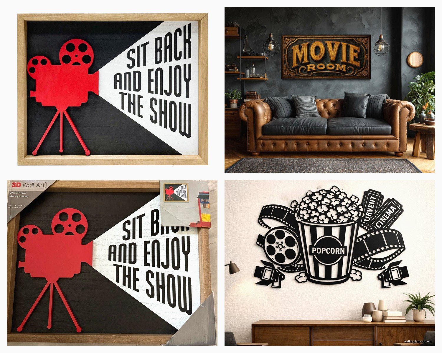
This is gonna sound weird but gallery walls can work in cinema rooms if you commit to chaos. Not organized chaos – actual randomness. Mix sizes, overlap frames slightly, include some 3D elements like film reels or those old ticket dispensers.
I saw this in a client’s mood board and thought it would be a disaster but we did a whole wall floor-to-ceiling with probably 30 pieces and it became the conversation starter. The key was keeping everything in black and white or monochrome so even though there was a lot happening visually, it didn’t compete with the screen.
You gotta use picture hanging strips for this though, not nails. You’ll be adjusting positions constantly until it looks right.
Poster Styles That Work vs Don’t
Original vintage posters – the real ones – are stupid expensive. Like thousands for anything decent. Reproductions are fine and nobody can tell from viewing distance anyway. I get most of mine from places like Poster Foundry or Mondo when they do reprints.
Modern minimalist posters are everywhere now. Those simple geometric designs with limited color palettes? They photograph well for Instagram but in actual dark viewing rooms they can disappear. If you love that style, make sure they have strong contrast.
What really works: posters with bold colors, high contrast, recognizable imagery. Classic horror posters are perfect – Jaws, Alien, The Thing. They have these strong silhouettes that read even when the lights are down.
I’m personally obsessed with Polish film posters from the 70s and 80s. They’re artistic, weird, and most people don’t recognize them so you avoid the “basic home theater” look. My own viewing room has a Polish Vertigo poster that gets more comments than anything else.
Custom vs Pre-Made
You can commission custom poster art and honestly for like $200-400 you can get something nobody else has. I worked with an illustrator who did a series of posters for my client’s favorite obscure films. That level of personalization makes the room feel curated, not decorated.
Etsy is hit or miss. Read reviews, ask for material samples if you’re ordering something expensive. I’ve gotten incredible prints and also received what was basically printer paper with a movie image on it.
Mounting Methods Nobody Talks About
French cleats are my preferred method for anything heavy. They distribute weight evenly and let you adjust level easily. For lighter frames, those 3M Command strips rated for the actual weight work fine.
Do not use those sawtooth hangers that come on cheap frames. They will go crooked within a month from door vibrations and bass from your sound system. Yes, really. The bass thing surprised me too but I’ve had to remount so many posters after action movie marathons.
Magnetic mounting is another option I’ve been testing. There are these systems where you put magnetic strips on the wall and the frame, and they just… stick. Super clean look, easy to adjust. Still not sure about long-term hold with heavy pieces but for smaller posters it’s perfect.
Protecting Your Investment
UV-protective glass or acrylic if you have any windows in your theater room. Even indirect sunlight will fade prints over time. Acrylic is lighter and doesn’t shatter but it scratches easier. Glass is heavier, clearer, but you gotta worry about glare.
I usually go with museum glass for anything expensive – it’s anti-reflective and UV-protective. Costs about 3x regular glass but if you’re framing a $300 print it makes sense.
For canvas prints, you can spray them with a UV protective coating. Do this outside because the fumes are no joke. Let it cure for like 48 hours before hanging.
The Lighting Setup
This is where it all comes together or falls apart. You need dedicated art lighting if you want people to actually see your posters when the room lights are up. Picture lights – those little LED bars that mount above frames – work but they’re obvious.
Better option: recessed spotlights with narrow beam angles aimed at the posters. You can put them on a dimmer separate from your main room lighting. During movies, off. Before and after, they showcase your collection.
I’ve also done LED strip lighting behind posters to create a halo effect. Mount the strips on the wall, frame sits about an inch off the wall. Creates this floating appearance that looks expensive. My cat knocked one off the wall once and I spent an hour fixing it so maybe secure them really well if you have pets.
Theme Coherence
Your posters should tell a story or follow a theme, even loosely. All horror, all sci-fi, all Tarantino, whatever. Mixing random genres looks scattered unless you’re intentionally going for an eclectic film buff vibe.
Color palette matters too. I usually pick 2-3 dominant colors and make sure most posters incorporate them. So like if you’re doing a lot of blue and orange (classic movie palette), find posters that fit that scheme.
One wall could be directors, another could be decades, another could be franchises. Give yourself categories to work within.
Budget Reality Check
You can do this cheap or expensive. Cheap version: download high-res poster images, print at a local shop on good paper, buy basic black frames from Amazon. Total cost for like four large posters maybe $200-300.
Mid-range: Buy reproduction prints from specialty shops, decent frames with real glass, proper mounting. Figure $600-1000 for a good collection.
High-end: Original vintage posters or limited edition prints, custom framing, museum glass, professional installation. Sky’s the limit but realistically $2000-5000 gets you something special.
I usually tell people to start with 2-3 really good pieces rather than filling the walls with mediocre stuff. You can always add more later.
Mistakes I See Constantly
Hanging everything at the same height in a perfect line. It looks sterile. Vary the vertical placement slightly – follow the general sightline but don’t use a level for every single piece.
Forgetting about the door swing. I’ve seen so many posters positioned where the door would hit them. Measure your clearances.
Using poster putty or tape. Just no. It leaves residue, damages prints, looks temporary.
Not considering the viewing angle from seating. What looks good standing might be weirdly positioned when you’re sitting in your theater seats. Mock it up with paper templates first.
The Actual Installation Process
Mark your spots with painter’s tape before making any holes. Step back, sit in your viewing position, adjust. I usually do this whole process while watching TV honestly because it takes forever to get the spacing right.
Use a laser level if you’re doing multiple frames. Worth the $25 investment.
Have someone help you with large pieces. Trying to hold a 4-foot frame while marking holes is how you end up with crooked art.
Wait so I should mention – some people are doing acoustic panels disguised as movie posters now. They print the poster image onto sound-absorbing fabric panels. Functional and decorative. They’re pricey but if you need room treatment anyway, it’s a smart double-duty solution.
The whole process from planning to final install usually takes me a full day for a decent-sized room. Don’t rush it. Live with your layout for a bit before committing to permanent mounting. I’ve rearranged rooms three times before finding the right configuration.
Anyway that’s basically everything I’ve learned from doing these rooms over and over. The main thing is just make sure whatever you choose actually means something to you because you’re gonna be looking at it for hours while watching movies.