Wall Art Guide, Wall Art Tutoriels
Cabin Wall Art: Rustic Lodge Mountain Retreat Decor
May
So I’ve been decorating this cabin in Tahoe for like three years now and honestly the wall art situation is where most people completely mess up the vibe. They either go too literal with the moose heads and “welcome to the lodge” signs or they swing the other way and hang modern abstract stuff that looks like it belongs in a downtown loft.
What Actually Works on Cabin Walls
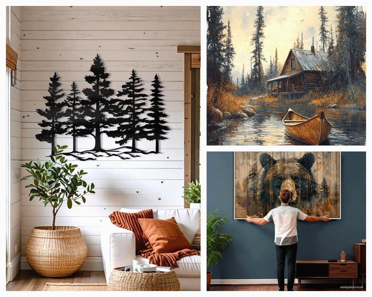
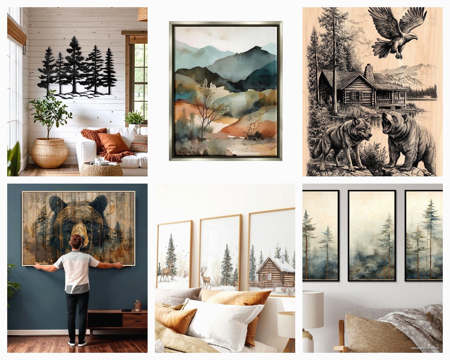
The thing about cabin wall art is you’re working with wood. Like, so much wood. Pine paneling, cedar walls, log beams—whatever you’ve got going on, it’s gonna eat up your art if you don’t think about contrast. I learned this the hard way when I hung this gorgeous black and white landscape photo in my friend’s place and it just… disappeared. The tones were too similar to the aged wood behind it.
You need either really bold colors or really strong blacks and whites. No in-between muddy tones. My go-to formula is actually vintage national park posters because they have those saturated colors that pop against wood grain. The WPA style ones from the 1930s and 40s—you can get reproduction prints pretty cheap on Etsy or even Amazon. I’m talking like $30-50 for a decent sized print.
Size Matters More Than You Think
Okay so funny story, I bought what I thought was a massive vintage ski poster for above this client’s fireplace and when it arrived it was like… maybe 16×20. Looked like a postage stamp on that wall. Cabin walls are BIG. Your ceilings are probably vaulted or at least 9-10 feet. Regular apartment-sized art (that 24×36 range) looks weirdly small.
You want to think 36×48 minimum for a main wall. Over a sofa or fireplace? Go even bigger. I’ve done 48×72 prints and they still don’t feel overwhelming because the space just swallows them up.
The Actual Pieces That Work
Here’s what I actually buy and hang in cabins:
Vintage topographic maps – USGS survey maps from your actual area are perfect. You can order custom prints of your specific mountain or lake, and they’re like $40-80 depending on size. They read as neutral from far away but have all this interesting detail up close. Plus there’s something cool about having the literal map of where you’re standing on your wall.
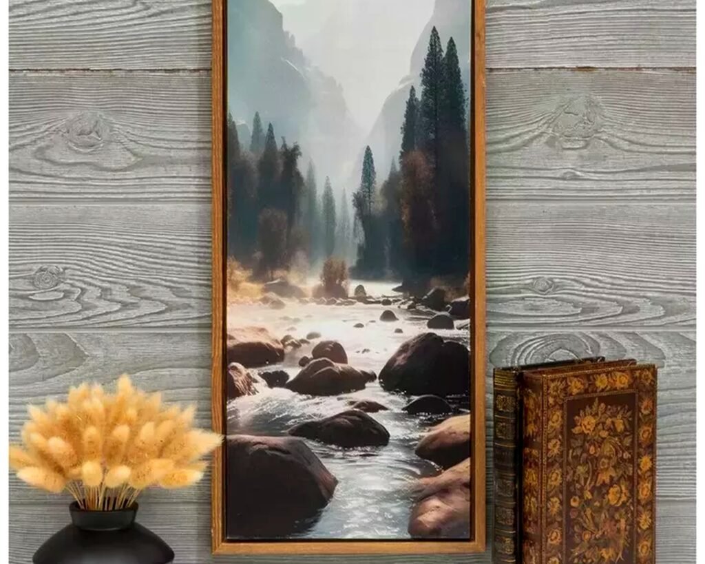
Black and white landscape photography – But it has to be HIGH contrast. Ansel Adams style stuff. Washed out grey landscapes will disappear. I get most of mine printed through a local print shop because the quality matters here. You need deep blacks.
Vintage ski posters – The European ones are chef’s kiss. French and Swiss ski resort posters from the 50s and 60s have this graphic quality that feels retro but not kitschy. Stay away from the ones that say the resort name in huge letters though, unless it’s actually YOUR local resort.
Animal illustrations (not photos) – This is gonna sound weird but bear with me. Illustrated animals feel more sophisticated than photographic ones. Like a vintage field guide style bear or elk drawing vs a photo of a bear. The illustrations have this naturalist vibe instead of “I shop at Cabela’s” energy.
My dog just knocked over my coffee while I’m writing this, hold on…
Okay back. Where was I.
What to Avoid Unless You Want It to Look Like a Cracker Barrel
- Metal signs with “funny” sayings about beer and fishing
- Live edge wood rounds with burned-in quotes
- Anything that says “Lake House Rules” or “Cabin Sweet Cabin”
- Mounted animal heads unless you actually hunted them (and even then, maybe reconsider)
- Those canvas prints of forests with the trees all blurry and oversaturated
- Rustic crosses made from twigs
I know some of you are attached to this stuff and that’s fine, but if you want it to look more curated and less “I bought everything in one trip to HomeGoods” this is my honest take.
Framing for Cabin Walls
Don’t sleep on frames because they matter SO much against wood walls. Regular black frames can look too modern and crispy. What works better:
Dark walnut or espresso wood frames—they have enough contrast against pine but still feel organic. I order most of mine from Frame It Easy online because I can get custom sizes and they’re not stupidly expensive.
Chunky natural wood frames in lighter tones work if your walls are really dark. The rule is like 3-4 shades different from your wall color either lighter or darker.
Oh and another thing, if you’re hanging on log walls (the round logs), you gotta use those heavy duty picture hangers, not regular nails. The curved surface doesn’t hold regular hardware well. I use the OOK brand hangers rated for like 50+ pounds even for medium pieces.
Gallery Wall vs Statement Pieces
I’ve done both and here’s what I’ve figured out. Gallery walls can work in cabins but they need to be LOOSE. Not that precise grid layout you’d do in a modern house. Think more like… collected over time. Mismatched frame sizes, different styles of art that share a color palette or theme.
I did one in a cabin bedroom with vintage botanical prints, old postcards from the area, and a few small landscape photos. All in different sized wood frames. The trick was keeping like 4-6 inches between pieces instead of the tight 2-3 inch spacing you’d do normally. Gives it room to breathe against all that wood texture.
But honestly? Statement pieces are easier. One big awesome print over the sofa, one over the fireplace, maybe one in each bedroom. Done. You don’t have to fuss with layouts and measurements.
Where to Actually Buy This Stuff
Since you’re probably gonna ask where I shop:
Etsy – Search “vintage national park poster” or “USGS map” or “vintage ski poster.” Make sure they’re selling prints, not originals (unless you wanna drop serious money). Read reviews about print quality.
Juniper Print Shop – They have really beautiful national park prints in a vintage style. Around $40-70 per print unframed.
Artifact Uprising – If you have your own landscape photos you wanna use, their printing quality is solid. I’ve ordered tons of stuff from them.
Local antique stores – For actual vintage pieces. You’ll pay more but sometimes you find incredible stuff. I found a 1960s ski trail map that’s now my favorite piece in my own cabin.
Wait I forgot to mention, if you go the vintage route, make sure the colors aren’t too faded. Faded vintage looks sad on cabin walls. You want stuff that still has some punch to it.
Placement Strategy
Okay so practical hanging advice because I’ve watched people put stuff in the weirdest spots.
Above the fireplace – Center it obviously. Bottom of frame should be like 4-6 inches above the mantel. If you don’t have a mantel, hang it like 8-10 inches above the fireplace opening. Go big here—this is your statement wall.
Above a sofa – Two-thirds the width of your sofa is the sweet spot for size. Hang it so the center is at eye level when you’re standing, which is usually around 57-60 inches from the floor to the center of the frame.
Stairway walls – Follow the angle of the stairs with your arrangement. The bottom of each frame should align with the stair railing angle roughly.
Bedroom – Over the bed is obvious but I actually like art on the wall you see when you’re lying in bed. Like across from the bed. Give yourself something nice to look at.
Lighting Considerations
This is huge and people forget about it. Cabin lighting is usually warm and dim—lots of lamps, maybe some Edison bulbs, fire glow. Your art needs to work in low light.
Really light colored art or anything with subtle details gets lost at night. This is why I push the high contrast stuff so hard. You want pieces that still read clearly when the only light is from table lamps and the fireplace.
If you’re hardcore about it, get some picture lights. The battery operated LED ones are like $25-40 on Amazon and you don’t have to deal with wiring. Makes your art look gallery-level.
Mixing Styles Without Looking Confused
You can totally mix vintage maps with modern photography with illustrated animals. The connecting thread should be your color palette. I usually pick 3-4 colors that appear throughout the space.
For example, in one cabin I worked with: deep forest green, rust orange, cream, and black. Every piece of art had at least two of those colors. The styles varied but it all felt cohesive because of the color connection.
Also wood tones in frames—keep those consistent. All warm woods or all cool woods. Don’t mix honey oak with grey-washed pine frames.
Seasonal Swapping
This is extra but some cabin owners like to swap art seasonally. Winter they want cozy snow scenes, summer they want hiking trails and lakes. If you’re into this, get two sets of prints and just swap the photos in your frames twice a year. Way cheaper than buying new framed pieces each time.
I have one client who does this and honestly it’s kinda extra but she loves it so whatever makes you happy.
Budget Breakdown
Since you’re probably wondering what this actually costs:
Budget approach ($200-400 for main living areas):
- Print your own photos at Costco or Artifact Uprising
- Order prints from Etsy ($30-50 each)
- Frame at Frame It Easy or buy ready-made frames from Michael’s with coupons
- Focus on 3-4 key walls instead of every wall
Mid-range ($600-1000):
- Higher quality prints from specialty shops
- Custom framing for a few key pieces
- Mix of vintage and reproduction pieces
- Better hanging hardware and maybe some picture lights
Splurge level ($1500+):
- Original vintage posters
- Large format custom photography prints
- Professional framing throughout
- Gallery-quality pieces from artists
Most of my clients land in the mid-range and it looks really good. You don’t need to go crazy expensive to make it look intentional.
My Actual Favorite Pieces I Keep Recommending
There’s this Yellowstone WPA-style print I’ve probably bought for like five different cabins. It’s on Etsy from a shop called… hold on let me check… I think it’s called Ranger Doug Enterprises or something. Around $45 for a big print. The colors are perfect—that vintage mustard yellow, deep green, rust red.
Also any USGS topo map of your specific area. I cannot stress enough how good these look and how much people love having the actual topography of their mountain on the wall.
And if you can find vintage ski trail maps from your local resort, grab them. They’re getting harder to find and more expensive but they’re perfect cabin art.
Okay I think that’s everything I’ve learned from decorating way too many cabin walls. The main thing is just avoid the obvious cliché stuff and think about contrast against all that wood. And go bigger than you think you need to because cabin spaces are large and dramatic.