Wall Art Guide, Wall Art Tutoriels
Large Kitchen Wall Art: Oversized Cooking Space Designs
May
So I just finished installing this massive 6-foot abstract piece in a client’s kitchen and honestly, I’m still thinking about how much it transformed the space, which is why I’m texting you back at like 10:30pm because oversized kitchen art is having such a moment right now and I have THOUGHTS.
The Scale Thing Everyone Gets Wrong
Okay so first thing – and I cannot stress this enough – people always go too small. Like, you have this huge blank wall above your breakfast nook or behind your dining table in an open kitchen, and you think “oh I’ll get something nice” and then you buy something that’s like 24×36 inches and it just floats there looking sad and tiny. I did this in my own kitchen three years ago and my sister still makes fun of me for it.
The rule I use now (and I literally learned this after making that mistake) is that your art should take up at least 60-75% of the wall space you’re working with. So if you’ve got an 8-foot wall, you’re looking at something that’s minimum 5-6 feet wide. Sounds insane until you see it in person, then you’re like oh yeah, that’s actually right.
For kitchens specifically, I’m usually working with pieces that are:
– 48×60 inches minimum for a standard dining wall
– 60×72 inches or larger for those big open-concept kitchen spaces
– Triptychs that span 6-8 feet total when you need to break up the visual weight
What Actually Works in Cooking Spaces
Here’s where it gets practical because kitchens are weird environments for art, right? You’ve got heat, humidity, grease particles floating around even with a good vent hood (my range hood is supposed to be amazing and I still find that slight film on things), and usually pretty bright lighting.
Canvas prints are gonna be your best friend here. I know everyone wants original oil paintings or whatever, but unless you’re spending serious money on sealed, varnished pieces, you’re better off with:
- Gallery-wrapped canvas prints with a protective coating
- Acrylic prints (these are actually incredible for kitchens – the acrylic face sheet protects everything)
- Metal prints if you’re going modern – they wipe clean so easily
- Framed prints under glass, but make sure it’s UV-protective glass
I had this whole thing last month where a client insisted on an unprotected watercolor piece and three months later the colors had faded so much from the skylight exposure. Had to have that conversation which was… not fun.
Subject Matter That Doesn’t Feel Obvious
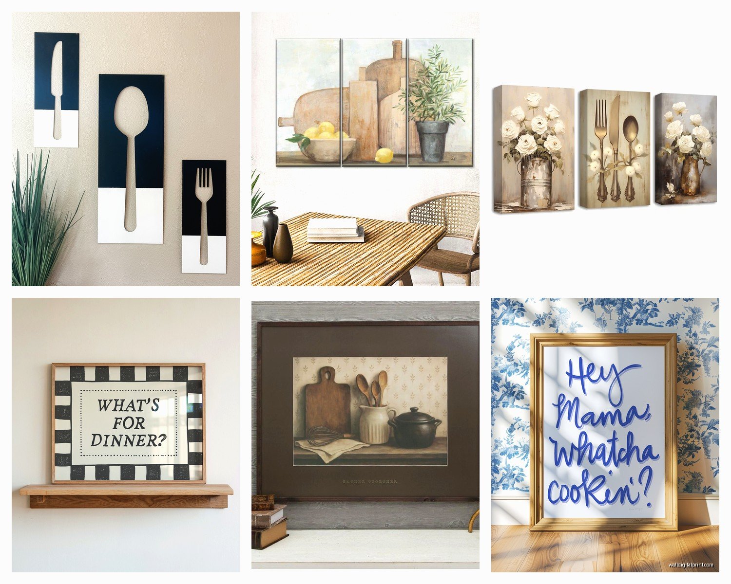
Everyone thinks kitchen art has to be food-related and like, no. Please no. Unless you’re doing it in a really elevated way, the coffee beans and wine bottle prints are gonna make your kitchen look like a HomeGoods exploded.
What I’ve been using instead:
Abstract pieces with colors that pull from your kitchen palette – this is huge. If you’ve got white cabinets with brass hardware and maybe some sage green accents, find an abstract with creams, greens, and those warm metallic tones. It ties everything together without being matchy-matchy.
Oversized botanicals but make them dramatic. I’m talking about those large-scale palm fronds or fig leaves, black and white photography of plants, that kind of thing. There’s this photographer on Etsy (wait I’m gonna find her name… okay I can’t remember but I’ll send it later) who does these massive botanical prints that are just *chef’s kiss* for modern kitchens.
Landscape photography printed LARGE. Like really large. A 5-foot wide landscape of some minimalist desert scene or coastal cliffs… it gives your kitchen this window-to-another-world vibe that’s actually really calming when you’re cooking.
Vintage-style maps if your kitchen has any traditional elements. I used a huge antique map of Tuscany in a client’s kitchen last year and it became the whole conversation piece of their dinner parties.
The Mounting Situation
Okay so this is where people panic but it’s actually not that complicated, just different than hanging regular art.
For pieces over 40 pounds (and yeah, a 6-foot canvas can weigh that much), you cannot just use regular picture hooks. You’re gonna need:
Heavy-duty wall anchors if you’re not hitting studs. I use the toggle bolt kind that flip open behind the drywall – they can hold like 50+ pounds each. You’ll want at least two, probably three for really large pieces.
D-rings or wire on the back of your piece. Wire is actually better for heavy stuff because it distributes weight across two hanging points. Make sure it’s braided picture wire, not craft wire or whatever.
A level and painter’s tape for marking. I literally map out where everything’s going with tape first because once you put holes in the wall above your expensive backsplash, you can’t really undo that.
Oh and another thing – consider the height. In kitchens, I usually hang art a bit higher than in other rooms because you’ve got counters and tables creating visual lines. The center of your art should be around 60-65 inches from the floor, but in a kitchen with a dining table, I sometimes go up to 70 inches so it’s not competing with what’s on the table.
The Gallery Wall Alternative
If one massive piece feels too committal or you can’t find the right thing, a large-scale gallery wall can work. But – and this is important – you have to think of it as ONE large installation, not a bunch of small pieces.
I did this in my own kitchen actually (after the too-small piece disaster) and used nine 20×20 inch prints arranged in a 3×3 grid. Looked like one big 5-foot square installation. The trick is:
- Keep spacing consistent – I use 2 inches between frames always
- Use identical frames so it reads as one unit
- Choose images that relate to each other in color or subject
- Plan the whole layout on the floor first, take a photo, then hang using that as reference
This approach is also cheaper because you can buy prints gradually, though honestly the measuring and hanging takes forever. My cat kept walking across my floor layout which was… helpful.
Where to Actually Buy This Stuff
So you’re probably wondering where to find affordable oversized art because custom pieces at this scale get expensive FAST. Like, thousands of dollars expensive.
Minted has been my go-to lately for large-scale prints. They go up to 54×40 inches on a lot of their designs, and the quality is genuinely good. I’ve ordered probably 15 pieces from them for various projects. Their canvas prints come ready to hang and the colors are accurate to what you see online.
Etsy for downloadable files that you print yourself. Sounds complicated but hear me out – you find a design you love, buy the digital file for like 8 bucks, then take it to a local print shop or use an online service like Printique. For a 48×60 canvas print, you’re looking at maybe 150 dollars total versus 400+ for the same thing pre-made. I do this constantly.
Society6 and Redbubble for more artistic/independent creator stuff. They print on demand which means the artist gets paid and you get exactly the size you need. Goes up to pretty large dimensions.
Local art fairs and student shows if you want something original. Art students especially will sell large pieces for surprisingly reasonable prices because they just need studio space. I got a 5-foot abstract from a college senior show for 300 dollars and it’s one of my favorite pieces.
Color Strategy For Kitchen Walls
This is gonna sound weird but I think about kitchen art colors differently than other rooms because kitchens have so many fixed elements you can’t change easily – cabinets, counters, appliances, backsplash.
Your art needs to either:
Complement what’s there by pulling 2-3 colors directly from your existing palette. If you have white cabinets, marble counters with grey veining, and stainless appliances, look for art with whites, greys, and maybe a pop of color that matches something small like your dish towels or bar stools.
Or create contrast intentionally. All-white minimalist kitchen? A huge colorful abstract can be STUNNING. But you gotta commit – like a 6-foot piece with bold colors, not a timid little splash.
Neutrals are safer but can be boring. I’ve done so many projects with those beige/cream/taupe abstract pieces and they’re fine, they’re nice, but they don’t excite me anymore you know? If you’re gonna go neutral, make sure the texture and brushwork are interesting enough to create visual depth.
Lighting Makes or Breaks It
Something I forgot to mention earlier but it’s actually critical – you need proper lighting on oversized art or it just becomes a dark blob on your wall, especially in kitchens where task lighting is focused on counters not walls.
Picture lights are the obvious solution but they can look fussy in kitchens. What I do instead:
Install track lighting or adjustable recessed lights that can angle toward the wall. This is what I have in my kitchen and it’s perfect because I can adjust as needed.
Use LED strip lights mounted at the top of the frame if the art is on a wall without good overhead lighting. Sounds complicated but they’re battery-operated stick-on strips now that are basically invisible.
Make sure your general kitchen lighting is warm-toned (2700-3000K) so your art doesn’t look weird and cold. I see this mistake ALL the time where people have these cool blue LEDs and their warm-toned art looks completely different than it did in the store.
Practical Stuff Nobody Talks About
Okay so real talk – oversized art in kitchens needs maintenance. Every few months you should:
Dust it gently with a microfiber cloth. Grease particles accumulate even if you can’t see them.
Check the hanging hardware because temperature changes in kitchens can cause slight shifts over time.
If it’s canvas, you might need to tighten the corners eventually. Canvas can loosen with humidity changes.
For acrylic or glass-covered pieces, use glass cleaner but spray it on your cloth first, not directly on the art.
Also think about your kitchen style before committing to something huge. I have a client who bought this gorgeous modern abstract piece and then decided six months later she wanted a farmhouse kitchen renovation and the art didn’t fit at all. That’s a expensive mistake with a 6-foot piece.
My Current Favorite Looks
Since you asked what’s actually working right now in real kitchens (not just Pinterest fantasy kitchens), here’s what I’m installing most often:
Black and white photography at massive scale – especially architectural shots or nature scenes. There’s something about a 6-foot black and white photograph that feels both modern and timeless.
Colorful abstracts in open-concept spaces where the kitchen flows into living areas. The art becomes the focal point for both spaces.
Oversized line drawings for minimalist kitchens. Simple, bold, sophisticated. Think Matisse-style single-line faces or figures blown up to 5 feet.
Vintage botanical prints (reproductions) in traditional kitchens. But only if they’re printed large enough to make a statement.
Textured neutrals for transitional spaces – you know, those pieces that look like plaster or have heavy brushwork. They add dimension without adding color chaos.
The worst trend I’m seeing is people doing those word art pieces (“EAT” “GATHER” etc.) at large scale and honestly just… don’t. It was tired five years ago and making it bigger doesn’t make it better.
Budget Real Talk
You can do this affordably but you gotta be strategic:
Under 100 dollars: Printable downloads from Etsy plus local printing, or IKEA’s largest canvas prints (they have some decent abstract options)
100 to 300 dollars: Minted, Society6, or Wayfair’s large art selection during sales
300 to 600 dollars: Original pieces from local artists or high-quality custom canvas prints from professional print shops
Over 600 dollars: Gallery artists, custom commissions, or really high-end photography prints
I usually tell clients to budget at least 200-300 for a quality oversized piece that’ll actually last in a kitchen environment. You can find cheaper but the quality difference is noticeable.
Wait I forgot to mention – if you’re renting, command strips make ones now that hold up to 16 pounds. You’d need several for a large piece but it’s possible to hang substantial art without nails. I tested this in my last apartment and it actually worked, though I was nervous the whole time.
The main thing is just committing to the scale. That’s what transforms a kitchen from basic to designed. One large, confident art choice beats five small pieces scattered around any day.