Wall Art Guide, Wall Art Tutoriels
Biblical Wall Art: Scripture & Religious Christian Decor

Jul
So I’ve been working with biblical wall art for like three years now and honestly it’s gotten SO much more interesting than those basic “Live Laugh Love” vibes everyone thinks of. Let me tell you what actually works because I just finished a client’s prayer room last month and learned some stuff the hard way.
First Thing – Figure Out Your Actual Style Not Just “Christian Decor”
Okay so this is gonna sound weird but the biggest mistake is searching “Christian wall art” and buying the first scripture print you see. I did this for my own house and ended up with this really ornate gold-leafed verse that looked like it belonged in a completely different century than my mid-century modern living room.
You gotta match the aesthetic to your existing space. Like:
- Modern minimalist homes – go for simple black typography on white or those line-art crosses
- Farmhouse style – the wood signs with carved or painted verses work perfectly
- Traditional/classic – framed prints with decorative borders, maybe some gold accents
- Boho spaces – watercolor scripture prints or macrame pieces with verses woven in
- Industrial – metal signs with verses, distressed finishes
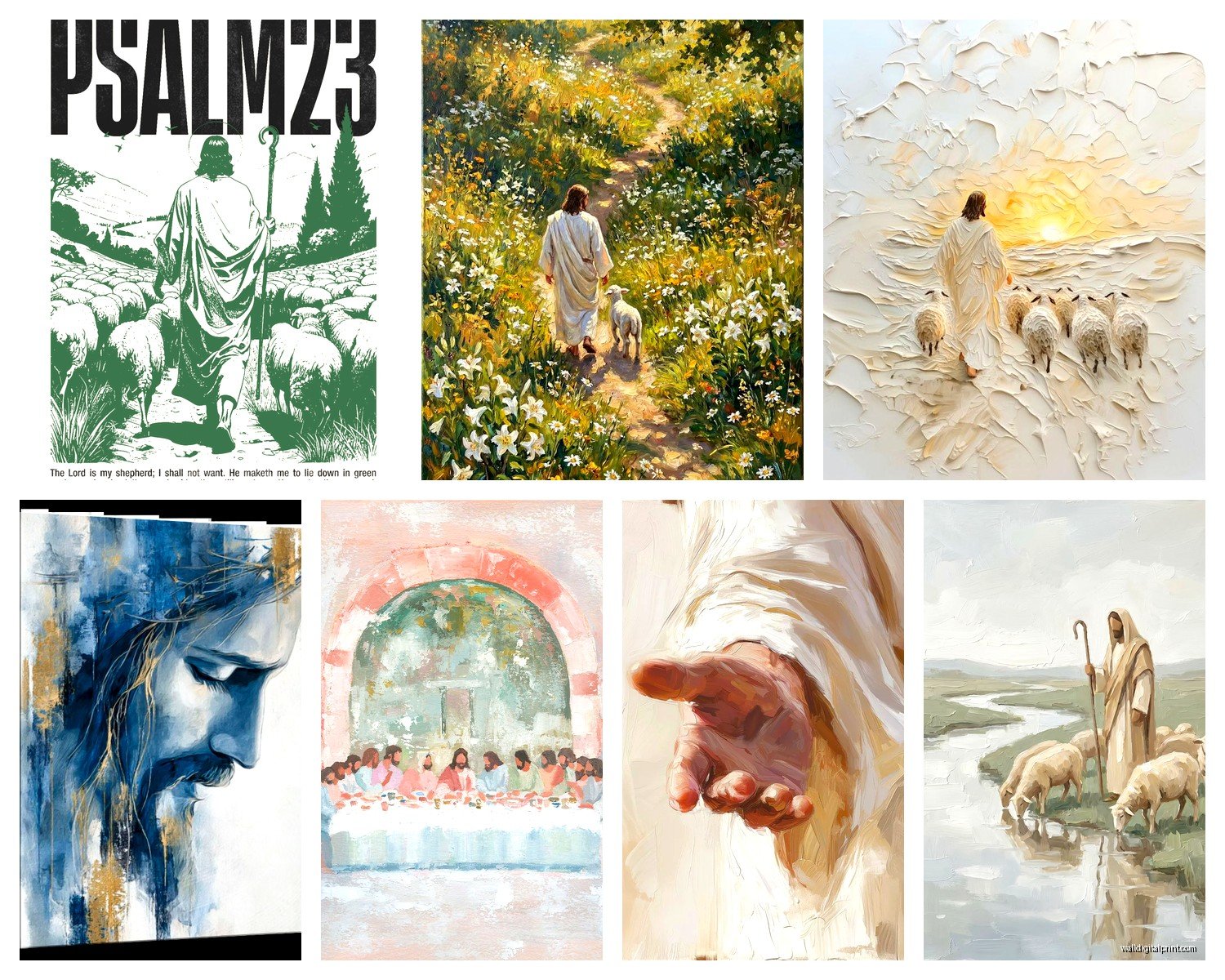
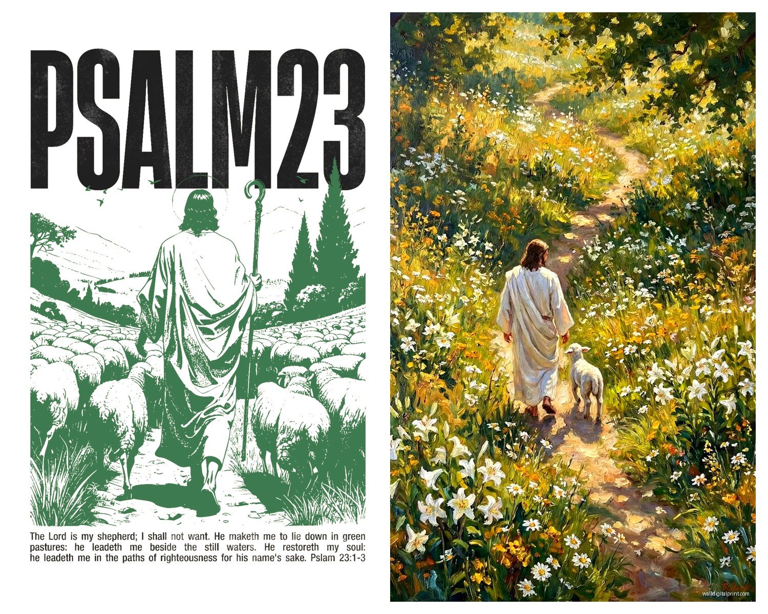
I spent like two hours one night (my dog was at the vet so I was stress-shopping) comparing different Psalm 23 prints and the range is INSANE. Same verse, completely different vibes.
Size Actually Matters More Than You Think
Real talk – most people buy too small. A tiny 8×10 scripture print on a big empty wall just looks sad and like you’re scared to commit. I learned this when staging a client’s entryway and the verse we chose was basically invisible from the doorway.
Here’s what I typically recommend:
For above a couch or bed, you want something at least 24-30 inches wide. Could be one large piece or a gallery wall situation. The rule I use is the art should take up about 2/3 to 3/4 of the furniture width below it.
Hallways can handle narrower pieces but go TALL. Like 18×24 or even 20×30. Vertical space draws the eye up and makes those boring corridors feel intentional.
Small walls like the space above a light switch or in a bathroom? That’s where your 8x10s and 5x7s shine. I have this tiny “Be Still” print in my powder room and it’s perfect there.
The Gallery Wall Approach
Oh and another thing – if you’re doing multiple pieces, odd numbers look better. Three or five frames, not four. I don’t make the rules, that’s just how our brains work apparently.
I did a client’s stairwell last spring with seven different verses, all in matching black frames but different sizes. We used Ephesians 2:8, Proverbs 3:5-6, Philippians 4:13, Romans 8:28, Jeremiah 29:11, Psalm 46:5, and John 3:16. Mixed the sizes – couple of 16x20s, some 11x14s, few 8x10s. Looked cohesive but not boring.
Canvas vs Framed Prints vs Wood Signs vs Metal
Okay so I’ve tested all of these and here’s the actual breakdown:
Canvas prints are lightweight and you don’t need to buy frames which saves money. But they can look cheap if you go too budget-friendly. The really thin ones (like 0.75 inch depth) feel flimsy. Spring for the 1.5 inch gallery wrapped if you’re doing canvas. They’re more substantial and you can actually see the sides which makes them look finished.
Framed prints give you the most flexibility because you can change the frame later if your style evolves. I’m literally about to swap out some frames in my bedroom because I’m over the rustic wood vibe. The print stays, frame changes. Also they feel more “art gallery” and less “craft fair” if that makes sense.
Wood signs – these are having a MOMENT right now. The carved ones especially. But be careful because they collect dust like crazy in all those grooves. I have a client who’s allergic to dust and we had to avoid these entirely. They’re gorgeous though, especially for farmhouse or rustic spaces. The weight is real too, make sure you’re using proper anchors.
Metal signs are super durable and great for covered outdoor spaces. I used one on a client’s screened porch with Psalm 19:1 and it’s held up perfectly. They can read a bit masculine though, so if you want softer energy maybe skip these.
What Verses Actually Work for Different Rooms
This is where it gets fun because placement matters for the vibe you’re creating.
Living rooms – go for community and hospitality focused verses. Joshua 24:15 “As for me and my house” is classic for a reason. Romans 15:13 about hope and peace. Psalm 100 is cheerful without being preachy.
Bedrooms – calming, restful verses. Psalm 4:8 about lying down in peace. Matthew 11:28 “come to me all who are weary.” I have Zephaniah 3:17 in my room and it’s just… it hits different at night, you know?
Kids rooms – Psalm 139 verses about being fearfully and wonderfully made. Jeremiah 29:11 about plans and hope. Proverbs 3:5-6 for older kids. Keep the fonts playful and colors bright.
Kitchen/dining – blessing and gratitude focused. Psalm 34:8 “taste and see.” Proverbs 31 excerpts. 1 Corinthians 10:31 about doing everything for God’s glory (works great near a coffee station actually).
Home office – Colossians 3:23, Proverbs 16:3, Philippians 4:13. Motivational but grounded in faith.
Wait I forgot to mention bathrooms – don’t skip these! Psalm 46:10 “Be still and know” is PERFECT for a bathroom. It’s literally the one room where you’re supposed to pause.
The Typography Thing Nobody Talks About
Font choice is huge. Like, HUGE.
Serif fonts (the ones with little feet on the letters) feel traditional and classic. Think Times New Roman vibes. These work great for longer passages or formal spaces.
Sans-serif (clean, no feet) reads modern and minimalist. Perfect for short verses or contemporary homes.
Script fonts can be gorgeous but they’re hard to read from a distance. I made this mistake with a Corinthians verse in a client’s entryway – looked beautiful up close, completely illegible from across the room. Save script for smaller pieces or places people will get close to.
Color Schemes That Don’t Look Cheesy
Black and white is foolproof. Seriously, you cannot go wrong. Clean, classic, works with everything.
Navy blue feels sophisticated. I’m obsessed with navy text on cream backgrounds right now.
Earth tones (terracotta, sage green, warm browns) are having a moment and they feel grounded without being boring.
Avoid: those teal and coral combos from 2015, rainbow scripture art unless it’s for a kid’s space, anything with too much gold sparkle overlay.
Custom vs Pre-Made
Okay so I’ve gone both routes and here’s the deal. Etsy is your friend for custom stuff. You can get digital downloads for like $5-15, print them yourself at FedEx or Staples, and frame them. Total cost maybe $30-40 for a decent sized piece.
Pre-made from places like Hobby Lobby or Kirkland’s (when they have sales) can be cheaper if you catch them right. I got a gorgeous Proverbs 31 piece for $25 on clearance.
The custom route lets you pick your exact verse, exact colors, exact size. But you gotta do the legwork of printing and framing. Pre-made is grab and hang but you’re limited to what’s available.
I usually do a mix – custom for specific verses that matter personally, pre-made for filling in gaps or trying out a style before committing.
Hanging Tips Because I’ve Messed This Up
Eye level is 57-60 inches to the CENTER of the artwork, not the top. This is standard gallery height and it’s right for most people.
In dining rooms, you can go a bit lower since people are seated. About 54-56 inches.
Above furniture, leave 6-8 inches between the furniture top and the bottom of the frame. Not more, not less. Well, you can go up to 10 inches if the furniture is really low but that’s pushing it.
Use a level. I know this seems obvious but I watched my husband eyeball a piece last week and it’s still crooked and driving me nuts. Just use the level.
Command strips work for lightweight pieces under 5 pounds. Anything heavier needs real nails or screws with anchors if you’re going into drywall.
Mixing Scripture Art with Other Decor
This is where people get nervous but honestly it’s fine to mix biblical art with regular art. Your home doesn’t need to look like a church bookstore.
I have a gallery wall in my hallway that’s got two scripture pieces mixed with family photos and a random abstract print I love. They all have black frames so it flows.
The key is finding a common element – same frame color, similar color palette in the art, or consistent matting. That ties everything together so it doesn’t look chaotic.
Oh and another thing – you can absolutely put scripture art in the same room as your TV or bar cart or whatever. It’s your home, not a sanctuary. Faith is part of life, not separate from it.
What to Avoid
Those word collages with like 47 different Christian words in various fonts and sizes. They’re busy and dated.
Anything that looks like it was made in Microsoft Word in 1997.
Super literal illustrations – like a piece that has the verse about eagles’ wings with an actual eagle photoshopped in. Too on the nose.
Verses taken wildly out of context just because they sound nice. I mean, you do you, but maybe actually know what the passage is about?
Budget Breakdown
You can totally do this affordably. Here’s what I’ve spent on various projects:
Budget option: Digital download from Etsy ($6) + print at home or Staples ($3-8) + basic frame from Target ($12-20) = $21-34 per piece
Mid-range: Canvas print from Amazon or CanvasDiscount.com ($30-50) + maybe some wood stain or paint to customize the edges = $35-60
Splurge: Custom carved wood sign from a local artist or nice framed piece from a Christian bookstore ($80-200)
I usually tell clients to invest in 1-2 really nice statement pieces and fill in around them with budget-friendly options. Nobody can tell which is which when they’re all styled together.
Where to Actually Shop
Etsy – best for custom digital downloads and unique handmade pieces. Search specific verses to see tons of options.
Amazon – huge selection of canvas prints, surprisingly good quality if you read reviews. Prime shipping is clutch.
Hobby Lobby – wait for the 50% off home decor sales. Their scripture art selection is decent and the framing department can help with custom stuff.
DaySpring – if you want specifically Christian company with faith-based designs. Pricier but quality is solid.
Society6 and Redbubble – independent artists, lots of modern designs. You’re supporting small creators which I love.
Target – their Threshold and Opalhouse lines sometimes have scripture pieces mixed in. Hit or miss but worth checking.
Local craft fairs and church bazaars can have amazing one-of-a-kind pieces too. I found this incredible hand-lettered Psalm 121 at a church fundraiser for $35 and it’s one of my favorite pieces.
The Lighting Factor
This is gonna sound weird but I learned this while watching some HGTV show in the background – lighting makes or breaks wall art. A gorgeous scripture piece in a dark corner is wasted.
If you have a piece you really love, consider adding a picture light above it or positioning it where natural light hits during the day. Track lighting or even a well-placed lamp can highlight your art.
Avoid direct sunlight though because it’ll fade prints over time. Learned that one the hard way with a watercolor Philippians print that’s now basically pastel when it used to be vibrant.
Seasonal Swapping
I started doing this last year and it keeps things fresh – swap out some pieces seasonally. Not everything, just maybe one or two.
Christmas season: verses about Christ’s birth, star of Bethlehem imagery, Luke 2 passages
Easter: resurrection verses, 1 Corinthians 15, John 11:25
General winter: Psalm 46:10, rest-focused verses
Summer: Psalm 19:1 about the heavens, creation-focused passages
You don’t gotta do this but it’s kinda fun and gives you an excuse to collect more pieces without overcrowding your walls year-round.
The main thing is just start somewhere. Don’t overthink it. Pick a verse that means something to you, find a style that matches your space, and hang it up. You can always move it later or add to it. None of this is permanent and your walls can evolve as you do.