Wall Art Guide, Wall Art Tutoriels
Highland Cattle Wall Art: Scottish Cow Farmhouse Designs
Jul
So I’ve been completely obsessed with Highland cattle wall art lately and honestly it started because a client wanted to do this whole Scottish farmhouse thing in her dining room, right? And I was like okay, let me dive into this because I knew literally nothing about decorating with these shaggy cows.
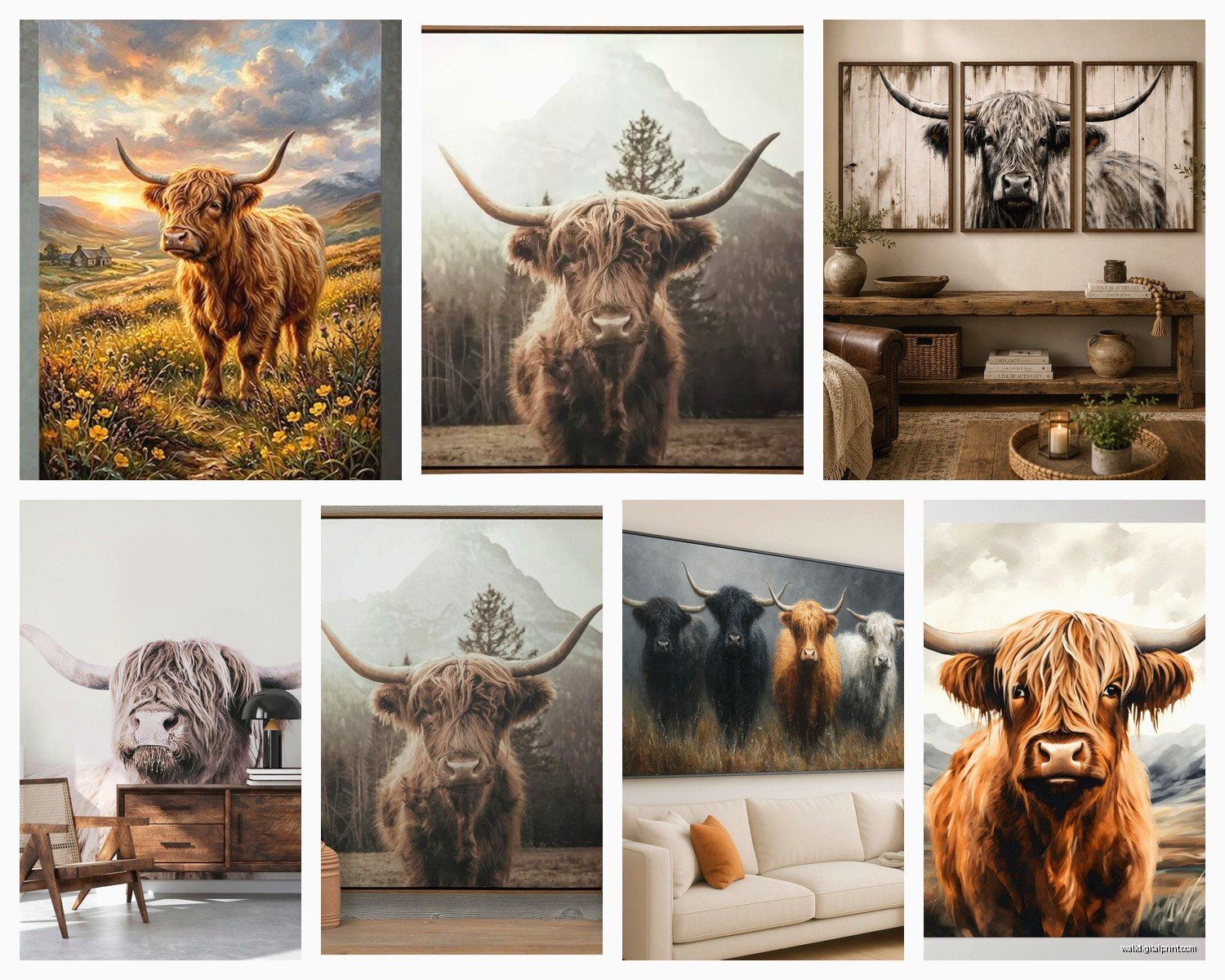
First thing you gotta know is that Highland cattle art comes in SO many different styles and not all of them actually work in farmhouse spaces. Like, I made the mistake of ordering this super modern geometric Highland cow print thinking it would be quirky and cool, but it just looked out of place next to all the rustic wood and linen textures. The piece itself was beautiful but totally wrong vibe.
What Actually Works in Farmhouse Spaces
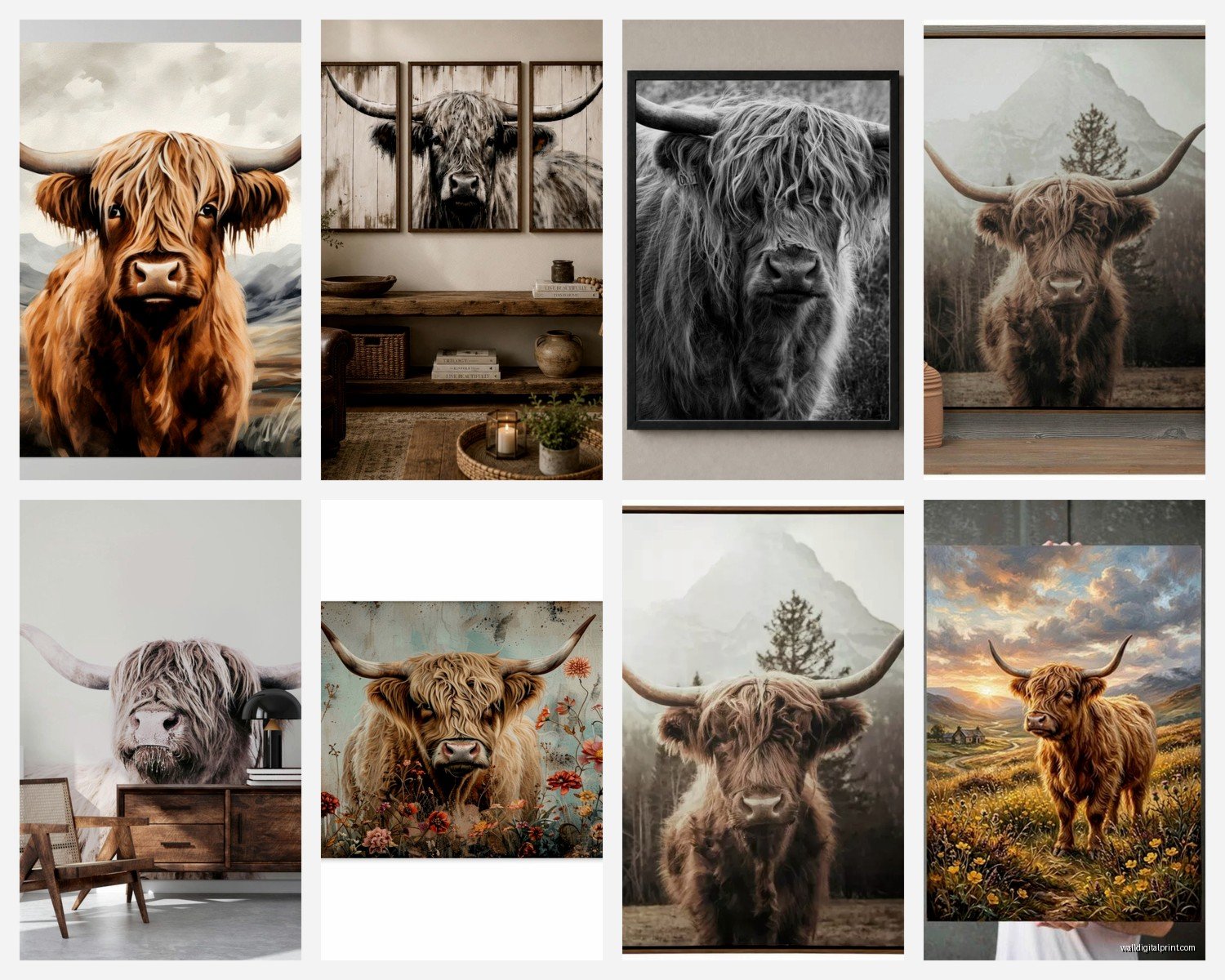
The best Highland cattle pieces for farmhouse design are either watercolor style or photography-based prints. The watercolors give you that soft, organic feel that doesn’t compete with your other decor. I found this amazing one on Etsy where the artist did these loose, flowing strokes and the cow almost melts into this misty Scottish landscape background. Hung it in my own kitchen actually and my sister was like “when did you become obsessed with cows” but whatever, I love it.
Photography prints work too but you need the right kind. Look for images that have:
- Muted, natural colors (not oversaturated)
- Soft focus or slightly vintage processing
- Minimal background distractions
- The cow positioned in a pastoral setting, not like… at a county fair or something artificial
Oh and another thing, black and white Highland cattle photography is PERFECT if you’re going for that modern farmhouse look. Takes away the orange-brown color that can sometimes feel too matchy with wood tones.
Size and Placement Stuff
Okay so this is where I messed up initially. I bought a 16×20 print for above my client’s fireplace and it was completely dwarfed by the space. Highland cattle art actually needs to be BIGGER than you think because the subject itself (a fuzzy cow) doesn’t have the visual weight of, say, a dramatic landscape or bold abstract piece.
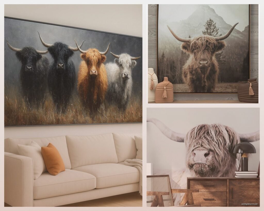
For above a sofa or console table, you’re looking at minimum 30×40 inches. I know that sounds huge but trust me. Or do a gallery wall with multiple smaller Highland cow pieces mixed with complementary art. Actually did this in my own hallway with three 11×14 prints of different Highland cows and it tells more of a story than one big piece would.
If you’re doing the single statement piece route, go 40×60 or even bigger if your wall can handle it. The shaggy texture of the Highland cattle’s coat needs space to breathe and be appreciated. When it’s too small, it just looks like… a blob of brown fur? Not the majestic Scottish vibe you’re going for.
Gallery Wall Configurations
Wait I forgot to mention – if you do a gallery wall with Highland cattle art, don’t make them all cows. That’s gonna look like you’re running a cattle farm documentation center or something. Mix in:
- Scottish landscape prints (moors, highlands, lochs)
- Botanical prints of heather or thistle
- Vintage farm tool illustrations
- Black and white photography of sheep or other pastoral animals
- Neutral abstract pieces that pull colors from the Highland cow
The key is the Highland cow should be your hero piece, the biggest or most central, and everything else supports it.
Frame Selection Because This Matters More Than You Think
So I was watching this show about flipping houses the other night and they put this gorgeous Highland cow print in a shiny silver frame and I literally cringed. Farmhouse style needs specific frame treatments and metallic is NOT it.
Go for:
- Natural wood frames in light oak, pine, or weathered finishes
- White-painted wood frames (distressed is even better)
- Black frames if you’re doing modern farmhouse, but they need to be matte
- No frame at all – canvas wraps work great for this subject
The natural wood frames are my favorite because they echo the organic, earthy quality of the Highland cattle themselves. I found these reclaimed barn wood frames at a local shop and they were pricey but worth it – the texture and color variation adds so much character.
Canvas wraps are good if you want something more casual and less formal. They work especially well in kitchens, mudrooms, or kids’ spaces where you want that farmhouse feel without it being too precious.
Color Coordination Tips
Highland cattle are naturally rusty orange-brown with those cream-colored horns, so you need to think about how that plays with your existing color scheme. If you’ve got a lot of warm wood tones already, the orange can be overwhelming – this is why black and white versions are sometimes the move.
But if you embrace the color, here’s what works:
- Pair with sage green, dusty blue, or soft gray walls
- Use cream and white textiles to balance the warmth
- Add black accents to ground the space
- Incorporate natural textures like jute, linen, and raw wood
I did this living room where we had a huge Highland cow canvas above the sofa, sage green walls, cream linen curtains, and these amazing black iron curtain rods. The cow became the warm focal point but didn’t dominate because everything else was cool and neutral.
This is gonna sound weird but if you have a lot of orange-toned Highland cattle art, add some eucalyptus stems or silver-green plants nearby. The cool gray-green creates this perfect contrast that makes both elements pop.
What Doesn’t Work
Don’t try to match the orange of the Highland cattle with orange throw pillows or orange decor. That’s too literal and it ends up looking like a theme park. The art should be the ONLY obvious nod to the color, everything else should complement not match.
Also skip busy patterns near your Highland cattle art. The shaggy texture of the cow’s coat is already a lot of visual texture, so pairing it with like, a bold plaid or busy floral just creates chaos. Keep nearby patterns subtle – small checks, simple stripes, or solid colors.
Where to Actually Buy This Stuff
Okay so funny story, I spent three hours comparing Highland cattle prints across different sites because my client had a tight budget. Here’s what I learned:
Etsy is goldmine for watercolor and illustrated Highland cow art. You can find instant downloads for like $5-15 and print them yourself at a local print shop. Quality varies wildly though so check the seller’s reviews and make sure they’re offering high-resolution files (at least 300 DPI).
Society6 and Redbubble have tons of options and they’ll print and frame for you, which is convenient but pricier. The quality is consistent though, which matters if you don’t wanna deal with the hassle of coordinating printing and framing separately.
For photography, I actually love Desenio and The Poster Club. They have curated Highland cattle photos that are already styled for Scandinavian/farmhouse aesthetics. The prints arrive ready to frame and the paper quality is really good.
If you want something more unique or handmade, search for local artists who specialize in livestock portraits. I found an artist at a farmers market who does custom Highland cattle paintings and commissioned one for my entryway. Took six weeks but it’s legitimately my favorite piece of art I own.
Styling the Space Around Your Highland Cow Art
Once you’ve got your art, you can’t just hang it and call it done. The styling around it makes or breaks the farmhouse vibe.
Under or beside your Highland cattle art, layer in:
- A vintage wooden dough bowl with dried florals
- Stoneware crocks or ceramic vases in neutral tones
- A small stack of vintage books
- Candlesticks in varying heights (wood or matte black)
- A woven basket or wooden tray for texture
Keep it asymmetrical and organic. Farmhouse style isn’t about perfect symmetry – it’s about collected-over-time charm. I always tell people to imagine you inherited this stuff from your Scottish grandmother who lived on an actual farm. Would she have everything perfectly matched and spaced? Nah.
My cat knocked over a vase while I was staging a console table under a Highland cow print and honestly the slightly off-kilter arrangement looked better after I fixed it than the too-perfect setup I’d started with.
Lighting Considerations
Oh and another thing – lighting makes a huge difference with Highland cattle art. The texture and details of the shaggy coat can get lost in dim lighting. If you’re hanging it somewhere without great natural light, add a picture light above the frame or position a table lamp nearby to wash light across it.
Warm-toned bulbs (2700K-3000K) work better than cool white because they enhance the natural warmth of the subject and create that cozy farmhouse atmosphere.
Different Rooms Different Approaches
Highland cattle art works in pretty much any room but the approach changes:
Living Room: Go big and bold, make it a focal point above the sofa or fireplace. This is where you can do a really substantial piece.
Dining Room: Gallery wall or a pair of medium-sized prints flanking a window or buffet. The repetition feels intentional without being boring.
Kitchen: Smaller prints or even Highland cattle tea towels framed (yes really, I’ve done this and it’s adorable). Keep it casual and functional-feeling.
Bedroom: Above the bed or on the wall opposite. Choose softer, more muted versions – you don’t want intense eye contact with a cow first thing in the morning.
Bathroom: Okay this sounds random but a small Highland cattle print in a farmhouse bathroom is actually perfect? It adds personality without being weird. Keep it small though, like 8×10 max.
Entryway: Great spot for a medium piece that sets the tone for your whole home’s aesthetic. First impression when guests walk in.
Mixing Metals and Textures
Even though I said skip metallic frames, you CAN incorporate metal elements in the styling around your Highland cattle art. Matte black iron, aged brass, or copper accents work beautifully. Think curtain rods, plant stands, candle holders – stuff that adds industrial-farmhouse edge without competing with the art itself.
Texture layering is huge. The Highland cow’s shaggy coat is already a textural element, so echo that with:
- Chunky knit throws
- Woven baskets
- Raw wood surfaces
- Linen or burlap textiles
- Natural fiber rugs
The goal is this collected, organic feeling where natural materials and textures build on each other. Nothing too slick or modern.
Seasonal Variations
One thing I love about Highland cattle art is you can style it differently throughout the year. In fall, add some wheat stalks and amber glass bottles nearby. Winter, bring in evergreen branches and plaid textiles. Spring, fresh flowers and lighter linens. Summer, keep it minimal and breezy.
The art stays constant but the supporting elements shift, which keeps your space feeling fresh without having to rotate artwork constantly.
Common Mistakes I See
Hanging it too high – the center of the art should be at eye level, roughly 57-60 inches from the floor.
Choosing art that’s too colorful or cartoonish – Highland cattle art should feel authentic and grounded, not cutesy.
Overloading the space with Scottish clichés – you don’t need tartan everything and bagpipes just because you have a Highland cow on the wall.
Ignoring the rest of the room’s style – the art needs to connect to your existing aesthetic, not fight against it.
Wait I forgot to mention – if you’re gonna print your own from a digital download, don’t cheap out on the printing. Go to a professional print shop or use a quality online service. The difference between a drugstore print and a professional one is massive, especially with Highland cattle where the fur texture and detail matter.