Wall Art Guide, Wall Art Tutoriels
Monstera Wall Art: Tropical Leaf Swiss Cheese Plant Decor
Jul
So I’ve been completely obsessed with monstera wall art lately and honestly it started because a client wanted to do this whole tropical vibe without making her living room look like a tiki bar, you know? And I went down this rabbit hole of figuring out what actually works versus what looks cheap and desperate.
The Real Deal About Choosing Monstera Prints
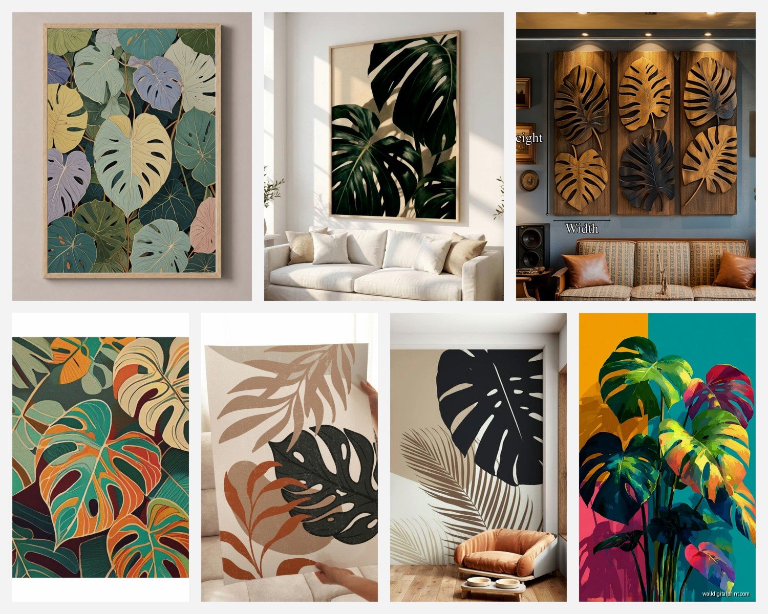
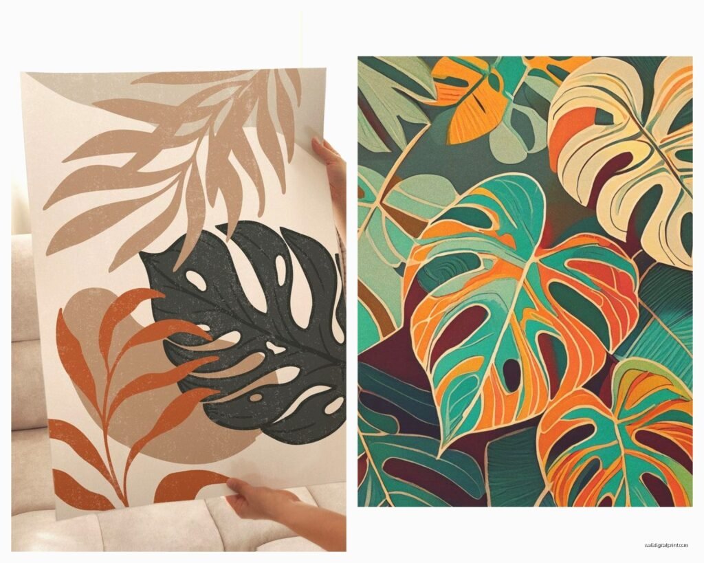
Okay first thing – the style matters SO much more than I thought it would. You’ve got your photographic prints, watercolor versions, line drawings, and those trendy minimalist black and white ones. I’ve tested all of them in different spaces and here’s what I learned the hard way:
The photographic ones work best in modern or contemporary spaces but they need to be HIGH quality or they just look like you printed something from Google images. I made that mistake once and my friend still gives me crap about it. You want at least 300 dpi if you’re buying digital downloads to print yourself. Learned that after wasting $45 at a print shop on a blurry mess.
Watercolor monstera art is tricky because it can go twee really fast. Like overly precious botanical illustration energy. BUT if you find ones with good color saturation and pair them with more masculine or industrial elements, they actually balance really nicely. I did this in a loft apartment with exposed brick and the watercolor monstera prints softened everything without making it feel feminine.
Line Drawings Are Having a Moment
The single-line monstera drawings or those minimalist outline versions? They’re everywhere right now which means they’ll probably feel dated in like two years, but for now they work great in Scandinavian-minimal spaces. They’re also the cheapest to DIY if you’re crafty – I literally traced a monstera leaf photo onto a lightbox for my sister’s apartment and framed it. Took 20 minutes and looks like something from West Elm.
Size and Placement Because This Is Where People Mess Up
Alright so this is gonna sound obvious but I see people get this wrong constantly – bigger isn’t always better with botanical prints. A massive 40×60 monstera print can completely overwhelm a space and make it feel like you’re trying too hard to fill wall space.
Here’s what actually works:
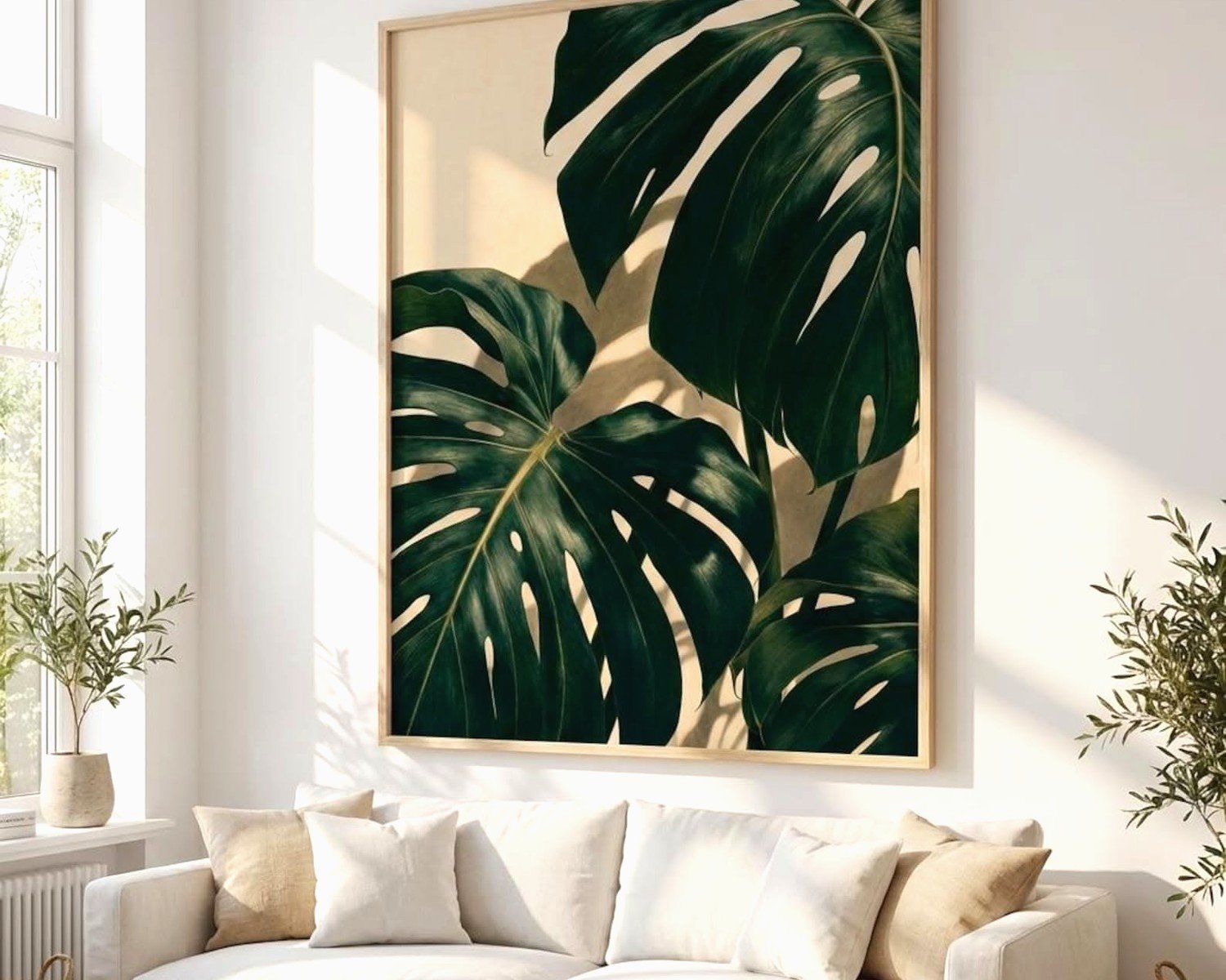
- Over a couch: go for something around 30×40 inches or do a trio of smaller prints (like three 16x20s)
- Bedroom: I love a big one over the bed but keep it around 36×48 max unless you have like 12-foot ceilings
- Entryway or hallway: vertical orientation works better, around 16×20 or 20×30
- Gallery wall: mix monstera with other tropical leaves – more on this in a sec
The height thing matters too. Center of the artwork should be at eye level which is roughly 57-60 inches from the floor. My dog always sits under my gallery wall like she’s judging my measuring skills but whatever.
Gallery Wall Combinations That Don’t Look Like Pinterest Threw Up
Oh and another thing – if you’re doing a gallery wall with monstera art, you gotta mix it up or it becomes too much of one thing. I learned this when I did an all-monstera gallery wall in my own place and it just felt… aggressive? Like the plant was attacking the wall.
What works better:
- Monstera + bird of paradise + palm leaves (different shapes keep it interesting)
- Monstera + abstract geometric art (the organic vs geometric contrast is *chef’s kiss*)
- Monstera + black and white photography (adds depth and keeps it grounded)
- Different monstera styles – like one photographic, one line drawing, one watercolor
Frame spacing should be 2-3 inches between frames. I use painters tape on the wall to map it out first because I’ve definitely put way too many holes in walls from “eyeballing it.”
Frames Matter More Than You Think
So this is where I spent way too much time and money figuring things out. The frame can make a $15 print look expensive or a $200 print look cheap.
For monstera art specifically, I’ve found these combinations work:
Natural wood frames – Light oak or bamboo frames give that organic California-casual vibe. They work especially well with watercolor monstera prints. Avoid dark walnut unless your space is already really warm-toned because it can make the green look muddy.
Black frames – Classic, can’t go wrong, but make sure they’re matte black not glossy. Glossy looks cheap and dated. Black works with literally any monstera style but especially good with line drawings or black and white botanical prints.
White frames – These are my go-to for small spaces or rooms with lots of color already happening. White frames let the monstera be the focal point without competing. But you need bright white not cream-white or it looks dingy.
Gold or brass frames – Okay so these can look amazing or terrible depending on execution. Thin brass frames (like 1/4 inch) with monstera line drawings? Gorgeous and elevated. Thick ornate gold frames with photographic monstera prints? Looks like your grandma’s house but not in a good way.
Wait I forgot to mention – floating frames are really cool for pressed real monstera leaves if you wanna go that route. I did this for my own place using actual leaves I preserved and it’s like… the most commented-on thing when people come over.
Color Schemes That Actually Work
The color palette you choose for your monstera art needs to vibe with your existing space obviously, but there are some combinations I keep coming back to because they just work:
Monstera + blush pink + brass accents – This is very 2019 but honestly still looks good if you don’t go overboard. The pink softens the green and brass warms everything up.
Monstera + navy blue + white – More masculine energy, works great in offices or dens. The deep blue grounds the tropical vibe so it doesn’t feel too vacation-y.
Monstera + terracotta + cream – This is my current favorite combo. Very earthy and California-desert meets jungle. Terracotta pots as accessories, cream walls, monstera art – it all just flows.
Monstera + black + concrete gray – Industrial-tropical which sounds weird but looks incredible in lofts or modern spaces. The black and gray keep it edgy while the monstera softens it.
Where to Actually Buy This Stuff
Okay so I’ve bought from basically everywhere at this point and here’s the honest breakdown:
Etsy – Best for digital downloads and unique styles. You can find really talented artists doing custom monstera illustrations. Download the file, take it to a local print shop or use an online service. Usually costs $5-$15 for the digital file then $20-$50 to print depending on size. Quality varies wildly so read reviews.
Society6 and Redbubble – Good for when you want the print and frame together. More expensive but convenient. Quality is pretty consistent. They have tons of monstera options but a lot of them are the same trendy style, so if you want something unique, look elsewhere.
Local artists and art fairs – This is gonna sound pretentious but hear me out – I’ve found some of my favorite monstera pieces at local art markets. They’re original, nobody else has them, and you’re supporting actual artists. Usually $50-$200 depending on size and whether it’s an original or print.
Target and HomeGoods – For when you need something quick and cheap. I’ve found decent monstera canvas prints at both for like $30-$60. They’re not gonna be heirloom quality but they work for renters or if you change your decor frequently.
Custom commissions – If you have a specific vision, commissioning an artist isn’t as expensive as you’d think. I’ve paid $150-$300 for custom monstera paintings and it’s worth it for a statement piece.
The DIY Route If You’re Broke or Bored
I did this when I was between jobs and honestly some of my DIY monstera art is still hanging in my apartment. Here’s what worked:
Print your own from free stock photo sites – Unsplash and Pexels have gorgeous high-res monstera photos. Download, take to FedEx or Staples, print on nice paper or canvas. Frame it. Boom. Under $40 total.
Paint your own – Even if you “can’t paint” you can do an abstract monstera. I watched my cat knock over a plant while I was attempting this and somehow the chaos made it better? Just use acrylic paint, a canvas from Michael’s, and reference a photo. It doesn’t have to be perfect – abstract botanical art is very forgiving.
Press real leaves – Collect monstera leaves (ask a friend with a plant or buy from a florist), press them in heavy books for 2-3 weeks, then frame them in floating frames. This looks SO expensive and costs basically nothing.
Styling Around Your Monstera Art
Alright so you’ve got your art on the wall, now what? It can’t just float there alone or it looks unfinished.
Layer with shelving – A floating shelf under your monstera print with actual plants, books, and ceramics creates depth. I do this in almost every room I style now.
Add actual monstera plants – This might seem obvious but having a real monstera plant near your monstera art creates this cool dialogue between the two. Just don’t go overboard or it’s like… we get it, you like monsteras.
Lighting matters – A picture light or even just a well-placed floor lamp directed at the art makes it look gallery-quality. I use those cheap clip-on LED picture lights from Amazon and they work fine.
Furniture placement – Your couch or console table should be roughly 2/3 the width of the art above it. This is a design rule I ignored for years and my spaces always felt off until I learned this.
Common Mistakes I See All the Time
Hanging it too high – I already mentioned the 57-60 inch rule but seriously, everyone hangs art too high. It should feel connected to your furniture not floating near the ceiling.
Too matchy-matchy – If you have monstera art, monstera pillows, monstera bedding, and actual monstera plants everywhere… it’s too much. Pick two, maybe three places for the motif and call it done.
Wrong room energy – Monstera art in a formal dining room or traditional space usually feels forced unless you’re intentionally doing an eclectic mix. It works best in casual, contemporary, or bohemian spaces.
Ignoring the undertones – If your monstera print has warm yellow-greens and your space has cool blue-greens, they’ll clash. Pay attention to whether the green in your art is warm or cool and match your space accordingly.
Cheap printing on good art – Spending $50 on a digital file then printing it at home on regular printer paper defeats the purpose. Invest in good printing or don’t bother.
Specific Room Recommendations
Living room – Go bigger and bolder here. This is your statement space. A large monstera canvas or framed print above the sofa works great. Mix with real plants and natural textures like jute rugs and linen throws.
Bedroom – Keep it calming. Watercolor monstera in soft greens or even black and white line drawings. Nothing too vibrant or it’ll mess with your sleep energy (yes I sound like a hippie but it’s true).
Bathroom – Smaller prints work better here and make sure they’re properly sealed if it’s a humid bathroom. I did a trio of 8×10 monstera prints in my bathroom and it makes it feel like a spa. Kinda.
Home office – Monstera art adds life to a space where you’re staring at screens all day. I like it behind the desk so it’s in your video call background too. Looks professional but interesting.
Kitchen – Smaller pieces or a gallery wall near the breakfast nook. Keep it away from cooking areas where grease can damage the art.
Okay I think that’s everything I’ve learned from way too much time thinking about monstera wall art. The main thing is just pick something you actually like, not what’s trendy, and make sure it fits the scale and vibe of your space. Also measure twice, nail once, because patching drywall is annoying.