
Wall Art Guide, Wall Art Tutoriels
Coco Chanel Wall Art: Fashion Icon Designer Quote Decor
Jul
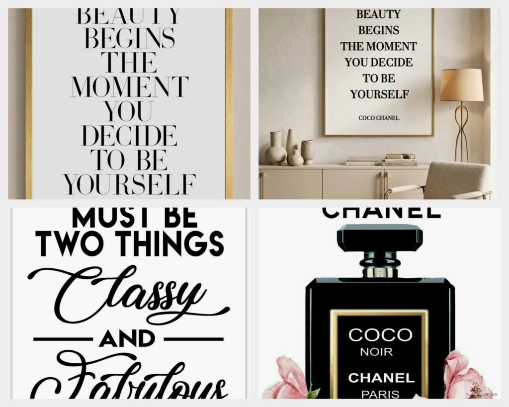
So I’ve been totally obsessed with Coco Chanel wall art lately and honestly it started because a client wanted to redo her dressing room and I went down this rabbit hole of designer quote prints that I’m still not out of.
The thing with Chanel pieces is they can look either really elegant or super tacky depending on how you style them, and I’ve definitely made both mistakes in my own space before figuring this out.
What Actually Works for Different Rooms
Okay so first thing – not every Chanel print belongs everywhere. I learned this the hard way when I put a huge “A girl should be two things: classy and fabulous” print in my kitchen and it just felt… wrong? Like why is Coco judging me while I’m eating cereal in my pajamas at 2pm.
Bedroom and closet spaces are honestly the sweet spot. That’s where these prints make the most sense because you’re getting dressed, thinking about style, the whole vibe just clicks. I have this simple black and white “Before I leave the house, I put on my perfume” quote above my dresser and it actually does make me remember to spritz something on instead of rushing out smelling like nothing.
Home offices work too but you gotta be selective. The motivational-ish quotes like “Success is most often achieved by those who don’t know that failure is inevitable” hit different when you’re staring at spreadsheets. Just don’t go overboard with the whole girlboss aesthetic because that got cringey around 2019.
Living rooms are tricky. You can do it but it needs to be more subtle – maybe a smaller print as part of a gallery wall rather than a statement piece. Nobody wants to feel like they walked into a Forever 21 when they sit down to watch Netflix.
The Format Thing Nobody Talks About
This is gonna sound weird but the format matters SO much more than the actual quote sometimes.
I’ve tested basically every style at this point because my spare room has been my experimental gallery space (my cat knocks stuff down regularly so nothing’s permanent anyway). Here’s what I’ve figured out:
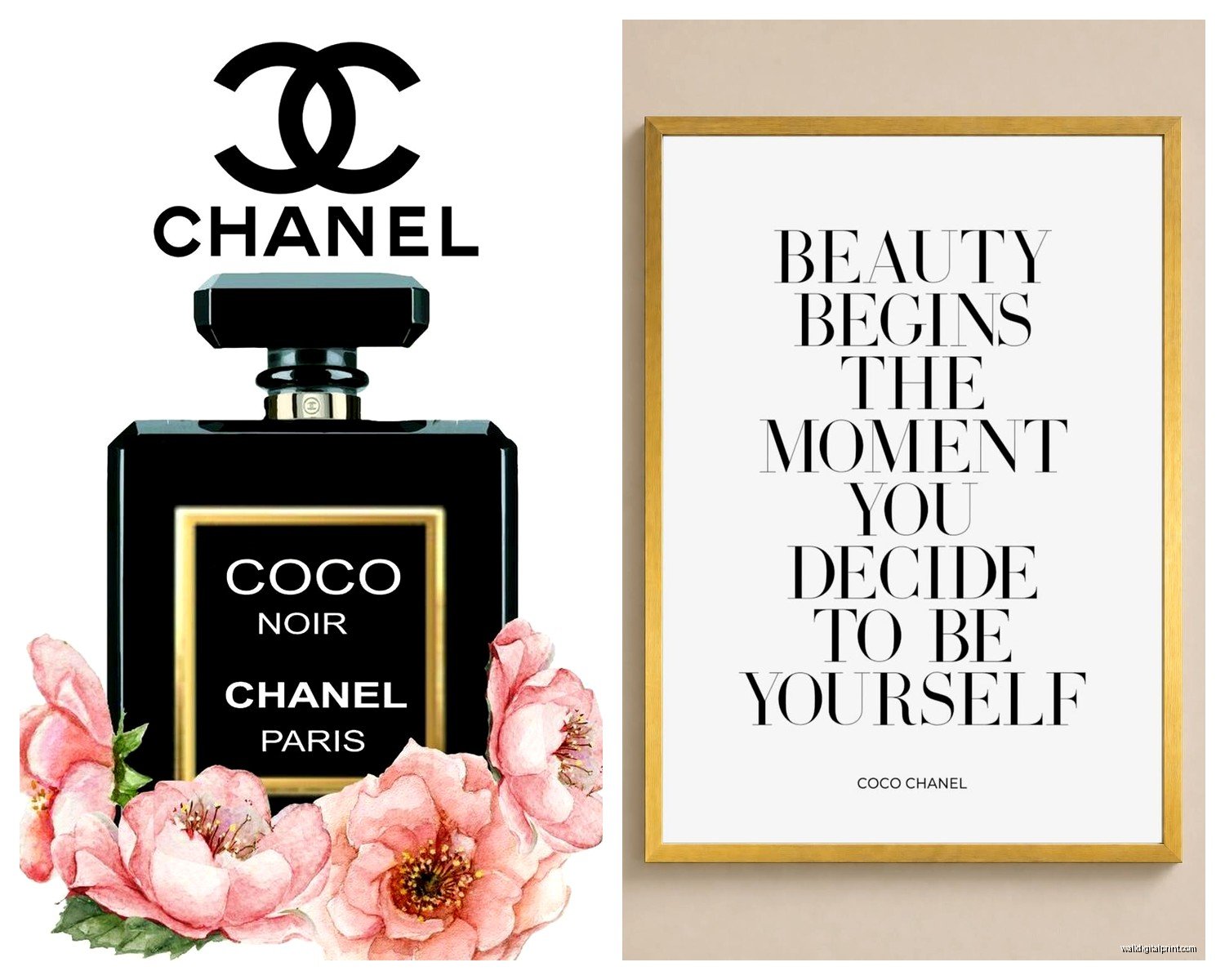
- Minimalist black text on white – always works, never fails, kinda boring but that’s the point
- Gold foil accents – can look expensive or can look like you bought it at TJ Maxx, depends entirely on the frame quality
- Watercolor backgrounds – I wanted to love these but they usually read as too soft for Chanel’s whole vibe which was pretty sharp and direct
- Vintage photograph style with quotes overlaid – hit or miss, sometimes really cool if it’s an actual Chanel photo, sometimes looks like a Pinterest fail
- Chanel logo incorporated designs – honestly just skip these unless you want your house to look like a boutique
The minimalist route is safest but if you’re gonna do color, stick with blacks, whites, creams, and maybe one accent color. I did a blush pink background once and it actually worked because I pulled that exact pink into my throw pillows.
Size Matters More Than You Think
I spent three hours last Tuesday (my morning appointment canceled) comparing sizes and here’s the deal – bigger isn’t always better even though that’s what I used to think.
For quote prints specifically, you want people to be able to read them from like 6-8 feet away. If they have to walk up close and squint, it defeats the purpose. But if the text is HUGE, it feels aggressive. There’s this weird sweet spot.
I generally go for:
- 8×10 for small accent pieces or gallery walls
- 16×20 for solo pieces in bedrooms or offices
- 24×36 if you’ve got a big empty wall and need a statement piece
Anything bigger than 24×36 starts feeling like wall decal territory and that’s not the vibe we want. Unless you have like cathedral ceilings, then I guess do whatever.
The Frame Situation
Oh and another thing – the frame is honestly 60% of whether this looks good or cheap. I cannot stress this enough.
Black frames are the obvious choice and they work great, but they can also disappear against dark walls which might be what you want or might make the whole thing feel flat. White frames give it more of a fresh, modern look but they show dust like crazy (ask me how I know).
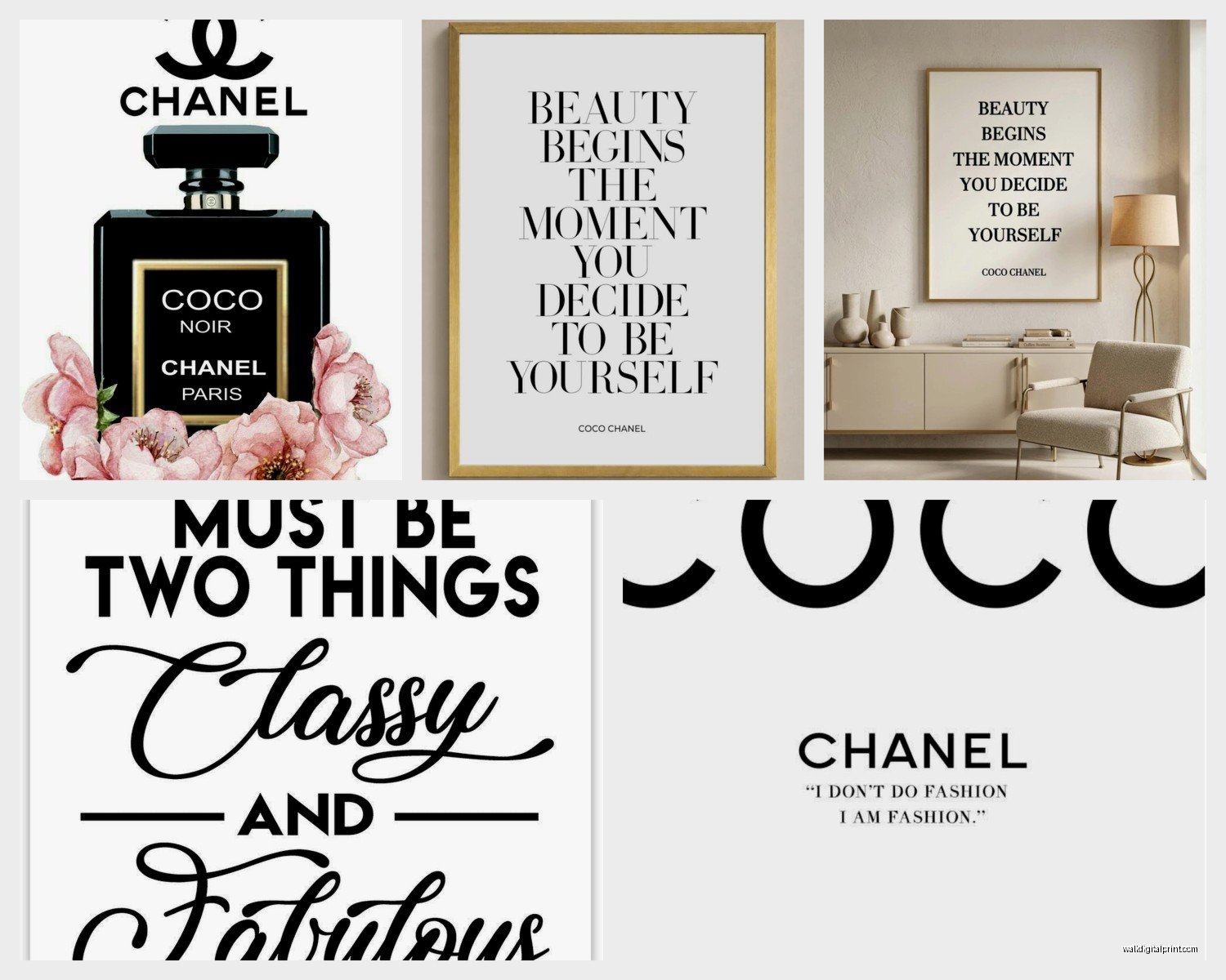
Gold frames are where people mess up most. You need a thin, simple gold frame – not ornate, not thick, not antique-looking. Modern and sleek. I found some good ones at Target actually that were like $25 and they look way more expensive than they were.
Matting is optional but it does elevate the look. I usually do white or cream matting, keeps it clean. Skip the mat if you’re doing a gallery wall with multiple prints because too much matting gets visually cluttered.
Gallery Wall Configurations That Don’t Look Messy
So if you’re doing multiple Chanel prints together (which can look amazing btw), you gotta have a plan or it ends up looking like a teenager’s bedroom wall.
I did a three-piece setup in my client’s closet that turned out perfect – all same size frames (16×20), all matching black frames, hung in a horizontal line with equal spacing. Three different quotes but same design style. Clean and impactful without being chaotic.
The asymmetrical gallery wall approach works too but it’s harder to pull off. You need to mix the Chanel prints with other elements – maybe a small mirror, some fashion sketches, a vintage perfume ad. The key is varying the sizes but keeping a cohesive color palette.
Wait I forgot to mention – if you’re doing a gallery wall, lay it out on the floor first. I know everyone says this but I still sometimes skip this step and regret it when I’ve already put 6 nail holes in the wall.
Which Quotes Actually Matter
Okay so there are like a million Chanel quotes floating around and some of them are… not great? Or they’re misattributed? Or they’re just kinda basic at this point.
The ones I actually like and have used:
- “In order to be irreplaceable, one must always be different” – this one’s good for offices or creative spaces
- “Simplicity is the keynote of all true elegance” – works anywhere, classic, not overused yet
- “Fashion fades, only style remains the same” – maybe the most Chanel quote that exists
- “A woman who doesn’t wear perfume has no future” – dramatic but fun for a bedroom or bathroom
- “The best things in life are free, the second best are very expensive” – cheeky, I have this in my closet
Avoid: “Keep your heels, head, and standards high” because it’s been done to death. Also anything that feels too girlboss-y or like it’s trying to sell you a lifestyle rather than just being a nice quote.
Where to Actually Buy These
This is gonna sound scattered but I buy from different places depending on what I need.
Etsy is great for digital downloads if you want to print yourself. You can find really beautiful designs for like $5-8, then just get them printed at a local print shop or even Costco if the resolution is good enough. The quality control is variable though – read the reviews and check the seller’s other work.
Society6 and Redbubble have curated options and the quality is consistent. More expensive but you’re paying for convenience and knowing it’ll look good. They do sales pretty regularly so wait for like 20% off.
Amazon has options but it’s hit or miss. I’ve gotten some surprisingly nice prints and some that looked like they were printed on copy paper. Check the reviews with photos.
Local print shops or frame stores can do custom work if you have a specific vision. More expensive but you get exactly what you want. I did this for a client who wanted a specific Chanel photo with a custom quote overlay and it turned out gorgeous.
Styling Around the Print
The print isn’t gonna work in isolation, you need to style around it which I think is where a lotta people drop the ball.
If you’re doing a black and white print, echo those colors elsewhere in the room. Black lamp, white bedding, you get it. Doesn’t have to be matchy-matchy but there should be a visual connection.
I like adding fresh flowers nearby – white roses or peonies if we’re being very on-brand with the Chanel thing. But honestly any fresh flowers elevate the space and make it feel more intentional.
Books are your friend. A small stack of fashion or design books near your Chanel print reinforces the aesthetic. I have a coffee table book about the history of Chanel No. 5 that I keep on my dresser near my print and it just ties everything together.
Avoid: putting the print near anything too kitschy or casual. Like don’t hang it above your collection of beer cans or whatever. The vibe clash is too much.
Lighting Considerations
Natural light is obviously ideal but watch out for direct sunlight because prints will fade over time. I learned this when a print I had near a west-facing window started looking washed out after like six months.
If you’re putting it in a closet or darker space, consider adding a picture light or even just positioning a nearby lamp so it illuminates the print. Makes it feel more intentional and gallery-like.
LED strips behind the frame can look cool if you’re into that modern vibe but it can also look kinda tacky so proceed with caution. I tried it once while watching some home reno show and immediately took it down the next day.
The Authenticity Question
Some people get really hung up on whether the quotes are “real” Chanel quotes and look… most of them are real or at least attributed to her in various biographies and interviews. Some are paraphrased. Does it really matter for wall art? I don’t think so.
If someone’s gonna fact-check your wall art, they’re probably not someone whose opinion you need to worry about anyway. That said, stick with the well-known quotes if you want to be safe.
Mixing with Other Designer or Fashion Elements
You don’t have to make your whole space Chanel-themed (please don’t actually). Mixing in other fashion references can look really sophisticated.
I did a gallery wall that had one Chanel quote, one vintage Vogue cover, one fashion illustration, and one abstract piece that pulled all the colors together. Way more interesting than four Chanel quotes in a row.
If you’re into other designers, you can mix quotes – like one Chanel, one Yves Saint Laurent, one Diane von Furstenberg. Just keep the design style consistent so they look like they belong together.
Common Mistakes I See All the Time
Too many quotes in one room. One or maybe two is enough. More than that and it feels like you’re trying too hard.
Wrong proportions for the wall space. A tiny 8×10 print on a massive empty wall looks lost. A huge print in a small crowded room feels overwhelming.
Hanging it too high. The center of the print should be at eye level, which is usually around 57-60 inches from the floor. People always hang stuff too high and then it floats awkwardly near the ceiling.
Mixing too many fonts or design styles. If you’re doing multiple prints, they should feel cohesive even if they’re not identical.
Not considering the room’s existing style. A super modern minimalist Chanel print looks weird in a bohemian space with lots of patterns and textures. Make sure it fits your overall aesthetic.
The reality is Chanel wall art can look absolutely stunning or completely tacky and the difference is in these details – the frame, the size, the placement, how you style around it. I’ve seen it go both ways in client homes and in my own experimental phases.
Just start with one good piece, frame it properly, hang it at the right height, and see how you feel. You can always add more or switch it out. Nothing’s permanent, which is good because my cat’s probably gonna knock it down eventually anyway.
