Wall Art Guide, Wall Art Tutoriels
Mickey Mouse Wall Art: Disney Classic Character Decor
Jul
So I’ve been obsessing over Mickey Mouse wall art lately because honestly, it’s having this weird resurgence and not just in kids’ rooms anymore. Like, I was watching The Bear last night and got distracted scrolling Instagram and every third post was someone’s “sophisticated Disney” living room and I couldn’t look away.
The Whole Vintage vs Modern Thing
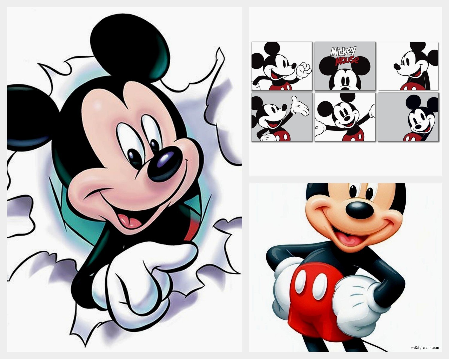
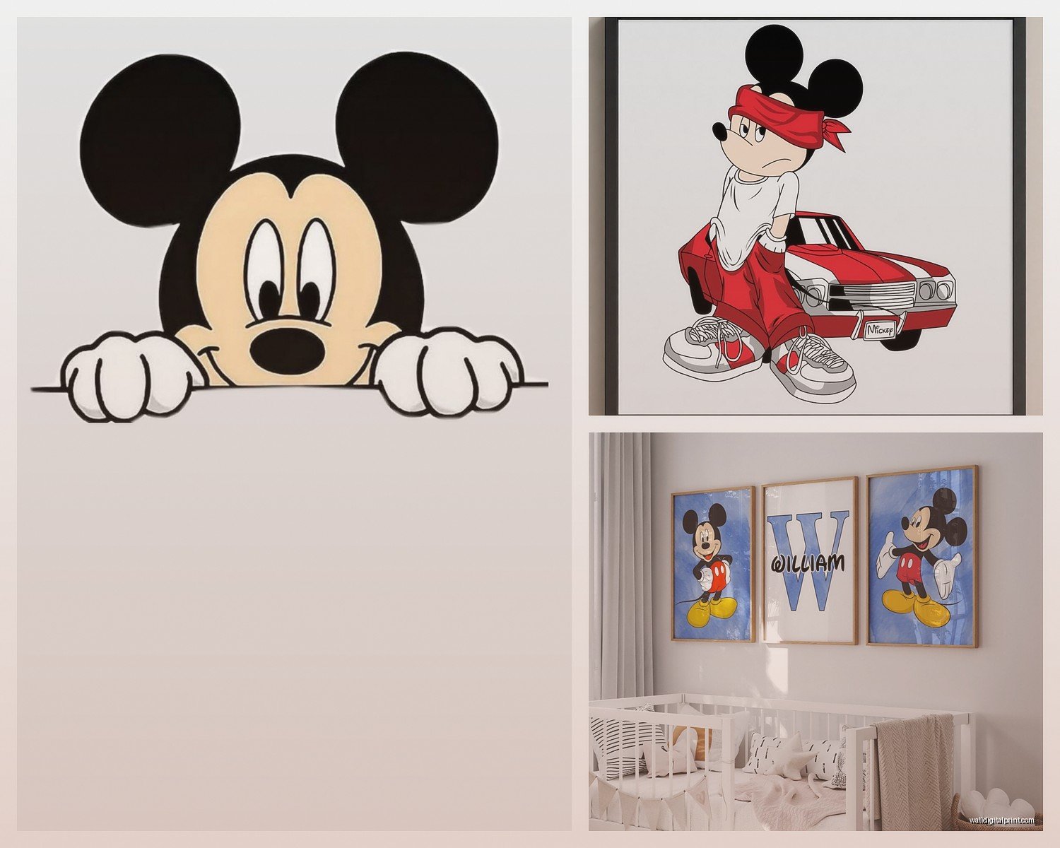
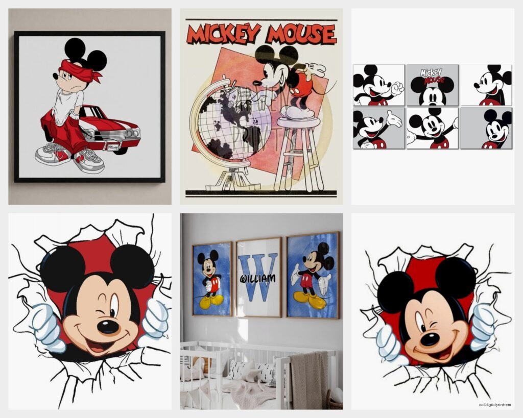
Okay so here’s where it gets interesting. You’ve basically got two camps with Mickey art. There’s the vintage steamboat Willie style stuff—black and white, super graphic, kinda looks like it belongs in a gallery? And then there’s the modern colorful Mickey that’s more playful. I actually have both in my own place because apparently I can’t make decisions.
The vintage route is stupidly easy to style. Black frames, white mats, done. I picked up three different Mickey prints from this Etsy shop (I’ll get to online shopping in a sec) and they’re all 1920s-1930s era designs. Hung them in my hallway and people genuinely ask if they’re “real” art. Which, I mean, they are? But you know what I mean. They don’t immediately scream Disney. More like… cool graphic design that happens to feature a mouse.
Where to Actually Buy This Stuff
Target has surprised me recently. Their Project 62 line did a Disney collab that was actually good? Not sticky-sweet, just clean designs. I got a canvas print there for like $40 that’s holding up really well. The colors haven’t faded even though it’s near a window which, honestly I was skeptical about.
Etsy is gonna be your goldmine for vintage prints. Search for “vintage Mickey Mouse poster” or “steamboat Willie art” and you’ll fall down a rabbit hole. Just watch out because some sellers are literally just printing stuff from Google Images which… legal gray area aside, the quality is hit or miss. Look for sellers with tons of reviews that specifically mention print quality.
Oh and another thing—Society6 and Redbubble let artists sell their interpretations of Mickey. Some of them are WILD. Like abstract, or mid-century modern style, or mixed with other art movements. I bought this one that’s Mickey in the style of Matisse cutouts and it’s in my office and clients always comment on it.
Size Matters More Than You Think
This is gonna sound obvious but I’ve messed this up so many times. That print that looks perfect on your laptop screen? It’s gonna look like a postage stamp on your actual wall.
For above a couch or bed, you want something at least 24×36 inches. Or a gallery wall situation with multiple pieces. I learned this the hard way when I hung a 16×20 above my friend’s couch and we both stood there like “…this looks sad.”
Single large statement pieces work great in dining rooms or as a focal point. I did a 40×60 inch Mickey canvas in a client’s breakfast nook (painted it this deep navy color first which made the red and black pop) and it completely transformed the space.
The Gallery Wall Approach
Okay so if you’re doing multiple pieces, odd numbers look better. Three, five, seven. I don’t know why, it just does. My go-to formula is:
- One large central piece (like 16×20)
- Two medium flanking pieces (11×14)
- Two or four smaller accent pieces (8×10 or 5×7)
Start with the center piece at eye level (which is like 57-60 inches from the floor to the center of the frame). Then build around it. And for the love of everything, lay it out on the floor first. Take a picture. Live with that picture for a day. THEN commit to putting holes in your wall.
I use those Command picture hanging strips for smaller frames because my landlord already hates me and also I change my mind every three months about what should go where.
Mixing Mickey with Your Existing Decor
This is where people get nervous. Like, how do you put Mickey Mouse in your very adult minimalist apartment without it looking like a kindergarten classroom?
Black and white photography plus vintage Mickey prints? *Chef’s kiss.* They play really well together. I’ve got family photos in black frames next to my steamboat Willie prints and it just… works. The key is keeping the frames consistent.
If your style is more bohemian, those colorful modern Mickey pieces actually fit great. Mix them with plants, woven wall hangings, maybe some abstract art. The playfulness matches the eclectic vibe.
For modern/contemporary spaces, go abstract. There are artists doing minimalist line drawings of Mickey that are basically just a few curved lines and circles but your brain immediately sees Mickey. Super sophisticated. I saw one that was just black lines on cream canvas—$200 but worth it for the right space.
Color Coordination Is Your Friend
Mickey’s color palette is pretty simple. Red, black, white, yellow. If your room already has these colors, you’re golden. If not, you gotta decide if you want Mickey to be the accent or if you’re building around him.
I did a whole bedroom in gray and white, then added one large Mickey print with those classic colors. It became the only bright spot in the room and it totally worked. But I’ve also seen rooms where someone pulled the red from Mickey and used it in throw pillows, a rug, curtains… made it cohesive.
Wait I forgot to mention—there’s this thing happening with Mickey in unexpected colors. Like, all navy. Or blush pink. Or metallics. If the traditional colors feel too primary-school, look for recolored versions. I found a rose gold Mickey silhouette that I’m low-key obsessed with.
DIY Options If You’re Crafty
My cat knocked over my coffee while I was working on this one but—vinyl decals are surprisingly not-tacky if you choose the right design. Walmart and Amazon have tons. I put a simple Mickey silhouette on a client’s nursery wall, like 3 feet tall, just in matte black. Looked custom. Cost $15.
You can also buy Mickey stencils and paint directly on the wall. This works especially well if you’re doing an accent wall situation. One coat of paint in your base color, then stencil Mickey in a contrasting color. I’ve seen this done in mudrooms and laundry rooms where you want it fun but not precious.
Oh and those wooden cutouts from craft stores? You can get Mickey shapes, paint them however you want, and mount them as 3D wall art. I did this in metallic copper for someone’s home office and it was unexpectedly chic.
Framing Choices That Don’t Suck
Michael’s and Hobby Lobby always have frame sales. Like always. 40-50% off. Stock up then.
For vintage prints, I almost always use black frames with white mats. It’s classic for a reason. Makes the image pop and works with any decor style.
Modern colorful prints look good in natural wood frames. Or white frames if your walls are darker.
Floating frames (the kind where the art seems suspended in the frame) are great for canvas prints or if you want something more contemporary.
And if you’re hanging multiple pieces, seriously just buy them all at the same time from the same place. Trying to match black frames from different stores is a nightmare. They’re never quite the same black.
Kid Rooms vs Adult Spaces
Obviously Mickey works in kids rooms but like, you already knew that. What’s interesting is how you can make it grow with them.
Instead of the super cartoonish baby Mickey stuff, go for cleaner designs. Geometric Mickey. Silhouettes. Vintage poster reproductions. Stuff that a teenager won’t immediately hate.
I did a kid’s room with a whole timeline of Mickey—earliest designs to current. Made it educational almost? The kid’s 8 and super into it. Each print has a little label with the year. Might be too extra for most people but it worked.
For adult spaces, lean into the nostalgia but make it sophisticated. Like I said before, the vintage route is easiest. But also consider Mickey as part of a larger pop culture or animation art collection. Mix him with other classic characters or animation cells or comic art. Creates context.
The Bathroom Thing
This is gonna sound weird but Mickey art in bathrooms is having a moment? Powder rooms especially. It’s unexpected and playful and guests always mention it. Just make sure you’re using prints that can handle humidity or frame them properly with sealed backs.
I put a tiny Mickey print (like 4×6) in my powder room in a thick frame and it makes me smile every time. Cost maybe $10 total.
Lighting Considerations
Direct sunlight will fade prints over time. If you’re putting Mickey art opposite a big window, either use UV-protective glass in the frame or accept that you might need to replace it eventually.
Picture lights are worth it for larger pieces. Those little LED ones that mount above the frame? They make such a difference at night. I installed one above a client’s big Mickey canvas and it became this cool focal point after dark.
Also, if you’re doing a gallery wall, make sure there’s enough ambient light that you can see all the pieces. I’ve seen people create beautiful arrangements that are half in shadow and it’s such a waste.
Seasonal Rotation Thing
Okay so this might be just me being extra but I have a few different Mickey prints and I swap them out seasonally. Halloween Mickey in October, vintage winter Mickey around Christmas, bright colorful ones in summer. It’s an easy way to refresh a space without redecorating entirely.
You can store the off-season prints under beds or in closets. Just wrap them in paper or bubble wrap so they don’t get damaged.
The other option is having a few spots around your house where you rotate different art. Like, my entryway gets different prints throughout the year. Keeps things interesting and lets me justify buying more art which… yeah.
What Actually Works in Different Rooms
Living room: Go big or go gallery wall. This is where you can make a statement. Vintage or sophisticated modern designs work best.
Bedroom: More personal here. Either romantic vintage Mickey or softer color palettes. Above the bed or on the wall opposite.
Kitchen: Smaller pieces or a series. I’ve seen cute Mickey prints in retro kitchen scenes that fit perfectly. Or just a simple silhouette.
Home office: Playful but not childish. Abstract Mickey or vintage posters. Something that sparks joy during Zoom calls but doesn’t look unprofessional.
Hallways: Perfect for gallery walls or a series of coordinating prints. You’ve got the wall space and people actually look at walls in hallways.
Just avoid putting anything too precious in high-traffic areas where it might get bumped or damaged. Learned that one the hard way.
Honestly the main thing is just to start. Grab one piece you love and see how it feels. You can always add more or switch it out. Mickey’s been around for almost 100 years at this point—there’s a version that’ll work for basically any style if you look hard enough.