Wall Art Guide, Wall Art Tutoriels
Bathroom Rules Wall Art: Humorous Bath Etiquette Signs
Jul
So I’ve been obsessed with bathroom rules wall art lately and honestly it started because a client asked me to “make their guest bathroom less boring but not too fancy” and I went down this rabbit hole of humorous etiquette signs that actually work really well.
The thing is, you gotta pick the right vibe or it comes off trying too hard. Like those “wash your hands ya filthy animal” signs can be cute in a farmhouse bathroom but feel super forced in a modern minimalist space, you know?
Finding Your Humor Style Without Being Cringey
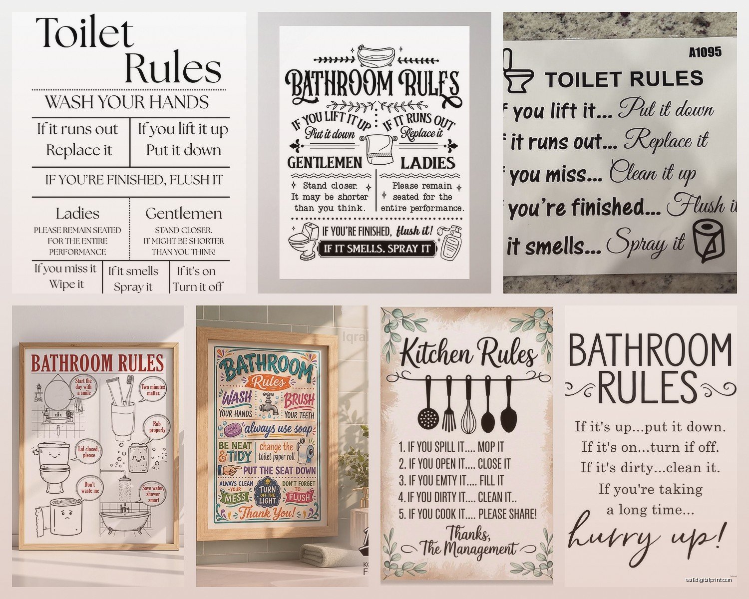
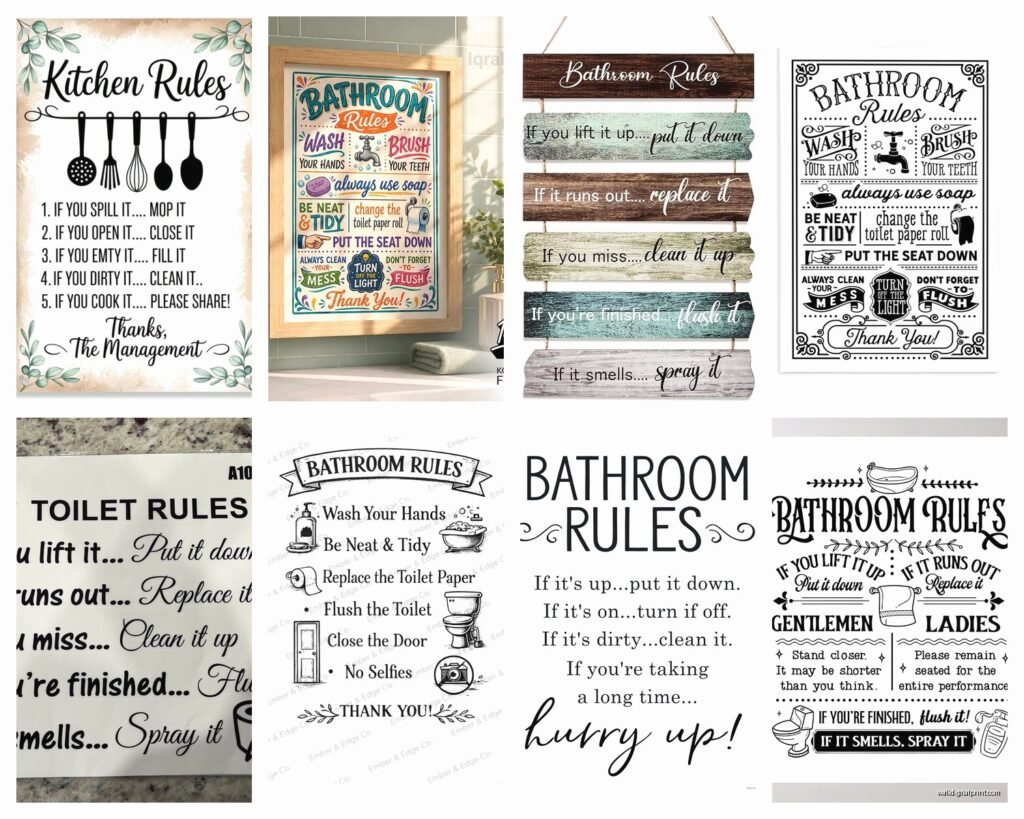
Okay so there are basically three humor categories that actually work. First is the gentle reminder style – think “Please remain seated for the entire performance” or “If you sprinkle when you tinkle, be a sweetie and wipe the seatie.” These are corny but in that dad-joke way that somehow works. I put one in my own powder room and my sister rolled her eyes but I’ve caught her smiling at it.
Then there’s the sarcastic modern vibe which is more like “Bathroom rules: 1. Wash your hands 2. That’s it, that’s the list” or “This is my throne room, act accordingly.” These work better in spaces with clean lines, maybe some black fixtures or industrial touches.
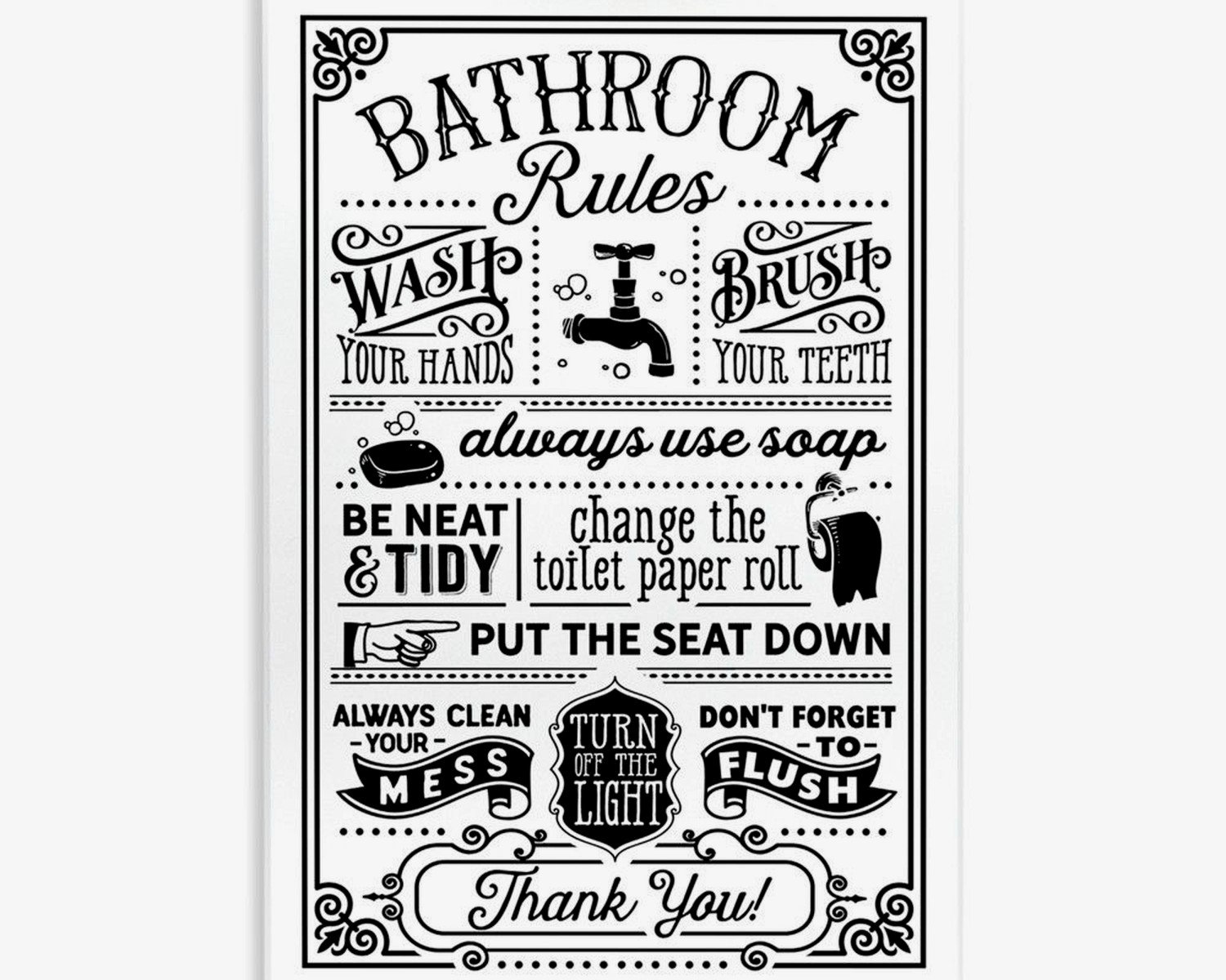
Third category is vintage-inspired which leans into old-timey fonts and phrasing. “Gentlemen will please lift the seat” or “Ladies powder room – freshen up and look fabulous.” These need the right setting though, like if you’ve got any vintage elements going on already.
Where People Actually Mess This Up
The biggest mistake is buying something too big or putting it in the wrong spot. I’ve seen so many bathrooms where there’s this massive sign taking up the whole wall behind the toilet and it’s just… overwhelming? You’re trapped in there staring at giant letters telling you to wash your hands and it feels less funny and more preachy.
Better placement is actually on the side wall if you have space, or that little wall area beside the door. Basically anywhere that’s not directly in your eye line when you’re sitting down for a while, if you know what I mean.
Size-wise I usually go for 8×10 or 12×16 max unless you have a huge bathroom. And honestly most people don’t have huge bathrooms.
Frame Choices That Don’t Look Cheap
Oh and another thing – the frame matters SO much more than you’d think. I learned this the hard way when I ordered these cute signs from Etsy and just stuck them in basic black frames from Target and they looked like dorm room decor.
What actually works is matching your existing bathroom hardware. Got brushed nickel faucets? Look for frames with silver or metallic touches. Oil-rubbed bronze fixtures? Go for dark wood or matte black frames. It sounds fussy but it makes everything look intentional instead of like you just threw up some Pinterest ideas.
Floating frames are actually really good for this stuff if you’re printing on nice cardstock. They give it this modern gallery feel that makes even a silly message look more sophisticated. I use them constantly now.
DIY vs Buying Ready-Made
Okay so funny story, I spent like three hours one night making custom bathroom signs in Canva because I couldn’t find exactly what I wanted. My cat kept walking across my keyboard and at one point I accidentally saved a version that said “Please be seeted” which… yeah. But honestly the DIY route is totally doable if you’re even slightly design-inclined.
Canva has tons of templates and you can customize the colors to match your bathroom exactly. Print at a local print shop on good quality paper or cardstock – not your home printer unless it’s actually good because the colors will look washed out.
But if you’re not into that, Etsy is where it’s at. Search for “bathroom rules printable” and you’ll find thousands. The printable digital downloads are usually like $5-8 and then you just handle printing and framing yourself. Physical prints that ship to you run more like $15-30 depending on size.
Amazon has pre-framed options too which is honestly the easiest route if you just want something quick. The quality is hit or miss though – read the reviews carefully and look at customer photos not just the listing photos.
Actually Funny vs Trying Too Hard
This is gonna sound weird but the best bathroom signs are the ones that make you exhale through your nose in amusement, not full-on laugh. You want that subtle smile reaction, not something so outrageous that guests feel awkward.
Some messages that consistently work well:
- “Wash your hands and say your prayers because germs and Jesus are everywhere”
- “Bathroom occupied? Use the yard” (only works if you have a sense of humor about your space)
- “Get naked, just kidding this isn’t that kind of bathroom”
- “Please don’t do coke in our bathroom” (this one is very dependent on your friend group honestly)
I usually steer clients away from anything too bathroom-function specific because it can get gross pretty fast. Like there’s a line between cheeky and TMI.
Multiple Signs vs Single Statement
You can do a gallery wall thing with bathroom rules but it needs to be a decent-sized bathroom or it looks cluttered. I did this in a client’s master bath where we had this big blank wall – we did five smaller frames in a grid with different rules on each. “Wash” “Brush” “Flush” “Relax” and then one that said “Don’t tell me what to do” which tied the whole thing together with humor.
But in a small powder room? One sign is plenty. Maybe two if they’re really small and you’re creating a specific vignette with other decor.
The gallery wall approach works better when you mix humorous signs with other bathroom-appropriate art too. Like a funny rule sign, a botanical print, maybe a vintage soap advertisement, and a small mirror creates an actually interesting wall instead of being too theme-heavy.
Color Coordination Without Being Boring
Black and white is the safe choice and honestly it usually looks good. But if your bathroom has a color scheme going on, work with it. I’ve done bathroom signs in navy blue for a nautical-ish bathroom, sage green for a more organic spa vibe, even blush pink for a feminine powder room.
The key is keeping the text color high-contrast with the background so it’s actually readable. Light text on dark background or dark text on light background – don’t get fancy with like… yellow on white or something.
And this might be obvious but make sure the colors don’t clash with your towels or shower curtain. I’ve walked into bathrooms where there’s this visual chaos happening because nothing coordinates.
Fonts Matter More Than You Think
Script fonts can work but they’re tricky – they need to be readable from a few feet away. I’ve seen so many elaborate calligraphy signs where you literally can’t read what they say without walking right up to them.
Sans serif fonts (the ones without the little feet) read quickest and work in modern spaces. Serif fonts (with the little decorative bits) feel more traditional or vintage. Slab serif fonts have that retro diner vibe that can be really fun.
Just don’t mix too many fonts if you’re doing multiple signs. Pick two max – maybe one for the main message and one for smaller text or accent words.
Placement Strategy That Actually Works
So beyond just picking a wall, think about the experience. When someone walks into your bathroom, what do they see first? That’s prime real estate for either your funniest sign or your most aesthetically pleasing one.
Above the toilet is classic but make sure it’s high enough that it doesn’t get splashed if you have boys in the house or male guests. I usually go at least 12 inches above the tank.
Beside the mirror works well for smaller signs, especially ones about washing hands or looking good. Behind the door is another option that people forget about – it’s the last thing guests see before they leave so a “thanks for not peeing on the floor” type message can be funny there.
If you have open shelving, you can actually lean a small framed sign on a shelf among your pretty bathroom stuff. This works better than hanging sometimes because it feels more casual and intentional.
Rental-Friendly Options
Command strips are your friend if you can’t put holes in walls. Get the picture hanging ones rated for the weight of your frame – I usually go one size up from what they recommend just to be safe.
You can also use those adhesive picture rails that stick to the wall and let you hang frames without nails. They’re pretty invisible once the frame is up.
Leaning art is having a moment too. If you have a ledge or the back of your toilet is flat enough, just lean a frame there. Put something slightly grippy underneath like a thin cork pad so it doesn’t slide around.
Keeping It Fresh Without Constant Changes
The cool thing about bathroom signs is they’re small enough and inexpensive enough that you can rotate them seasonally if you want. I keep a little collection and swap them out when I’m bored – my partner thinks I’m nuts but whatever, it makes me happy.
Holiday versions can be fun too. “All I want for Christmas is a clean bathroom” or “Spring cleaning starts here” – just don’t leave them up all year or they lose impact.
But honestly a good neutral funny sign can stay up for years. I’ve had “Please remain seated during the entire performance” in my powder room for like three years now and it still makes me smile.
When to Skip the Humor Entirely
Real talk – some bathrooms are too nice for funny signs. If you’ve invested in really high-end finishes and fixtures and the whole space feels like a spa, a humorous bathroom rule sign might actually cheapen the look. In those cases, go for actual art or just a really beautiful mirror.
Also if you’re trying to sell your house, I’d probably take down anything too sarcastic or specific to your sense of humor. Neutral botanical prints are safer for staging.
And if you’re doing a bathroom reno for aging parents or anyone with cognitive issues, clear straightforward signs without humor are actually more helpful than funny ones.
Budget Breakdown From Someone Who’s Done This Too Many Times
Cheapest route is printing your own and using a frame you already have – basically free to $5 for printing.
Next level is Etsy printable plus decent frame – $20-35 total.
Pre-framed from Amazon or similar – $25-50 depending on size and quality.
Custom from a local artist or high-end Etsy shop – $50-150.
Honestly for most bathrooms the middle options are perfect. Save your money for the rooms people spend more time in.
Wait I forgot to mention – check HomeGoods and TJ Maxx if you’re near one. They randomly get bathroom signs and the quality is usually pretty decent for like $12.99. I’ve found some gems there that I’ve used in client projects.
The vintage stores sometimes have actual old bathroom signs too which can be really cool if they’re in good shape. Just make sure they’re not falling apart or smell weird because bathroom humidity will make that worse.
Anyway that’s basically everything I’ve learned from way too many hours thinking about bathroom wall art. Pick something that makes you smile, make sure it actually fits your space and style, and don’t overthink the rest.