
Wall Art Guide, Wall Art Tutoriels
Cloud Wall Art: Sky Weather Fluffy Dreamy Designs
Jul
So I’ve been obsessing over cloud wall art lately because honestly, after working with three different clients who all wanted “something calming but not boring” I realized clouds are like… the perfect solution nobody thinks about first.
Let me just dump everything I know because I literally spent my entire Saturday testing different cloud pieces in my studio space when I should’ve been watching that new Netflix series everyone’s talking about.
The Main Categories You’re Gonna See
Okay so cloud art basically breaks down into a few types and you gotta know which vibe you’re after before you start buying random stuff on Etsy at midnight like I did last month.
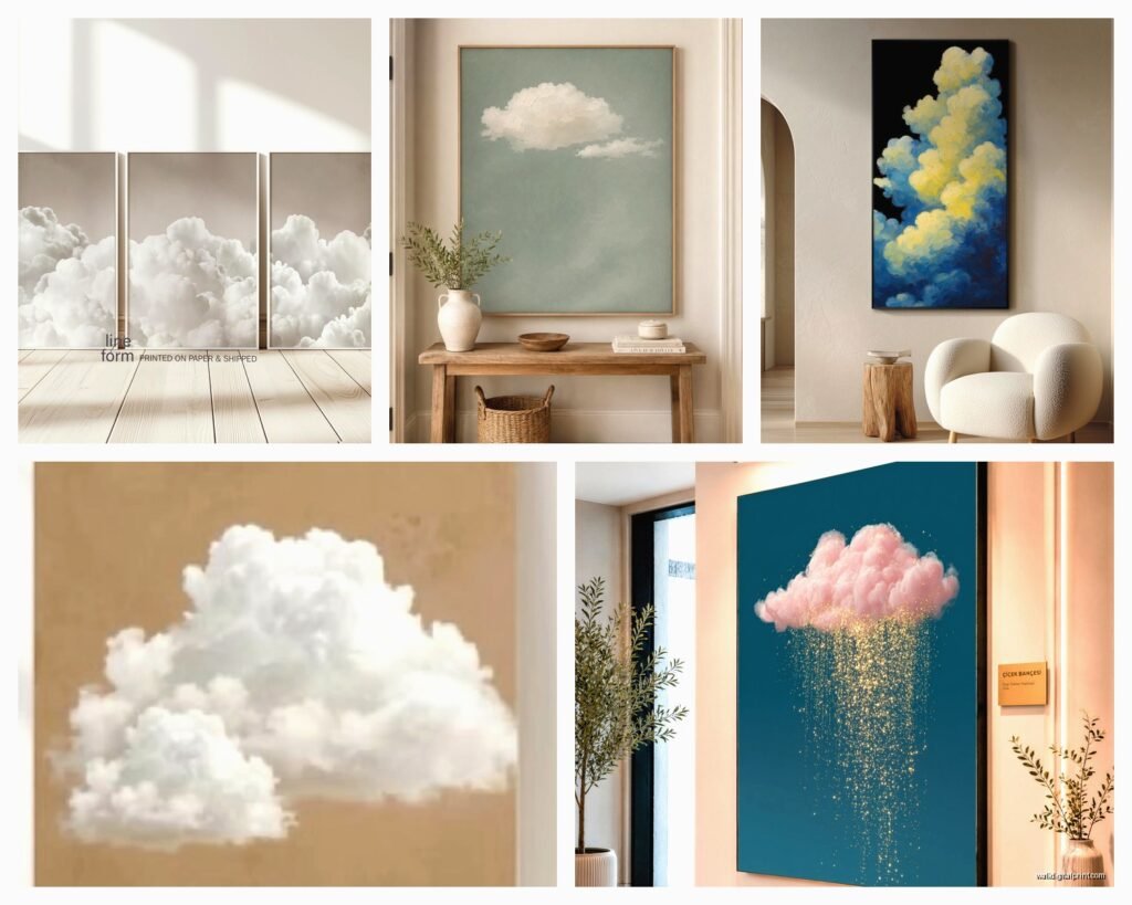
There’s the photographic prints which are actual sky photos. These work amazing in modern spaces or anywhere you want that real, grounded feeling. I used a set of three stormy cloud photos in a client’s home office and she literally texts me every few weeks about how much she loves them. The trick with photos is getting high resolution ones because nothing looks cheaper than a pixelated cloud when you’re standing close to it.
Then you’ve got the watercolor style which is where my heart lives honestly. These are soft, dreamy, usually in pastels or that trendy dusty blue everyone wants right now. Perfect for nurseries obviously but also… I put a massive watercolor cloud piece in my bedroom and it’s not childish at all. It’s about the frame and the scale.
Abstract interpretations are the ones that just suggest clouds without being literal. Think brushstrokes, minimal lines, sometimes mixed with gold leaf or geometric elements. These are your safest bet if you’re worried about things looking too themed or kitschy.
Colors That Actually Work in Real Rooms
This is gonna sound weird but the color of your clouds matters WAY more than the style sometimes.
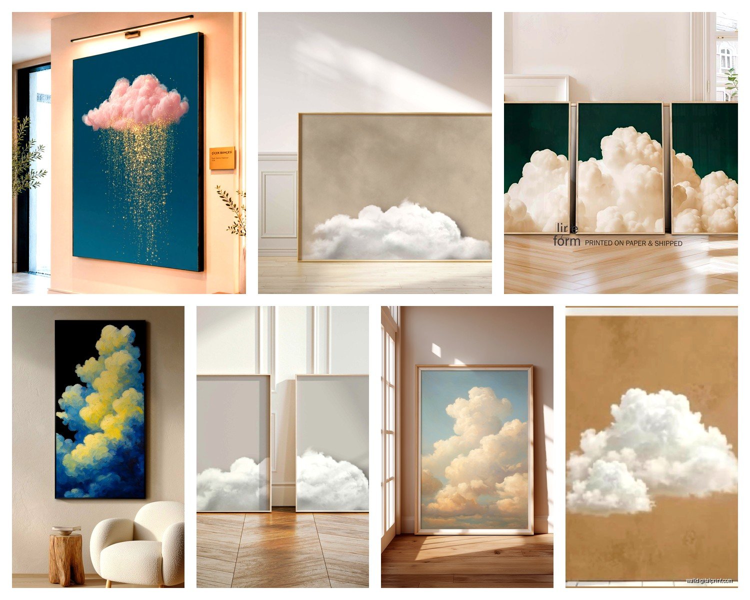
Gray and white clouds are the most versatile and I always recommend starting here if you’re unsure. They read as neutral but add visual interest. I’ve used charcoal storm clouds in spaces with blush pink accents, with emerald green furniture, with warm wood tones… they just work. The depth comes from the different shades of gray, not from adding a bunch of colors.
Blue-toned pieces are what most people gravitate toward first and yeah they’re beautiful but you gotta be careful. That sky blue can clash with cooler grays or look too matchy-matchy if your room already has blue elements. I learned this the hard way in my own living room where I had blue clouds, blue pillows, blue rug and it all just… melted together in the most boring way.
Sunset clouds with pinks, oranges, purples are gorgeous but they’re a statement. You’re committing to a mood with these. I curated a whole gallery wall of sunset cloudscapes for a client’s dining room and it’s stunning but that room is now The Pink Room, you know? Everything else has to work around those warm tones.
Oh and another thing, white clouds on white or cream backgrounds are having a moment right now. Super subtle, textural, almost sculptural looking. These only work if you’ve got good natural light though, otherwise they just disappear into the wall.
Size and Placement That Won’t Look Awkward
I measured like fifteen different walls last week trying to figure out the formula for this and here’s what I’ve got.
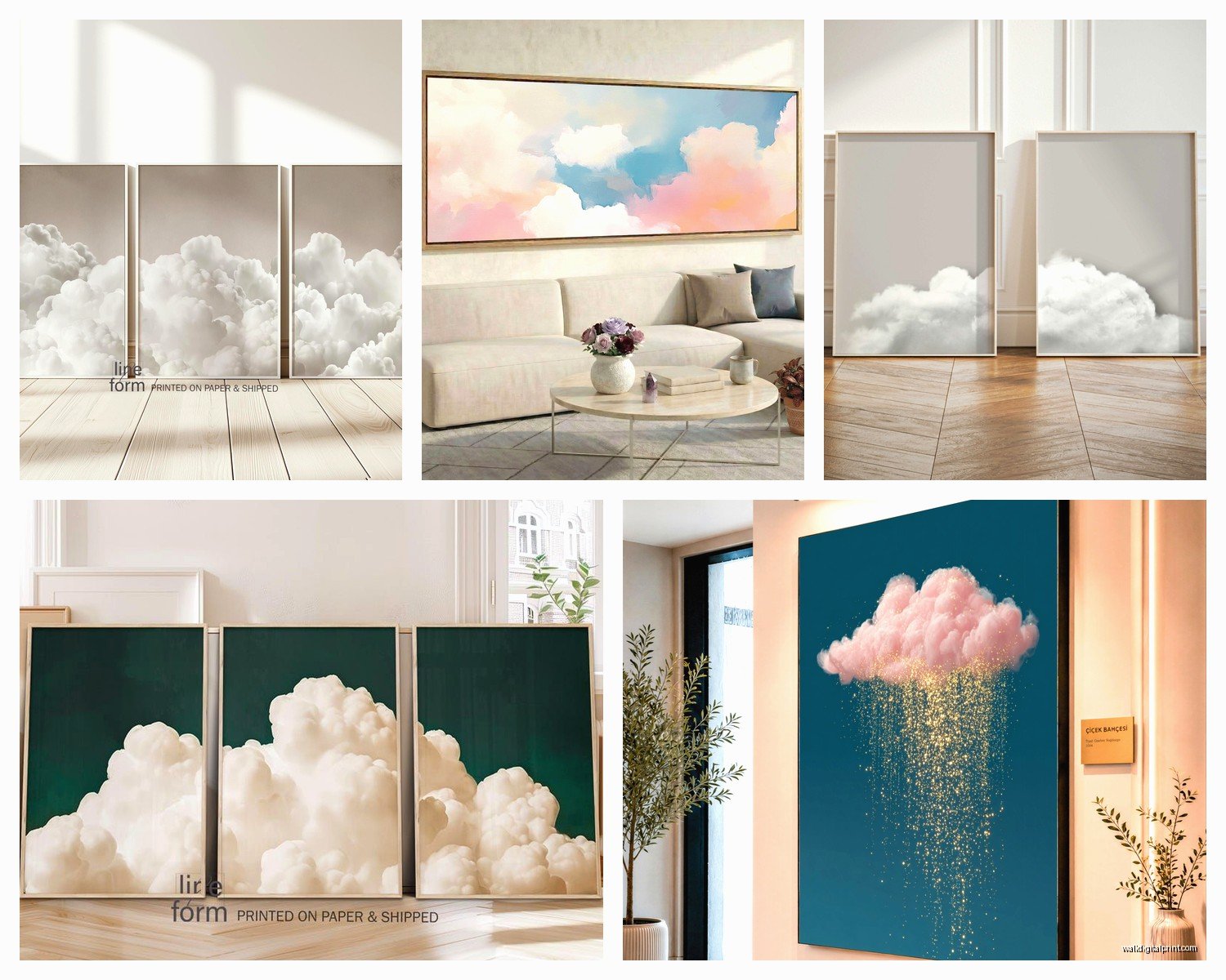
For above a bed or sofa, you want your cloud art to be roughly two-thirds the width of the furniture. So if your bed is 60 inches wide, you’re looking at a 40-inch piece or a grouping that spans about that width. I see so many people buy these tiny 16×20 prints and hang them above a king bed and it just floats there looking lost.
Gallery walls of smaller cloud photos work really well but you need at least 6-9 pieces to make an impact. I did a set of nine different cloud formations, all black and white photos in simple black frames, arranged in a grid. It’s in my portfolio and people ask about it constantly. The grid needs to be tight though, like 2-3 inches between frames max, or it looks disconnected.
Horizontal orientations feel more peaceful and expansive. Vertical pieces add height and drama. I know that sounds obvious but I’ve watched people hang a tall vertical cloud painting in a room with low ceilings and it just emphasizes the problem instead of helping it.
Spots That Always Work
Bedrooms are the obvious choice and yeah, they’re perfect there. Something about clouds just makes sense when you’re trying to sleep or wake up. I’ve got a dreamy pastel piece above my bed right now and honestly my cat sits and stares at it sometimes which is either very zen or very weird.
Bathrooms are underrated for cloud art. Think about it, you want that spa feeling, clouds give you sky and openness. I used a large cloud photograph in a windowless bathroom and it completely changed the energy. Just make sure you’re using proper glass or acrylic covering if there’s shower steam involved.
Hallways and stairwells are where I use cloud art when I wanna create flow through a space. A series of cloud images leading up the stairs feels like you’re ascending through layers of sky. Sounds cheesy when I write it out but it genuinely works.
Frame Choices That Won’t Ruin Everything
Okay so funny story, I once spent $400 on this gorgeous custom cloud painting and then put it in a $15 poster frame from Target and my friend was like “did you print that yourself?” So yeah, frames matter.
Floating frames where there’s a gap between the art and the frame work beautifully with cloud art because they add literal dimension and depth. It enhances that airy feeling. I use these for watercolor pieces especially.
Simple wood frames in light oak or white-washed finishes keep things feeling natural and soft. They don’t compete with the clouds. I probably use light wood frames for 60% of my cloud art installations because they’re just easy and they work with everything from Scandinavian to coastal to modern farmhouse styles.
Black frames make cloud art more graphic and bold. This is what I use when I want the clouds to feel more like a statement piece than a soft accent. Black frames with white mat boards around cloud photos create this really crisp, gallery-quality look that’s perfect for modern or minimalist spaces.
No frame at all, just mounted canvas, works if you’re going for that contemporary vibe. The clouds wrap around the edges of the canvas. I’m less excited about this option honestly because it can look unfinished, but I’ve used it successfully in casual spaces like family rooms or kids’ playrooms.
Mixing Cloud Art With Other Stuff
You don’t have to make your whole wall about clouds, and actually you probably shouldn’t.
I love mixing cloud pieces with botanical prints. The nature connection makes sense and the combination of sky and earth elements creates balance. Did this in a bedroom recently with three cloud photos on one wall and large leaf prints on the adjacent wall. Felt cohesive without being matchy.
Abstract art works well with clouds because you’re playing with similar concepts of color and form without being too literal. A geometric abstract piece next to a soft watercolor cloud creates this nice tension between structure and dreaminess.
Text or quote prints can work but you gotta be careful it doesn’t get too Pinterest-y. I used a simple “breathe” print in minimal typography alongside cloud photography for a meditation space and it worked, but I probably wouldn’t go much cheesier than that.
Where to Actually Buy This Stuff
Since I’ve wasted money on some really disappointing purchases, lemme save you the trouble.
Etsy is great for unique watercolor clouds and custom pieces. I’ve found amazing independent artists there. The downside is shipping times can be all over the place and quality varies wildly. Always read reviews and look at photos from actual buyers, not just the listing photos.
Society6 and Minted have good cloud art options with the advantage that you can order the same image in different sizes and formats. I use these when clients need something specific but don’t have a huge budget for original art. The printing quality is consistently good.
Local art fairs and markets are where I’ve found some of my favorite cloud pieces honestly. There’s something about seeing the texture and colors in person. Plus you can talk to the artist about custom sizing or colors.
Photography websites like 500px or even Instagram can connect you directly with photographers who shoot cloudscapes. I’ve commissioned a few pieces this way and the artists are usually happy to sell you print rights or make prints for you.
The DIY Route If You’re Feeling Ambitious
Wait I forgot to mention, you can totally make your own cloud art and it’s not as hard as you’d think.
Watercolor clouds are the easiest because the medium is naturally soft and forgiving. Wet the paper, drop in blues and grays, let them blend. You literally cannot mess this up in a way that doesn’t look intentional. I did this with my niece one afternoon and her “clouds” are hanging in my studio bathroom right now.
Photography is obvious if you’ve got a decent camera or even a good phone. Just look up. I’m serious, some of my favorite cloud shots were taken on my iPhone during my evening walks. The trick is editing them well afterward, bumping up contrast and playing with the tones until they feel artistic rather than just like… a snapshot.
Acrylic pouring creates these amazing abstract cloudy effects. You layer white, gray, and blue acrylics and let them flow together. Very trendy right now and honestly pretty fun even though it’s messy as hell. Did this in my garage last summer and still finding paint splatters.
Common Mistakes I See All the Time
Using only one small cloud print in a large room. It’s gonna look like an afterthought. Go bigger or go with multiple pieces. Scale matters so much more than people realize.
Matching your cloud colors exactly to your decor. A little contrast is good, it creates depth. All-blue everything is just… flat.
Hanging cloud art too high. The center of the piece should be at eye level, which is usually around 57-60 inches from the floor. I see people mounting things way up near the ceiling and it’s like, why? You’re not creating sky, you’re creating neck pain.
Forgetting about lighting. Cloud art needs good light to show the subtle tones and variations. I always add picture lights or make sure there’s ambient lighting that highlights the pieces, especially for darker storm cloud imagery.
Choosing super busy cloud scenes with too much detail. Sometimes simplicity is what makes cloud art work. A few soft clouds on a gradient background can be more impactful than a photo of an entire dramatic storm system.
Making It Work Long-Term
The thing about cloud art is it shouldn’t feel trendy even though it’s having a moment right now. I’ve had cloud pieces in my rotation for like five years and they still feel current because they’re based on something timeless.
Stick with more neutral or classic color palettes if you want longevity. Those millennial pink sunset clouds might feel dated in a couple years, but gray storm clouds or soft white cumulus formations aren’t going anywhere.
Invest in good quality printing and framing for pieces you really love. I’m still mad about a cloud photograph I loved that I got printed cheap and it faded within a year. UV-protective glass is worth it.
Rotate your cloud art seasonally if you want variety. I keep stormy dramatic pieces for fall and winter, lighter airier clouds for spring and summer. Sounds extra but it keeps things feeling fresh without buying new furniture or repainting.
Anyway that’s basically everything I know about cloud wall art from actually using it in real spaces rather than just pinning pretty pictures. The main thing is just to trust your gut on what feels calming versus what feels too cutesy or generic. You’ll know it when you see it.
