Wall Art Guide, Wall Art Tutoriels
Lavender Wall Art: Purple Flower Field Provence Decor
Jul
So I’ve been kinda obsessed with lavender wall art lately and honestly it started because a client wanted to recreate this Provence vibe in her bedroom but didn’t have the budget to actually GO to Provence, you know? And I went down this whole rabbit hole of purple flower field prints and now I have like…way too many opinions about this.
Why Lavender Art Actually Works (When It Doesn’t Look Cheesy)
Okay so the thing about lavender field art is it can go really wrong really fast. Like, it can look either super sophisticated or like a hotel lobby circa 2005. The difference is basically in the saturation and the composition. I learned this the hard way after ordering three different prints that all looked COMPLETELY different than their online photos.
The prints that actually work have these muted purples, not that bright purple that screams “I bought this at HomeGoods.” You want those dusty lavender tones, maybe with some sage greens mixed in. The fields should look a bit hazy, almost like there’s that golden hour light filtering through. My dog knocked over my coffee on one of my sample prints last month and honestly I wasn’t even that mad because it was the oversaturated one that wasn’t working anyway.
Size Matters More Than You Think
This is gonna sound weird but I’ve noticed that lavender field art needs to be either really big or in a set. A single small lavender print just looks…lonely? Like it’s trying too hard. I did a bedroom last year where we went with a massive 40×60 canvas of lavender rows and it completely transformed the space. But then in my own hallway I did three smaller 16×20 prints in a row and that worked too.
The mistake people make is getting like one medium 24×36 print and centering it on a big wall. It just floats there awkwardly. Either go big or do a gallery wall situation with multiple pieces.
Different Styles You Can Actually Find
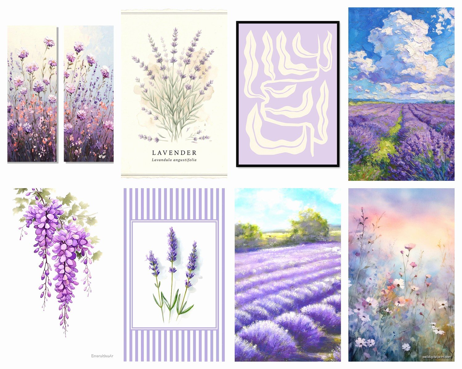
The Classic Provence Row Shot
These are the ones with those perfect purple rows stretching to the horizon. Super geometric, very satisfying if you’re into symmetry. I use these in bedrooms a lot because there’s something calming about those repeating lines. The best ones have a slight aerial perspective, not completely from above but elevated enough that you see the pattern.
What to look for: the rows should fade into a soft horizon, ideally with some French countryside elements in the background. A distant farmhouse, some cypress trees, whatever. Just not a pure field shot with nothing else because that can read as too agricultural somehow?
Close-Up Lavender Blooms
These are more abstract and honestly I think they’re easier to work with in modern spaces. You get the purple color story without being so literal about the “Provence farmhouse” thing. I’ve mixed these with gold frames in contemporary spaces and it totally works.
The trick with close-ups is making sure there’s still some depth and texture. Flat purple isn’t interesting. You want to see the individual flower spikes, maybe a hint of stems, some variation in the purple tones from light to dark.
Watercolor or Painted Versions
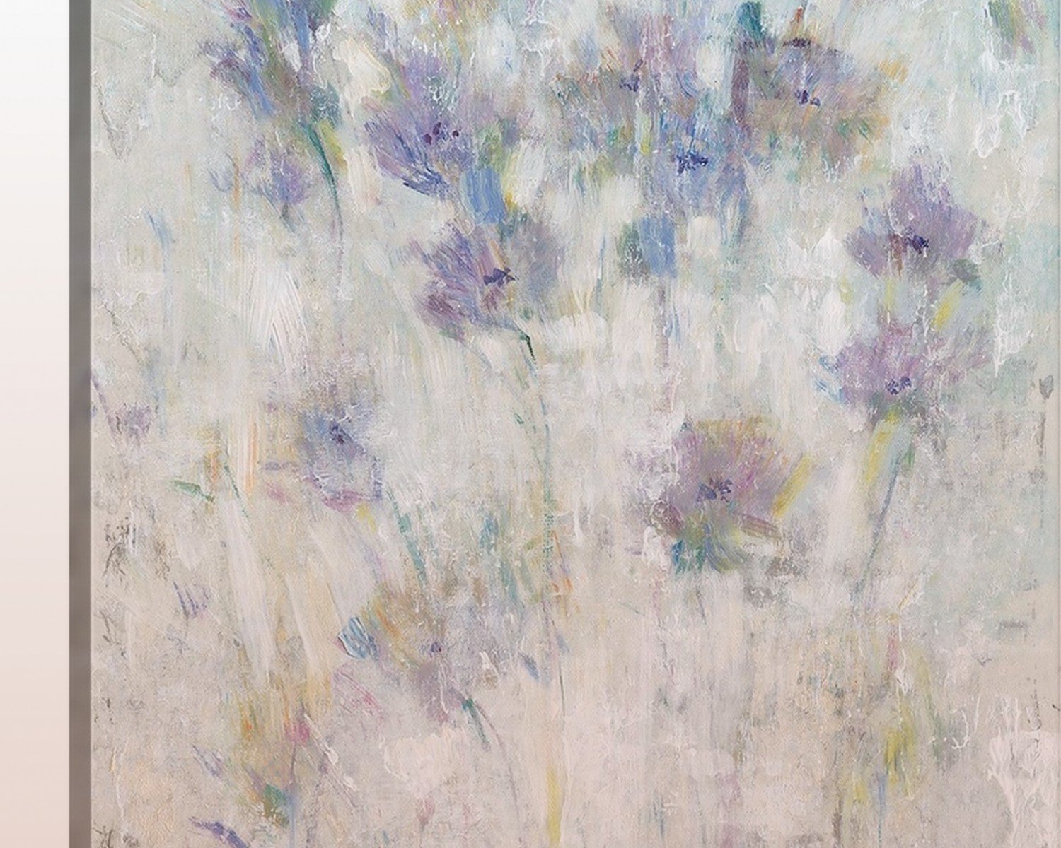
Okay so funny story, I was super skeptical about painted lavender art because I thought it would look too crafty. But then I found this artist on Etsy who does these loose watercolor lavender fields and they’re actually gorgeous. The key is that they’re NOT detailed. Loose brushstrokes, lots of white space, very impressionistic.
These work really well in spaces where a photograph might feel too heavy or serious. Like a bathroom or a nursery or something. Just make sure it’s actually painted with skill and not like…someone’s first attempt at watercolors.
Color Combinations That Don’t Suck
This is where people mess up constantly. They see purple flowers and think “I’ll add purple pillows and purple curtains and purple everything!” No. Stop.
Lavender art works best with:
- Soft whites and creams – this is the obvious one but it really does work
- Warm grays and taupes – creates that French countryside neutral thing
- Sage green and eucalyptus tones – pulls from the foliage in the actual lavender fields
- Warm terracotta – okay this one surprised me but it’s SO good with lavender art
- Soft buttery yellows – like that Provence sunlight
- Natural wood tones – walnut, oak, whatever
Colors to avoid pairing with it:
- Bright purple anything – too matchy
- Cool grays – makes the whole thing feel cold and sad
- Stark black frames unless you’re going for a very modern look
- Hot pink or fuchsia – I’ve seen this attempted and yikes
I did a living room last spring where we had a huge lavender field canvas and I brought in these terracotta planters and linen curtains in this oatmeal color and it was *chef’s kiss*. The client wanted to add purple throw pillows and I had to physically stop her.
Frame Choices That Actually Matter
So I spent way too long comparing frame options when my client canceled one day and here’s what I figured out. Gold frames make lavender art feel more traditional and French countryside. But like, brushed gold or antique gold, not shiny brass. Shiny brass looks weird with the soft purple tones.
Natural wood frames in lighter finishes (oak, maple, natural pine) keep it casual and approachable. This is what I’d do in a bedroom or casual space. Dark walnut frames make it feel more sophisticated and formal – good for a dining room or office.
White frames can work but they need to be the RIGHT white. Warm white, not stark white. And honestly? I think white frames are kinda boring with lavender art. You’re not adding anything to the conversation.
Black frames are tricky. They can look amazing in a modern space with lots of white walls and contemporary furniture. But in a traditional or farmhouse space they can feel too harsh against the soft lavender tones.
wait I forgot to mention – floating frames (where there’s a gap between the art and frame) are really nice with lavender photography because it adds dimension and makes it feel more gallery-like. I used these in a client’s entryway and people always comment on them.
Where to Actually Hang This Stuff
Bedrooms – The Obvious Choice
Yeah it’s obvious but it works. Lavender is supposed to be calming or whatever, so bedrooms make sense. I usually put a large lavender field print above the bed, but here’s the thing – don’t hang it too high. I see this all the time. It should be like 6-8 inches above your headboard, not floating near the ceiling.
If you’re doing a gallery wall around the bed, mix the lavender art with some neutral abstract pieces or maybe some French botanical prints. Don’t make it all lavender fields or it becomes a theme bedroom in a bad way.
Bathrooms – Better Than You’d Think
Okay this is gonna sound weird but lavender art is amazing in bathrooms, especially if you’re going for that spa-like feel. The purple tones work with white subway tile, marble, all that stuff. I did a powder room with a small lavender field print and some eucalyptus in a vase and it felt so much more elevated than before.
Just make sure you get a print that’s properly sealed or behind glass because humidity and all that.
Living Rooms and Dining Rooms
This is where you gotta be more careful because lavender art can feel too soft or feminine for a main living space if you don’t balance it right. I usually pair it with more substantial furniture, maybe some leather or dark wood, to keep it from feeling too precious.
In a dining room, a large lavender field landscape can be really stunning above a sideboard. It adds color without being aggressive about it. Just don’t put it where food smells will hit it constantly – I learned that one the hard way with a client who grilled fish like every night.
Home Offices
Actually works better than you’d expect. The calming purple tones are nice when you’re staring at a screen all day. I have a small lavender print in my own office and my cat loves to sit on the desk below it for some reason, like she’s guarding it or something.
Print vs Canvas vs Framed Photography
So I’ve tested all three options and here’s my honest take:
Canvas prints are the most forgiving. They hide imperfections, they don’t need a frame (though you can add one), and they have this casual gallery vibe. The texture of canvas actually works nicely with lavender fields because it adds to that painterly, romantic feel. Just avoid the super thick gallery wraps that stick out like 2 inches from the wall – they’re trendy but kinda dated already.
Paper prints need to be framed obviously, but they can look more sophisticated if you do it right. The detail is usually sharper than canvas. I prefer this for close-up lavender shots where you want to see texture. Get them professionally matted though – those pre-made frames with the standard white mat look cheap.
Framed photography (like actual photo prints) is the most expensive but looks the most high-end. If you’re investing in one really good piece, this is the way to go. The color depth is better, the quality is better, everything is better. But you’re gonna pay for it.
oh and another thing – if you’re buying online, which let’s be real you probably are, check if they offer samples. Some places will send you a small test print for like $10 so you can see the actual colors before committing to a huge canvas. I wish I’d known this before ordering that oversaturated purple disaster.
Avoiding the Clichés
Look, lavender wall art can easily tip into cliché territory. Here’s how to keep it from looking like every other “Live Laugh Lavender” situation:
Skip any prints with words on them. No “Provence,” no French quotes, no “lavande” typography. Just no. Let the image speak for itself.
Avoid the super filtered, heavily edited versions that look like someone cranked up the saturation and added a sunset filter. Natural, realistic colors are where it’s at.
Don’t pair it with other super obvious French country decor. Like, you don’t need the lavender art AND the Eiffel Tower print AND the French cafe menu poster. Pick one theme element and keep everything else more neutral.
Mix it with unexpected elements. I love pairing lavender field art with modern furniture or industrial lighting. The contrast keeps it interesting.
Budget Real Talk
You can find decent lavender prints on Etsy for like $20-40 for a digital download that you print yourself. This is honestly fine if you’re on a tight budget. Just get it printed at a good place, not your home printer. FedEx Office or a local print shop will do way better than whatever you’ve got at home.
Mid-range is probably $80-150 for a ready-to-hang canvas from places like Society6 or Desenio or even Amazon (though quality varies wildly on Amazon, gotta read those reviews).
High-end would be $300+ for actual photography prints from artists or galleries. I’ve splurged on these for clients who have the budget and yeah, you can tell the difference. The color accuracy, the print quality, the framing – it’s all just better.
My advice? Start with one good piece rather than multiple cheap ones. One really nice lavender field print in the right spot beats five mediocre ones scattered around your house.
Seasonal Vibes
Here’s something I noticed – lavender art hits different depending on the season. In summer it feels fresh and current, like you could actually be in those fields. In winter it becomes more nostalgic and dreamy, like remembering warmer days. I actually think it works year-round because of this dual nature.
Some people rotate their art seasonally but honestly that’s too much work for me. I’d rather find pieces that work all year. Lavender does this naturally because those purple tones work with both warm and cool palettes depending on what you pair them with.
Anyway I could probably keep going but you get the idea. The main thing is don’t overthink it but also don’t just grab the first purple flower print you see on Amazon. Take your time, look at the actual colors and composition, think about your space, and remember that less is usually more. One really good lavender piece beats a whole wall of mediocre ones every single time.