Wall Art Guide, Wall Art Tutoriels
Just Breathe Wall Art: Meditation Mindfulness Reminder
Jul
So I’ve been getting asked about this “Just Breathe” wall art thing constantly lately and honestly, it’s kinda become my default recommendation for anyone trying to create a meditation corner or just wants their space to feel less chaotic. My friend Sarah texted me last week at like 11pm asking which version to get and I ended up sending her a novel, so lemme break this down properly.
Why This Particular Piece Actually Works
The thing about “Just Breathe” wall art is that it’s become super popular but not all versions are created equal. I’ve probably styled like fifteen different clients’ homes with some variation of this, and here’s what I’ve learned – you want something that’s visible enough to actually catch your eye when you’re stressed, but not so in-your-face that it feels preachy. Nobody wants their wall screaming at them to calm down, right?
The best ones I’ve found are either in really minimal typography or paired with subtle nature imagery. There’s this one print I used in a client’s home office that has the words in this soft sage green with tiny eucalyptus leaves, and she literally told me she looks at it before every Zoom meeting now. It’s become her visual cue to like, reset.
Choosing Your Style Direction
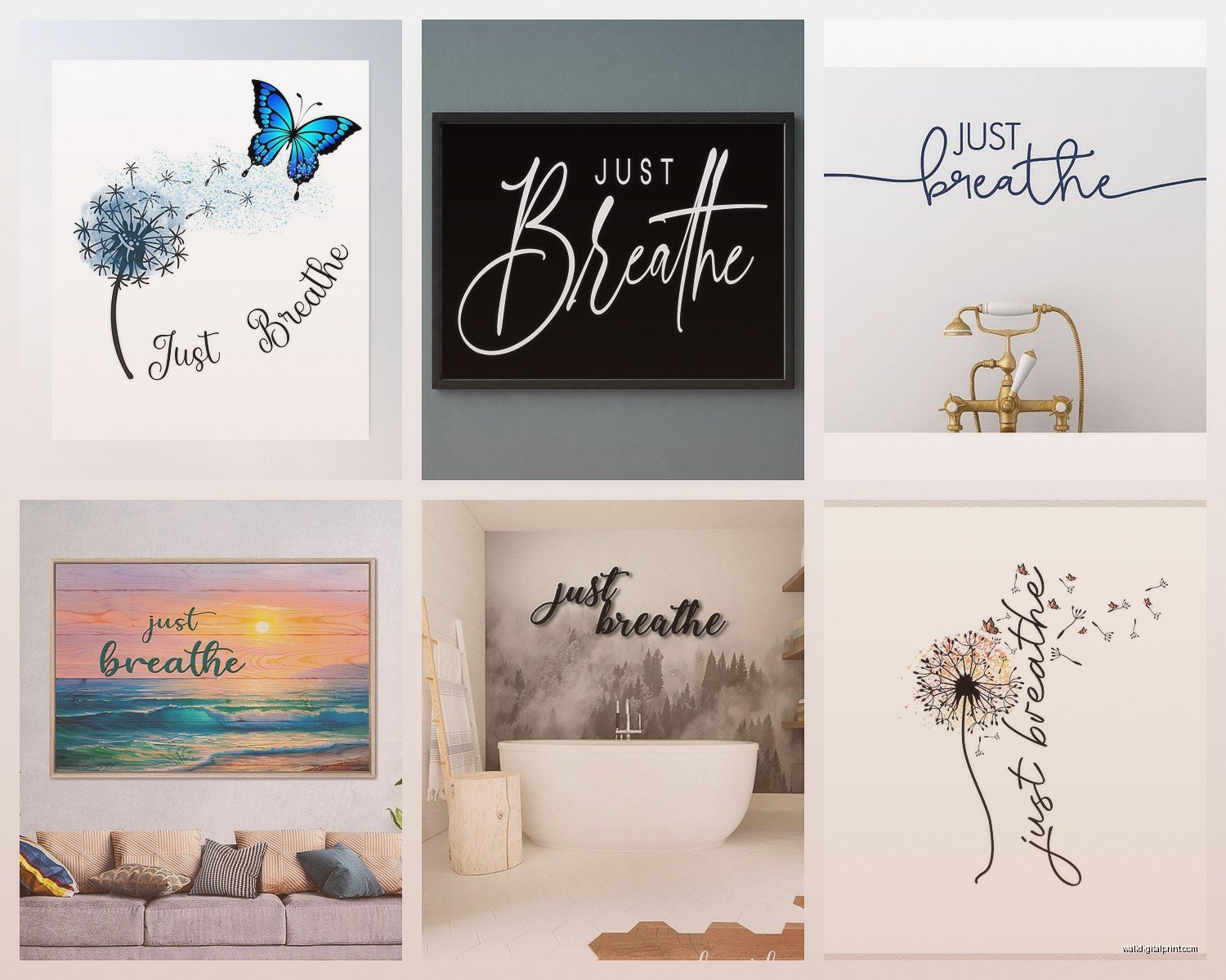
Okay so there’s basically four main style categories you’re gonna see:
Minimalist Typography
This is your basic text-only approach. Clean fonts, usually black or navy on white, sometimes the reverse. I actually have one of these in my own bedroom – simple black script on cream paper. Got it from this small Etsy shop during lockdown when I was having those 3am anxiety spirals, and it’s still up three years later.
The key with typography ones is font choice matters SO much. Avoid anything too curly or hard to read. You want something you can glance at quickly. I made the mistake once of getting one with this super elaborate calligraphy for a client and she said it stressed her out trying to read it, which like… defeats the entire purpose.
Nature-Inspired Designs
These pair the words with mountains, waves, trees, leaves, that whole vibe. My cat knocked over my coffee on one of these once and I literally cried because it was a limited print, but anyway – these work really well in spaces where you’re trying to bring the outdoors in.
I used a “Just Breathe” piece with watercolor ocean waves in a bathroom renovation last year. Sounds weird but bathrooms are actually great meditation spaces? The client does her breathing exercises in there every morning while the kids are eating breakfast. The moisture hasn’t damaged it yet because we got it printed on canvas instead of paper.
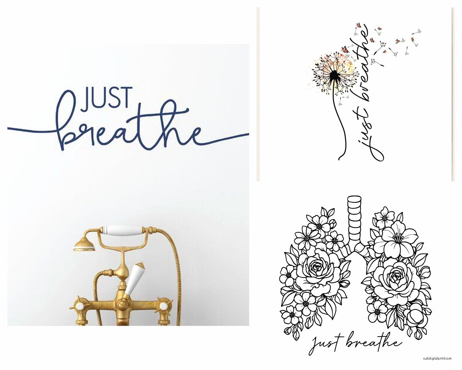
Abstract/Geometric Versions
These combine the text with circles, lines, sacred geometry type stuff. Honestly these can go either way – either they look really sophisticated or they look like someone’s college dorm room. The difference is usually print quality and framing.
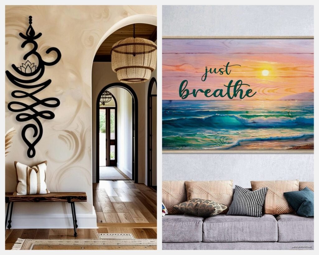
Photographic Backgrounds
Text overlaid on actual photography – sunset, forest, beach, whatever. These tend to be the most dramatic but also the hardest to style around. You gotta make sure the colors work with your existing palette.
Size and Placement Strategy
This is where people mess up constantly. They get this tiny 8×10 print and stick it somewhere random and then wonder why it doesn’t work.
For a meditation space, you want it at eye level when you’re seated. I usually go with 16×20 minimum, sometimes bigger depending on the wall. In my studio apartment I have an 24×36 above my meditation cushion and it’s perfect – big enough to focus on during breathing exercises but not overwhelming.
If you’re putting it in a bedroom, above the bed is obvious but kinda cliché at this point. I’ve been doing bedside wall placement lately – like on the wall you see when you first wake up. One client positioned hers so it’s the first thing she sees when she opens her eyes and she swears it’s changed her whole morning routine.
Office spaces need it wherever you experience the most stress. For me that’s directly across from my desk so when I look up from my computer, there it is.
Print Quality Matters More Than You Think
Okay so funny story – I ordered a cheap print from Amazon once for a staging project and when it arrived the colors were completely washed out and the paper felt like it would disintegrate if you breathed on it wrong. Which again, ironic given the message.
Here’s what to look for:
Paper weight: Minimum 200gsm if you’re getting a paper print. Anything less looks flimsy.
Printing method: Giclée prints are gonna give you the richest colors and best longevity. Yes they cost more. Yes it’s worth it for something you’re gonna look at every day.
Ink type: Archival, fade-resistant inks. Especially if there’s any natural light in the room.
I’ve had good luck with independent artists on Etsy – you can usually message them about customization too. Changed the color of the text on one to match a client’s existing decor and it was only like $15 extra.
Frame or No Frame
This depends on your vibe but here’s my take – unframed prints feel very temporary and college-apartment unless you do that trendy clip-hanging thing with brass clips, which can look clean and intentional.
Basic frames are fine but nothing transforms a print like a good mat and quality frame. I usually do white or natural wood frames for these because they keep the focus on the message. Black frames can work but they’re more dramatic.
There’s also the canvas wrap option where the image wraps around the edges – no frame needed. These work great in more casual spaces. Got one in my yoga corner and it’s held up really well.
Creating the Actual Meditation Corner Around It
The wall art is obviously the focal point but you gotta support it with the rest of the space or it just looks random.
What I usually do: meditation cushion or chair directly below or near the art, small side table for whatever – timer, journal, tea, whatever you use. Maybe a small plant. Keep it minimal though because clutter defeats the purpose.
Lighting is huge. I installed a dimmer switch in my meditation corner and it was like $20 but completely changed the space. You want soft, warm light. Those salt lamps everyone was obsessed with a few years ago? Actually work great for this.
oh and another thing – scent matters. I keep a small essential oil diffuser nearby. Lavender obviously, but I’ve been really into frankincense lately. My friend thinks I’m being extra but it genuinely helps with the whole mindfulness thing.
Color Psychology for Your Print Choice
The color of your “Just Breathe” art actually impacts how effective it is, which sounds woo-woo but there’s research on this.
Blue versions: Most calming, reduces blood pressure, great for anxiety. I use these in bedrooms mostly.
Green versions: Balance and renewal, easy on the eyes. Perfect for home offices where you need to stay focused but calm.
Neutral/black and white: Most versatile, works with everything, feels more sophisticated. This is what I’d recommend if you’re not sure.
Warm tones (coral, terracotta, warm gray): These are trickier but can work in spaces with lots of natural materials and plants.
I had a client insist on a red version once because it matched her decor and I tried to talk her out of it because red is literally the opposite of calming, but she loved it so whatever. Your space, your choice.
DIY vs. Buying Pre-Made
Look, I’m an art curator so I should probably tell you to buy from artists, and I do think that’s ideal, but I also get that budgets are real. I’ve made my own versions before using Canva and gotten them printed at a local print shop for like $30 total.
If you go the DIY route:
– Use high-resolution design (300 dpi minimum)
– Don’t just use any random font – invest in a quality typeface or use Google Fonts
– Print larger than you think you need
– Test print a small version first to check colors
The pre-made route is easier and you’re supporting artists, which I’m always gonna advocate for. Plus they’ve already figured out the composition and color balance.
Styling Multiple Pieces Together
This is gonna sound weird but I’ve been seeing people create whole “mindfulness galleries” and when done right, they’re actually really effective.
You could pair “Just Breathe” with other short affirmations or meditation-related art. I did this in my own apartment – “Just Breathe” is the largest piece, then I have smaller prints with “Be Present” and “This Too Shall Pass” in complementary frames.
The trick is keeping a consistent style. All minimalist typography, or all watercolor nature scenes, or whatever. Mixing styles looks messy.
Grid layouts work well for this – three pieces in a row, or a 2×2 grid. Keep spacing consistent, like 2-3 inches between frames.
Maintenance and Longevity
Nobody talks about this but these prints can fade or get damaged if you’re not careful. Direct sunlight is the enemy. I learned this the hard way with a beautiful piece that faded to almost nothing within a year because it was across from a west-facing window.
Use UV-protective glass in your frame if the piece is gonna get any sun exposure. Costs a bit more but worth it.
Dust the frame every couple weeks. Sounds basic but dust buildup makes everything look dingy.
If it’s unframed, be careful with humidity. That bathroom placement I mentioned earlier? Only works because we used canvas and sealed it properly.
When It Actually Helps vs. When It’s Just Decor
Real talk – having “Just Breathe” on your wall doesn’t automatically make you a more mindful person. I’ve definitely had moments where I’m completely spiraling and catch sight of mine and it just annoys me because I’m clearly NOT breathing calmly.
But here’s what does work: using it as an actual tool. When I remember to actually pause, look at it, and take three deep breaths, my whole nervous system shifts. It’s become a trigger for my meditation practice in a way that’s genuinely helpful.
Some clients have told me they use it as their “reset button” throughout the day. Look at it, breathe, continue. That’s the goal.
wait I forgot to mention – if you have kids, getting a “Just Breathe” piece for their room can be surprisingly helpful. My friend’s seven-year-old uses hers when she’s upset. They do breathing exercises together in front of it. Kids are way more receptive to visual cues than we think.
The placement in kids’ rooms should be lower though, at their eye level, not adult height.
Anyway, that’s basically everything I’ve learned from working with these pieces constantly. The short version is: get something you actually like looking at, make sure it’s quality, put it somewhere you’ll see it when you need the reminder, and actually use it as a tool not just decoration.