Wall Art Guide, Wall Art Tutoriels
Scarface Wall Art: Gangster Movie Al Pacino Tony Montana
Aug
So I’ve been getting SO many questions about Scarface wall art lately and honestly it’s one of those things where you can go really wrong or really right, there’s not much middle ground. Let me just dump everything I know because I literally just finished a consultation where the guy wanted his entire living room to be a Tony Montana shrine and… we had to have a conversation.
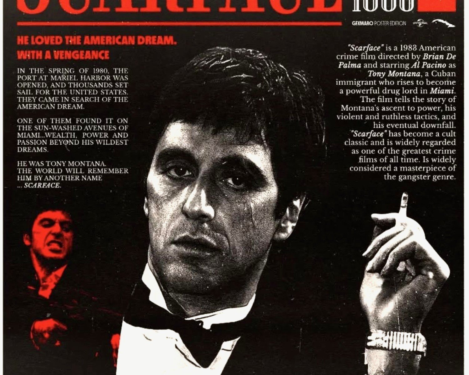
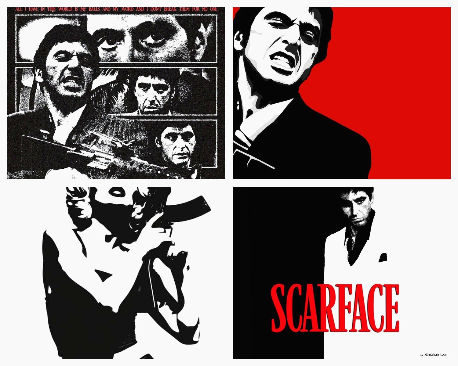
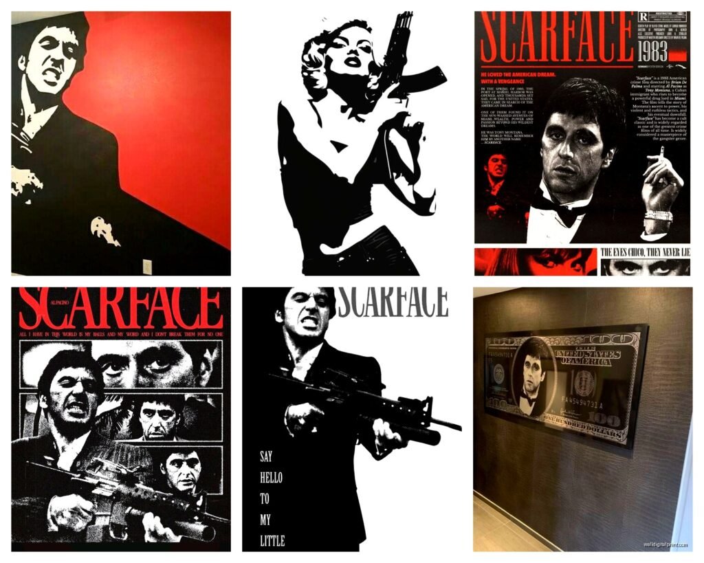
First thing – and I cannot stress this enough – the black and white prints are gonna be your safest bet if you’re actually trying to make this work in a real living space. I know, I know, the movie is all about that excessive 80s vibe with the red and gold and everything, but trust me on this. The black and white “Scarface” text posters or the close-up shots of Al Pacino looking intense? Those actually work in modern spaces. I put one in a client’s home office last year, the one where Tony’s got the cigar, super dramatic lighting, and it looked incredible against this charcoal accent wall.
The sized matter way more than you’d think. Like if you’re doing a gallery wall situation, you want at least one piece that’s 24×36 or bigger as your anchor. I made the mistake once of getting all medium-sized prints and it just looked… timid? Which is the opposite of what Scarface energy should be. Go big or honestly just pick a different movie theme.
Oh and another thing – canvas vs poster matters for this specific aesthetic. The canvas prints, especially the gallery-wrapped ones where the image continues around the edges, they give you that expensive gallery look that actually balances out how aggressive the imagery can be. Posters in frames can look cheaper unless you’re really investing in the frame, and then you’re spending like $150 on framing a $30 poster which feels backwards to me but whatever works for your budget I guess.
The “World is Yours” pieces are everywhere right now. You’ll see them with the statue, the neon sign recreation, all of it. Here’s my take – these work best in home offices, game rooms, or that weird bonus room you don’t know what to do with. I would not put this in your main living room unless your whole aesthetic is already very maximalist and bold. My neighbor did this and his wife made him move it to the garage within a week, true story.
For bedroom placement which people ask about more than you’d expect… maybe rethink? Like I get the appeal but Tony Montana watching you sleep is a vibe and not necessarily a good one. If you’re set on it though, go for the suit portraits, the more “classy gangster” shots rather than the ones with guns and violence. There’s this one print of him in the white suit looking off to the side that’s actually pretty sophisticated if you frame it right.
Wait I forgot to mention the triptych options – those three-panel sets. These are actually genius for Scarface because you can spread the intensity across your wall. I saw one that was black and white stills from different scenes and it created this narrative flow that didn’t feel like you were just obsessed with one violent moment from the movie. More artistic, less dorm room energy.
The metal prints are having a moment and okay so funny story, I ordered one of these for my own space (my studio, not like my living room, let’s be clear) and the way the aluminum makes the blacks deeper and the contrast sharper? It’s actually perfect for those high-contrast Scarface images. They’re pricier – you’re looking at $80-200 depending on size – but they don’t need frames and they have this modern edge that makes the whole thing feel more curated than accidental.
Color scheme coordination is where people really mess up. If you’re going with the red and black Scarface posters (you know the ones, very graphic, very bold), your room basically needs to be neutral everywhere else. White walls, black furniture, maybe some grey. I watched someone try to put a bright red Tony Montana poster in a room that already had burgundy curtains and brown leather furniture and it was just… a lot. Too much warmth, everything fighting for attention.
The typography posters with quotes are tricky. “Say hello to my little friend” is iconic but also it’s literally about violence so consider your audience. Are your parents visiting? Do you have kids? I’m not saying don’t do it but maybe the “All I have in this world is my balls and my word” print isn’t ideal for the family room, you know? There are more subtle quote options that reference the movie without being so in-your-face.
Gallery walls with Scarface as the theme can actually work if you mix in other elements. I did one where we included vintage Miami photos, some art deco prints, a couple of Scarface images, and this cool Cuban-style artwork. It told a story about the era and the setting rather than just being a Tony Montana fan wall. Made it feel intentional and designed rather than obsessive.
Lighting matters SO much with these prints. If you’re gonna invest in Scarface wall art, put a picture light on it or position it where natural light hits it during the day. Those dramatic shadows in the photography? They need good lighting to actually read properly. I’ve seen expensive canvas prints look like muddy messes because they were stuck in a dark corner.
The painted portrait style – where it looks like an oil painting or has that pop art treatment – these can actually elevate the whole thing. There’s this artist (can’t remember the name, ugh) who does these incredible stylized versions that feel more like legitimate art than movie merch. They’re obviously more expensive but if you’re trying to make this work in an upscale space, that’s your route.
Size and scale for different rooms because this comes up constantly:
– Home office: go for 24×36 or 30×40, one statement piece
– Game room/man cave: you can do multiple pieces, mix sizes, get weird with it
– Living room: if you must, stick to 16×20 or 20×30, black and white only is my recommendation
– Hallway: vertical prints work better, maybe a series of smaller matching frames
The framing options are honestly overwhelming. Black frames are the safest – they add sophistication and contain the energy of the image. Silver or metallic frames can work with the black and white prints, gives it that modern gallery vibe. Wood frames? Only if your whole space is warm and woody already, otherwise it creates a weird disconnect.
Oh wait, gotta mention the neon sign replicas. These aren’t technically wall art but they’re adjacent and people always ask. “The World is Yours” neon signs are cool but they’re like $200-500 for decent ones and they’re BRIGHT. I have a client who got one and it’s legitimately the only light source he needs in his game room, which is either awesome or problematic depending on your perspective. Just know what you’re getting into.
The authentication thing – lots of these prints claim to be “officially licensed” or whatever and honestly for wall art it doesn’t matter as much as it would for like, clothing or collectibles. What matters is the print quality. Look for giclée printing or high-resolution digital prints. If the preview image looks pixelated on the website, it’s gonna look worse in person.
Mixing Scarface with other movie art is doable but you gotta be strategic. Godfather and Scarface together makes sense thematically. Scarface and like, Breakfast at Tiffany’s? That’s chaos. Keep it within the same genre or era or aesthetic vibe. I saw someone mix Scarface with Miami Vice art and vintage Florida travel posters and it actually worked because it was cohesive around the Miami 80s theme.
The shower curtain thing – I’m just gonna say it because someone always asks. Yes they exist, no you should not get one unless you’re like 22 and living in your first apartment and fully leaning into the absurdity of it all. At that point it’s almost so ridiculous it loops back to being funny.
For renters, the peel-and-stick wall decals are actually not terrible? They’ve gotten way better in quality. You can get these huge Scarface silhouettes or quotes that go up easily and come down without damaging walls. I’m usually not a huge fan of wall decals but for temporary situations they work.
The set collections where you get like 4-6 prints together are usually a better value than buying individually, but make sure they’re actually different images and not just the same shot in different filters. I’ve seen sets where it’s basically the same picture cropped five different ways and that’s lazy.
Placement height is basic but people still get it wrong – the center of your artwork should be at eye level, which is usually 57-60 inches from the floor. For Scarface prints especially, you want people to make eye contact with Tony, not stare at his chest or look up at him like he’s towering over you.
This is gonna sound weird but the room’s purpose should dictate how aggressive you go with the imagery. Workout room? Go full intensity, get the angry Tony with the gun, the power pose stuff. Home theater? Perfect spot for movie stills and scene recreations. Dining room? Probably skip this theme entirely unless you’re really committed to making your dinner guests uncomfortable.
The limited edition numbered prints – these are for collectors and resale value matters to you. For most people just trying to decorate their space, the mass-produced versions are totally fine and like a tenth of the price.
Anyway that’s basically everything I know about making Scarface wall art work in actual human homes, my cat is literally walking across my keyboard right now so I’m gonna stop but yeah, stick with black and white, size up bigger than you think, and for the love of god please don’t put the cocaine mountain scene in your kitchen