Wall Art Guide, Wall Art Tutoriels
Alice in Wonderland Wall Art: Lewis Carroll Fantasy Story
Aug
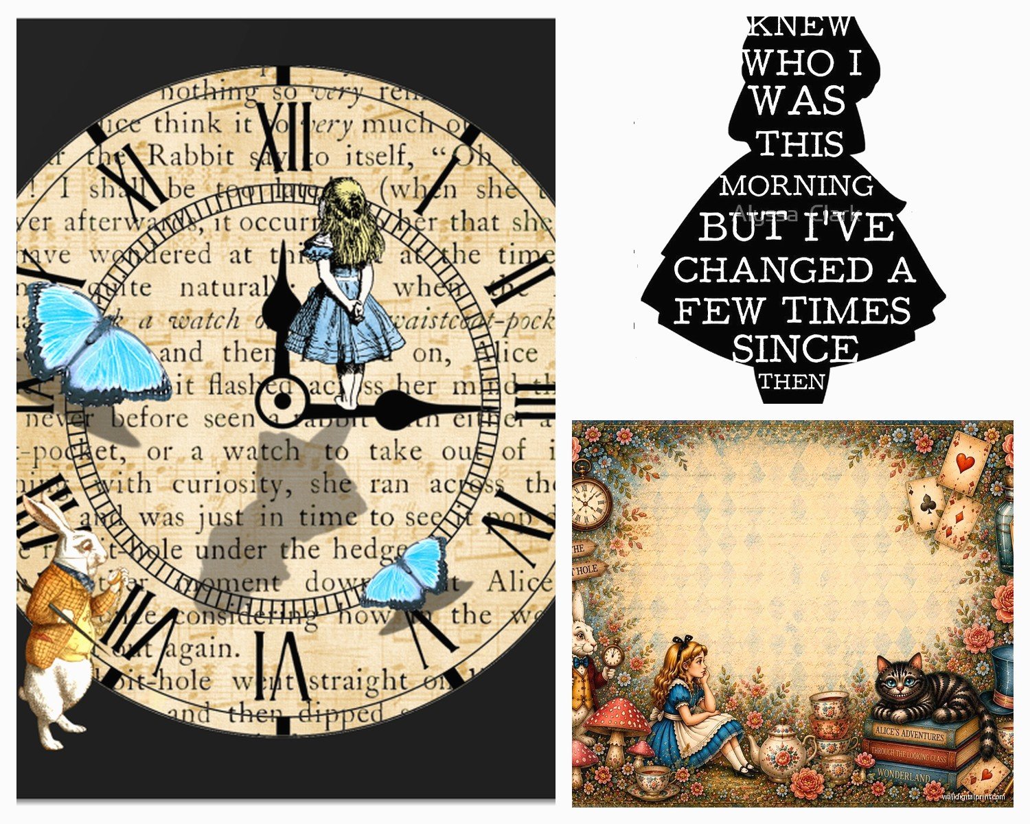
So I’ve been completely obsessed with Alice in Wonderland wall art lately and honestly it started because a client wanted to do this whole whimsical reading nook thing but then I fell down the rabbit hole myself (sorry, had to). Let me just dump everything I’ve learned because there’s actually a lot more to this than just slapping up some Cheshire Cat poster.
Finding Your Alice Aesthetic First
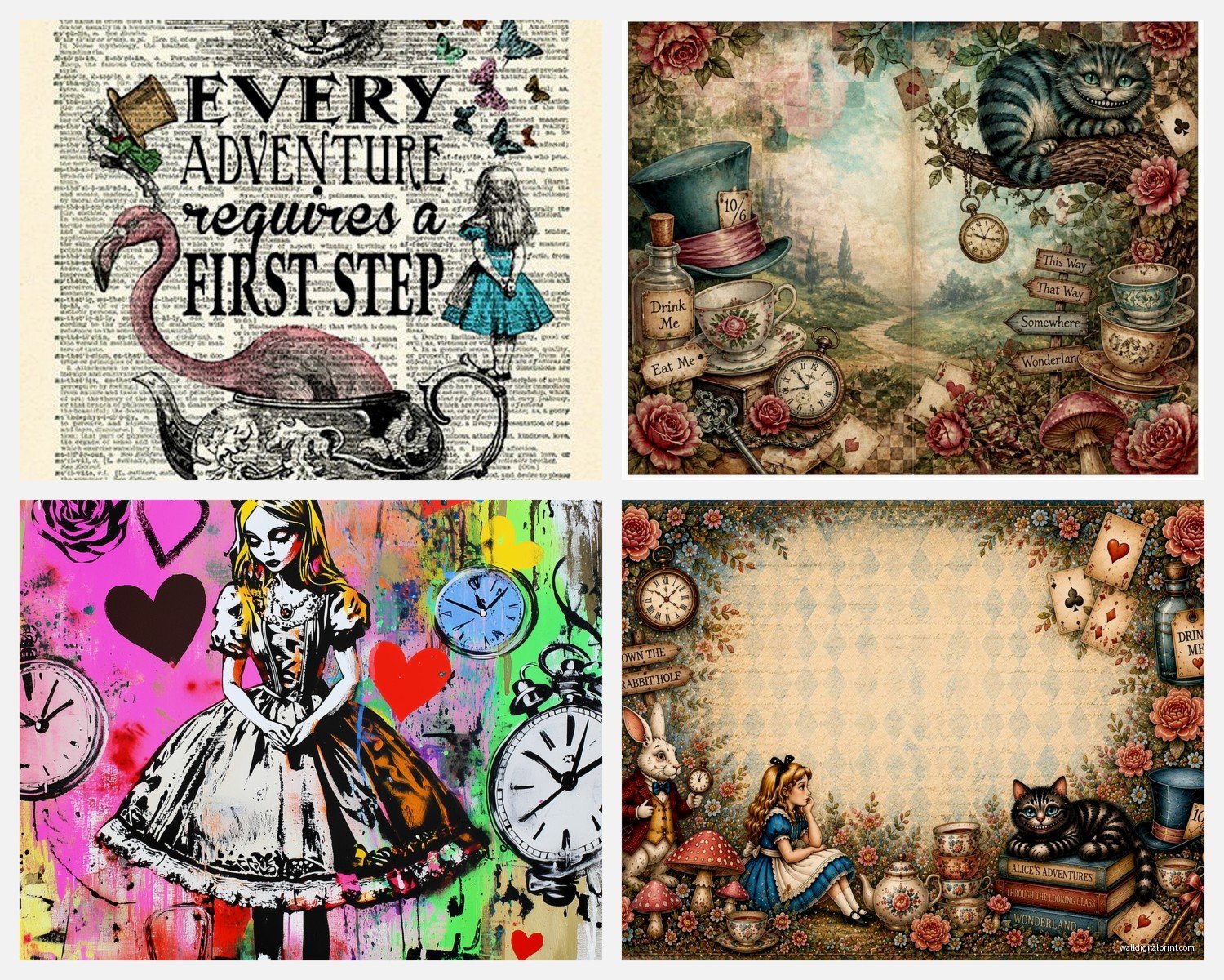
Okay so here’s the thing—you gotta figure out which version of Wonderland you’re actually into because they’re wildly different. Like, are you going for the original John Tenniel illustrations from the 1865 book? Those are super detailed, kind of dark and Victorian, lots of crosshatching. Or maybe you want the Disney version which is brighter and more… I don’t know, sanitized? There’s also the Tim Burton aesthetic which is basically goth Wonderland, and then there’s modern interpretations that are all watercolor and dreamy.
I spent like three hours one night (my dog was judging me) comparing different art styles and honestly the Tenniel originals hit different when you see them large scale. They’ve got this intricate, almost creepy quality that works amazing in a library or study. But in a kid’s room or a cheerful space? Maybe not.
Print Quality Actually Matters Here
This is gonna sound weird but Wonderland art shows print quality issues more than like, abstract stuff. Because there’s usually so much detail—the playing cards, the tea party setup, all those little mushrooms and flowers. I learned this the hard way when I ordered what looked gorgeous online and it arrived looking… pixelated? Is that the word? Just blurry and sad.
Look for prints that are at minimum 300 DPI. Giclée prints are your friend here—they’re basically museum-quality and the colors stay vibrant. I’ve had good luck with Etsy sellers who specifically mention archival inks because those won’t fade into weird orange tones after a year in sunlight.
Oh and another thing, matte vs glossy actually matters. Glossy can look cheap with illustrative art like this. Matte or semi-gloss is the way to go. The only exception is if you’re doing something really pop-art style with bright colors, then glossy can work.
Size and Scale Gets Tricky
So everyone thinks bigger is always better but with Wonderland stuff, not necessarily. I did this gallery wall last month with like seven different scenes—the tea party, the Queen’s croquet game, Alice growing tall, the Caterpillar—and used mostly 8×10 and 11×14 prints. It looked way better than one massive print would have.
But if you’re doing a statement piece, go big or go home. Like a 24×36 of the Cheshire Cat above a reading chair? *Chef’s kiss*. Just make sure whatever scene you pick has enough going on to fill that space. A simple silhouette of Alice falling might look empty at that size unless the artist did something really special with it.
Framing Makes or Breaks This
Okay I’m just gonna say it—those cheap black frames from Target are fine for some stuff but Wonderland art deserves better. The Victorian era detail in a lot of this art actually pairs beautifully with ornate frames. I found these vintage-style frames at an estate sale once and they were perfect, all gold with this subtle decorative edge.
If you’re going the Tenniel route or anything vintage-looking, consider:
- Antique gold or bronze frames with some ornamental detail
- Dark wood frames (walnut or mahogany tones) for that Victorian library vibe
- White distressed frames if you want shabby chic instead of formal
For modern interpretations or watercolor styles:
- Simple wood frames in light oak or maple
- Thin black metal frames for a contemporary gallery look
- No frame at all, just mounted on wood or foam board
Wait I forgot to mention—mat boards are your secret weapon here. A good mat board adds like instant sophistication. I usually do white or cream for most Wonderland prints, but I’ve seen black mats work with really colorful modern interpretations.
Where to Actually Hang This Stuff
So obviously you’re thinking bedroom or kid’s room but there are way more options. I’ve put Wonderland art in:
Home libraries or reading nooks – this is like the most obvious perfect fit. Stack some vintage books nearby, add a cozy chair, and you’ve got a whole vibe going.
Powder rooms – hear me out on this. A small bathroom with one striking Wonderland print, especially something with the “Drink Me” bottle or “Eat Me” cake? It’s whimsical without being childish. Just avoid anything that’ll get ruined by humidity.
Stairway galleries – this is where you can do that whole “falling down the rabbit hole” theme literally. Arrange prints going down the stairs with Alice tumbling through different scenes.
Kitchen or dining areas – the Mad Hatter’s tea party scenes work here obviously. I did a breakfast nook with tea party prints and it was adorable, though the client’s husband thought it was too much at first. He came around.
The Gallery Wall Approach
If you’re gonna do a gallery wall situation, which honestly works great for Wonderland because there are so many scenes to choose from, here’s what actually works:
Pick a color palette first. Even if you’re using different art styles, keeping the colors cohesive makes it look intentional instead of chaotic. Like all black and white prints with maybe one pop of red (Queen of Hearts, obviously). Or all muted watercolors in blues and greens.
Don’t go too matchy-matchy with frame sizes. I usually do three sizes max—like 8×10, 11×14, and maybe one 16×20 as an anchor piece. Arrange them on the floor first, take a picture with your phone, then commit to the wall. Trust me on this, my walls have so many unnecessary holes from not planning ahead.
Mixing Art Styles Without It Looking Weird
This is where people mess up. They’ll put a Disney-style colorful Cheshire Cat next to a creepy vintage Tenniel illustration and it just… doesn’t work. The styles clash too much.
What does work:
- All vintage illustrations in different frames
- All modern watercolor interpretations together
- Black and white prints from different eras—the lack of color unifies them
- Mixed styles but in a very deliberate “Alice through different artists’ eyes” theme where the variety IS the point
I saw someone on Instagram do this thing where they had the same scene—Alice at the tea party—interpreted by like five different artists in five different styles, all in identical frames. It was actually brilliant because the repetition made the variety work.
DIY vs Buying Prints
Okay so funny story, I tried to DIY some Wonderland art by printing vintage illustrations myself and it was a disaster. My printer couldn’t handle the detail and the colors were all wrong. But if you have access to a good quality printer or a print shop, you can actually find public domain Tenniel illustrations online for free.
Sites like Project Gutenberg and the British Library have high-resolution scans of the original Alice books. You can download those and print them legally because they’re public domain. Just make sure you’re getting high enough resolution—look for files that are at least 3000 pixels on the longest side if you want to print bigger than 8×10.
For buying prints, Etsy is honestly my go-to. There are artists doing incredible modern takes on Wonderland themes. I’ve also found good stuff on Society6 and Redbubble, though the quality can be hit or miss. Read reviews before ordering.
Original Art vs Prints
If you’ve got the budget, commissioning an original piece or buying original Wonderland-inspired art is next level. I worked with an artist once who did this custom piece of Alice in her client’s actual garden with their real cat as the Cheshire Cat and it was magical. Pricey, but magical.
Original vintage Wonderland illustrations or book pages framed are also an option if you’re into antiques. I’ve found these at estate sales and antique shops—actual pages from old Alice in Wonderland books that you can frame. Just make sure you’re okay with the whole “destroying a book” ethics thing because some people have feelings about that.
Color Schemes That Actually Work
The traditional Wonderland palette is pretty specific—reds, blacks, whites, with pops of blue (Alice’s dress) and gold. But you can absolutely modernize this.
I did a nursery once with Wonderland art in all soft pastels—mint green, blush pink, pale yellow. It was adorable and way less intense than traditional colors. The key was finding artists who did watercolor or minimalist interpretations rather than the classic illustrations.
For a more sophisticated look, go monochromatic. All black and white Wonderland prints with maybe gold frames creates this elegant literary vibe that doesn’t read as childish at all.
Lighting These Prints Properly
This matters more than you’d think. I’ve seen gorgeous Wonderland art completely washed out by bad lighting. If you’re hanging near a window, make sure the print isn’t getting direct sunlight or it’ll fade. UV-protective glass exists for frames and it’s worth it for prints you really love.
Picture lights are great for creating drama with larger pieces. There’s something about having a little spotlight on a dramatic Queen of Hearts portrait that just works. Battery-operated ones exist now so you don’t need to deal with wiring.
Wait I should mention—if you’re doing a kid’s room, consider adding some string lights around or near the art. It adds to that whimsical fairytale vibe without being too over the top.
Quotes and Typography
Lewis Carroll’s writing is so quotable that typography prints work really well mixed with illustration. “We’re all mad here” is probably the most overdone one but there are so many other options:
“Curiouser and curiouser”
“Why, sometimes I’ve believed as many as six impossible things before breakfast”
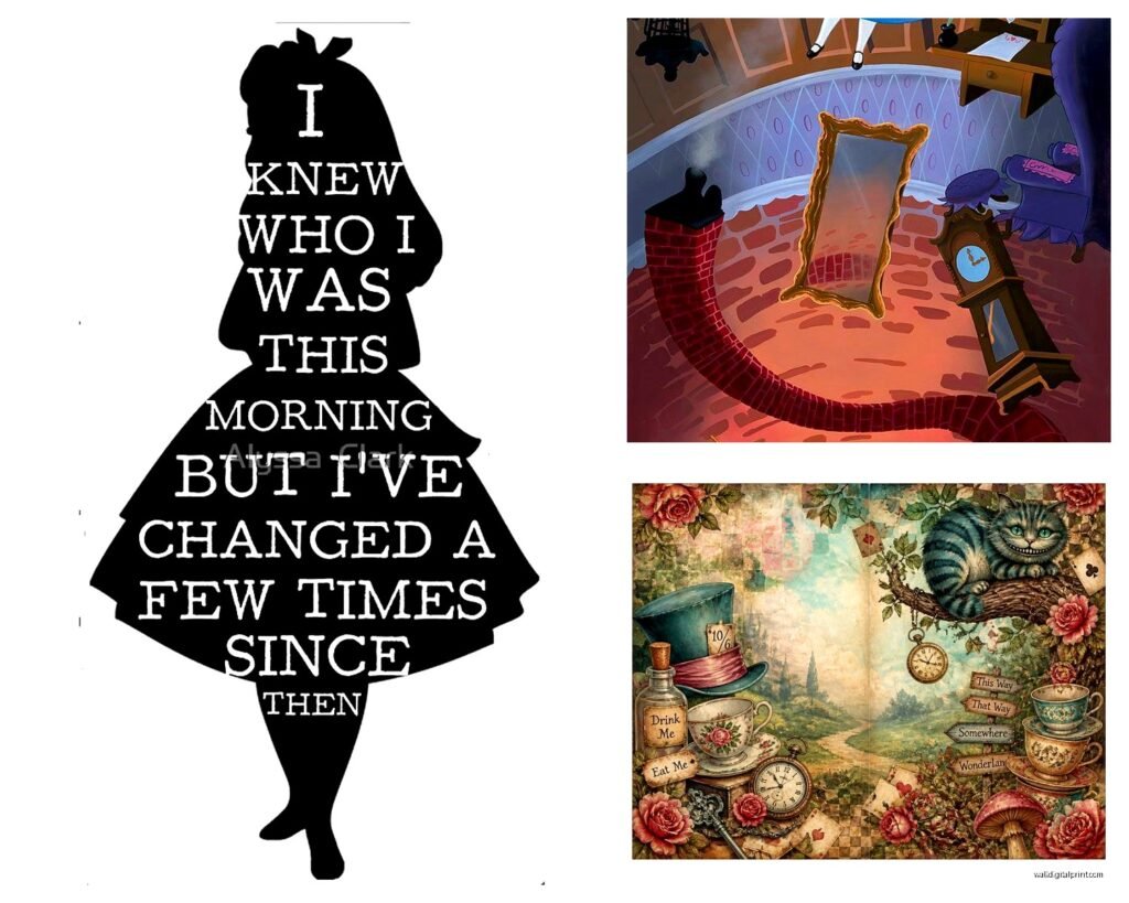
“It’s no use going back to yesterday because I was a different person then”
I like mixing one or two quote prints with illustrated scenes. Just keep the typography style consistent with your overall aesthetic—vintage fonts for classic looks, modern clean fonts for contemporary spaces.
Alright I think that’s everything swimming around in my brain about this. The main thing is just pick a direction and commit to it rather than trying to include every version of Wonderland that exists. Unless that’s your thing, then go wild I guess.