Wall Art Guide, Wall Art Tutoriels
Audrey Hepburn Wall Art: Iconic Actress Breakfast at Tiffany’s
Aug
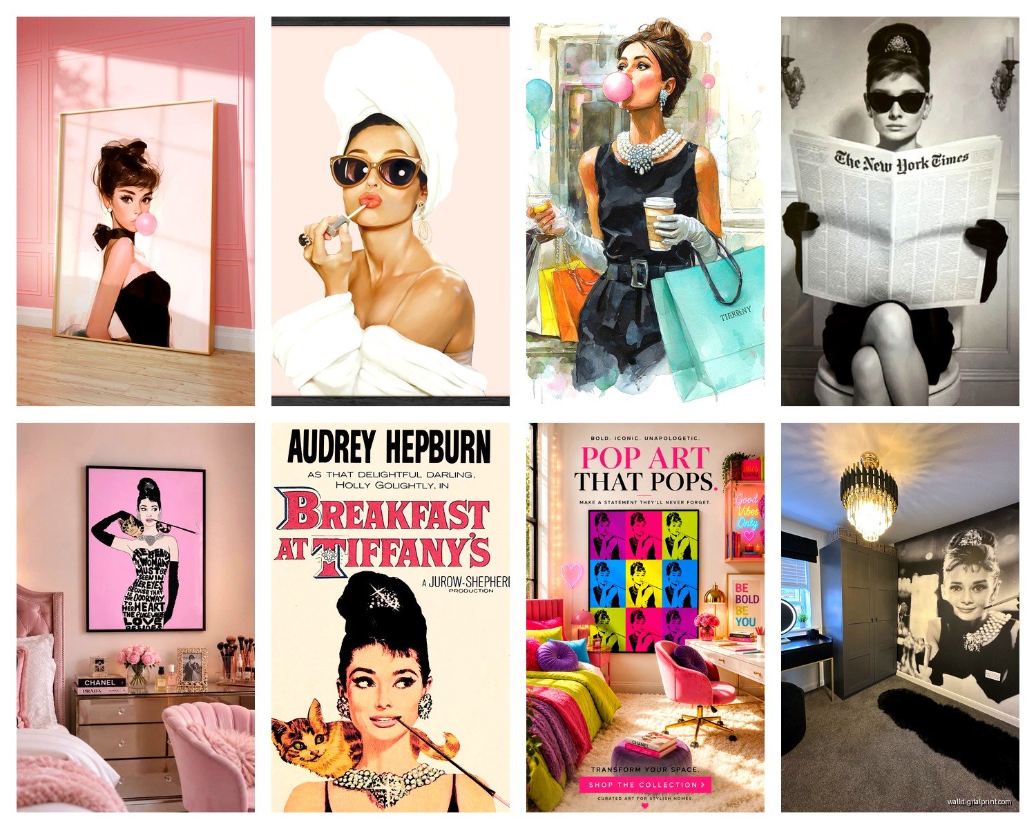
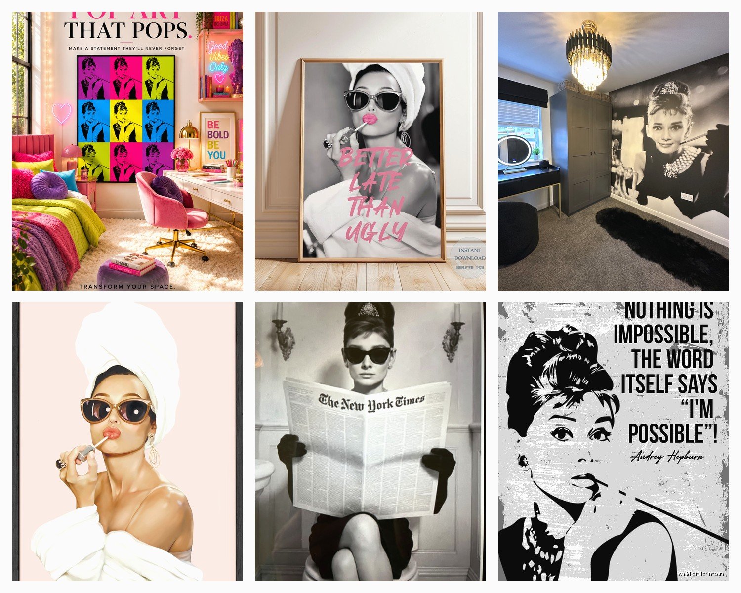
So I’ve been decorating spaces with Audrey Hepburn prints for years now, and honestly the Breakfast at Tiffany’s stuff never gets old. Like, I just hung a massive canvas in a client’s apartment last week and she literally teared up which was…unexpected but also kinda sweet?
Here’s the thing about Audrey wall art – there are approximately a million options out there and most of them look cheap in person even if the listing photos are gorgeous. I learned this the hard way when I ordered what I thought was gonna be this stunning black and white print and it showed up looking like someone printed it at a grocery store kiosk in 2003.
Finding Actually Good Quality Prints
The material matters SO much more than you’d think. Canvas prints are everywhere but they’re not all equal. You want giclée printing if you’re going canvas – it’s basically fancy inkjet but the colors stay true and don’t fade into that weird yellowish thing that happens with cheaper prints. I usually tell people to look for listings that specifically mention “museum quality” or “archival inks” because those actually mean something.
Paper prints can be stunning though, especially if you’re doing the whole gallery wall thing. I’m obsessed with the ones on fine art paper – they have this texture that makes Audrey look even more elegant somehow. Matte finish is usually safer than glossy unless you’re putting it somewhere with zero light reflection issues.
Metal prints are having a moment right now and honestly? They work really well with iconic photography like Breakfast at Tiffany’s stills. The image kind of floats on the metal surface and it catches light in this subtle way. My friend got one for her office and I was skeptical but it looks incredible. They’re pricier though.
Which Scene Should You Actually Get
Okay so there are like five classic images that everyone gravitates toward:
- The window shopping scene with the tiara and cigarette holder
- Holly eating a pastry outside Tiffany’s in that black dress
- The close-up with the sunglasses and updo
- Her sitting on the fire escape with the guitar
- The party scene with all the people
The window shopping one is probably the most iconic but also the most overdone? Which doesn’t mean you shouldn’t get it – I have it in my own bedroom actually – but just know that three of your friends probably also have some version of it.
I’m personally partial to the pastry scene because there’s something about the composition that works in more spaces. The vertical orientation fits narrow wall spaces better and the mood is slightly less formal somehow. Works great in kitchens or dining areas which sounds random but I’ve done it multiple times and it always looks right.
The close-up with sunglasses is EVERYWHERE and for good reason – it’s striking as hell. But it needs space to breathe. Don’t put this one in a small cramped area or between a bunch of other art. It demands attention.
Size Actually Matters Here
This is where people mess up constantly. They order like a 12×16 print for a massive empty wall and then text me photos asking why it looks wrong. Scale is everything with statement pieces like Audrey prints.
For above a couch or bed, you’re looking at minimum 30×40 inches, honestly bigger is usually better. The general rule I use is the art should take up about two-thirds to three-quarters of the furniture width below it. So if your couch is 84 inches wide, you want your print to be somewhere around 50-60 inches wide.
Smaller prints (16×20 or 20×24) work perfectly for gallery walls or those weird narrow spaces like hallways or the wall next to a doorframe. I actually love using smaller Audrey prints as part of a bigger collection – mix her with some abstract pieces, maybe some gold frames, couple of personal photos…it keeps it from feeling too theme-y.
Oh and another thing – consider the room height. High ceilings can handle oversized vertical prints. Standard 8-foot ceilings usually look better with horizontal or square formats unless you’re doing a specific narrow wall situation.
Frame or No Frame That Is The Question
Canvas prints look fine without frames – that’s kind of their whole thing. The image wraps around the edges and you get that modern gallery vibe. BUT I’m gonna be honest, I almost always recommend adding a floater frame anyway. It’s this thin frame that sits slightly away from the canvas edge and it just makes everything look more intentional and expensive.
For paper prints you obviously need a frame and mat. Black frames are classic with Audrey prints – they echo the black and white photography and feel sophisticated without trying too hard. My go-to is a simple black wood frame with a white or cream mat. The mat should be like 2-3 inches on all sides for smaller prints, wider for larger ones.
Gold or brass frames can work too if your space has warm metallics already happening. I did a client’s home office with an Audrey print in an ornate gold vintage frame and it was *chef’s kiss* – very old Hollywood glamour. But that’s a specific vibe and you gotta commit to it.
White frames feel more modern and light but can wash out with black and white photography unless you use a dark mat to create contrast. It’s trickier to pull off.
Where to Actually Buy These Things
Etsy is honestly your best bet for variety and quality. There are shops that specialize in classic Hollywood prints and they usually have way better quality control than Amazon. Look for sellers with tons of reviews that specifically mention the print quality and shipping. I always read through the photo reviews – those are the ones that show you what actually showed up at someone’s door.
Society6 and Redbubble have Audrey stuff but it’s hit or miss on licensing and quality. Some artists on there are amazing, others are just stealing images and upscaling them badly. Check the artist’s other work to see if they seem legit.
For higher-end stuff, there are galleries that sell officially licensed Breakfast at Tiffany’s prints. These are expensive – like several hundred dollars – but the quality is museum-level and you know everything is legal and above board. Worth it if this is going in a prominent space or you’re just really particular about these things.
Wayfair and Overstock have framed options that are pretty affordable and decent quality. I’ve ordered from both for client projects when we needed something fast. They’re not gonna blow your mind but they’re perfectly fine for most spaces.
The Licensing Thing Nobody Talks About
Real talk – a lot of Audrey prints being sold online are technically copyright violations. The movie stills are owned by Paramount and Audrey’s image rights are controlled by her estate. Does this matter for personal use? Probably not really. But if you care about supporting legitimate artists and rights holders, look for officially licensed products. They’ll usually say so prominently.
There are also artistic interpretations – like painted versions or graphic design takes on the iconic imagery – and those exist in more of a gray area legally but are often created by actual artists doing original work based on the inspiration of the film.
Making It Work In Your Actual Space
Okay so you’ve got your print, now what. Location matters way more than people think.
Living rooms are obvious but think about lighting. Audrey prints are usually high contrast black and white, so they can handle being in brighter spaces. Actually they kind of need good lighting to really pop. That said, avoid direct sunlight because that’ll fade any print over time, even the fancy archival ones.
Bedrooms work great – there’s something glamorous but also intimate about having Audrey in your bedroom. I have the window shopping scene above my dresser and catch myself looking at it every morning while I’m getting ready. It’s like a little reminder to put effort into your appearance or whatever, but less preachy than those “live laugh love” type things.
Home offices are underrated for this kind of art. A single large Audrey print behind your desk creates a sophisticated backdrop for video calls and makes the space feel more curated. Just don’t go overboard – one statement piece is enough.
Dining areas can handle the more casual scenes – like Holly with the pastry or sitting on the fire escape. These feel less formal and more livable than the full glam shots.
Bathrooms! Okay this is gonna sound weird but a small framed Audrey print in a bathroom can be really chic if you do it right. Powder rooms especially. Keep it small and well-framed so it doesn’t get humidity damage.
Styling Around The Print
Don’t just slap it on the wall and call it done. The stuff around your Audrey print affects how it looks.
If you’re going for that classic Hollywood Regency vibe, pair it with:
- Mirrored or metallic furniture pieces
- Velvet textiles in jewel tones
- Crystal or glass decorative objects
- Vintage bar cart vibes
- Maybe a faux fur throw somewhere
For more modern spaces, keep everything else minimal. Let Audrey be the focal point and surround her with clean lines, neutral colors, maybe some brass accents. The contrast between her vintage glamour and modern minimalism actually works really well.
I did a whole apartment last year where we mixed Audrey with mid-century modern furniture and lots of plants – sounds weird but it totally worked. The key was keeping the color palette tight (black, white, wood tones, green from plants) so everything felt cohesive even though the styles were different eras.
Common Mistakes I See All The Time
Hanging it too high. The center of your print should be at eye level, which is roughly 57-60 inches from the floor. People always hang art way too high for some reason and then wonder why their room feels off.
Choosing color prints when black and white would work better. Most of the iconic Breakfast at Tiffany’s imagery is black and white for a reason – it’s timeless and elegant. The colorized versions can look kinda gimmicky unless you really know what you’re doing with color coordination in your space.
Going too matchy-matchy with the rest of the decor. You don’t need teal accents everywhere just because Tiffany blue is a thing. Actually please don’t do that. Let the print reference the film and keep your decor choices separate.
Buying the cheapest option without checking reviews. I know budget is real but a $15 print that looks terrible in person is a waste of $15. Sometimes it’s worth saving up for the $60-80 version that’ll actually look good for years.
The Gallery Wall Approach
If one Audrey print feels like too much commitment or you want something more dynamic, gallery walls are your friend. Mix Audrey with other elements:
Start with your Audrey print as the anchor – usually the largest piece or the most central. Then build around it with complementary stuff. I like mixing in abstract art, typography prints, smaller vintage photography, maybe some line drawings.
Keep frames consistent OR go intentionally eclectic – the middle ground is where things look messy. Either all black frames or a curated mix of black, gold, and natural wood. Nothing in between.
Layout matters. I always arrange everything on the floor first, take a photo, live with it for a day, then actually hang. Use painters tape on the wall to mark where frames will go before you start hammering. Trust me on this my dog was NOT happy when I had to redo an entire wall because I eyeballed it and got everything crooked.
Maintenance and Long-Term Stuff
Dust your prints regularly with a microfiber cloth. Sounds obvious but people forget and then wonder why everything looks dingy after a year.
If you’ve got a canvas print, you can very gently vacuum it with the brush attachment if it gets really dusty. Keep the vacuum on low power though.
Paper prints behind glass just need the glass cleaned occasionally. Use glass cleaner on a cloth, not sprayed directly on the frame.
Check for fading every few months if your print gets any natural light. If you start noticing color shifts or the blacks looking gray, might be time to move it to a different wall or add UV protective glass.
Honestly once you find the right Audrey print in the right spot it’s pretty low maintenance. The hard part is just making all those initial decisions about size and style and where it goes. But once it’s up and working with your space, it’s just there being iconic and making everything look a bit more put-together.