Wall Art Guide, Wall Art Tutoriels
Barn Wall Art: Farmhouse Rural Agricultural Building
Aug
So I’ve been obsessing over barn wall art lately and honestly it’s one of those things that seems super straightforward until you actually try to pick something and then you’re like wait, there are SO many directions to go with this.
Why Barn Art Actually Works (When It Works)
Okay so here’s the thing – barn imagery hits different than other farmhouse decor because it’s not trying too hard. Like, you know how some farmhouse stuff feels very “I bought this entire aesthetic at HomeGoods in one trip”? Barn art tends to feel more grounded because barns are just… buildings. They’re functional. They’ve got texture and history without being precious about it.
I had this client last month who was adamant she wanted “rustic but not country” which is basically an impossible brief, but we landed on this massive black and white photograph of an old tobacco barn and it totally worked because the photography treatment made it feel more art gallery than Cracker Barrel, you know?
The Different Styles You’re Gonna See
Photography Prints
This is probably the easiest route and honestly where I’d start. Black and white barn photography feels classic and won’t look dated in three years. Color photos can work too but they’re trickier – you want either really muted vintage-looking colors or super crisp modern shots. That middle ground where it just looks like someone’s vacation photo doesn’t really work on a wall.
I’ve found Etsy has the best selection for this, but you gotta be careful because print quality varies WILDLY. Always check if they’re selling the actual print or just the digital file. If it’s a digital file, you’ll need to get it printed yourself which… okay that’s a whole other rabbit hole but basically you want a local print shop, not like Walgreens photo center.
Painted Art
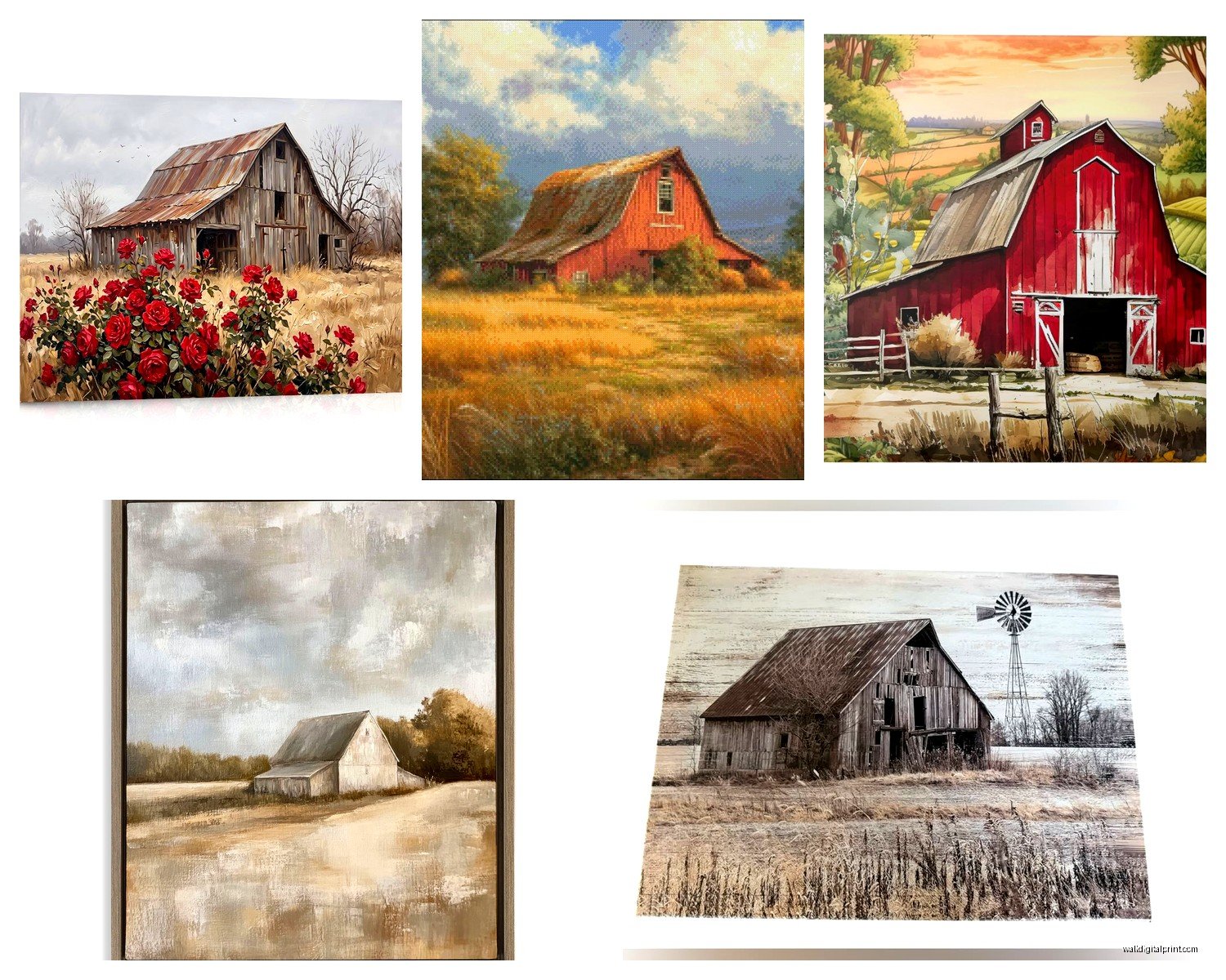
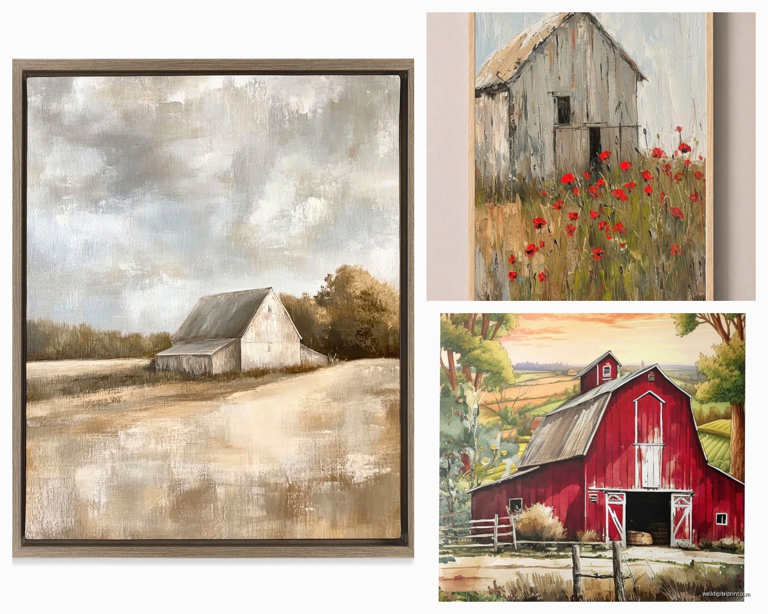
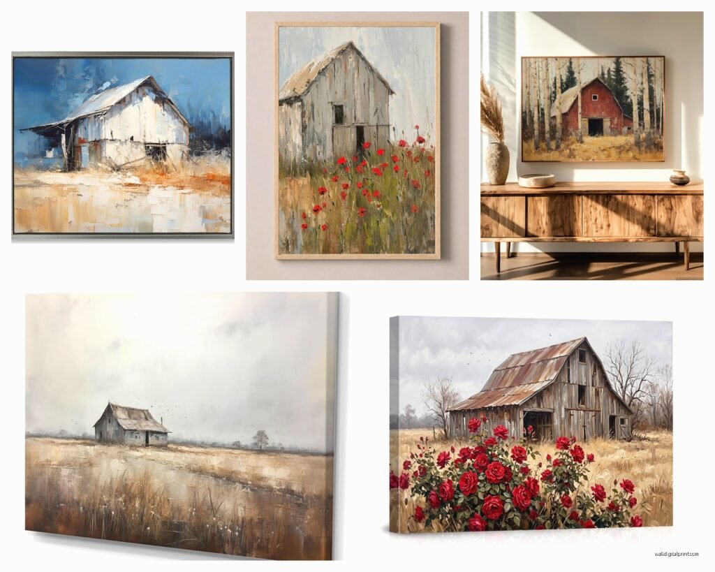
Acrylic paintings of barns can go either really traditional (think Bob Ross vibes with happy little barns) or more abstract and modern. The abstract ones are what I usually recommend because they give you the barn feel without being too literal. Like, suggestion of a barn structure, some texture, interesting color palette.
Oil paintings tend to skew more expensive but they’ve got that depth that’s hard to replicate. Worth it if you’re doing a statement piece over a couch or fireplace.
Rustic Wood Art
Oh and another thing – there’s this whole category of barn images printed or painted on reclaimed wood which is very meta when you think about it. Barn on barn wood. I actually love these for smaller spaces or galleries walls because they add dimension. Just make sure the wood is actually sealed properly because I’ve seen some that shed splinters or smell weird.
Size Matters More Than You Think
This is where people mess up the most. They find perfect barn art and then get it in like 16×20 and wonder why it looks dinky on their wall.
For over a couch or bed, you want AT LEAST 2/3 the width of the furniture. So if your couch is 90 inches, you’re looking at 60 inches minimum. You can do one large piece or a diptych or triptych (two or three panels). The triptych thing works really well with barn art actually – like three different angles of the same barn or three different barns in similar style.
For dining rooms, I usually go bigger than people expect. Like a 40×60 isn’t too big for most spaces. My cat knocked over my coffee while I was measuring a client’s dining room last week and I’m still finding spots on the baseboard but anyway – the point is don’t go too small.
Gallery Wall Approach
If you’re doing a gallery wall with barn art as the anchor piece, make that piece at least 24×36. Then you can surround it with smaller stuff – maybe some vintage farm tools, smaller barn sketches, black and white farm animal prints. Keep the frames consistent though. All black, all wood, or all white. Mixed frame colors usually looks messy unless you really know what you’re doing.
Color Palettes That Actually Work
Okay so this is gonna sound weird but the best barn art isn’t always red. I know, I know, red barns are THE thing, but hear me out.
Weathered gray barns photograph beautifully and work with basically any color scheme. They’re neutral enough that you can change your decor around them. Red barns lock you into more of a specific palette – you’re looking at creams, whites, maybe some navy or denim blue, natural wood tones.
Black barns are having a moment right now. Super moody and dramatic. These work amazing in modern farmhouse spaces with lots of white walls and black accents.
White barns feel more coastal farmhouse. They’re lighter, airier, work great in kitchens or breakfast nooks.
Wait I forgot to mention – sepia or brown-toned vintage barn photos are clutch for traditional spaces. They feel historical without being too themed.
Where to Actually Buy This Stuff
Etsy
Best for: Unique prints, digital downloads, custom work
Watch out for: Print quality inconsistency, shipping times
I probably spend too much time on Etsy but genuinely some of the best barn photography I’ve found is there. Search terms that work: “modern barn photography,” “rustic barn print,” “farmhouse barn art minimalist.” That last one seems contradictory but it pulls up the good stuff.
Always read reviews about print quality specifically. If people are posting photos of what they received, that’s your best intel.
Local Art Fairs and Antique Shops
This is hit or miss but when you hit, you HIT. Original barn paintings from local artists have so much more character than mass-produced stuff. Plus you can literally see the texture and colors in person before buying.
Antique shops sometimes have vintage barn photographs that are genuinely old, which is cool if you want actual history on your wall.
Online Retailers
Wayfair, Overstock, Amazon all have barn art but it’s pretty generic. Fine for a rental or if you just need something quick, but it’s not gonna be a conversation piece. Although I did find this surprisingly decent three-panel barn canvas set on Amazon for like $89 that I used in a basement renovation and it totally did the job.
Society6 and Minted have more curated selections. Pricier but better quality and more artistic interpretations.
Framing Decisions Because This Gets Complicated
Canvas wraps are the easiest route – no framing needed, just hang it. But they can look cheap if the image quality isn’t great or if the canvas is thin. Thicker stretched canvas (like 1.5 inches deep) looks way more substantial.
For paper prints, you’re gonna need frames. Black frames feel modern, wood frames feel traditional, white frames feel coastal. For barn art specifically, I usually lean toward natural wood or black metal frames.
The mat or no mat debate: Mats make things look more formal and gallery-like. No mat feels more casual and contemporary. For barn art, I actually skip the mat most of the time unless it’s a really small print that needs the mat to fill out a larger frame.
Oh and floating frames where you can see the edges of the canvas or paper? Those are really cool for barn photography because it adds another layer of dimension.
Placement Ideas That Aren’t Obvious
Everyone thinks living room or bedroom for barn art, but lemme tell you where it actually surprises people:
Mudrooms – Perfect spot for barn imagery. It’s literally the transitional space from outside to inside, so agricultural imagery makes total sense.
Home offices – Especially if you’re going for that modern farmhouse executive vibe. A large black and white barn photograph behind a desk is *chef’s kiss*.
Stairway walls – You’ve got all that vertical space. A series of barn images going up the stairs tells a story.
Bathrooms – Okay this sounds weird but a small barn sketch in a simple frame in a powder room? It’s unexpected and interesting. Just make sure it’s properly sealed if there’s moisture.
Mixing Barn Art with Other Decor
This is where people get nervous but it’s actually pretty forgiving. Barn art plays well with:
– Industrial elements (metal, exposed bulbs, factory carts)
– Natural textures (jute, linen, raw wood)
– Vintage finds (old signs, antique tools, weathered furniture)
– Modern minimalism (clean lines, neutral palette, simple barn photo in black frame)
What it doesn’t really work with: Heavy floral patterns, very ornate traditional furniture, tropical themes (obviously), super contemporary colorful abstract stuff.
The Gallery Wall Mix
If you’re mixing barn art into a gallery wall with other stuff, keep a consistent element. Maybe everything’s black and white, or everything has a vintage feel, or everything’s the same frame color. I did one recently where we mixed barn photos with botanical prints and vintage map sections – worked because everything was sepia-toned and in matching gold frames.
DIY Options If You’re Feeling Crafty
Okay so funny story, I tried to transfer a barn image onto wood using Mod Podge after watching a YouTube tutorial and it was a complete disaster. The image got all blurry and stuck to the wax paper and I basically wasted $30 in materials and three hours. So maybe don’t do that.
What DOES work: Printing your own barn photos if you’ve got a decent printer and good quality paper. You can frame them simply and they look legit. Just calibrate your printer colors first.
Or if you’re artistic at all, barn sketches are actually pretty forgiving because weathered buildings are supposed to look imperfect. Grab some charcoal or ink and just… try it. Worst case you’re out $15 in art supplies.
Seasonal Switching
One thing I’ve started doing with clients who want flexibility – we get a few different barn prints in the same size frame and switch them out seasonally. Snow-covered barn for winter, fresh green landscape barn for spring, golden hour barn for fall. Same frame, different vibe throughout the year. It’s less expensive than you’d think if you’re buying prints rather than originals.
The Authenticity Question
Look, some people really care about whether their barn art depicts a “real” barn with historical significance. If that’s you, great – there are photographers who document specific historic barns and include info about the location and history.
But honestly? Most people just want something that looks good on their wall. A beautiful barn is a beautiful barn whether it’s the Anderson Farm in Vermont or a random structure someone photographed in rural Ohio. Don’t overthink this part unless authenticity specifically matters to you.
Common Mistakes to Avoid
Hanging it too high – the center of your art should be at eye level, which is usually around 57-60 inches from the floor.
Going too matchy-matchy with the reds – if you have a red barn in your art, you don’t need red throw pillows and a red rug too. Let it be an accent.
Forgetting about lighting – barn art especially benefits from good lighting. A picture light or even just making sure there’s adequate ambient light makes such a difference.
Buying something just because it says “farmhouse” – actually look at the image quality and artistic merit. Lots of mass-produced stuff is just mediocre photography slapped on canvas.
My dog just knocked over my water bottle but the important thing is, you gotta actually like looking at whatever you put up. If you’re choosing barn art because you think you’re “supposed to” for farmhouse style but you’re not actually into it, skip it. There are plenty of other ways to get that rustic vibe.