Wall Art Guide, Wall Art Tutoriels
Calming Wall Art for Living Room: Peaceful Serene Main Space
Sep
So I’ve been down this rabbit hole lately because my living room was giving me actual anxiety every time I walked in, and I realized it was partly the art situation. Too much going on, you know? Let me just dump everything I’ve learned because I literally reorganized three clients’ spaces last month around this exact concept.
Colors That Actually Work Without Being Boring
Okay so first thing – everyone thinks calming means beige or those washed out beach scenes from HomeGoods, but that’s not it. I tested this theory in my own place and here’s what actually registers as calming to your brain: muted blues, soft greens (like sage, not lime), warm grays, and this dusty terracotta shade that’s having a moment. The trick is staying in the 60-70% saturation range if we’re getting technical about it, which I know sounds annoying but basically means the color shouldn’t jump off the wall at you.
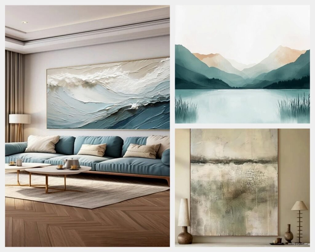
I hung this massive abstract piece above my couch that’s mostly soft blue with some cream… my cat knocked over my coffee looking at it the first day because she was startled by the size, but now it’s genuinely the first thing that makes me exhale when I get home. The piece is like 48×36 inches and I was worried it’d be too much but nope.
Size Matters Way More Than You Think
Here’s where people mess up constantly – they buy art that’s too small. Your living room wall can handle more than you think. I’ve got this formula I use: measure your sofa or the furniture piece below where you’re hanging stuff, and your art should be roughly 2/3 that width. So if your couch is 90 inches, you’re looking at a 60-inch wide piece or a gallery wall that spans that.
Single large pieces (40×30 minimum for most living rooms) create this immediate calm because your eye doesn’t have to work to process a bunch of different elements. Gallery walls can work too but they gotta be planned carefully or they just add visual noise.
What Actually Reads as Peaceful
After curating like probably 200+ art pieces for various spaces, these are the subjects that consistently make spaces feel serene:
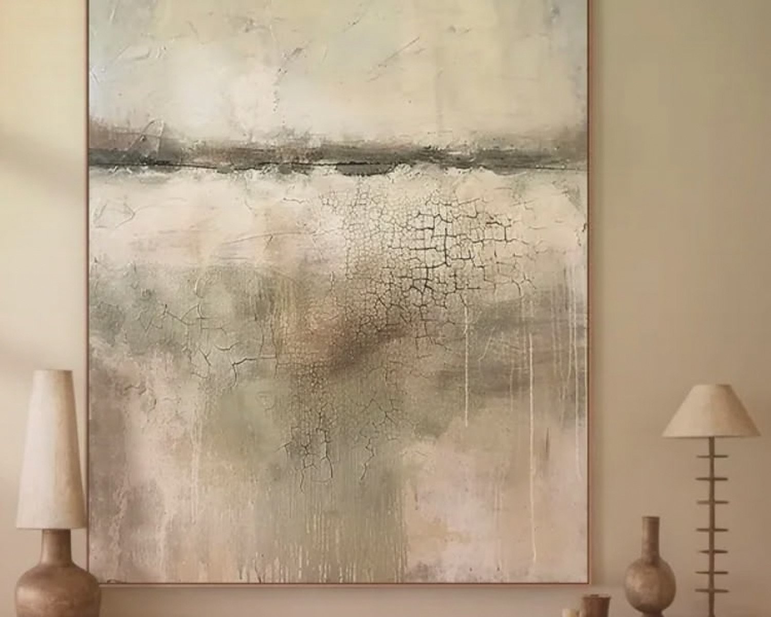
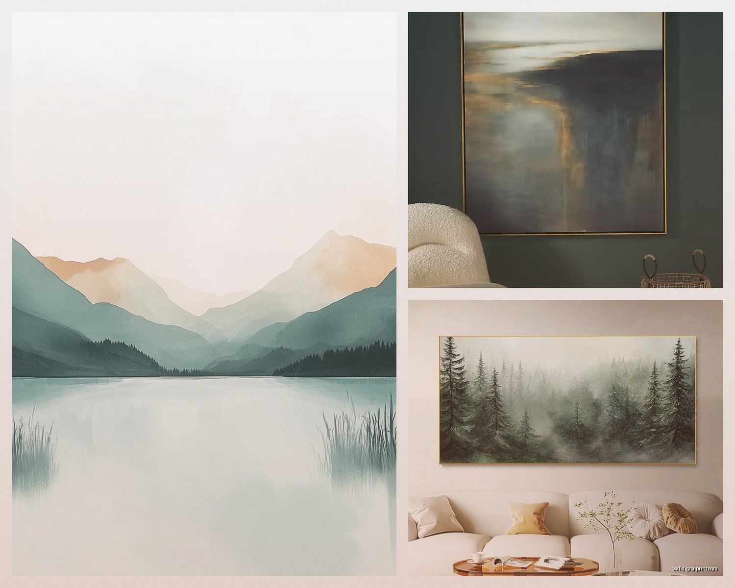
- Abstract landscapes – not realistic ones with tons of detail, but impressionistic or minimalist interpretations
- Minimal line drawings (single line face profiles are overdone now but still work)
- Soft geometric shapes – circles are weirdly calming, harsh angles less so
- Botanical prints IF they’re not too busy – single stems or leaves, not entire gardens
- Monochromatic photography – black and white or tonal images
- Horizon lines – something about that horizontal element just settles people
I’m gonna sound like a snob here but avoid: quotes in script fonts, busy patterns, anything neon or high-contrast, realistic portraits staring at you (my client had this and said she felt watched constantly which… yeah), and those geometric patterns that create optical illusions because your brain never stops trying to process them.
Where to Actually Buy This Stuff
Okay so I’ve ordered from basically everywhere at this point. Here’s my honest breakdown:
Etsy has become my go-to for downloadable prints that you can frame yourself. Search terms that work: “abstract calming art,” “minimalist landscape print,” “serene wall art.” You can get high-res files for like $5-15 and then print them at Costco or a local print shop for cheap. I did this for my bedroom and spent maybe $40 total for three large frames.
Society6 and Minted are pricier but they ship framed which saves you the hassle. I used Society6 for a client who needed something fast and the quality was solid. Their return policy is decent too which matters when you’re buying online.
Local art fairs or student shows if you want original pieces – I found this incredible abstract piece at a university senior show for $200 that would’ve been $800+ in a gallery. The artist was just happy someone wanted it.
Framebridge for custom framing if you’ve got a print you love but need it to look expensive. They’re not cheap but they’re cheaper than local framers usually.
The Printable Route
Wait I forgot to mention – if you go the downloadable print route, make sure you’re getting at least 300 DPI resolution. Ask the seller what size it’ll print clearly at. I’ve made the mistake of buying a file and then realizing it only prints clearly at like 8×10 which is useless for a living room.
Also Canva has templates now where you can literally create your own calming abstract art. I messed around with it one night when I couldn’t sleep and made this ombre blue piece that’s now in my hallway. Took maybe 20 minutes and cost nothing.
Framing Without Losing Your Mind
This part is honestly where the whole vibe comes together or falls apart. Matting creates breathing room around the art which adds to that calm feeling – I usually do white or off-white mats, 2-3 inches on each side.
Frame colors for serene spaces: light wood tones (oak, maple), white, black if your room can handle it without feeling stark, and natural wood with visible grain. Skip ornate frames with lots of detail because they compete with the art.
I’ve been using these simple wood frames from Amazon (gonna sound basic but the Americanflat brand) and they’re shockingly good quality for the price. My friend who’s a professional photographer even asked where I got mine.
Oh and another thing – if you’re doing a gallery wall, lay it out on the floor first. Take a picture. Live with that picture as your phone background for a day or two and see if it still feels calm or if it’s too chaotic. I know that sounds extra but I’ve redone gallery walls three times before getting them right.
Placement Rules That Actually Matter
Hang art so the center is at eye level, which is usually 57-60 inches from the floor. This is the standard gallery height and there’s a reason – it just feels right to your brain.
Above a sofa, leave 6-10 inches between the top of the furniture and the bottom of the frame. Too high and it looks like it’s floating away, too low and it feels cramped.
For large statement pieces, give them space. Don’t crowd them with other stuff on the same wall. The negative space around calming art is part of what makes it calming.
Lighting Makes or Breaks Everything
I cannot stress this enough – you can have the most beautiful serene artwork and if the lighting is harsh overhead fluorescent, it’s gonna kill the vibe. I added picture lights above my main pieces and the difference is wild. Battery-operated LED picture lights are like $25 on Amazon if you don’t want to deal with wiring.
Natural light is obviously ideal but if your art is in direct sun, make sure you’re using UV-protective glass or it’ll fade. Learned that the hard way with a print that turned completely yellow-toned after six months.
Layering Your Art Strategy
This is gonna sound weird but I sometimes lean art on surfaces instead of hanging everything. Like on a console table or mantel, I’ll prop a large frame and layer a smaller one in front. It creates this casual, collected-over-time feel that’s inherently more relaxing than a perfectly hung grid.
Testing Before Committing
Here’s what I do now before buying anything permanent: I print a test version at FedEx or Staples in the size I’m considering, tape it to the wall, and live with it for a week. Costs maybe $10-20 depending on size but saves you from a $300 mistake.
My client canceled last week so I spent an hour comparing different abstract prints in her space this way and we ended up going in a completely different direction than what she originally wanted. The test prints showed that cooler tones worked way better in her light than the warm terracottas she thought she wanted.
Color Psychology Stuff That’s Not Total BS
Blues genuinely do lower blood pressure slightly – there’s actual research on this. They work great in living rooms where you want to decompress.
Greens reduce eye strain and feel restorative. I put a large botanical print in my office area and I swear I’m less tired at the end of the day.
Neutrals with warm undertones (think cream, beige, soft taupe) create coziness without being stimulating.
Avoid reds and oranges in large doses for calming spaces – they literally increase heart rate. Small accent amounts are fine but a huge red abstract is gonna energize more than calm.
The Gallery Wall Approach for Calm
If you really want multiple pieces, here’s how to keep it serene:
- Stick to one color palette across all pieces – varying shades of the same color family
- Use identical frames – mixing frame styles adds visual complexity
- Keep spacing consistent – I use 2-3 inches between frames
- Odd numbers work better (3, 5, 7 pieces)
- Start with the largest piece and build around it
I did a grid of six botanical prints in my dining area, all same size, all white frames, and it reads as one cohesive calming element instead of six separate things.
Budget Breakdown Reality Check
You can do this at different price points:
Budget option: $50-150 total – downloadable prints from Etsy, print at Costco, simple frames from Amazon or thrift stores
Mid-range: $200-500 – Minted or Society6 framed prints, or original art from emerging artists
Splurge: $500+ – original paintings, custom framing, gallery pieces
I’ve honestly gotten compliments on my $8 Etsy download framed in a $30 frame that rivals reactions to pieces I spent $400 on. It’s really about the overall effect in your space.
Mistakes I’ve Made So You Don’t Have To
Bought a “calming” beach scene that had too much detail – my eye kept trying to count the waves or something, it was exhausting.
Went too small on my first attempt – had this tiny 16×20 above my couch that just looked sad and made the wall feel bigger and emptier.
Mixed too many styles in a gallery wall thinking it’d feel collected but it just felt chaotic.
Didn’t consider my wall color – hung a cream piece on a cream wall and it basically disappeared.
Used glass that created glare from my window, couldn’t actually see the art during the day.
Quick Fixes If You Already Have Art That’s Not Working
Sometimes it’s not the art itself but how it’s presented. Try rematting in a wider white mat, switching to a simpler frame, or moving it to a different wall where the lighting is better. I’ve salvaged pieces I thought I hated just by changing the matting.
Also you can paint your wall a different color to make existing art work better – I went from bright white to this soft greige and my art suddenly looked intentional instead of random.
The living room I’m working on right now is getting this massive 60×40 abstract ocean piece that’s mostly soft gray-blue with white. Cost $180 on Etsy as a print, another $200 to frame at a local place, and it’s gonna completely transform the space. Sometimes one perfect piece is the whole answer instead of trying to fill every wall.