Wall Art Guide, Wall Art Tutoriels
Wall Art for Kitchen and Dining Room: Combined Space Decor

Sep
So I’ve been dealing with this exact situation in like three client homes this month and honestly, the kitchen-dining combo thing is trickier than people think because you’re basically trying to make two spaces feel connected but not… identical? If that makes sense.
First thing I always tell people is don’t match your art too perfectly between the two zones. I made this mistake in my own place like five years ago and it looked so staged and weird. I had these matching botanical prints and my sister walked in and was like “did you buy a set?” in that tone, you know? So yeah, lesson learned.
The key is thinking about sightlines. Stand in your kitchen and look at the dining area. What do you actually see? Because that’s gonna tell you what needs to connect visually. In most open layouts, you’re looking at the dining room wall from the sink or stove, right? So that’s your anchor piece. That’s where I usually go bigger and bolder because it needs to carry the visual weight for both spaces.
For the dining room wall, I’m obsessed with large-scale stuff right now. Like 30×40 minimum if you have the space. Abstract pieces work really well here because they don’t compete with food or the general chaos of meal times. I did this deep blue and terracotta abstract piece for a client last month and it completely changed how the space felt. The colors picked up both the kitchen backsplash AND the dining chairs without being matchy-matchy, which is what you want.
Oh and another thing – photography works surprisingly well in dining spaces. I know everyone defaults to food art for kitchens (we’ll get to why that’s usually a mistake in a sec), but architectural photography or landscapes in the dining area create this nice… I dunno, sophistication? I used a black and white series of European doorways once and people literally complimented it every time they came over. It gave the space this gallery feeling without being pretentious.
Okay so for the kitchen itself. This is where people mess up constantly. They put food art in the kitchen. Pasta, wine, vegetables, those “But First, Coffee” signs that I swear I see in every third house. Here’s the thing – you’re already IN a kitchen. You don’t need art to remind you that kitchens are for food. It’s redundant and honestly kinda boring?
Instead, I like using the kitchen for unexpected stuff. Geometric art works great because it’s easy to clean (kitchens get gross, let’s be real). Abstract pieces in colors that complement your cabinets or countertops. I even did a series of vintage botanical illustrations for someone with white cabinets and marble counters, and it was perfect – sophisticated but not trying too hard.
The other mistake is going too small in kitchens. People think “oh it’s just a kitchen, I’ll put small pieces here” but then it looks like an afterthought. If you have wall space between cabinets or above a breakfast nook, treat it like real wall space. A single medium-sized piece (like 20×24) looks way better than three tiny ones clustered together.
Wait I forgot to mention – material matters SO much in kitchens. Paper prints behind glass are fine if they’re away from the stove, but near cooking areas you want sealed canvas or acrylic prints. I learned this the hard way when a framed print got all warped from steam. My dog knocked it off the wall eventually anyway, but still. Acrylic prints are actually really cool looking in modern kitchens – they have this depth to them and they’re super easy to wipe down.
For connecting the two spaces, I use color as the bridge. Pick 2-3 colors that appear in both areas. Like if your kitchen has navy cabinets and brass hardware, and your dining chairs are upholstered in a warm gray, look for art that incorporates navy, gold/brass tones, and gray. It doesn’t have to be exact matches – actually it’s better if it’s not – but having that color thread running through makes everything feel intentional.
This is gonna sound weird but lighting is half the battle with art in these spaces. The kitchen usually has bright task lighting and the dining room has that moody pendant or chandelier situation. So your art needs to work in both bright and dim lighting. This is why I lean toward pieces with good contrast – they read well whether you’re chopping onions under bright LEDs or having a dinner party with dimmed lights.
Texture is another thing nobody talks about. In a combined space, you’ve got smooth cabinets, maybe a wood table, upholstered chairs, tile backsplash… it’s a lot of different textures. Your art can either add to that (textured canvas, mixed media) or calm it down (smooth photography, simple prints). I usually do textured art in the dining area and smoother pieces in the kitchen because the dining room can handle more visual complexity.
Gallery walls are tricky in kitchen-dining combos. I’ve done them successfully, but you gotta be strategic. In the dining area? Yes, definitely doable. In the kitchen? Only if you have a full wall that’s not interrupted by cabinets or appliances. And please, PLEASE use proper hanging hardware. I cannot tell you how many times I’ve walked into homes where people used command strips for heavy frames and… just no. Get proper wall anchors or hit the studs.
Oh and proportions – this matters more than people realize. If you have high ceilings (like 10 feet or more), you need to go bigger or hang things higher. Art that looks perfect in a room with 8-foot ceilings looks like a postage stamp on a 10-foot wall. I usually tell people to hang art so the center is at eye level, which is about 57-60 inches from the floor. But in dining rooms, you can go slightly higher since people are often standing.
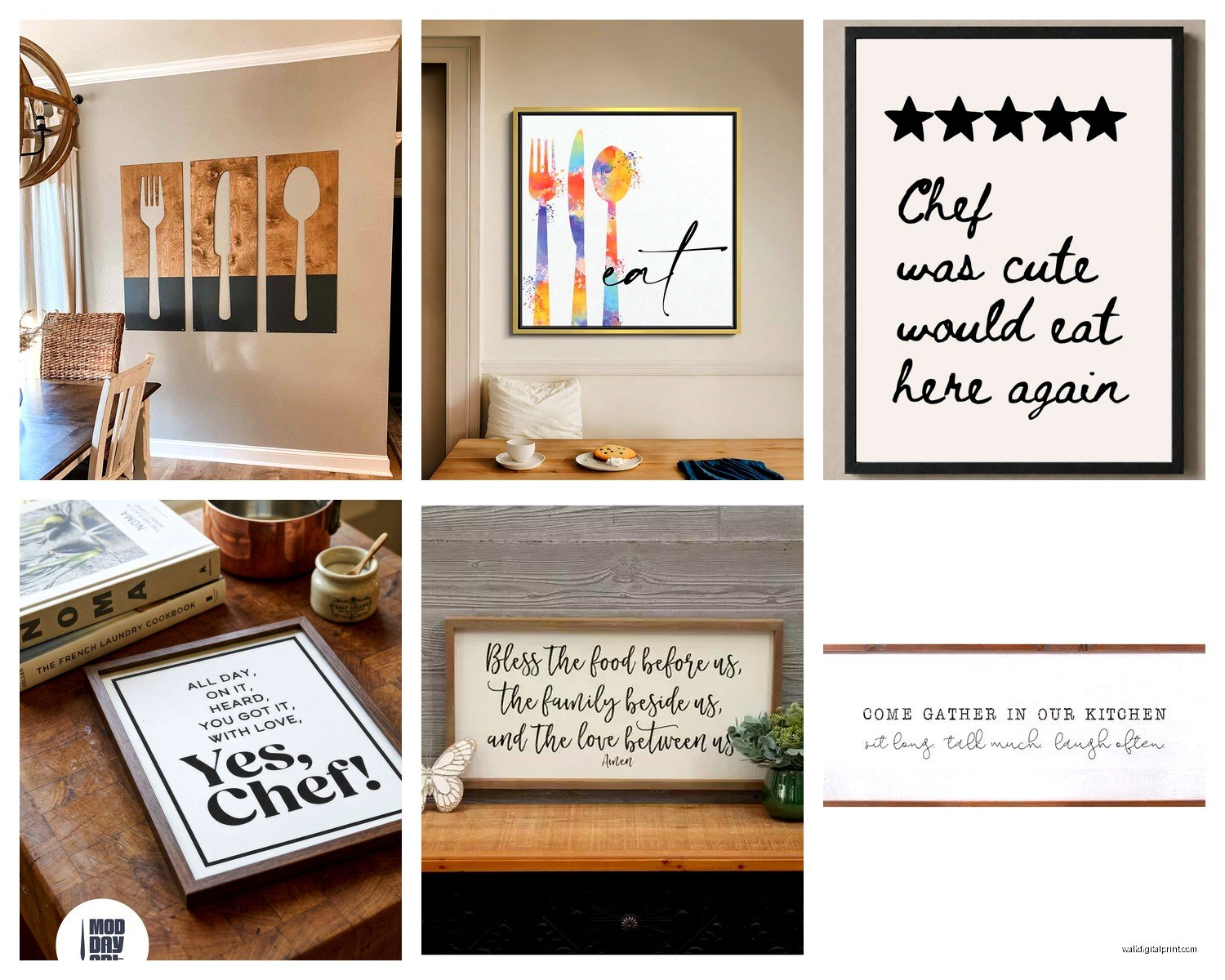
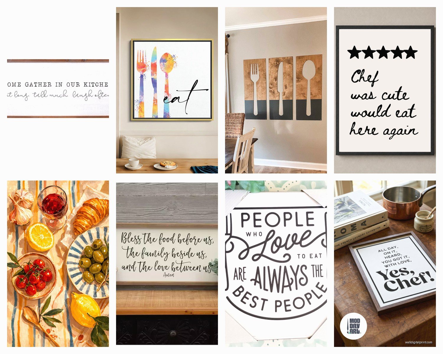
Personal taste rant incoming – I’m so over farmhouse signs. The “Gather” signs, the “Eat” signs, all of it. They had their moment around 2015 and we need to move on. If you want text art (which can actually be cool), look for something more interesting. Typography prints, vintage signage, even menus from favorite restaurants framed nicely. Just… not another “Bless This Mess” situation.
For rental situations or if you’re commitment-phobic about holes in walls, large leaning art works great in dining rooms. Like lean a big frame against the wall on a buffet or console table. It’s very editorial-looking and you can switch it out whenever. Just make sure it’s secured so it doesn’t slide – earthquake putty works great for this even if you don’t live in earthquake territory.
Seasonal switching is something I do in my own space and clients always ask about it. You don’t need different art for every season (that’s excessive and expensive), but having two sets you rotate can be fun. I keep warmer, richer tones for fall/winter and lighter, brighter pieces for spring/summer. My cat absolutely hates when I change things around though – she sits and stares at the new art like I’ve personally offended her.
Budget stuff because this matters – you don’t need to spend thousands. I mix high and low constantly. Etsy has amazing printable art that you can download and print at Costco or a local print shop for like $20 total. Then frame it in a nice frame (where you might spend $50-100) and it looks expensive. I’ve also found great pieces at HomeGoods, Target’s threshold line, and even Facebook Marketplace. Just make sure the frame quality is decent – a good frame elevates cheap art, but a cheap frame ruins expensive art.
If you’re DIYing frames, measure twice I swear. I once ordered custom mats for frames and reversed the dimensions and… yeah that was $60 down the drain. Also, stick with classic frame colors for kitchen-dining areas – black, white, natural wood, or brass/gold. Trendy colored frames date your space fast.
The rule of thirds applies to arranging art too. If you have a long wall in your dining area, break it into thirds visually. You could do three separate pieces, one large piece that takes up the middle third, or even a gallery wall that occupies one third with the rest staying empty. Empty space is good – don’t feel like you have to fill every inch.
One thing that works really well is creating a focal point opposite the kitchen. So if your kitchen is on one side of the open space, put your statement art on the opposite wall in the dining area. It draws the eye through the space and makes the whole area feel larger and more intentional.
Okay quick practical tip – before you hang anything permanently, tape paper templates to the wall. Literally cut paper or use newspapers to the size of your frames and tape them up. Live with it for a few days. Look at it while you’re cooking, eating, cleaning. Make sure the scale feels right and it’s not gonna drive you crazy being off-center or whatever. This has saved me so many times from making permanent holes in the wrong spots.
For super modern kitchens with lots of stainless steel and minimal vibes, black and white photography or line drawings look incredible. For more traditional spaces, landscapes or still life paintings work better. And if your style is somewhere in between (like most people), abstract art is your friend because it works with basically everything.
The backsplash situation – if you have an interesting tile backsplash, your art needs to not compete with it. Either go really simple with the art or put it far enough away that they’re not fighting for attention. I did a kitchen once with this gorgeous blue zellige tile and we kept the art in the adjacent dining area really minimal because the tile was the star.
Last thing I’ll mention is that art doesn’t have to be precious in these spaces. Kitchens and dining rooms are high-traffic, high-mess areas. Don’t put your grandmother’s original watercolors here. Put stuff that makes you happy but that you won’t cry over if it gets splattered with tomato sauce or wine. Save the precious pieces for bedrooms or living rooms where life is calmer.
Also groupings of three work well visually – three prints in a row above a buffet, three pieces staggered on a wall, whatever. Our brains just like groups of three apparently. Something about it being dynamic but balanced. I dunno, I didn’t make the rules, but I use this trick constantly and it works.