Wall Art Guide, Wall Art Tutoriels
Large Wall Art for Living Room: Oversized Main Space Statement
Sep
So I just spent like three hours yesterday helping my sister pick out this massive piece for her living room and honestly the whole thing made me realize how many people totally overthink this. Like she was spiraling about whether it needed to “match the throw pillows” and I’m like no no no, that’s not how this works.
First Thing—Measure Everything Before You Do Anything Else
Okay so this is gonna sound obvious but I’ve seen so many people (including myself, embarrassingly) eyeball wall space and then order something that’s either weirdly tiny or can’t actually fit through their doorway. You need the width of your wall obviously, but also measure your couch length because there’s this rule that actually works—your art should be about two-thirds to three-quarters the width of your sofa. I know everyone says different things but I’ve tested this in probably 30+ living rooms at this point and that ratio just works.
My cat knocked over my measuring tape twice while I was doing this last week which was super helpful. But anyway, write down:
– Wall width
– Wall height
– Sofa length
– Distance from floor to where you’re thinking of hanging it
– Ceiling height because sometimes that matters more than you’d think
The Actual Size Thing Everyone Gets Wrong
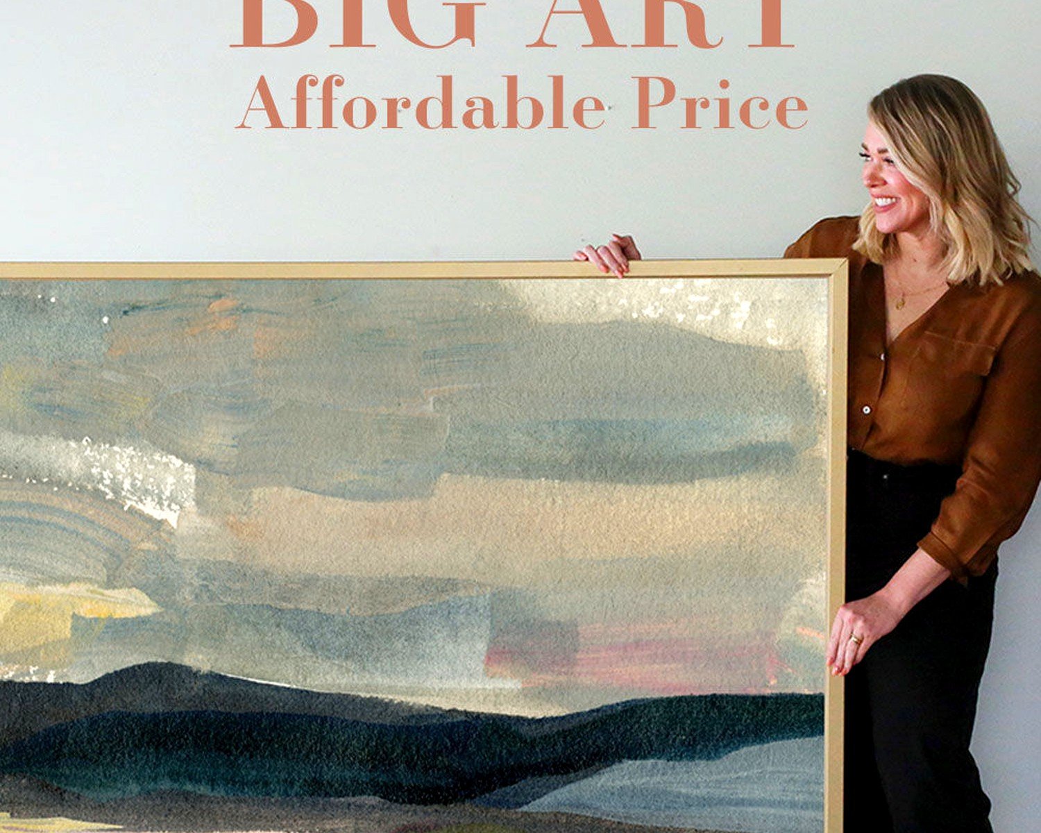
Here’s what I see all the time—people think “large wall art” means like 30×40 inches and then it goes up and looks like a postage stamp. For a standard living room with a couch that’s around 7-8 feet, you’re looking at something that’s AT LEAST 48 inches wide. Like minimum. I usually push people toward 60-72 inches for a real statement.
If you’ve got a huge wall (like 12+ feet), you’ve got options:
– One massive piece (72+ inches)
– A diptych or triptych that spans 80-100 inches total
– A gallery wall situation but that’s a whole different conversation
The thing about going big is it actually makes your room look bigger? I know that sounds backwards but tiny art makes your walls look empty and your space feel cramped. A properly sized piece gives your eye somewhere to land and the room feels more intentional.
Vertical vs Horizontal
Okay so if you have high ceilings (10 feet or more), vertical pieces can be really dramatic. Like 40×60 or even 48×72 oriented vertically. But most living rooms work better with horizontal because that’s how we naturally scan a room when we walk in. Our eyes go side to side first.
I did this one client’s place where we went vertical above their console table instead of their sofa and it completely changed the room’s proportions in a good way, so like… rules are flexible but you gotta know what you’re doing.
What Actually Looks Good Content-Wise
This is where people freeze up completely. My sister was looking at like 47 browser tabs of abstract art and literally couldn’t decide. Here’s what I told her—pick based on what your room is NOT giving you.
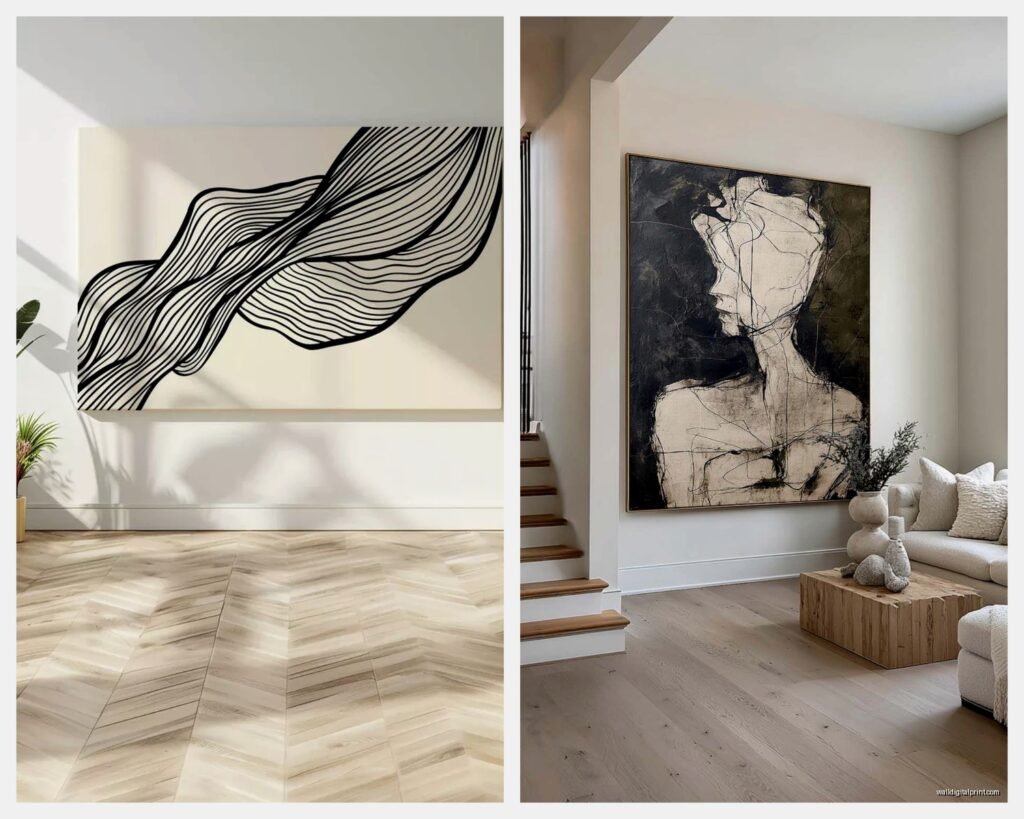
If your living room is all neutrals and clean lines, you can go wild with:
– Bold abstract with lots of color movement
– Oversized photography (black and white can be insanely chic)
– Textured pieces with dimension
– Something with metallics if you want it to feel more elevated
If your room already has pattern and color everywhere, you need art that calms things down:
– Minimal line drawings
– Monochromatic abstracts
– Landscapes in muted tones
– Large scale single-subject photography
The Three-Color Trick
Wait I forgot to mention this earlier but it’s actually the most useful thing. Look at your room and identify the three most dominant colors (including neutrals). Your art should pull at least ONE of those colors but it doesn’t need to match perfectly. Like if you have a grey sofa, navy curtains, and warm wood floors, your art could have grey OR navy OR warm brown tones in it. It doesn’t need all three.
This is what I mean about the throw pillow thing being wrong—you’re not trying to match, you’re trying to coordinate the overall palette.
Where to Actually Buy This Stuff
Okay so this varies wildly depending on budget obviously. I’m gonna break it down by price point because some of the “affordable art” sites are actually terrible quality and I don’t want you wasting money.
Budget-Friendly (Under $300)
Society6 and Redbubble let you print designs in huge sizes and the quality is honestly pretty decent for the price. I’ve used both. The colors can be slightly off from what you see online but for abstract stuff it doesn’t really matter. Just make sure you’re getting a canvas or framed print, not a poster, because oversized posters look cheap no matter what.
Etsy has tons of printable art where you download the file and get it printed locally at a print shop. This can be cost-effective for really large sizes if you find a good local printer. I use this method probably 40% of the time for client projects where we need custom sizing.
Mid-Range ($300-$1000)
Minted has really elevated their large format stuff and they do sales constantly. I got a 54×40 inch piece for my own living room from there during a 25% off sale and it’s held up great for like two years now.
Artfully Walls does curated collections and their framing is actually good quality. A bit pricey but you’re getting something that looks more original.
Local art fairs and open studio events—okay this is gonna sound weird but I’ve found some of my favorite oversized pieces by just googling “[my city] art walk” and going to talk to artists directly. They usually have large pieces that galleries won’t take because they’re hard to ship and you can negotiate.
Investment Level ($1000+)
If you’re spending this much, get an original or a limited edition print. Saatchi Art has a huge selection and their search filters actually work well for finding large-scale pieces. I’ve ordered from them maybe 6-7 times and only had one issue with shipping damage which they resolved immediately.
Uprise Art does payment plans for original art which makes larger pieces more accessible. My client just bought a 72-inch original through them and pays like $200/month.
The Framing Situation
Oh and another thing—framing adds SO much to the cost and weight. A 60-inch framed piece is legitimately heavy and you need serious wall anchors. Canvas wraps (where the image wraps around the edges) are lighter and you can skip framing entirely, which is what I usually recommend for really large pieces.
If you do want framing:
– Thin black frames keep it modern and don’t overwhelm
– Natural wood frames add warmth but make sure the wood tone works with your floors and furniture
– White/light frames only work if your walls aren’t white or it’ll disappear
Floating frames (where there’s space between the art and frame) are having a moment and they do look expensive but they’re also more fragile.
DIY Framing for Large Pieces
I did this for a 60×40 print and it was… an experience. Framebridge does custom sizing online and ships to you which is easier than hauling something huge to a frame shop. But honestly for anything over 48 inches I just go frameless unless the client is really insistent.
How to Actually Hang It Without Destroying Your Wall
This is where people get nervous and I get it because you can’t really redo holes in drywall easily. Here’s my system:
Materials you actually need:
– Stud finder (the $15 one from hardware store is fine)
– Level (or use your phone app honestly)
– Heavy duty wall anchors if you’re not hitting studs
– Picture hanging wire or D-rings depending on what your art comes with
– Painter’s tape
– A helper because doing this alone is how walls get damaged
The Tape Method
Before you put any holes in anything, cut painter’s tape to the exact dimensions of your art and stick it on the wall where you think it should go. Live with it for a day or two. Move it around. This has saved me so many times from hanging things in the wrong spot.
The center of your art should be at eye level, which is usually 57-60 inches from the floor to the center point. But if you’re hanging above a sofa, you want 6-8 inches between the top of the sofa and bottom of the frame. These two rules sometimes conflict and you gotta just make a judgment call.
For really large pieces (60+ inches), I sometimes hang them slightly lower than standard eye level because otherwise they float weirdly near the ceiling.
Common Mistakes I See Literally All The Time
Hanging it too high—this is the number one thing. People think art should be up near the ceiling and it ends up looking disconnected from the furniture.
Going too small—we covered this but seriously, go bigger than you think you need.
Picking something too literal for the space—like beach photography in your beach house is kinda on the nose? I like when there’s a little unexpectedness.
Ignoring the undertones—if your room has warm undertones (beige, cream, warm greys) and you bring in art with cool undertones (true grey, blue-grey, stark white) it’ll feel off even if you can’t articulate why.
Not considering lighting—if your living room gets tons of natural light, glass-covered art will have major glare issues. Go for matte finishes or canvas.
What About Multiple Pieces Instead of One Large One
So diptychs and triptychs are great if you want the impact of large-scale art but you’re nervous about commitment. You can rearrange them, and they’re easier to transport if you move.
The spacing between panels should be 2-4 inches typically. I use 3 inches as my default. Closer than 2 inches and they look like they’re supposed to be touching, wider than 4 inches and they read as separate pieces instead of a cohesive unit.
You can also do two large pieces side by side if you have a really long wall. Like two 40×50 inch pieces with 12 inches between them can look really sophisticated. I just finished a project where we did this with matching frames but totally different art styles and it was *chef’s kiss*.
Styles That Work for Different Living Room Vibes
Okay I’m gonna speed through this because I’ve been typing for a while and I’m supposed to meet someone in 20 minutes but—
Modern/Contemporary: Large scale abstracts, geometric designs, bold color blocks, oversized photography
Traditional: Landscape paintings, classical portraiture (but sized up dramatically), botanical prints in ornate frames
Bohemian: Textured fiber art, macrame (yes it can be wall art), cultural textiles mounted on canvas, warm-toned abstracts
Industrial: Black and white photography, architectural drawings, maps, pieces with exposed hardware
Minimalist: Single-subject photography, minimal line art, monochromatic abstracts, lots of negative space in the composition itself
The thing is you can kinda break these rules if you commit to it. Like a super traditional oil painting in an industrial loft can be really striking if everything else stays industrial.
Maintenance Stuff Nobody Tells You
Dust your art. I know this sounds basic but oversized pieces collect dust on the top edge and it shows. Use a microfiber cloth every few months.
If you have canvas, it can sag over time. You can tighten it from the back by misting the back lightly with water and letting it dry (Google this before you do it, don’t just trust my random explanation).
Keep art out of direct sunlight even if it’s UV-protected because everything fades eventually.
Check your hanging hardware annually especially for heavy pieces. I had a client whose 70-inch canvas fell at 3am and it was a whole thing.
Anyway that’s basically everything I know about this after doing it professionally for way too long. The main thing is just go bigger than feels comfortable and pick something that makes you actually feel something when you look at it, not just something that “goes with” your couch.