Wall Art Guide, Wall Art Tutoriels
Bunny Wall Art: Rabbit Easter Spring Cute Animal Decor
Sep
So I’ve been down this rabbit hole lately (pun totally intended) with bunny wall art because my sister asked me to help her daughter’s nursery and honestly it spiraled into me ordering like seven different pieces to compare and now half my living room looks like an Easter explosion but whatever.
The Actual Styles That Don’t Look Cheesy
Okay so first thing – bunny art can go really wrong really fast. Like there’s cute and whimsical and then there’s “my grandma’s bathroom in 1987” territory. The key is picking a style that matches your vibe.
Watercolor bunnies are having a moment right now and they’re actually pretty versatile. I got this set from Etsy (gotta support small artists) that had these soft gray and blush bunnies and they look sophisticated? Like you can put them in an adult space and it doesn’t scream “I have toddlers” which was important for my client who wanted something that could transition as her kid grows.
The minimalist line art ones are chef’s kiss if you’re into modern decor. Just simple black line drawings of rabbit silhouettes. I hung three of them in a vertical arrangement in my studio and my cat keeps staring at them like they’re gonna move but they photograph really well for the blog.
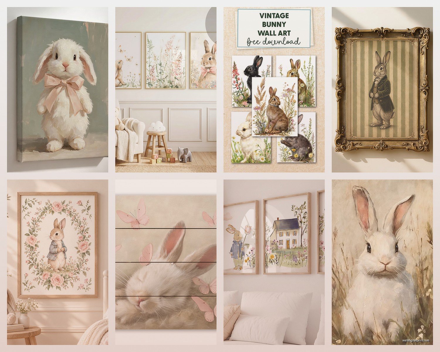
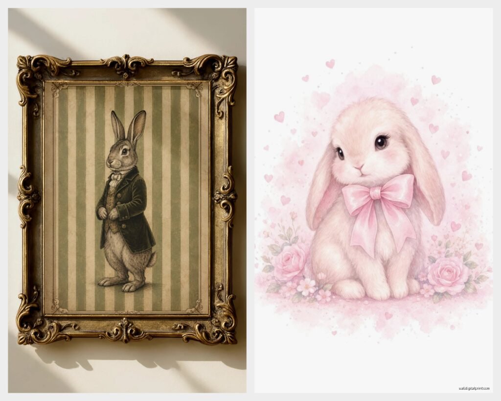
Then there’s the vintage botanical print style – rabbits mixed with flowers and garden elements. These work insanely well for spring decor because you can swap them out seasonally without feeling guilty about the purchase. I found some reproduction prints that look like they came from old nature journals and they’re so good for that cottagecore aesthetic everyone’s still doing.
Size and Placement Strategy
This is where people mess up constantly. They buy art they love and then it’s completely wrong for the space.
For nurseries and kids rooms you want the art at their eye level eventually not yours. So like 36-40 inches from the floor to the center of the piece. But also you’re gonna be in there a lot so don’t hang it so low that you can’t appreciate it either. I usually go slightly higher than “proper” kid height.
Gallery walls with bunny themes are tricky because you don’t want it to look too themed? Mix in some non-bunny elements. I did one with three bunny prints, two botanical prints without animals, and one abstract piece that had similar colors. It felt cohesive without being like a Easter display at Hobby Lobby.
Single large statement pieces (like 24×36 or bigger) work better in playrooms or above cribs. The smaller 8×10 or 11×14 sizes are perfect for shelves or creating little vignettes with other decor items.
The Canvas vs Print vs Poster Debate
Okay so I’ve tested all of these and here’s my honest take:
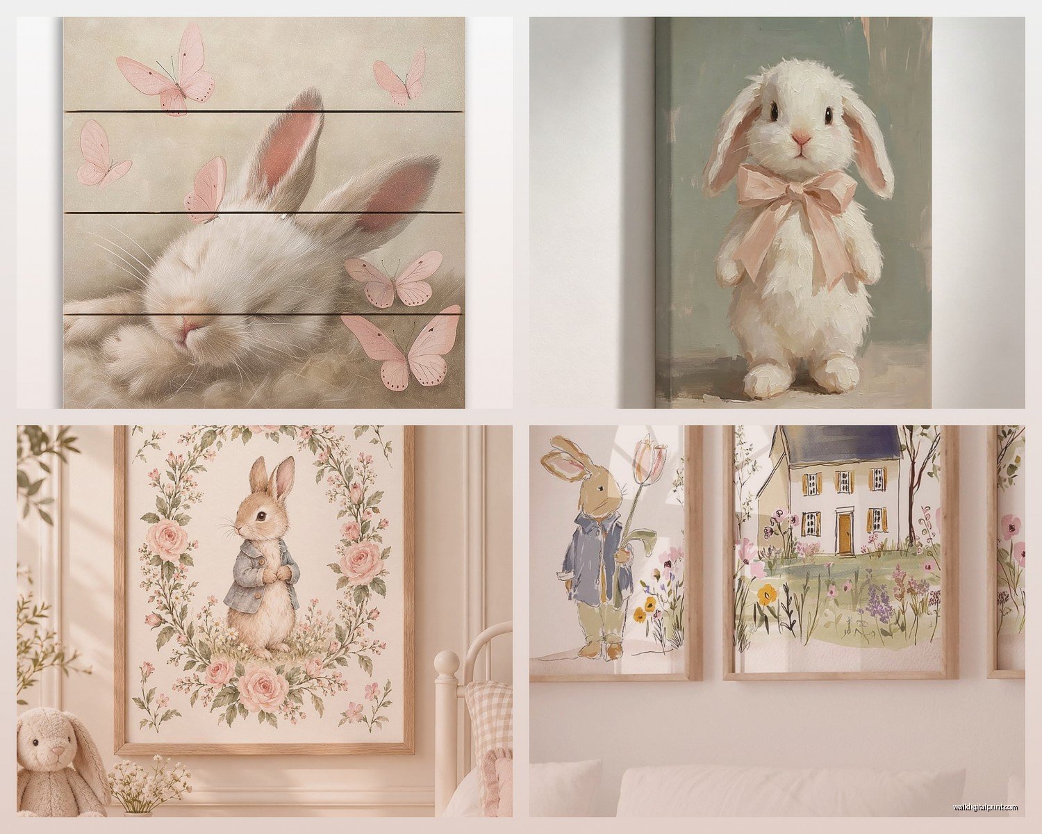
Canvas prints are convenient because they come ready to hang and they have that gallery wrapped edge thing going on. But they can look cheap if the print quality isn’t great. The colors sometimes look muddy on canvas especially with watercolor designs. I ordered one from Amazon that looked amazing in the listing and it showed up looking like someone printed it on a bedsheet. Returned immediately.
Framed prints are more expensive upfront but they look way more polished. You can control the mat color and frame style to match your exact decor. I’m obsessed with matching wood tones lately so being able to pick a light oak frame made a huge difference. The glass also protects the print which matters if you’re putting it in a kid’s room where sticky fingers happen.
Posters are fine if you’re gonna frame them yourself. Don’t hang unframed posters unless you’re in college. Just don’t. Get some cheap frames from IKEA if budget is tight – their RIBBA frames are like $10 and look decent.
Oh and another thing – peel and stick wall decals of bunnies are actually pretty cute for temporary situations or rentals. I used some in a staging project and they photographed well. They’re not gonna fool anyone into thinking they’re real art but for a kid’s room that you know you’ll wanna change in two years? Smart choice.
Color Schemes That Actually Work
The classic pastel bunny situation (soft pinks, baby blues, mint greens) is fine but it’s been done to death. If you want something that feels more current:
Neutral bunnies with black and white and maybe one accent color are so much more versatile. I did a whole wall with sepia-toned rabbit prints and touches of sage green and it felt modern and calm. Works for spring but also just year-round.
Bold jewel tones are unexpected with bunny art. I saw this piece with a rabbit silhouette in deep emerald green against cream and it was stunning. Completely different vibe from the usual soft and sweet approach.
If you’re going for Easter-specific decor the traditional pastels are obviously fine. Just make sure they work with your existing color palette. I made the mistake once of buying these gorgeous lavender bunny prints and then realized my client’s nursery was all warm tones and they looked completely out of place.
My Testing Process (aka What Worked and What Didn’t)
So when my client canceled that one Tuesday I literally spent three hours comparing prints. Here’s what I learned:
The Minted prints are expensive but the quality is legitimately better. The paper stock is thicker, colors are more accurate. Worth it if it’s a main piece you’re gonna look at every day.
Etsy is hit or miss with quality but you get way more unique designs. Always check reviews with photos. I got burned once by a shop that had clearly photoshopped their product images. The actual print was pixelated and sad.
Society6 is good for trendy designs and they do sales constantly. Wait for the 30% off weekends. Their framing options are decent though the frames themselves aren’t heirloom quality or anything.
Printable downloads are the budget option – you get the file and print it yourself at like Staples or FedEx. Quality depends entirely on where you print it and what paper you choose. I’ve had good luck with this for smaller pieces but anything over 11×14 gets pricey to print professionally anyway so you might as well buy a finished print.
Target actually has some cute bunny wall art in their seasonal section and the Opalhouse line. Not gonna lie I’ve used their stuff in client projects and just swapped out the frame. No shame.
Making It Not Look Like Easter Threw Up
This is the thing everyone worries about and honestly valid concern.
Limit your bunny pieces to one wall or one area. Don’t scatter them throughout the entire room unless you’re fully committing to a theme. I group mine with other spring-ish elements like floral prints or bird illustrations so it feels more “nature inspired” than “rabbit obsessed.”
Skip the obvious Easter symbols with the bunnies. If every print has eggs and baskets it’s gonna feel very specifically holiday. Just bunnies in natural poses or with subtle floral elements read more as general spring or nature decor.
Mix in different animal prints if you’re doing a nursery. Bunnies plus deer plus maybe some woodland creatures creates more of a forest theme than a Easter theme. Way more longevity.
The frame color matters so much for this. White frames can make things look more juvenile and Easter-y. Wood tones or black frames immediately make things feel more sophisticated.
DIY Options If You’re Crafty
I’m gonna be real I’m not super crafty but I’ve done a few DIY bunny art projects that turned out okay.
Silhouette paintings are stupidly easy. Get a canvas, paint it whatever background color you want, find a bunny silhouette outline online (or draw one if you’re talented which I’m not), and fill it in with contrasting paint. Takes like an hour including drying time. I did three of these in different sizes and colors and hung them in a cluster.
Pressed flower bunny outlines are really pretty if you have the patience. You arrange dried flowers in the shape of a bunny and frame it under glass. Very cottagecore very whimsical. I attempted this and my dog knocked over my flower arrangement so I gave up but the concept is cute.
Fabric or wallpaper in a frame is a hack I use constantly. Find fabric or wallpaper with a bunny print you like, cut it to size, put it in a frame. Done. Looks custom and expensive. I did this with some vintage-style wallpaper from Spoonflower and people always ask where I got the prints.
Seasonal Rotation Strategy
Okay so if you’re buying bunny art specifically for spring here’s how to make it worth the investment:
Get pieces that can work multiple seasons. Bunnies in snow scenes work for winter obviously. Bunnies in autumn leaves work for fall. Plain bunnies without seasonal context can literally stay up year-round especially in a nursery or kid’s room.
I have a storage system (just a big plastic bin) where I rotate seasonal art. The bunny stuff comes out in March and stays through May usually. Then I swap for summer themes. It keeps things feeling fresh and gives me an excuse to keep buying art which my credit card doesn’t love but whatever.
If you’re putting bunny art in a main living area consider pieces that are subtle enough to not scream SPRING at full volume. That way if you’re lazy about rotating decor (me, I’m describing me) it doesn’t feel weird having bunnies up in July.
Where to Actually Hang This Stuff
Beyond the obvious nursery situation:
Entryways are great for seasonal art rotations. I have a small gallery wall by my front door that I change with the seasons and bunny prints are perfect for spring. It’s the first thing people see and it sets a welcoming tone.
Bathrooms are underutilized for art. A small bunny print in a powder room is unexpected and cute. Just make sure it’s properly framed to handle moisture.
Home offices need art too and bunny prints can add whimsy to what might otherwise be a boring space. I have a small one on the shelf behind me for video calls and people comment on it literally every meeting.
Dining rooms with botanical or garden themes pair really well with rabbit art. There’s something very Beatrix Potter about it that feels nostalgic and charming.
Wait I forgot to mention – mudrooms or laundry rooms are actually perfect for fun art that you might not want in main spaces. I have a really whimsical cartoon bunny print in my laundry room and it makes doing laundry like 2% more tolerable.
Budget Breakdown
Since you probably wanna know what this actually costs:
Printable downloads: $5-15 per design, then printing costs ($15-40 depending on size)
Budget prints from Target/HomeGoods: $15-30 framed
Etsy prints: $20-60 depending on artist and size
Canvas prints online: $30-80
High-end prints (Minted, Framebridge): $80-200+
Custom commissioned art: $200-1000+ (but you get exactly what you want)
I usually tell clients to invest in 1-2 really nice pieces and fill in with more budget-friendly options. Nobody’s gonna inspect every single piece on your wall to judge the quality.
The frames can cost more than the prints sometimes which is annoying. If you’re doing multiple pieces try to buy frames in bulk or wait for Michael’s 50% off sales. Their gallery frames are decent quality and way cheaper on sale.
Lighting Makes a Huge Difference
This is gonna sound obvious but proper lighting transforms wall art. I added a small picture light above one of my bunny prints and it went from “that’s nice” to “wow where did you get that.”
Natural light is obviously ideal but be careful with direct sunlight on prints. They’ll fade over time. I learned this the hard way with some prints in my bedroom that face east. UV-protective glass exists but it’s expensive.
If you’re doing a gallery wall consider the lighting in that spot. Hallways are notoriously poorly lit and your art won’t look as good in dim lighting. Add a sconce or two if needed.
Okay so I think that covers most of what I’ve figured out through trial and error. The main thing is just pick something you actually like looking at because you’re gonna see it every day. Don’t buy something just because it’s trendy or you think you’re supposed to have bunny art for spring. But also bunnies are really cute so like… hard to go wrong honestly.