Wall Art Guide, Wall Art Tutoriels
Grey and White Wall Art: Neutral Monochrome Elegant Designs
Sep
So I’ve been working with grey and white wall art for like three years now and honestly it’s become my go-to recommendation when clients are freaking out about commitment. Last week someone texted me at literally 11pm asking which pieces to buy for their living room and I realized I should probably just write this all down.
Why This Color Combo Actually Works
Okay so the thing about grey and white is it’s basically foolproof but also not boring if you do it right. I’ve tested this in probably 40+ homes at this point and it works whether you’ve got modern furniture or that vintage stuff your aunt gave you. The key is texture and scale, which I’ll get to in a second.
Grey comes in like a million undertones though and this is where people mess up. Cool greys have blue undertones, warm greys lean beige (sometimes called greige, which is a terrible word but whatever). You gotta match your grey art to your wall color or it looks off. I learned this the hard way when I bought this gorgeous abstract piece for my own place and it looked purple against my walls because the undertones clashed.
Getting the Undertones Right
Take a paint swatch of your wall color to the store or order samples. Seriously. I know it sounds extra but I’ve returned so many pieces because what looked perfect online looked completely wrong in the actual space. Natural light vs artificial light also changes everything – my north-facing rooms make greys look way cooler than they actually are.
If your walls are warm white or cream, go for warmer greys. If you’ve got stark white or cool-toned greys on the walls, stick with cooler grey artwork. There’s this middle ground grey that works with most things but it’s kinda boring honestly.
Types That Actually Look Good
Abstract Geometric Stuff
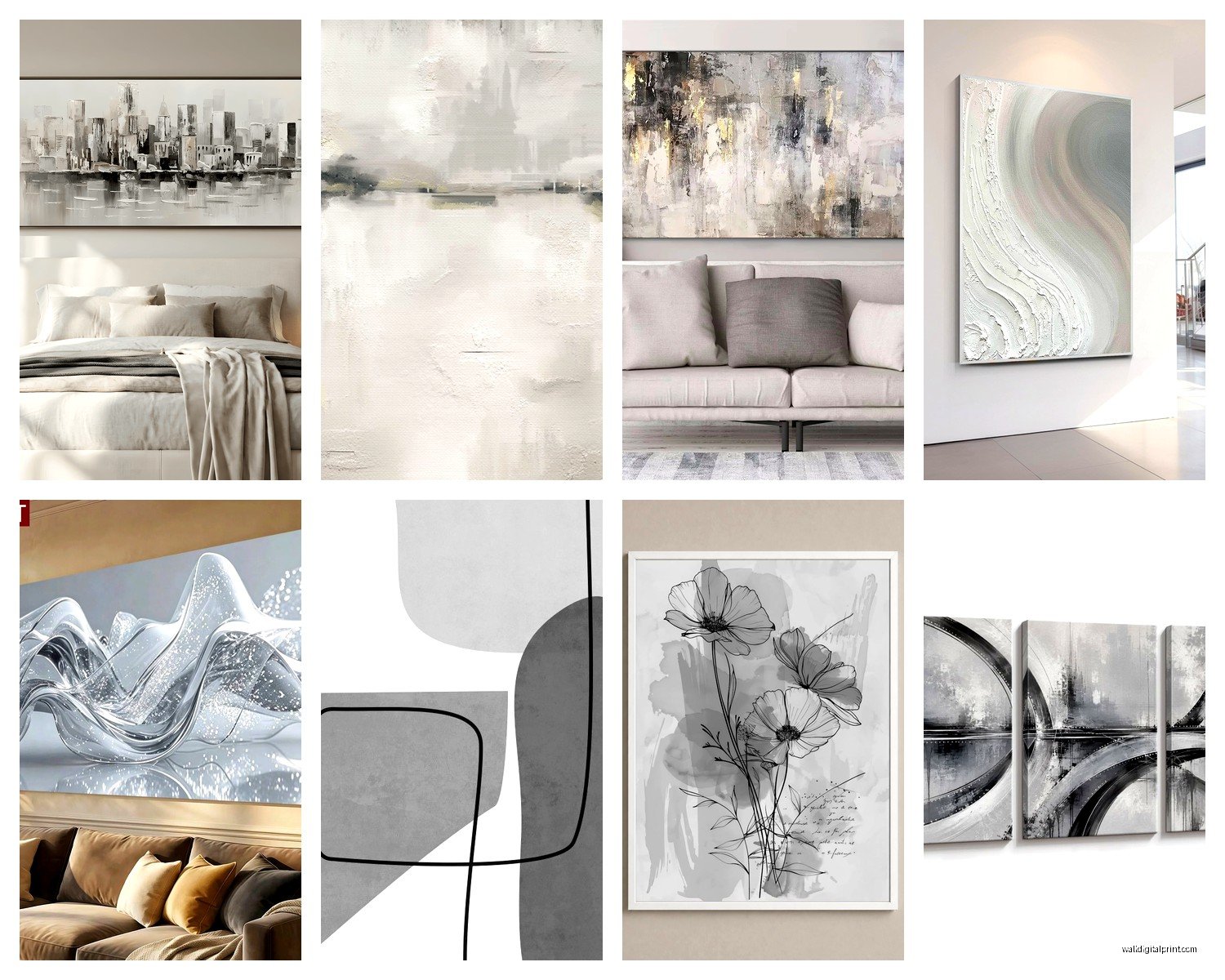
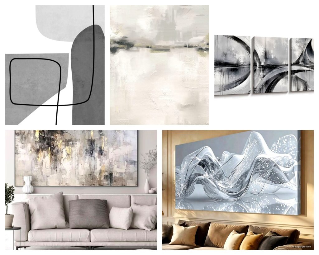
This is probably the easiest category to work with. Clean lines, shapes, maybe some texture. I’ve used these in like every minimalist space I’ve styled. The key is getting the right size – people always go too small and then it looks like an afterthought.
For over a sofa you want something that’s about 2/3 the width of the sofa. I measure this every single time because eyeballing it never works. A 90-inch sofa needs art that’s around 60 inches wide, either one large piece or a gallery wall that spans that width.
Canvas prints work great for geometric designs because the texture adds dimension. I’ve found that pieces with raised elements or mixed media look way more expensive than flat prints. There’s this one supplier I use that does textured grey concrete-look prints and they photograph amazing for my blog.
Line Drawings and Minimalist Sketches
Okay so this trend has been going strong for like five years and it’s not dying anytime soon. Single-line face drawings, botanical sketches, that kind of thing. They work because they’re subtle but still interesting.
The trick with these is grouping. One tiny line drawing looks lonely. Three or five in a grid looks intentional. Always odd numbers for gallery walls – it’s just visually more balanced, I don’t make the rules.
I did a client’s bedroom last month with five different botanical line drawings in thin black frames on white backgrounds and it looks so clean. Cost like $200 total for everything including frames from that big Swedish furniture store.
Photography Prints
Black and white photography is classic but you gotta be careful it doesn’t look like a dentist’s office. I stay away from those generic beach scenes or inspirational quote photos. Instead look for:
- Architectural photography with strong lines
- Abstract nature shots (close-ups of leaves, waves, sand patterns)
- Urban landscapes with interesting contrast
- Vintage-style portraits if you’re into that
Matte prints look more sophisticated than glossy for this style. Glossy can look cheap unless it’s behind museum glass which gets expensive fast.
Textured and Mixed Media
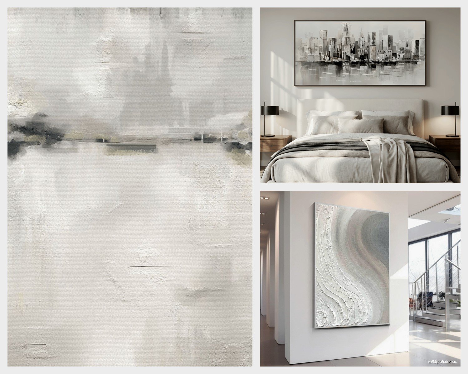
This is where you can really elevate the whole neutral thing. Pieces that combine paint with fabric, or have 3D elements, or use different shades of grey in layers. I’m obsessed with these right now because they add so much depth.
My living room has this piece that’s like grey and white paint with some raised plaster elements and every single person who visits asks about it. It catches light differently throughout the day which keeps it interesting.
Framing Makes or Breaks It
Oh and another thing – frames matter SO much with neutral art. I’ve seen beautiful prints completely ruined by the wrong frame.
Frame Colors That Work
Black frames are classic and work with literally everything. They add definition and make the art pop. I use black frames probably 60% of the time.
Natural wood frames (light oak, ash, maple) add warmth and work great if your space has other wood elements. Just make sure the wood tones match – mixing warm and cool woods looks messy.
White frames can work but they need to match your white walls exactly or they look dingy. I usually skip white frames unless it’s a gallery wall situation where I want everything to blend together.
Metallic frames (silver, brushed nickel, champagne gold) can look really elegant but they’re harder to pull off. I only use these in spaces that already have metallic accents in the light fixtures or hardware.
Frame Styles
Thin frames (like half-inch or less) look modern and let the art be the focus. These work best for photography and line drawings.
Chunky frames (2+ inches) make a statement and work well for abstract pieces or when you want the art to be a focal point. My cat knocked over one of these once and it survived because the frame protected it, so there’s that.
Floating frames where the art appears to float between two pieces of glass look super high-end. They’re more expensive but worth it for special pieces.
Arranging Multiple Pieces
Okay so this is gonna sound weird but I actually plan gallery walls on the floor first. I trace the frames on paper, tape the paper to the wall, then hang the actual pieces. Saves so many nail holes.
Gallery Wall Rules I Actually Follow
Keep spacing consistent – 2 to 3 inches between frames looks most professional. I use a ruler for this because my eye is terrible at judging equal distances.
The center of your gallery wall should be at eye level, which is usually around 57-60 inches from the floor. Measure to the center point of your overall arrangement, not individual pieces.
Mix sizes but keep a visual balance. I usually start with the largest piece slightly off-center and build around it. Putting the biggest piece dead center can look too symmetrical and stiff.
Stick to 2-3 frame styles max. All matching frames is safe, mixing too many styles looks chaotic.
Pre-Made Gallery Wall Sets
Listen, if the DIY approach sounds like too much, there are companies that sell pre-coordinated sets. I’ve used these for clients who need something done quickly and they look great. You get 5-7 pieces that are designed to work together with a template for hanging.
The downside is everyone else might have the same set, but honestly in neutral colors it’s less obvious than with colorful art.
Where to Actually Buy This Stuff
I get asked this constantly so here’s my real answer after testing a bunch of sources:
Budget-Friendly Options
That big Swedish store has surprisingly good options under $50. Their frames are solid quality too. I’ve used their stuff in rental properties and it holds up.
Online print-on-demand sites let you choose from thousands of designs and they print and ship within a week usually. Quality varies by which printing service they use – look for ones that specify archival paper and pigment inks.
HomeGoods and similar stores are hit or miss but when you find something good it’s usually well-priced. I check these every few weeks because inventory changes constantly.
Mid-Range
Minted and Society6 have tons of independent artists and you can get stuff printed in different sizes. I’ve ordered probably 30 pieces from Minted and the quality is consistent. Their framing options are decent too.
West Elm and CB2 if you want something more unique. They’re pricier but the pieces tend to be more interesting than mass-market options. Wait for sales – they do 20% off pretty regularly.
Investment Pieces
For clients with bigger budgets I source from actual galleries or commission custom pieces. There’s something special about having original art even if it’s by an emerging artist. Etsy has some amazing artists doing custom abstract work in grey and white.
Local art fairs are great for finding unique pieces. I got this incredible textured grey painting at a street fair for $300 that would easily cost $800 in a gallery.
Sizing Without Losing Your Mind
This is where people mess up most often. Too small art floating on a big wall looks sad.
For a statement wall, go big – like 40×60 inches or larger. I know it feels scary but trust me, you’ll wish you went bigger. I’ve never had a client say their art was too large, but I’ve had dozens say they should have sized up.
Above furniture, the art should be anchored visually. For a console table or dresser, the art should be no wider than the furniture and ideally around 2/3 the width.
In a gallery wall, the overall arrangement should follow these sizing rules, not individual pieces.
My bedroom has a 48×36 inch piece above the bed and initially I thought it was too big but now I can’t imagine anything smaller. Scale is everything.
Mixing Patterns and Textures
Wait I forgot to mention – you can totally mix different styles of grey and white art in the same space as long as you stick to the color palette. I’ve got a line drawing next to an abstract painting next to a textured piece in my hallway and it works because they’re all grey and white.
The key is repeating elements. If one piece has geometric shapes, maybe another has geometric elements too. Or they all have similar frame styles. There needs to be something tying them together visually.
Adding Subtle Color
Okay so technically this is about grey and white but a tiny bit of another color can actually make the neutrals pop more. Like 90% grey and white with 10% soft blue or blush pink. I did this in my office with mostly neutral art plus one small piece with pale blue and it makes the whole wall more interesting.
Just keep any additional colors super subtle and limit it to one accent color. Otherwise you lose the elegant neutral vibe you’re going for.
Lighting Your Art
This makes such a huge difference and people forget about it. Grey and white art needs good lighting or it falls flat.
Picture lights mounted above the art look fancy but they’re expensive and require electrical work. I use them in formal living rooms and dining rooms.
Track lighting or adjustable spotlights are more flexible. You can aim them at your art and adjust as needed. These work great if you change your art seasonally.
Natural light is obviously best but watch out for direct sunlight which will fade prints over time. I use UV-protective glass on anything in direct sun.
The warmth of your light bulbs affects how the greys read. Cool white bulbs (4000K+) make greys look crisper. Warm bulbs (2700K) make them look softer and cozier. I usually go with 3000K as a middle ground.
Maintenance Real Talk
Dust your art. I know this sounds obvious but textured pieces especially collect dust in the crevices. I use a soft brush attachment on my vacuum on low power, sounds weird but it works.
Glass-covered prints just need a wipe with glass cleaner. Easy.
Canvas prints can be gently dusted or very lightly vacuumed. Don’t use any wet cleaning methods.
If you’ve got pets, hang art higher than you think you need to. My dog’s tail has knocked things off walls before and it’s the worst.
Common Mistakes I See All the Time
Hanging art too high. The center should be at eye level, not ceiling level. So many people hang things way too high and it looks weird.
Going too matchy-matchy. All identical frames in a perfect grid can look sterile. Add some variation.
Forgetting about the space below the art. If there’s a sofa or table underneath, leave 6-8 inches of space between the furniture and the bottom of the frame.
Buying art before painting. Paint colors look different with art on the walls. If you’re doing both, choose paint first or at least bring paint samples when art shopping.
Not considering the room’s style. Modern art in a traditional room can work but you need transition elements. Same with traditional art in a modern space.
Okay I think that covers most of what you’d actually need to know. I’m gonna stop here because my dinner’s ready but honestly grey and white art is pretty forgiving once you understand the basics about scale and undertones. Just start with one piece you really love and build from there.