Wall Art Guide, Wall Art Tutoriels
Yellow and Grey Wall Art: Sunny Neutral Cheerful Combo
Sep
So I’ve been obsessing over yellow and grey combos lately and honestly it’s one of those things that sounds kinda basic until you actually start playing with it in real spaces. Like, my client last month wanted something “cheerful but sophisticated” and I immediately went to this pairing.
Why This Actually Works When Other Combos Don’t
The thing about yellow and grey is that grey basically acts like a visual dimmer switch for yellow. You know how yellow can go from sunshine-happy to school-bus-aggressive real fast? Grey just… calms it down without making it boring. I learned this the hard way after putting a massive all-yellow abstract piece in someone’s dining room and they literally said it gave them anxiety during dinner. Oops.
Grey brings this neutral sophistication that makes yellow feel intentional instead of like you’re trying too hard. And depending on which grey you use—charcoal, slate, warm grey, cool grey—you can totally change the vibe. Warm greys with yellow feel cozy and Scandinavian. Cool greys make it more modern and crisp.
Picking the Right Yellow Shade
Okay so this matters way more than people think. You’ve basically got these categories:
- Mustard/ochre yellows – these are earthy and vintage-feeling, work great with darker greys
- Butter/cream yellows – soft and subtle, pair with light greys for that airy look
- Lemon/bright yellows – high energy, need medium to dark grey to balance them out
- Golden yellows – warm and kind of luxe, surprisingly versatile with any grey
I usually tell people to avoid neon yellows unless you’re going for a very specific pop art thing. Had a client insist on neon yellow once and their living room ended up looking like a highlighter exploded. Not my best moment as a curator, but hey, they were happy with it so whatever.
The mustard yellows are having a moment right now and honestly they’re the easiest to work with because they’ve got some brown undertones that make them feel more grounded. Less likely to clash with your existing furniture.
Grey Choices That Actually Matter
Here’s where it gets interesting. Light grey (like dove grey or silver) with yellow creates this Scandinavian minimalist thing that feels really fresh and modern. It’s everywhere on Pinterest for a reason—it just works. The contrast isn’t super harsh so it feels calm.
Medium greys—think slate or pewter—give you more drama. The yellow really pops against these. This is my go-to for accent walls or when someone wants the art to be the focal point. You get that cheerful element but it doesn’t overwhelm the space.
Charcoal or dark grey with yellow is bold. Like, statement-making bold. The contrast is intense and it reads very contemporary. I used this combo in a home office last year and the client said it actually helped her focus because the yellow gave energy but the dark grey kept it from being too stimulating. Who knows if that’s actually true but she seemed convinced.
Mixing Different Greys
Wait I forgot to mention—you don’t have to stick to one shade of grey. Some of the best yellow and grey art I’ve curated uses multiple grey tones in the same piece. It adds depth and keeps things from looking flat. Like you might have charcoal lines, medium grey shapes, and light grey backgrounds all with pops of yellow throughout.
Where to Actually Hang This Stuff
Living rooms are the obvious choice because yellow is naturally social and welcoming. But don’t sleep on bedrooms—a softer butter yellow with light grey can be really calming. My sister has this yellow and grey abstract above her bed and she swears she sleeps better now. I think she’s making that up but it does look nice.
Kitchens and dining areas are perfect for this combo. Yellow stimulates appetite apparently (that’s what some study said, I read it while watching that baking show with the tent). Grey keeps it from being too intense. Just make sure you’re not putting it where direct sunlight hits because yellow pigments can fade faster than other colors.
Home offices need that energy boost and grey keeps it professional. I’ve got a yellow and grey geometric print in my own workspace and it definitely makes those 3pm slumps slightly less painful.
Bathrooms can handle this too, especially if you’ve got a lot of white tile. A small yellow and grey piece adds personality without making the space feel cluttered.
Styles That Work With This Color Combo
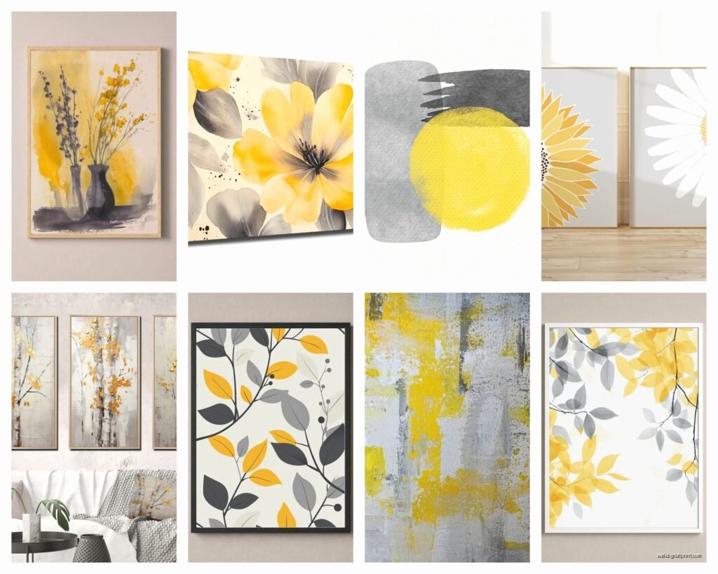
Abstract art is probably the most popular and for good reason. Geometric abstracts with clean yellow and grey shapes feel modern and put-together. Fluid abstracts with these colors can go either energetic or calm depending on the composition.
Botanical prints with grey backgrounds and yellow flowers—think sunflowers, marigolds, forsythia—bring nature indoors without being too cottage-core. I curated a whole gallery wall of these for a client who wanted “spring vibes year-round” and it actually turned out less cheesy than I expected.
Geometric patterns are your friend here. Chevrons, hexagons, triangles in yellow and grey create visual interest without needing to be representational. Good for people who want art but don’t wanna commit to a specific subject.
Typography and quotes work surprisingly well. Grey text with yellow accents or vice versa. Just… please choose better quotes than “Live Laugh Love.” I’m begging you.
Photography can be stunning—black and white photos with selective yellow coloring, or naturally yellow subjects (taxis, flowers, vintage cars) against grey urban backgrounds.
Size and Placement Tips
Okay so funny story, I once hung a massive yellow and grey piece way too high and the client’s husband couldn’t figure out why the room felt off until I came back and lowered it eight inches. Eye level is generally 57-60 inches from the floor to the center of the artwork. This is standard gallery height and there’s a reason galleries use it.
For over furniture, leave 6-8 inches between the furniture top and the bottom of the frame. Any more and it looks like it’s floating away. Any less and it feels cramped.
Scale matters more than people realize. A tiny 8×10 print on a huge empty wall looks sad and lost. Either go big (at least 2/3 the width of your sofa if it’s hanging above) or create a gallery wall with multiple pieces.
Gallery Wall Configurations
If you’re doing a gallery wall with yellow and grey pieces, mix in some all-grey or all-yellow pieces too. Don’t make every single piece the same color combo or it gets repetitive. I usually do like 60% yellow and grey, 30% just grey, 10% just yellow. Those percentages are totally made up but you get the idea.
Grid layouts feel structured and modern—all same-size frames in neat rows. Salon-style layouts are more organic and collected-looking—different sizes arranged together. Just lay them out on the floor first and take a photo so you remember the arrangement. Trust me on this, I’ve messed it up before by winging it.
Framing Choices
White frames keep things light and airy. Black frames add drama and make the colors pop more. Natural wood frames (especially light oak or maple) warm up the combo and add texture. Grey frames obviously blend with the artwork but can sometimes disappear too much—I usually only use grey frames when I want the art to feel really integrated with the wall.
Metal frames in silver or brass work great too. Silver echoes the grey, brass adds a third metallic element that can elevate the whole thing.
My cat just knocked over my coffee while I’m writing this, great.
Anyway, frameless or canvas prints are fine if you’re going for casual, but I find that yellow and grey art benefits from framing. It gives it structure and makes it feel more intentional.
What to Avoid
Don’t go too matchy-matchy with your wall color. If your walls are grey, don’t get grey frames with mostly-grey art. You need contrast or everything blends together and you’ve basically wasted money on art nobody notices.
Avoid putting yellow and grey art near other bold color combos. Like if you’ve got a bright blue accent wall or red furniture nearby, it’s gonna compete and nothing will look good. Keep the rest of the space relatively neutral.
Too much yellow is a real thing. Even though we’re talking about yellow and grey art, if you already have yellow curtains and yellow throw pillows and a yellow rug, adding yellow art might tip it over into overwhelming territory. Balance is key.
Lighting Considerations
Natural light changes how these colors look throughout the day. Morning light makes yellow glow and feel energetic. Afternoon light can wash it out a bit. Evening light makes grey look warmer and cozier.
Artificial lighting matters too. Warm LED bulbs (2700-3000K) make yellows richer and greys warmer. Cool LEDs (4000K+) make greys look more blue-toned and yellows more citrusy. I usually recommend warm LEDs for living spaces because it’s more flattering overall.
If you’re gonna put a picture light on your yellow and grey art, test it first. Some yellows can look weirdly green under certain lights.
Budget-Friendly Options
Look, you don’t gotta spend a fortune. Printable art from Etsy is like $5-15 and you can print it at a local print shop for cheap. Frame it yourself and you’ve got custom art for under $50.
HomeGoods and TJ Maxx randomly have decent yellow and grey pieces. It’s hit or miss but I’ve found some surprisingly good stuff there. You just have to go regularly because inventory changes constantly.
Society6 and Redbubble let independent artists sell prints. Quality varies but there’s tons of options in every style. Plus you’re supporting actual artists which feels good.
Thrift stores sometimes have frames you can spray paint and you can just print your own art to put in them. I’ve done this more times than I’ll admit.
Mixing Patterns and Textures
This is gonna sound weird but texture matters even in wall art. A smooth photographic print next to a textured canvas painting creates visual interest. Matte finishes feel more sophisticated, glossy finishes are more contemporary and energetic.
If you’re doing multiple pieces, vary the patterns. One geometric, one abstract, one botanical. Or one large-scale pattern with one small-scale pattern. Matching patterns can work but it’s riskier.
Seasonal Considerations
Yellow and grey genuinely works year-round which is part of why I love it. In spring and summer it feels bright and fresh. In fall the mustard yellows especially feel cozy and harvest-like. In winter the grey grounds it and makes it feel sophisticated instead of out-of-place.
Some people rotate their art seasonally which honestly sounds exhausting to me but if you’re into it, you could do brighter yellows in summer and deeper mustards in winter.
Quick Shopping Tips
Read dimensions carefully. I cannot tell you how many times people order art online and are shocked when it arrives tiny. Check measurements twice.
Look at reviews with photos if possible. Marketing photos can be misleading about actual colors. Real customer photos show you what it actually looks like in a normal room.
Check return policies before buying. Colors can look different in person and you might need to send it back. Make sure you can.
For original art, ask about the medium. Acrylic, watercolor, digital print, mixed media—they all have different looks and price points.
Oh and another thing, if you’re buying from an independent artist, don’t ask them to lower their prices. Just… don’t. Either buy it or don’t, but don’t haggle with artists trying to make a living.
The yellow and grey combo is forgiving enough that you can experiment without too much risk. Start with one piece, see how you like it, then build from there. You don’t need a whole gallery wall on day one.