Wall Art Guide, Wall Art Tutoriels
Koala Wall Art: Australian Eucalyptus Bear Cute Animal
Oct
So I’ve been completely obsessed with koala wall art lately and honestly it started because a client wanted to do this whole Australian-themed nursery but didn’t want it to look like a tacky souvenir shop, you know? And I went down this rabbit hole of eucalyptus bears (which is what my niece calls them and now I can’t stop) and figured out what actually works versus what looks cheap.
Finding the Right Style Without Looking Like a Tourist Trap
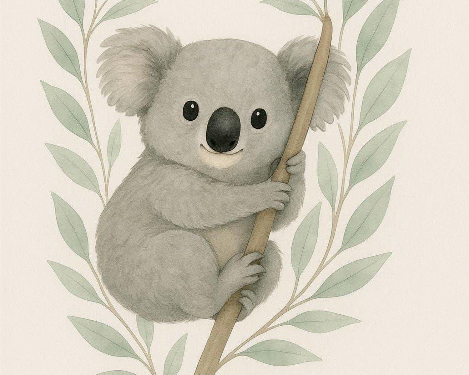
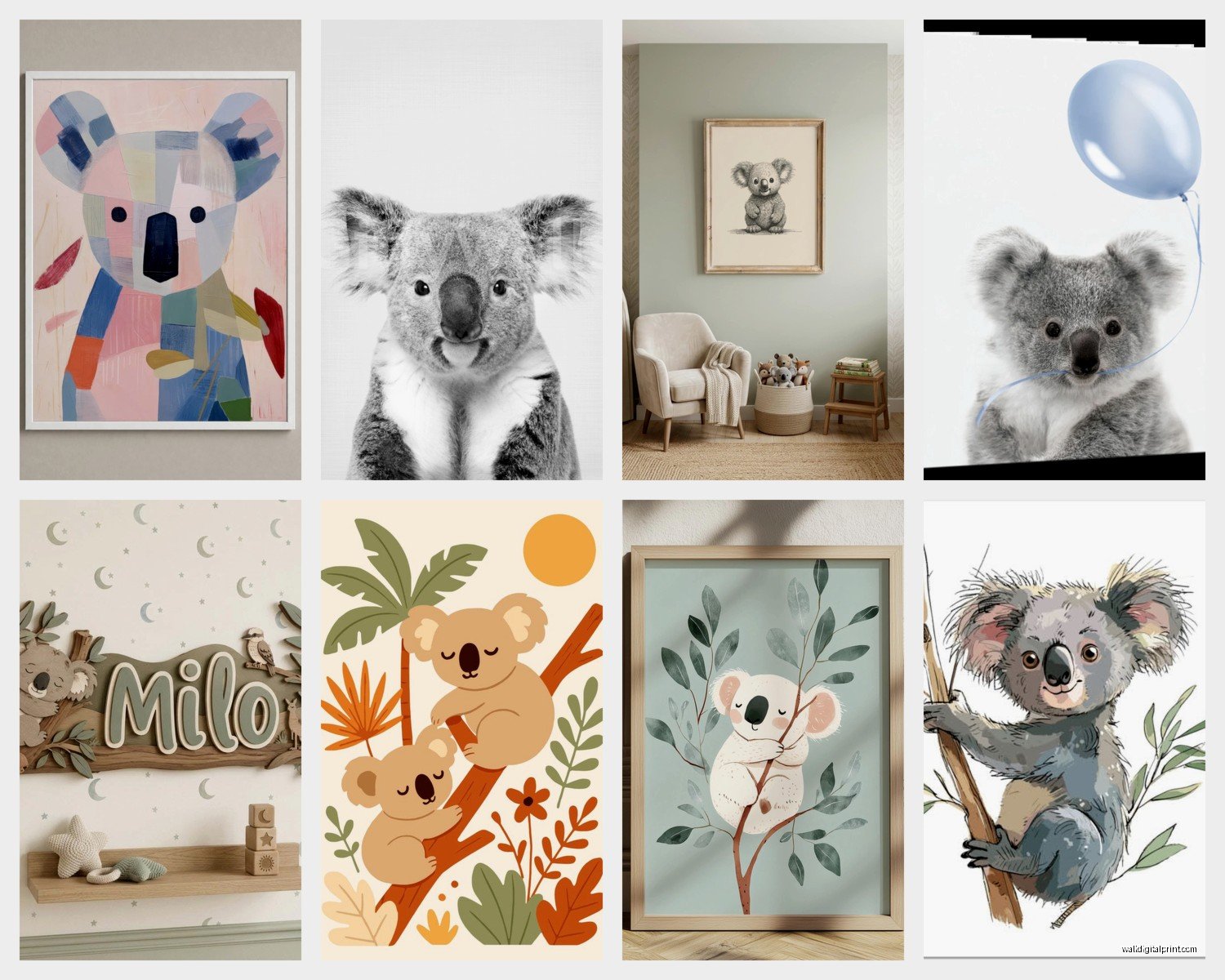
Okay so first thing – there’s basically three camps of koala art and you gotta pick your vibe. There’s the hyper-realistic photography prints which can be stunning but also sometimes too intense for like, a bedroom where you want to relax. Then there’s the watercolor illustration style which is EVERYWHERE right now, and finally the minimalist line art stuff.
I personally think the watercolor ones work best for most spaces because they’re cute without being childish. But here’s the thing nobody tells you – the quality difference is insane. I ordered five different prints from Etsy to test (my husband was like “more art?” but whatever) and three of them had this weird pixelated thing happening with the eucalyptus leaves. The artist had probably stretched a small file too large.
What you wanna look for is at least 300 DPI if you’re printing anything larger than 8×10. I learned this the hard way when I printed a “digital download” at 16×20 and it looked like someone had smeared Vaseline on it. Not cute.
Size and Placement That Actually Makes Sense
This is where people mess up constantly. They buy a tiny 8×10 print and stick it on this massive wall and wonder why it looks wrong. The rule I use is that your art should take up about two-thirds to three-quarters of the furniture width beneath it. So if you’ve got a crib that’s like 28 inches wide, you want your koala print to be around 20 inches wide minimum.
For living rooms though, I’m obsessed with doing a gallery wall of different koala poses. Like one sleeping, one munching eucalyptus, maybe one with a baby. But keep the frames consistent – either all black, all natural wood, or all white. Mixing frame colors with animal art reads very elementary school classroom and not in a good way.
Oh and another thing – height matters more than you’d think. Center of the artwork should be at eye level which is usually around 57 to 60 inches from the floor. I see so many people hang stuff way too high and it’s just floating up there awkwardly.
The Nursery vs Adult Space Dilemma
So everyone assumes koala art is just for kids’ rooms but that’s actually not true at all. I’ve used it in sophisticated living rooms and it totally works if you style it right. The trick is pairing it with the right elements.
For a nursery, yeah, you can go full cute – pastel backgrounds, maybe some text like “Dream Big Little One” or whatever. Add some matching eucalyptus garland, some neutral textiles. Easy.
But for an adult space you gotta be more intentional. I did this whole thing in my own bedroom actually where I found this gorgeous black and white photography print of a koala in profile – very dramatic lighting, almost moody. Put it in a thin black metal frame, paired it with some dried pampas grass and suddenly it’s not cutesy anymore, it’s like… sophisticated wildlife art? My sister came over and didn’t even realize it was “just a koala” until I pointed it out.
The background color of the print matters SO much here. White or light gray backgrounds read young and fresh. Dark backgrounds or natural wood tones read more mature and grounded. Eucalyptus green can go either way depending on the saturation.
Frame Choices That Won’t Break the Bank
Okay so funny story – I used to spend like $80 per frame at this boutique framing place and then I discovered that IKEA frames are actually perfectly fine for most situations. The RIBBA series especially. They’re like $15-20 and they look way more expensive than they are.
For koala prints specifically, I love a natural wood frame. Oak or ash tones. It reinforces that Australian/nature connection without being too literal. But here’s what you gotta watch out for – some wood frames have this orange-y tone that looks cheap. You want something with gray undertones or a very light natural finish.
If you’re going for black frames, make sure they’re matte not glossy. Glossy black frames look like something from a college dorm. Matte black is sleek and modern.
White frames work great for nurseries but in living spaces they can wash out the art unless your walls are a darker color. I have one client with sage green walls and the white-framed koala print looks incredible against it but on a white wall it just disappears.
Matting – Yes or No
This is gonna sound weird but I think matting makes a huge difference with koala art specifically. A white or cream mat creates breathing room around the image and makes even a cheap print look more gallery-quality.
Standard mat size is usually 2-3 inches on all sides but for smaller prints like 5×7 or 8×10, even a 1.5-inch mat helps. What I do sometimes is buy a larger frame with a mat and just print my art sized to fit. So like an 11×14 frame with an 8×10 opening. It’s cheaper than custom matting and you can swap the art easily.
Skip the mat if you’re doing a gallery wall with multiple small prints though – it gets too busy and complicated looking.
Digital Downloads vs Physical Prints
Alright so this is where I have Strong Opinions. Digital downloads are amazing IF you know what you’re doing with them. You can get instant access, print whatever size you want, and they’re usually way cheaper. I’ve bought tons from Etsy sellers for like $5-8.
But here’s the catch – you need to actually get them printed properly. Don’t just send them to Walgreens or whatever. The color will be off and the paper quality sucks. I use a local print shop that does archival quality prints or sometimes Printique online. The difference is night and day.
Physical prints that ship to you are easier but more expensive. You’re paying for convenience and usually the paper quality is better right out of the gate. For clients who aren’t DIY-inclined, I always recommend just buying the physical print even though it costs more because then there’s no variables.
Canvas prints are a whole other thing – they can look really good with koala art especially in like a playroom or casual space but make sure it’s gallery-wrapped (where the image continues around the edges) not the kind with white borders. Those look unfinished.
Color Schemes That Actually Work
So my cat just knocked over my coffee but anyway – color coordination is where most people overthink it or underthink it, there’s no middle ground.
If your koala print has eucalyptus leaves, you’ve got green to work with. Pull that green into your space through pillows, throws, maybe a plant (obviously). But don’t go matchy-matchy with the exact shade. If the print has a sage green, maybe your throw is more of a forest green or olive. Variation in tone looks intentional, exact matches look like you tried too hard.
Gray is basically a neutral that works with everything koala-related. Gray walls, gray furniture, gray frames – it all plays nice with the natural browns and greens of koala imagery.
I’m also really into the terracotta and rust tones with koala art right now. It feels very Australian outback without being costume-y. A rust-colored velvet pillow next to a koala print on a cream wall? Chef’s kiss.
What doesn’t work – don’t mix cool-toned koala art with warm-toned decor or vice versa. If your koala print has blue-gray tones, don’t pair it with orange and yellow. If it’s got warm browns, skip the navy and cool grays.
The Eucalyptus Element
Okay so this might be overkill but I love adding actual eucalyptus elements to spaces with koala art. You can get dried eucalyptus stems at most craft stores or flower shops and they last literally forever. Stick some in a simple vase near your koala print and suddenly the whole thing feels more cohesive.
Fresh eucalyptus smells amazing too but it’s pricey and only lasts a couple weeks. For permanent installations I always go dried.
You could also do eucalyptus wallpaper on an accent wall but that’s a bigger commitment. I did this once for a nursery and it was stunning but definitely not a renter-friendly option.
Where to Actually Buy Quality Koala Art
I’ve probably spent an embarrassing amount of time researching this. Etsy is obviously the go-to for variety – there’s literally thousands of options. But you gotta vet the sellers. Look for shops with lots of reviews and actual photos from buyers, not just the mockups.
Some artists I’ve had good luck with focus specifically on Australian wildlife and their koala work tends to be more authentic-looking because they actually reference real koalas instead of cartoon versions. Search terms like “realistic koala print” or “Australian wildlife art” work better than just “cute koala.”
Society6 and Redbubble are good for browse-and-buy convenience. The quality is consistent because it’s print-on-demand from a central facility. I’ve ordered from both and never had issues. Plus they offer different product options like canvas, framed prints, tapestries, whatever.
For really high-end stuff, there are Australian artists selling original watercolors or limited edition prints for like $200-500. If you’re decorating a luxury space or want something truly unique, that’s the way to go. I sourced one once for a client’s home office and it became the focal point of the entire room.
DIY Options If You’re Crafty
Wait I forgot to mention – if you’re artistically inclined at all, koalas are actually not that hard to paint or draw, especially in a simplified style. I’m talking basic watercolor washes and simple shapes. There’s tons of YouTube tutorials.
I did this with my niece last month (she’s seven) and we made this honestly adorable koala painting that her mom framed for her bedroom. It’s not professional quality but it has that personal touch that you can’t buy.
You could also do a tracing method where you project an image onto canvas and paint over it. It’s kind of cheating but also nobody needs to know and the result looks hand-painted because it is.
For people who can’t draw at all, there are paint-by-number koala kits. I’ve seen them on Amazon and they’re actually pretty detailed. Takes a few hours but you end up with something frameable.
Seasonal and Themed Variations
This is kinda niche but I’ve done koala art for different seasons and it’s surprisingly versatile. Christmas koala wearing a Santa hat? Cute for holiday decor that you swap in December. Koala with autumn leaves? Works for fall without being pumpkin-overload.
I’m not usually into seasonal decorating because it’s a lot of work to keep swapping stuff but with digital prints you can literally just print a new one for $10 and swap it in the same frame. Way easier than storing multiple pieces.
There’s also koala art with inspirational quotes which can be cheesy but sometimes works. “Just Hanging Around” with a koala in a tree is pretty perfect for a casual space. “Stay Calm and Eat Eucalyptus” might be too much unless it’s for a kids’ room or a really playful office.
Common Mistakes to Avoid
Okay so things I’ve seen go wrong – buying art that’s too small for the space is number one. People are afraid to go big but bigger is almost always better.
Another thing is mixing too many animal types. Like if you’re doing koala art, commit to the Australian vibe or at least stick with a cohesive wildlife theme. Don’t throw a koala print next to a giraffe and an elephant unless you’re deliberately doing a zoo nursery thing.
Poor lighting kills good art. If you have a koala print on a wall that gets no natural light and you don’t add a picture light or nearby lamp, it’s just gonna disappear into the shadows. This seems obvious but I see it constantly.
And please don’t use command strips on anything heavier than like 2 pounds. They fail eventually and your beautiful koala art ends up crashed on the floor. Use actual picture hangers or better yet, picture hanging strips rated for the weight.
Oh also – don’t put valuable art in direct sunlight. It’ll fade over time even if it’s UV-protected glass. I learned this when a print I loved turned from vibrant to washed out over one summer near a west-facing window.
Making It Work in Small Spaces
If you’re in an apartment or small room, you might think you don’t have space for wall art but that’s not really true. A single statement piece of koala art above a desk or bed can actually make a small space feel more intentional and designed.
I also love leaning art on shelves instead of hanging it if you’re in a rental situation. Get a small koala print in a nice frame and lean it on a bookshelf against the wall. Add a plant next to it and some books and suddenly you’ve got this whole styled moment without putting holes in anything.
Tiny spaces actually benefit from one medium-large piece rather than multiple small ones. It creates a focal point instead of visual clutter.
The key is keeping everything else relatively simple if you’re gonna feature koala art in a small room. Let it be the personality moment and keep the rest neutral and streamlined.
Alright I think that’s everything I’ve learned from my koala art obsession phase – which honestly I’m still in because I just ordered another print yesterday for my home office but don’t tell my husband. The eucalyptus and gray tones are just so calming and I spend way too much time staring at walls while I work so they might as well have cute animals on them.