
Wall Art Guide, Wall Art Tutoriels
Peaceful Wall Art for Bedroom: Serene Calming Sleep Space

Oct
So I’ve been obsessing over bedroom wall art lately because honestly, the wrong piece can completely mess with your sleep and I didn’t realize this until I moved into my current place and hung this super vibrant abstract painting right across from my bed. Looked amazing during the day but at night? My brain just wouldn’t shut off staring at it.
Why This Actually Matters More Than You Think
The thing about bedroom art is it’s literally the last thing you see before sleep and first thing when you wake up. I had a client once who kept complaining about feeling anxious in the mornings and turns out she had this massive photograph of a crowded city street above her bed. We swapped it for a simple ocean horizon print and she texted me like two weeks later saying her mornings felt completely different.
Your brain processes visual information even when you’re trying to wind down, so you gotta be strategic about this.
Colors That Won’t Keep You Up
Okay so here’s what I’ve learned through way too much trial and error. Cool tones are your friend. Blues, soft greens, lavenders, grays, muted teals. I tested this in my own bedroom by rotating different pieces every month for like half a year because I’m apparently that person now.
The blue-green spectrum consistently helped me fall asleep faster. There’s actual science behind this but I’m not gonna pretend I remember the details… something about how these colors lower your heart rate? What I DO know is that warm tones like reds, oranges, bright yellows made me feel more alert. Which is great for a home office, terrible for where you’re trying to sleep.
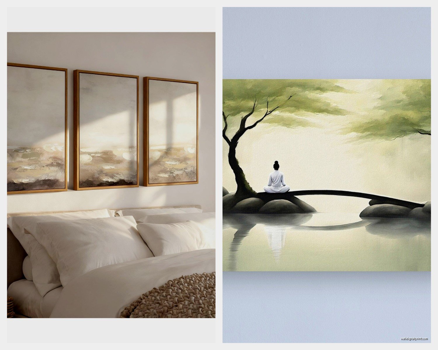
One exception though – very muted warm tones can work. Like a super soft blush pink or sandy beige. I have this vintage botanical print with pale peachy tones that’s actually really calming because the colors are so desaturated.
The Saturation Thing Nobody Talks About
This is gonna sound weirdly specific but the saturation level matters more than the actual color sometimes. A highly saturated blue can be just as stimulating as a bright red. You want colors that look like they’ve been washed out a bit, faded, watercolor-y.
I learned this the hard way with a “calming blue” abstract piece that was basically electric blue and completely defeated the purpose.
Subject Matter That Works
Natural landscapes are the obvious choice and yeah, they work. But not all landscapes are created equal for sleep spaces.
What’s actually helped me and my clients:
- Minimalist horizons – just sky meeting water or land, very simple
- Misty forests or foggy scenes (the lack of sharp detail is key)
- Abstract waterscapes that suggest water without being literal
- Botanical prints but only soft, flowing ones – not dramatic tropical leaves
- Simple geometric patterns in muted colors
- Neutral abstract art with gentle movement
I specifically avoid anything with strong diagonal lines or sharp angles. There’s this whole thing about how our brains interpret diagonal lines as movement or instability. Horizontal and gentle curves are better for relaxation.
Oh and another thing – avoid faces or eyes in bedroom art. Even abstract representations. I hung a modern portrait in my bedroom once thinking it was sophisticated and I swear I felt watched. Took it down after three nights.
Size and Placement Strategy
So everyone says to hang art at eye level but in a bedroom that’s not always the right move. If you’re hanging something above your bed, you’re mostly seeing it while lying down, which changes the whole perspective.
I usually go slightly lower than standard gallery height for over-the-bed pieces. And honestly? Sometimes I’ll prop a piece on the dresser or lean it against the wall instead of hanging it. Takes the pressure off and you can change it easily.
The Multiple Small Pieces vs One Large Piece Debate
I’ve tested both extensively and here’s my take – one larger piece (or a diptych/triptych that reads as one cohesive image) is more calming than a gallery wall. Gallery walls are visually busy. Your eye jumps around trying to take everything in.
For sleep spaces, you want your eye to rest, not wander. A single 30×40 inch piece or a simple two-panel set works better than six smaller frames.
Exception: if you do a very minimal grid of identical prints in identical frames, that can work because the repetition creates its own calm. I did this with four 8×10 botanical sketches in a perfect square arrangement and it actually felt really peaceful.
Frame Choices That Matter
Thin frames or no frames. Chunky ornate frames add visual weight and complexity that works against the peaceful vibe you’re going for.
I’m personally obsessed with natural wood frames in light finishes – maple, light oak, even bamboo. They add warmth without being heavy. White or black frames work too but can feel a bit stark depending on your wall color.
Wait I forgot to mention – if you’re going frameless (like canvas prints or floating frames), make sure the edges are finished nicely because you’ll notice rough edges way more in a bedroom where you’re actually spending quiet time.
What I’m Actually Using Right Now
Currently I have this two-panel abstract piece above my bed that’s basically just layers of very pale blue, gray, and cream with soft brushstrokes. Got it from an Etsy artist after scrolling for probably three hours one night when I couldn’t sleep, which is ironic.
On the wall opposite my bed I have a simple line drawing of mountains – just black lines on cream paper in a slim black frame. Very minimal, gives my eyes something to rest on without being demanding.
My cat knocked over a plant on my nightstand last week and I’m still finding dirt, but anyway…
Where I Actually Shop for This Stuff
For original or unique pieces:
- Etsy – search terms like “minimal landscape print” or “abstract calming art”
- Society6 – good for affordable prints in lots of sizes
- Minted – slightly pricier but really nice quality
- Local artists on Instagram – I’ve found amazing stuff this way
For budget-friendly options:
- Desenio – Scandinavian print company with great minimal options
- IKEA actually has some decent abstract pieces, just gotta dig through
- Target’s Project 62 line sometimes has good stuff
- Printable art on Etsy – you download and print yourself
The printable route is honestly underrated. You can test pieces without commitment and frame them yourself.
Mistakes I’ve Made So You Don’t Have To
Don’t hang anything directly above your bed that’s heavy or in a cheap frame. I watched a documentary about earthquakes and now I’m paranoid, but also it’s just practical safety stuff.
Don’t choose art based solely on how it looks in good lighting. Look at it in dim light too because that’s when you’ll actually be trying to relax. Some pieces that look great during the day can feel totally different at night.
I once bought this gorgeous photograph of waves crashing that I thought would be calming but the dramatic action in the image was actually energizing. Moved it to my hallway and got something more still and quiet instead.
Also avoid anything too personal or emotionally charged. Photos of loved ones, meaningful quotes, stuff that makes you think too much. Save that for other rooms. Your bedroom art should be more like… visual white noise in the best way.
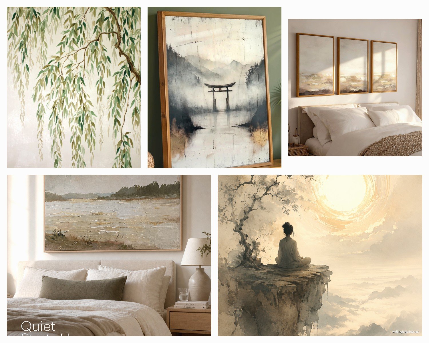
The Texture Consideration
Something I don’t see people talk about enough – textured art can add to the calming vibe. Woven wall hangings, canvas with visible brushstrokes, even subtle embossed prints. The texture adds interest without adding visual chaos.
I have a client who hung a simple macramé piece above her bed and it’s honestly perfect. The neutral color and soft texture create this really peaceful focal point.
Just keep textures organic and soft – avoid anything too shiny or metallic in bedrooms. The light reflection can be distracting.
Lighting Your Art (Or Not)
Picture lights and spotlights are generally not great for bedroom art. You don’t want bright focused light in a sleep space. If you want to highlight your art, use ambient lighting that’s on a dimmer.
I have a small lamp on my dresser that happens to cast a soft glow on my wall art at night and that’s plenty. Most of the time I’m looking at my bedroom art in natural light or very dim light anyway.
When to Just Go Minimal or Skip Art Entirely
Real talk – sometimes less is actually more. If your bedroom has a lot of visual interest already (patterned bedding, textured walls, lots of furniture), you might not need wall art at all.
I worked with someone who had this beautiful accent wall with natural wood paneling and we tried adding art but it just competed with the wall itself. Leaving it bare looked way better and more peaceful.
Your bedroom doesn’t NEED art just because that’s what design magazines show. If a bare wall feels calm to you, that’s totally valid.
Seasonal Swapping
Okay so funny story – I started swapping my bedroom art seasonally by accident when I was reorganizing my storage closet and now I’m kinda hooked on it. Lighter, airier pieces in spring and summer. Slightly moodier, cozier pieces in fall and winter.
It keeps the space feeling fresh without requiring a full redesign. Plus it’s an excuse to own more art which… I don’t need excuses but still.
Just keep all your bedroom pieces in the same general calming category. I’m not putting anything energizing in there regardless of season.
Quick Troubleshooting
If you hang something and it’s not feeling right, don’t force it. I used to think I just needed to “get used to” pieces but honestly, if it’s not working after a week or so, it’s probably not gonna work.
Too stimulating? Try something with less contrast and softer edges.
Too boring? Maybe add a second complementary piece or try a slightly larger size.
Feels off but you can’t figure out why? Check the height – moving it up or down a few inches can completely change how it feels.
The goal is that your bedroom art basically fades into the background of your awareness in the best possible way. You notice it when you want to, it pleases you when you do, but it doesn’t demand attention when you’re trying to wind down.
I’m still tweaking my own setup honestly, probably always will be, but these guidelines have helped me create a space that actually helps me sleep instead of keeping me up analyzing composition at midnight.
