Wall Art Guide, Wall Art Tutoriels
Black and White Ocean Wall Art: Monochrome Sea Photography
Oct
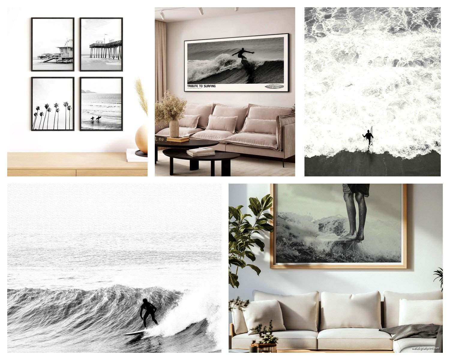
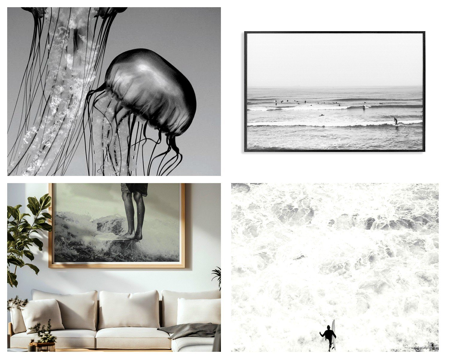
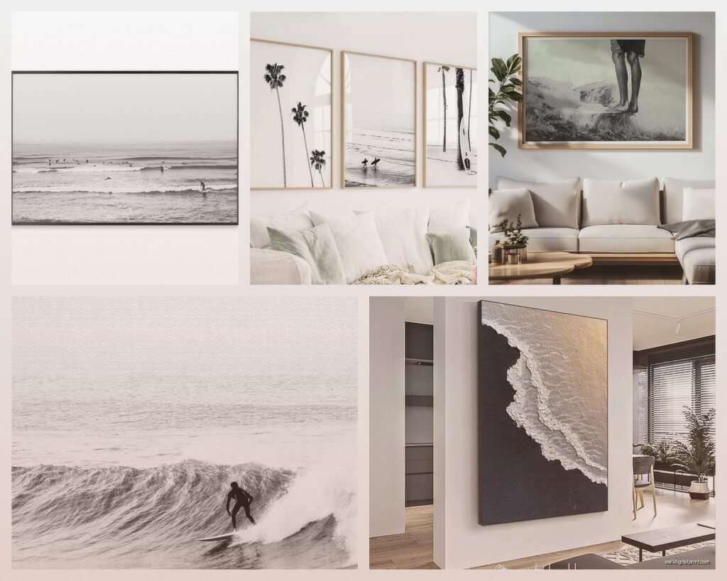
So I’ve been obsessing over black and white ocean photography lately and honestly it started because a client wanted to redo their living room but didn’t want the usual blue coastal vibes everyone does. We went monochrome and wow, game changer.
Why This Actually Works Better Than Color Sometimes
Okay so here’s the thing about black and white ocean art that I didn’t get until I started really looking at it—it strips away all the distraction. Like you’re not thinking “does that turquoise match my pillows” or whatever. You’re just seeing form, movement, texture. The waves become these incredible sculptural things. I had this one piece in my office (still there actually, my cat keeps staring at it) and visitors always stop and look at it way longer than they ever did with the colorful beach sunset I had before.
The contrast is what makes it dramatic. Dark stormy seas against white foam, or those really minimal shots where it’s just a horizon line and some texture. It works in literally any room because you’re not fighting with color schemes.
Where to Actually Find Good Pieces
Right so I’ve spent way too much time on this. Etsy is honestly your best bet for affordable stuff that doesn’t look mass-produced. Search for “black and white ocean photography print” or “monochrome seascape art” and you’ll find actual photographers selling their work. I usually filter by shops that have good reviews and look at their other work to make sure they’re consistent.
Some sellers I keep going back to:
- Photographers who shoot in California and Australia tend to have really dramatic coastlines
- Look for people who specify they print on archival paper or fine art paper—it matters for longevity
- Check if they offer different sizes because you might think you want a 16×20 but then realize you need bigger
Society6 and Minted are good for more curated selections but they’re pricier. The quality is consistent though which matters if you’re ordering online and can’t see it first.
Oh and another thing—don’t sleep on local art fairs and photography galleries. I found this incredible series at a small gallery last year, the photographer shot long exposures so the water looked like silk. Paid more than I would’ve online but I actually met the artist and she explained her process and now I appreciate it even more.
What About Those Big Box Stores
HomeGoods and TJ Maxx sometimes have decent ocean photography but it’s hit or miss. Like really miss most of the time. The framing is usually cheap and the prints can look flat. But I’ve found a couple good ones there so if you’re on a tight budget it’s worth checking every few weeks. Just look closely at the quality before you buy because their return policy is fine but it’s annoying to deal with.
Choosing the Right Style for Your Space
This is where people get stuck and honestly I get it because there are so many different approaches to black and white ocean photography.
Minimalist/Abstract: These are the ones that are basically just texture and tone. Maybe you can barely tell it’s water. Super modern, works great in contemporary spaces. I used one in a client’s bedroom and it’s so calming because your eye doesn’t have to work hard to understand it. Search terms: “abstract ocean,” “minimal seascape”
Dramatic Waves: Big crashing waves, lots of contrast, really dynamic. These make statements. I have one over my dining table (which sounds weird but it actually works) and people always comment on it. Good for living rooms, offices, anywhere you want energy. The key is making sure it’s large enough—a tiny dramatic wave looks kinda silly.
Aerial/Bird’s Eye: Those shots taken from above showing the coastline, waves patterns, surfers as tiny dots. These have gotten super popular in the last few years and honestly they’re gorgeous. Really graphic and interesting. Work well in modern spaces, offices, even bathrooms if they’re large enough.
Long Exposure: Where the water looks smooth and dreamy because of the camera technique. These are my personal favorite lately. They have movement but they’re also serene? If that makes sense. Great for bedrooms or any space where you want sophisticated calm.
Size Matters More Than You Think
Okay so funny story, I ordered a print for above my sofa and I measured the space and thought “36 inches wide should be good” and when it arrived it looked like a postage stamp on that wall. Ended up returning it and getting a 48-inch one.
Here’s what I’ve learned:
- Above a sofa: your art should be roughly 2/3 the width of the sofa, can go a bit larger
- Above a bed: either one large piece (40-60 inches) or a series of 2-3 pieces that span about 2/3 of the headboard width
- In a hallway: you can go narrower but taller works better than wider
- Dining room: consider the size of your table, you want proportion
When in doubt, cut out paper templates in the sizes you’re considering and tape them to the wall. I know it sounds extra but I do this even for my own place now because I’ve made too many expensive mistakes.
Gallery Walls vs Single Statement Pieces
Both work but they give totally different vibes. A single large black and white ocean photograph is dramatic and modern. Clean. Easy to hang (well, easier than multiple pieces).
A gallery wall of smaller ocean photos lets you show different moods and perspectives. Like you could do one wave close-up, one aerial shot, one minimalist horizon line. I did this in a client’s office and we mixed in some shells in shadow boxes too which tied it together nicely.
If you’re gonna do a gallery wall though, plan it out on the floor first. Take a photo. Live with that photo for a day or two. Then commit. I cannot stress this enough because patching drywall holes is annoying.
Framing Changes Everything
So you’d think black and white photos would be straightforward to frame but there are actually a bunch of decisions here.
Black frames: Classic, makes the image feel more dramatic and contained. Works in traditional or modern spaces. This is usually my default.
White frames: Lighter feel, more coastal vibes even though the image is monochrome. Good for spaces that are already dark or if you want it to feel more airy.
Natural wood: Can work beautifully with ocean photography, especially lighter woods. Adds warmth. I used walnut frames for a beach house project and the combination of black and white photos with warm wood was *chef’s kiss*
No frame/canvas wrap: Modern and clean but make sure the image quality is good because there’s nothing hiding the edges. Canvas wraps can look cheap if the printing isn’t high quality.
Mat or no mat? I usually say yes to a white or off-white mat because it gives the image breathing room and looks more polished. But for really large pieces or very modern spaces you can skip it.
Printing Options If You’re Going DIY
Wait I forgot to mention—if you buy a digital download you’ll need to get it printed somewhere. Here’s what I’ve learned through trial and error:
Artifact Uprising: Beautiful quality, archival paper, but expensive. Worth it for special pieces.
Nations Photo Lab: This is what a lot of professional photographers use. Really good quality, reasonable prices, lots of options.
Your local print shop: Sometimes they’re amazing, sometimes terrible. Ask to see samples of photo prints they’ve done. The advantage is you can talk to them about paper choices and see things in person.
Costco: Okay hear me out, their photo printing is actually decent for the price. Not gallery-quality but for a bedroom or hallway? Totally fine. Just don’t expect archival longevity.
Make sure you’re printing at the right resolution—at least 300 DPI at the size you want. A file that looks great on your computer can look pixelated when printed large.
Styling It Once It’s Hung
The art is just part of the equation honestly. I see people hang beautiful pieces and then surround them with clutter or put them in spots where you can’t actually see them properly.
Lighting: This is huge. If you can add picture lights or position it where natural light hits it during the day, do that. But avoid direct sunlight because it’ll fade over time. I installed simple LED picture lights for a client and it completely transformed how the art looked at night.
What to put nearby: With black and white ocean art, I usually keep surrounding decor pretty simple. Maybe some natural elements like driftwood, a plant, neutral textiles. You don’t want to compete with the drama of the piece. Although I did see someone pair monochrome ocean photos with dark green velvet furniture and it was stunning.
Height: Center of the art should be at eye level, which is roughly 57-60 inches from the floor to the center of the piece. Unless it’s above furniture, then you want about 6-8 inches between the furniture and the bottom of the frame.
Mixing Different Ocean Photos
If you’re doing multiple pieces in the same room, you gotta have some consistency. Either:
- Same style/mood but different compositions
- Same photographer or similar editing style
- Same frame style throughout
- Or go totally eclectic but then you need other elements in the room to tie it together
I mixed three different ocean photographs in my client’s living room last month—one aerial, one wave detail, one horizon line—but they were all printed in the same size, same frames, and the tones were similar enough that they felt cohesive.
Budget Breakdown Real Talk
Because I know this is what people actually want to know…
Budget option: $30-60 for a digital download from Etsy + $20-40 for printing at Costco or local shop + $20-50 for a basic frame from Ikea or Amazon. You’re looking at $70-150 total for a decent sized piece.
Mid-range: $75-150 for a print from an online gallery or photographer + $50-100 for quality framing. Around $125-250 total.
Splurge: $200-500+ for limited edition prints or larger pieces from established photographers, custom framing can add another $150-300. But these are investment pieces that’ll last forever.
I usually tell people to invest in one really good statement piece rather than several cheap ones. But that’s just me and my background in curation showing.
Care and Placement
Don’t hang ocean photography in bathrooms with showers unless it’s sealed really well—the humidity can warp paper and damage prints over time. I learned this the hard way with a piece in my guest bathroom.
Dust frames regularly because dust shows up more on black and white art for some reason. Just a microfiber cloth is fine.
If it’s behind glass, occasionally check that moisture hasn’t gotten between the glass and the print. Especially in humid climates.
Oh and keep the packaging if you’re buying something expensive, makes it easier if you move or need to store it.
Anyway that’s pretty much everything I’ve figured out through decorating my place and working with clients on this. Black and white ocean photography is one of those things that seems simple but there’s actually a lot to consider if you want it to look really good and not just like you grabbed something random from HomeGoods and called it a day.