Wall Art Guide, Wall Art Tutoriels
Coastal Wall Art for Living Room: Beach Main Space Decor
Oct
So I’ve been obsessing over coastal wall art lately because three of my clients wanted this beachy vibe without making their living rooms look like a tacky souvenir shop, and honestly it’s trickier than you’d think.
The Scale Thing Everyone Gets Wrong
Okay so first thing – and I cannot stress this enough – people always buy art that’s way too small. Like, I walked into this gorgeous living room last month with 12-foot ceilings and the homeowner had these tiny 16×20 prints scattered around and it just looked… sad? The rule I use is measure your wall space and go for art that takes up about 60-75% of the available width. So if you’ve got a couch that’s 84 inches wide, you want your art (or art grouping) to be somewhere around 50-60 inches wide minimum.
For coastal stuff specifically, I’m really into those large-scale ocean photography prints. Not the cheesy sunset ones with the dolphins or whatever, but like moody seascapes. There’s this photographer on Etsy – ugh what’s the name, hold on I have it bookmarked – who does these incredible storm-over-ocean shots that are basically just gray and blue and white and they’re stunning. Way more sophisticated than the typical beach art.
What Actually Works Style-Wise
Here’s the thing about coastal decor that nobody tells you: it’s gotta be subtle or it gets overwhelming fast. I learned this the hard way when I bought this huge canvas of a turquoise wave for my own place and had to return it because it literally gave me a headache. Too much color, too in-your-face.
The coastal art that actually looks good falls into a few categories:
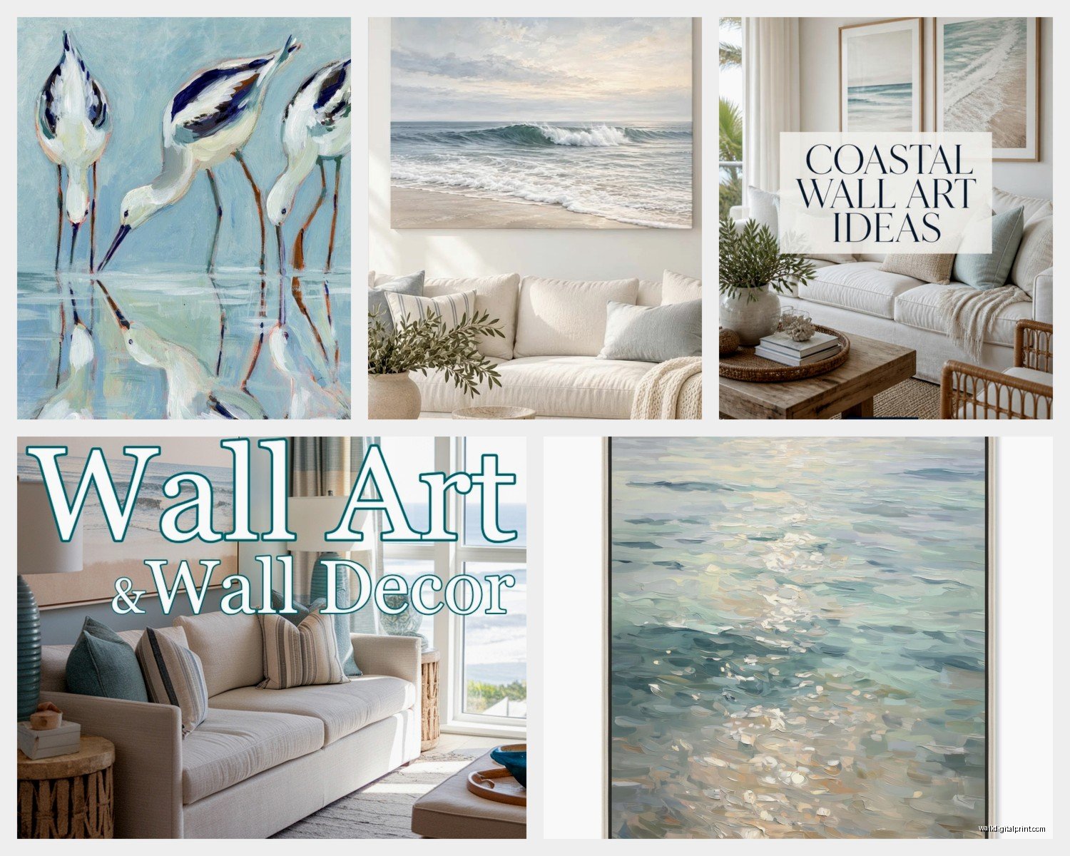
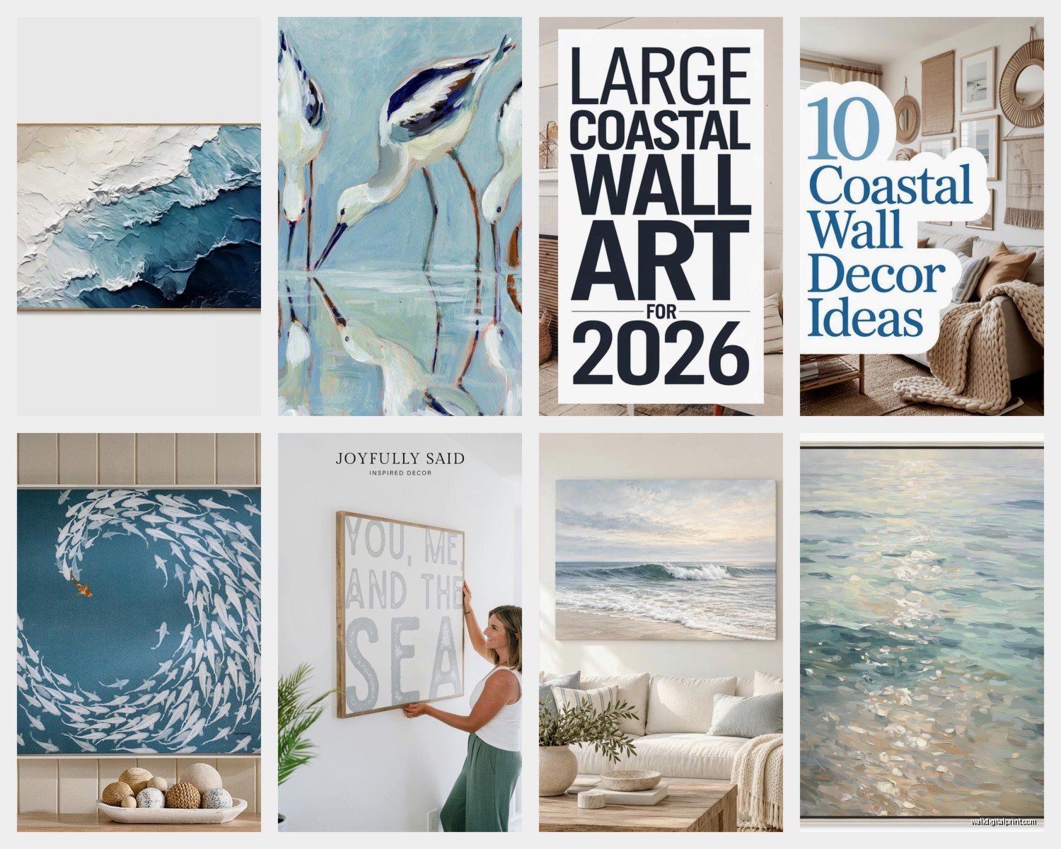
- Abstract ocean-inspired pieces (think watercolors with blues, grays, sandy neutrals)
- Black and white beach photography
- Vintage nautical maps or charts
- Minimalist line drawings of shells, waves, coastlines
- Textured pieces with actual sand or plaster that give you that beachy feel without being literal
I’ve got this one client who’s an actual marine biologist and even she didn’t want super literal ocean stuff everywhere. We ended up doing this gallery wall with vintage coral illustrations – the scientific kind from old books – and it’s probably my favorite coastal project ever.
The Gallery Wall Approach
Wait I forgot to mention – if you’re doing a gallery wall, which works really well for coastal themes, you gotta plan it out first. I use painter’s tape on the floor, arrange everything there, then transfer it to the wall. Sounds tedious but I’ve hung enough wonky galleries to know this step saves you.
For a coastal gallery wall I usually mix:
- One large anchor piece (maybe 30×40 or bigger)
- 3-4 medium pieces in different sizes
- A few small pieces or objects (like a piece of driftwood, a vintage fishing float, small prints)
The key is varying the frame styles but keeping them in the same color family. All white frames can look too matchy-matchy, but if you do white, natural wood, and maybe one or two navy frames it feels more collected over time. Which is the vibe you want – like you’ve been gathering these pieces from actual beach trips, not like you bought a coordinated set from HomeGoods.
Where to Actually Buy This Stuff
Okay so real talk about where to shop. Etsy is gonna be your best friend for unique coastal art. I probably spend way too much time there but the selection is insane. You can find actual vintage nautical charts, custom wave paintings, downloadable prints you can print at your local print shop for like $30 total.
Minted has some really good coastal photography if you want something more polished. Their framing is expensive though – like, really expensive. Sometimes I’ll buy the unframed print from them and take it to a local framer or even just use a basic frame from Amazon.
Society6 is hit or miss but they have this thing where artists can put their designs on different products, so if you find a coastal design you love you can get it as a canvas, framed print, tapestry, whatever. I got this abstract ocean piece from there for my guest room and it was like $65 framed which is honestly a steal.
Oh and another thing – don’t sleep on vintage stores and estate sales. I’ve found incredible old seascape paintings for nothing. There was this estate sale in Cape Cod last summer when I was visiting my sister, and I grabbed three oil paintings of boats for $45 total. One of them is now in a client’s living room and she gets compliments on it constantly.
The Color Palette Situation
This is gonna sound weird but I think the best coastal living rooms don’t actually use that much bright blue. Like yes, ocean = blue, but if you go too heavy on the bright turquoise and navy it starts feeling more nautical than coastal, if that makes sense?
The palette I keep coming back to:
- Soft grays (like weathered driftwood)
- Warm whites and creams
- Sandy beiges and taupes
- Muted blues – think slate blue, dusty blue, not Caribbean turquoise
- Touches of seafoam green as an accent
Your wall art should pull from these colors. I did a whole living room last year where the only blue was in the art – everything else was neutrals and natural textures – and it felt so much more elevated than if we’d done blue throw pillows and blue curtains and blue everything.
Mixing Mediums and Textures
One thing that makes coastal art more interesting is mixing up the mediums. Don’t just do all canvas prints or all framed paper. Try:
- A large canvas print
- Some framed watercolors or photography
- A piece of driftwood or coral mounted as sculpture
- Maybe a woven piece (macrame is very coastal and having a comeback)
- Shadow box with collected shells or sea glass
I actually made one of those shadow boxes for my own place and it’s probably the cheapest art I own but people always ask about it. Just got a deep frame from Michael’s, hot glued some shells and sand dollars I’d collected, and called it a day. Took like 20 minutes while watching The White Lotus.
Placement and Hanging Tips
So hanging height is crucial and most people get it wrong. The center of your art should be at eye level, which is usually around 57-60 inches from the floor. But here’s where it gets tricky with living rooms – eye level when you’re sitting is different than when you’re standing.
For art above a sofa, I do 6-8 inches above the back of the couch. Any higher and it looks like it’s floating away. Any lower and it feels cramped. And please, please use proper hanging hardware. Those little sawtooth hangers that come with cheap frames are garbage. Get some proper picture hanging hooks rated for the weight of your piece.
I use those monkey hook things for lighter pieces and they’re honestly amazing – you just push them into the drywall and they hold up to 50 pounds. For heavier stuff you gotta find studs or use proper anchors.
Lighting Makes or Breaks It
Okay so funny story – I hung this beautiful coastal gallery wall for a client and she hated it. Turned out the lighting in that room was terrible, all overhead fluorescent that made everything look flat and cold. We added some picture lights and warm-toned lamps and suddenly she loved it.
If you’re investing in nice coastal art, light it properly:
- Picture lights mounted above larger pieces
- Track lighting aimed at your gallery wall
- Even just a well-placed floor lamp can highlight art
- Natural light is great but watch for sun damage – use UV-protective glass for valuable pieces
DIY Options That Don’t Look DIY
Look, I’m all for supporting artists but sometimes you just need to fill wall space on a budget. Here’s what actually works:
Print your own photos if you’ve taken beach trips. Seriously, if you have a decent phone camera and you’ve been to the ocean, you probably have usable images. Upload them to a print service (I like Printique or even Costco for larger sizes), get them printed, frame them. Boom, custom coastal art for under $100.
There are also tons of downloadable coastal prints on Etsy that you can print yourself. You pay like $5-8 for the digital file, print it at Staples or FedEx for $10-30 depending on size, frame it yourself. Total cost maybe $50 for something that looks like it came from West Elm.
Abstract ocean paintings are super easy to DIY too. Get a large canvas, some acrylic paints in coastal colors, and just… make waves? I know that sounds dumb but I had a client who was nervous about art costs and I walked her through creating her own abstract ocean piece and it turned out gorgeous. Very loose and fluid, lots of blues and whites mixed together. She’d never painted before.
What to Avoid
Okay real talk about what doesn’t work:
Those wooden signs with beach quotes. “Life is better at the beach” or whatever. Just no. They’re fine for an actual beach house maybe but in a city living room they read as trying too hard.
Anything with starfish. I don’t know why starfish became THE coastal symbol but they’re so overdone. Unless it’s like a subtle scientific illustration, skip it.
Super bright, saturated colors. That electric blue and bright coral color scheme? It’s everywhere in beach decor and it almost never looks good in real homes. Too much visual noise.
Matching sets of three. You know those canvas sets where it’s one image split across three panels? They scream 2008 and not in a good way. If you want multiple pieces, make them actually different images that coordinate, not one image chopped up.
The Actual Best Pieces I’ve Used
Since you asked what to actually buy, here’s what’s worked in multiple client projects:
Large black and white wave photography – there’s something about removing the color that makes it more artistic and less literal. I’ve gotten great ones from Minted and from individual photographers on Etsy.
Abstract paintings with ocean-inspired colors but no recognizable imagery. These work because they give you the feeling of the coast without beating you over the head with it.
Vintage-style nautical maps, especially if you can find one of a place that’s meaningful to you. I framed an old map of Nantucket for a client who honeymooned there and it’s such a conversation piece.
Textured pieces with actual dimension – like paintings with heavy impasto that mimics waves, or mixed media with sand and plaster. These catch light in interesting ways and add depth to your walls.
Oh and my cat just knocked over my coffee so I gotta wrap this up anyway, but last thing – don’t overthink it. Start with one piece you really love above your sofa, live with it for a bit, then add more if you want. Coastal wall art should make your living room feel calm and collected, not cluttered and theme-park-ish. The best coastal rooms I’ve designed barely register as “themed” at all – they just feel light and airy and a little bit beachy without trying too hard.