Wall Art Guide, Wall Art Tutoriels
Leaf Wall Art: Botanical Foliage Green Nature Decor
Oct
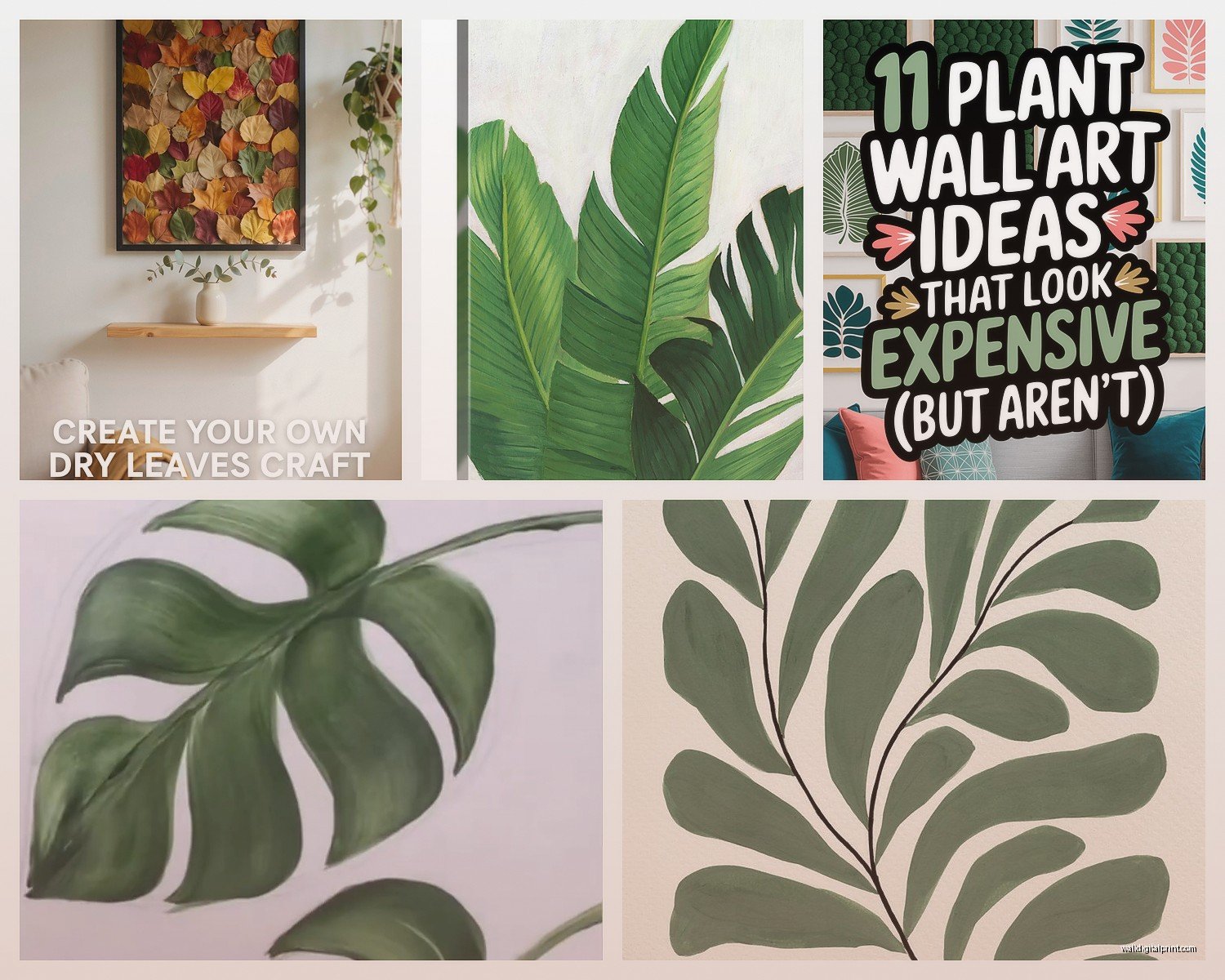
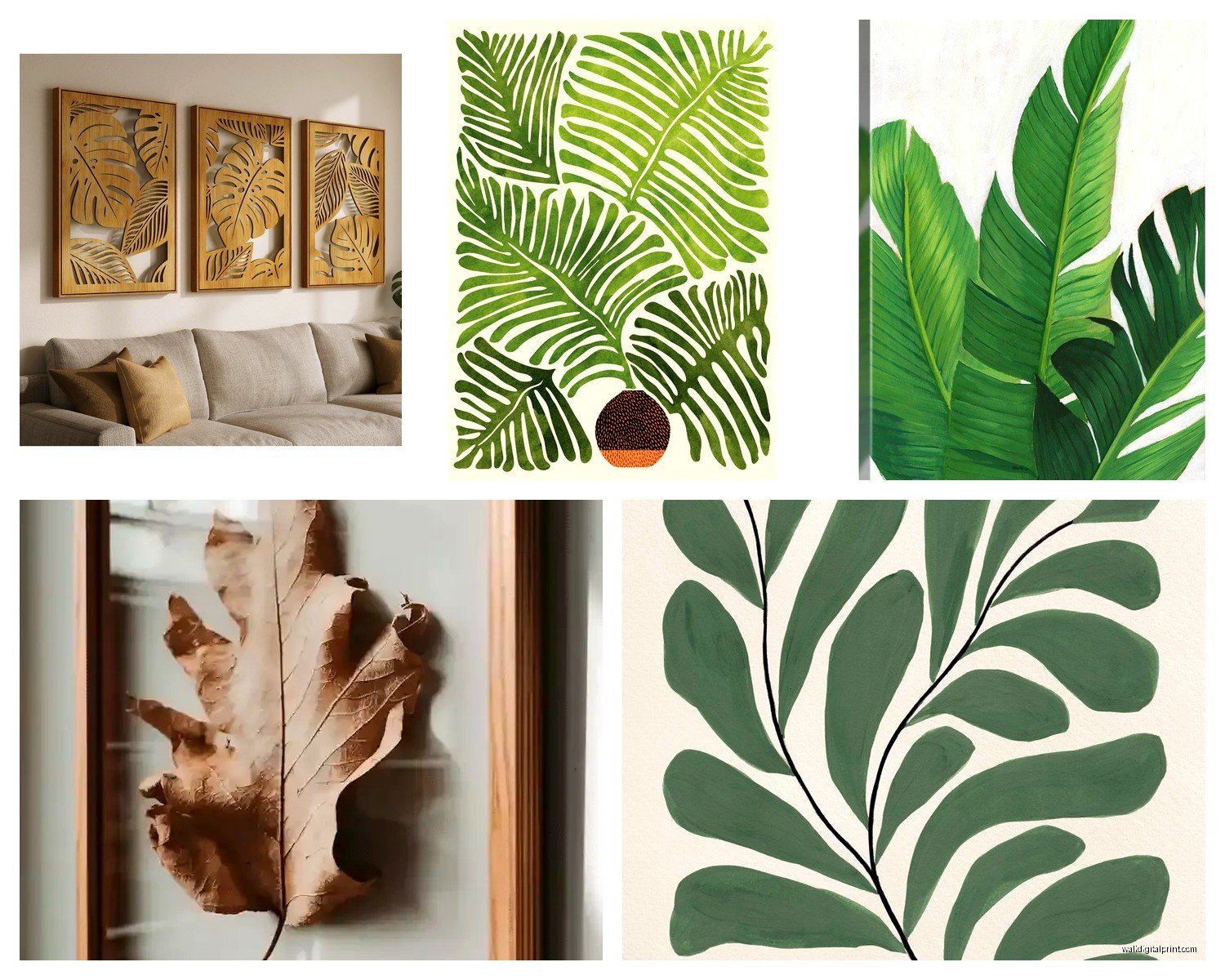
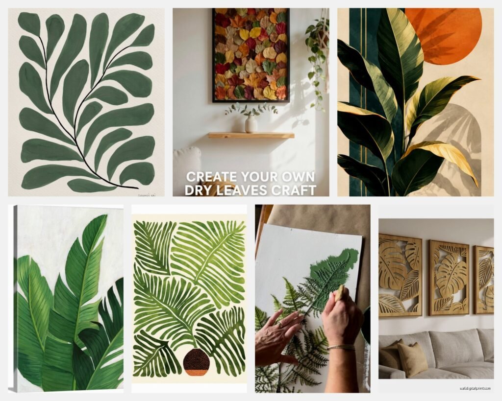
So I’ve been obsessing over leaf wall art lately because my living room looked like a beige void and I needed something that didn’t scream “I bought everything at Target in one trip” you know? And honestly botanical prints are having such a moment right now but like, in a good way where they actually look sophisticated instead of that weird tropical flamingo phase everyone went through.
What Actually Works for Different Spaces
Okay so first thing – you gotta figure out what vibe you’re going for because leaf art comes in like a million variations and I made the mistake of buying three monstera prints before realizing they all looked basically identical from across the room. Total waste.
For modern spaces, I’m obsessed with those minimalist line drawings of leaves. You know the ones that are just like one continuous line forming a palm frond or whatever? I found this set on Etsy from a seller in Denmark and the shipping took forever but they’re SO good. They’re simple enough that they don’t compete with other stuff in the room but still interesting if you actually look at them.
If you’ve got more of a traditional or farmhouse thing happening, pressed botanical prints are where it’s at. I did a whole gallery wall in my client’s dining room last month with vintage-style fern prints in those thin black frames and it looked expensive even though each print was like $15. The trick is getting them professionally matted – I know it sounds extra but the mat makes such a difference I can’t even explain it properly.
Real vs Fake Leaves Behind Glass
Oh and another thing – actual pressed leaves in frames. I tried this in my own bedroom and it’s more complicated than Pinterest makes it look. You need to:
- Find leaves that are relatively flat to begin with (forget about succulents, they just shrivel)
- Press them for like 2-3 weeks between heavy books with parchment paper
- Use UV-protective glass or they’ll fade to brown in like two months
- Mount them with archival tape, not regular tape because that yellows
Honestly? Unless you’re really into the DIY process, just buy pre-made ones. I spent three weeks pressing eucalyptus leaves and my cat knocked over the book stack and destroyed half of them. I’m still annoyed about it.
Size and Scale Thing Everyone Gets Wrong
This is gonna sound obvious but I see people mess this up constantly – size matters SO much with botanical prints. Like, one tiny 8×10 leaf print on a huge empty wall looks sad and lost. You either need to go big (like 24×36 minimum for a statement piece) or do a grouping.
I usually do odd numbers for groupings because it looks more organic. Three or five prints work better than two or four. My favorite layout is three large prints in a horizontal row, all the same size, with like 2-3 inches between them. Super clean and modern.
For galleries walls with mixed sizes, I literally lay everything out on the floor first and take a photo so I remember the arrangement. Then I use painters tape on the wall to mark where each piece goes before I start hammering nails. Sounds tedious but I’ve redone walls because I eyeballed it and it looked wonky.
Frame Colors That Don’t Suck
Okay so frames. Black frames are the safe choice and they work with literally everything, but lately I’ve been mixing in natural wood frames and it adds so much warmth. Just make sure all the wood tones are similar – don’t mix light oak with dark walnut or it looks chaotic.
White frames can look amazing but they show every speck of dust and if your walls are off-white instead of pure white, the frames might clash. Found that out the hard way in a rental apartment.
Gold frames are tricky with botanical art. They can look really elegant with vintage-style prints but modern leaf photography in gold frames gives me hotel lobby vibes in a bad way.
Where to Actually Buy This Stuff
I’ve ordered from basically everywhere at this point so here’s my honest breakdown:
Etsy is great for downloadable prints that you print yourself. Way cheaper and you can get exactly the size you need. I use a local print shop that does high-quality prints on nice paper stock for like $8-15 depending on size. The downloadable files are usually $5-10 and you can print them multiple times.
Society6 and Minted have gorgeous options and they frequently have sales. I wait for 20% off and then stock up. The quality is consistently good and they offer framing services but those are pricey.
West Elm and CB2 if you want something ready-made and you’re willing to spend more. Their stuff is good quality but you’re definitely paying for the brand. I only buy from them during big sales.
Amazon is hit or miss. I’ve gotten some surprisingly decent framed botanical prints for like $30-40 but the frames are usually cheap and flimsy. Good for rentals or temporary situations but not heirloom quality or anything.
HomeGoods/TJ Maxx – you gotta dig through a lot of questionable stuff but occasionally you find really good pieces for cheap. I found this huge palm leaf canvas there for $40 that looks identical to one I saw at Pottery Barn for $200.
Color Schemes Beyond Just Green
So everyone thinks botanical art means green on white and like, yes, that’s classic and works everywhere. But there are other options that might fit your space better.
I did a whole series in this dusty blue-green tone for a client’s bedroom and it was so calming. Way softer than bright emerald green. Look for eucalyptus or sage imagery if you want that vibe.
Black and white botanical prints are underrated. They’re sophisticated and work in literally any room. I have a huge black and white palm frond print in my bathroom and everyone comments on it.
Sepia or vintage tones give you that antique botanical illustration look. Really pretty in traditional spaces or if you’re going for that English cottage aesthetic.
And okay this is gonna sound weird but I’m seeing more botanical art with blush pink or terracotta backgrounds instead of white and it’s actually really pretty? Warmer and more interesting than plain white.
What Leaves Actually Look Good
Not all leaves are created equal for wall art purposes. Here’s what I’ve found works best:
- Monstera – yes it’s trendy but the shape is genuinely striking and recognizable
- Palm fronds – add height and drama, good for narrow wall spaces
- Ferns – delicate and pretty, work well in groupings
- Eucalyptus – soft and romantic, less graphic than other options
- Banana leaves – similar to palm but wider, more contemporary feel
- Olive branches – Mediterranean vibe, really elegant
- Ginkgo – underused but the fan shape is so pretty
Honestly skip anything too obscure because it just looks like a random plant instead of intentional decor.
Styling Around the Prints
Wait I forgot to mention – you gotta style around these prints or they just float there awkwardly. I always add at least one real plant nearby to echo the botanical theme. Doesn’t have to be the same plant as in the print (actually that might be too matchy) but just having real greenery makes the whole thing feel more cohesive.
Floating shelves under botanical prints are *chef’s kiss*. Put some small plants, a candle, maybe a small vase. Creates layers and makes the wall feel finished.
If you’re doing a gallery wall, mix in some texture – maybe a small woven basket or a macrame piece. Just not too much or it gets cluttered.
Lighting Makes or Breaks It
This is something I didn’t realize until I was like three years into decorating but lighting completely changes how art looks. If your botanical prints are on a dark wall or in a dim corner, they’re not gonna have the same impact.
I added picture lights above some fern prints in my hallway and it made them look ten times more expensive. You can get battery-operated LED picture lights for like $20-30 and they’re super easy to install.
Natural light is obviously ideal but watch out for direct sunlight because it’ll fade your prints over time. I learned this when a beautiful palm print turned yellowish after six months in a south-facing window.
DIY Options If You’re Crafty
Okay so if you wanna save money or just like making stuff, there are some good DIY routes. I mentioned pressed leaves already but here are other options:
Painting your own – I’m not saying you need to be an artist but simple watercolor leaves are actually doable. I did a bunch of eucalyptus sprigs in watercolor and they turned out decent. Very organic and imperfect in a good way.
Leaf printing – you paint real leaves and press them onto paper to create prints. It’s like potato stamps but fancier. Works best with leaves that have prominent veins.
Digital manipulation – if you’re good with Photoshop or Canva, you can take photos of leaves and turn them into stylized prints. I’ve done this with photos from my garden and had them printed at Costco.
Scanning leaves – literally just put leaves on a scanner and scan them at high resolution. Creates this cool x-ray effect. Then print on nice paper.
The thing with DIY is you gotta be honest with yourself about whether it’ll actually look good or just look homemade in a bad way. I’ve wasted money on supplies for projects that ended up in the trash.
Mixing Botanical Art with Other Styles
You don’t have to commit to full-on botanical everything. I mix leaf prints with other stuff all the time and it works fine as long as there’s some cohesion.
In my office I have two palm prints, one abstract geometric print, and a vintage map. They all have black frames and similar color palettes so it works together.
The key is repeating colors or frame styles throughout. If your botanical prints have gold accents, echo that gold in other frames or decor pieces.
Oh and botanical art actually looks really good with modern abstract art. The organic shapes of leaves contrast nicely with geometric abstracts. Just did this in a living room and the combination is *so* good.
Mistakes I’ve Made So You Don’t Have To
Let me just list these out because I’ve definitely learned the hard way:
- Hanging things too high – art should be at eye level, which is lower than you think
- Buying prints without checking the actual dimensions – “large” can mean different things
- Not using proper picture hanging hardware – those cheap plastic hooks will fail eventually
- Overcrowding a wall – negative space is your friend
- Buying all matching frames when I actually needed variety for visual interest
- Not measuring between pieces in a gallery wall and having uneven spacing
- Ignoring the room’s existing colors and ending up with clashing greens
Also I once bought like six leaf prints during a midnight online shopping session while watching Netflix and half of them were way too similar when they arrived. So maybe don’t shop when you’re tired.
Anyway that’s basically everything I know about leaf wall art after way too many hours obsessing over it. The main thing is just start with one or two pieces you really love and build from there instead of trying to do everything at once. And honestly? You can always rearrange or swap things out later. Nothing’s permanent.