Wall Art Guide, Wall Art Tutoriels
Wabi Sabi Wall Art: Japanese Imperfect Beauty Philosophy
Nov
So I’ve been diving deep into wabi sabi wall art lately because honestly, I got tired of all those perfectly curated gallery walls everyone’s doing. Like, my own living room was starting to look like a West Elm catalog and it just felt… soulless? Anyway, let me tell you what I’ve figured out because this Japanese philosophy thing is actually way easier to pull off than you’d think.
What You’re Actually Looking For
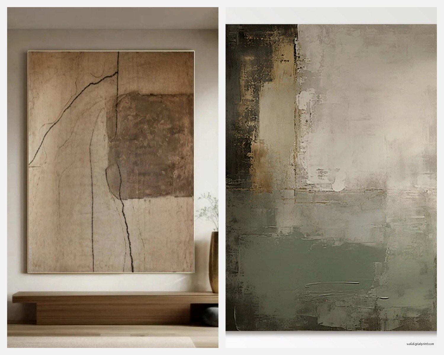
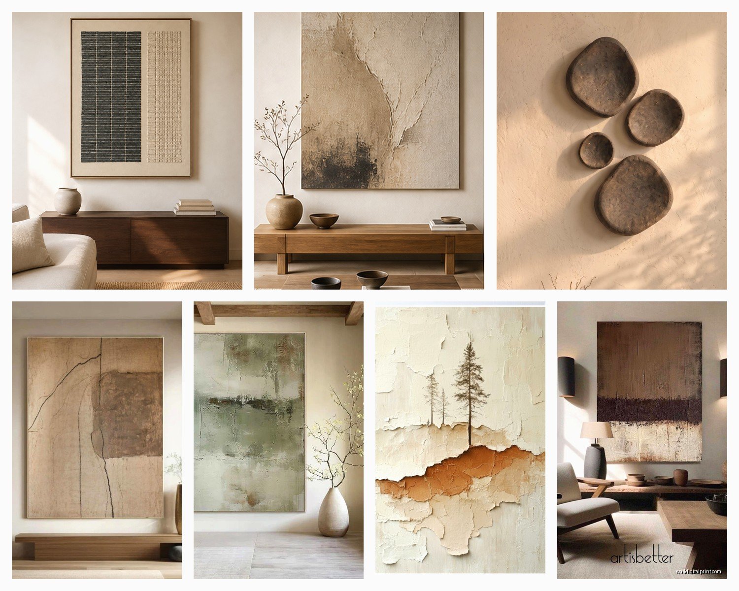
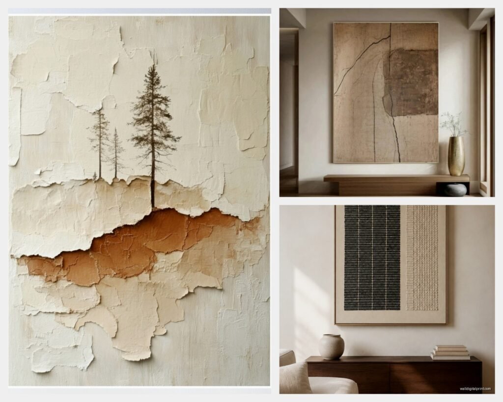
The whole wabi sabi concept is about finding beauty in imperfection and impermanence, which sounds super philosophical but really just means you’re gonna look for art that feels organic, weathered, or asymmetrical. Think rough textures, muted colors, natural materials. Not that mass-produced stuff that’s trying too hard to look “rustic.”
I started by hitting up local thrift stores and estate sales, which okay sounds cliche but hear me out. You want pieces that have a story or show age naturally. Found this amazing weathered wood panel with the paint literally peeling off and my partner was like “that’s trash” but it’s been the centerpiece of my office for six months now.
The Color Palette Thing
Stick with earth tones mostly. We’re talking:
- Warm grays and taupes
- Muted greens (like dried sage, not bright grass)
- Soft browns and beiges
- Dusty blues
- Cream and off-whites
- Black but used sparingly
I made the mistake early on of mixing in some bright coral piece because I thought “contrast” but it just looked wrong. Wabi sabi isn’t about bold statements, it’s about quiet presence. That piece is now in my storage unit lol.
Where to Actually Find This Stuff
Etsy has become my go-to honestly. Search for “abstract neutral art” or “organic line art” or “textured minimalist prints.” But you gotta scroll past the first three pages because everyone’s gonna have the same stuff. I found this seller who does these incredible ink wash paintings on handmade paper and they’re like $45 which is way better than the $300 “investment pieces” at that gallery downtown.
Oh and another thing, check out local art schools. Students doing Japanese brush painting or ceramic wall pieces? That’s your goldmine. I got three pieces from an end-of-semester show for $120 total and they’re more interesting than anything I could’ve bought retail.
DIY Options That Don’t Look DIY
If you’re gonna make your own (which I’ve done more times than I’ll admit), here’s what actually works:
Natural dye experiments: Get some canvas boards and play with tea, coffee, turmeric, even red wine. The staining is uneven and organic which is exactly the point. I spilled tea on one by accident and it made it better somehow.
Sumi ink paintings: You can buy sumi ink and rice paper on Amazon for like $25. Watch a couple YouTube videos about basic brush strokes. The imperfect lines you make as a beginner? That’s literally the aesthetic you want. My cat knocked over my ink bottle during one session and created this chaotic splatter pattern that I ended up framing.
Pressed botanicals: This sounds Pinterest-y but it works. Press leaves, grasses, flowers between book pages for a couple weeks. Frame them in simple wood or black frames. The browning and curling that happens? Perfect wabi sabi moment.
Framing Matters More Than You Think
Don’t put wabi sabi art in ornate gold frames or anything with too much going on. I learned this the hard way. You want:
- Raw wood frames (unfinished or lightly stained)
- Simple black frames with no embellishment
- No frame at all if it’s on wood panel or canvas
- Float frames for paper pieces
Target actually has decent simple wood frames in their threshold line. Or if you’re near an IKEA, their RIBBA frames work fine. I’ve also just used clipboards for smaller pieces which sounds weird but looks intentional if you get wooden or matte black ones.
Arrangement Is Where People Mess Up
Okay so funny story, I spent like three hours arranging a gallery wall perfectly symmetrical with measuring tape and the whole thing. Stepped back and it looked like a hotel lobby. Wabi sabi walls should feel a bit… casual? Imperfect spacing is actually what you want.
Here’s what I do now: lay everything on the floor first. Move pieces around until it feels balanced but not rigid. Take a photo. Then hang them without measuring too precisely. If something’s slightly off-level, leave it. I know that makes some people twitchy but it’s the whole point.
Try asymmetrical arrangements like:
- Three pieces in descending size going down a wall
- Two small pieces flanking one larger piece but not centered
- A collection grouped to one side of a wall, leaving negative space
- Different heights and depths (some flush, some on small shelves)
The Negative Space Thing
This is gonna sound weird but empty wall space is part of your design. Western decorating makes us wanna fill every inch but Japanese aesthetics embrace emptiness. I have this one wall that’s like 12 feet wide and there’s just two small pieces on it with tons of blank space and it’s become the most commented-on spot in my house.
Let your walls breathe. If you’ve got a beautiful textured plaster wall or even just a nice paint color, don’t cover it all up.
Textures You Should Be Looking For
The tactile element is huge. Flat prints are fine but adding dimensional pieces makes everything more interesting:
- Woven fiber art (macrame if it’s not too boho, woven tapestries)
- Ceramic wall sculptures
- Wood carvings or burned wood art
- Handmade paper with visible fibers
- Stone or concrete pieces
- Metal with patina or rust (intentional aging)
I found this ceramic artist on Instagram who makes these irregular circular wall pieces that look like stones worn by water. Bought three and they’re probably my favorite purchase this year. Cost more than I planned but whatever, they’re staying when I move.
What to Avoid
Don’t buy anything that’s trying too hard to look “distressed” in that manufactured way. You know those pieces that say “live laugh love” in artificially weathered letters? Yeah, opposite of that.
Also skip:
- Overly glossy finishes
- Perfectly symmetrical patterns
- Bright neon or primary colors
- Anything with words (usually)
- Super modern geometric prints (unless they’re really subtle)
- Anything that matches your couch too perfectly
The matching thing is important. Wabi sabi embraces the idea that things don’t have to coordinate exactly. My wall art doesn’t “match” my furniture and that’s fine actually.
Incorporating Natural Elements
Some of my best pieces are barely “art” in the traditional sense. I’ve got:
A large piece of driftwood mounted horizontally that I found at the beach. Sanded it lightly, added two simple brackets. Cost me $8 in hardware.
Pressed flowers from my garden in vintage frames I got at an estate sale. The frames are all slightly different woods which would normally drive me crazy but it works here.
A shadow box with stones and dried grasses. Sounds like something from a craft fair but the key is keeping it minimal and using a simple frame.
Budget Breakdown From My Own Projects
Since you’re probably wondering about cost… I redid my living room and hallway walls last year focusing on wabi sabi aesthetic:
- Three Etsy prints (digital downloads I printed at FedEx): $60 total
- Frames from Target and IKEA: $85
- One original ceramic piece from local artist: $140
- DIY pieces (supplies): $40
- Vintage frames from thrift stores: $25
- Random mounting hardware and supplies: $30
So like $380 for two rooms worth of wall art. You could definitely do it cheaper if you focus more on DIY or spend more if you want larger original pieces.
Mixing Wabi Sabi With What You Already Have
You don’t have to start from scratch. I had some existing art that didn’t fit the aesthetic but I worked around it. The key is creating zones. My modern geometric print lives on one wall and doesn’t interact with the wabi sabi pieces on another wall. They’re in the same room but separated enough that it doesn’t feel conflicting.
Or honestly, just take down what doesn’t work and rotate things seasonally. I store pieces and swap them out every few months which keeps things feeling fresh anyway.
The Impermanence Aspect
One thing I really love about this whole philosophy is that it’s okay for things to change or even deteriorate. That pressed flower art I mentioned? It’s fading and getting more brown. Most people would replace it but I’m just letting it age naturally. There’s something cool about watching art evolve.
Same with the wood pieces – they’re getting more weathered and developing cracks. It’s supposed to do that.
Practical Installation Tips
Use proper anchors especially for heavier pieces. I learned this when a ceramic piece came crashing down at 2am and scared the hell out of me. Toggle bolts for drywall, make sure you’re finding studs for anything over like 10 pounds.
For lightweight paper art, even command strips work fine. I’ve got several pieces hung with those and they’ve been up for over a year with no issues.
wait I forgot to mention – if you’re renting, definitely go the command strip route when possible. I’ve used the picture hanging strips for frames up to 16×20 and they hold fine.
Finding Your Own Style Within This
The wabi sabi philosophy is broad enough that your interpretation can be personal. My friend does it with more green tones because she’s really into botanical stuff. Mine leans more toward abstract ink work and natural textures. Another person I know focuses on pottery and ceramic pieces almost exclusively.
Start with what draws you naturally and build from there. I spent way too much time early on trying to replicate this Japanese aesthetic exactly like I saw in magazines but it felt fake. Once I loosened up and just followed what I actually liked within those basic principles, everything came together better.
Look at a piece and ask: does this feel honest? Does it have character? Would it be interesting to look at for years? If yes to all three, it probably fits.
The beauty is in the imperfection so stop stressing about getting it “right” – which I know is ironic advice but that’s literally the point of wabi sabi anyway. My walls aren’t perfect, the spacing is a little off in places, some pieces are better quality than others, and that’s exactly how it should be.