
Wall Art Guide, Wall Art Tutoriels
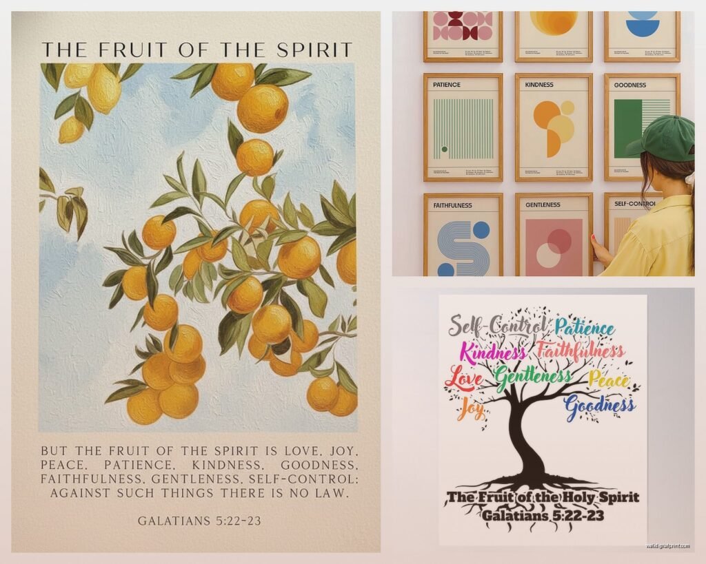
Fruit of the Spirit Wall Art: Christian Galatians Bible Verse
Nov
So I’ve been looking at these Fruit of the Spirit wall art pieces for like three months now because honestly, decorating a client’s prayer room sent me down this rabbit hole and now I can’t stop thinking about how to pick the right one.
First thing you gotta know is that Galatians 5:22-23 has a LOT of words. Like, the full verse is “But the fruit of the Spirit is love, joy, peace, forbearance, kindness, goodness, faithfulness, gentleness and self-control. Against such things there is no law.” That’s nine attributes, and fitting all of them on a piece of wall art without it looking like a cluttered mess is actually harder than you’d think.
Size and Placement Actually Matter More Than You Think
Okay so the biggest mistake I see people make is buying these tiny 8×10 prints and then wondering why they look lost on their wall. If you’re putting this in a living room or above a console table, you need at least 16×20, maybe even 24×36 if you have high ceilings. I learned this the hard way when I ordered what I thought was a decent sized print for my own entryway and it arrived looking like a postage stamp.
For bedrooms, especially above the bed, go bigger than you think. The standard is that your wall art should take up about two-thirds to three-quarters of your furniture width. So if your bed is 60 inches wide, you’re looking at 40-45 inches of art. You can do a single large piece or a gallery wall situation with multiple smaller Fruit of the Spirit prints.
Where These Actually Look Good
- Entryways – sets the tone when people walk in
- Above beds in master or guest rooms
- Kitchen eating nooks, especially farmhouse style kitchens
- Home offices where you need the reminder during stressful work days
- Kids rooms but only if the design isn’t too mature looking
- Hallways that feel empty and echo-y
Wait I forgot to mention bathrooms. I know that sounds weird but I’ve done several powder rooms with scripture art and guests always comment on it. There’s something about having a peaceful verse in a small space that just works.
Style Options Because Not Everything Fits Every Home
This is gonna sound scattered but there are like seven different aesthetic directions these prints come in and you really need to match your existing decor or it’ll look like you just slapped Christian decor on the wall without thinking.
Modern Minimalist – Clean sans-serif fonts, usually black text on white background or vice versa. Sometimes they’ll do a single word per line going down the print. These work in contemporary homes, Scandinavian style spaces, or anywhere you’ve got clean lines and not a lot of visual clutter. I used one of these in a client’s downtown loft and it didn’t scream “church basement” which was the goal.
Farmhouse Rustic – Oh man, these are everywhere right now. Usually involves wood grain backgrounds, sometimes actual wood signs, script fonts mixed with block letters. Lots of neutral colors like cream, gray, weathered brown. They’ll often add little botanical elements or a simple wreath design. If you have shiplap anywhere in your house, this is probably your style.
Watercolor Florals – Pretty popular for women’s spaces or nurseries. The fruits of the spirit are written in elegant script with painted flowers around the border or behind the text. Soft colors like blush pink, sage green, dusty blue. These can look really beautiful but they also date faster than other styles because floral trends change.
Typography Heavy – All about the font mixing. Different sizes, weights, some words emphasized more than others. Usually “love” and “peace” are the biggest words. Black and white or maybe one accent color. Works well in transitional homes that aren’t fully modern but aren’t traditional either.
Vintage Inspired – Designed to look like old book pages or aged paper. Sometimes they’ll add coffee stains or distressed edges digitally. Serif fonts that look like typewriter text. These work great in homes with lots of antiques or collected vintage pieces.
My dog just knocked over my coffee but anyway…
Print vs Canvas vs Wood vs Metal
Okay so funny story, I ordered the same design in four different mediums because a client couldn’t decide and honestly they all gave completely different vibes.
Paper Prints – Cheapest option, usually $15-40 depending on size. You’ll need to frame them which adds cost but also lets you customize the look. Go with a simple black or white frame for modern spaces, ornate gold or wood frames for traditional. The annoying thing is you gotta deal with glass and matting and making sure it’s level. But you can easily swap it out if you get tired of it.
Canvas Prints – More expensive, like $40-120 range. They come ready to hang which is nice. The texture adds depth and they don’t need glass so there’s no glare issues. They feel more substantial and art-like. Downside is they can look cheap if the printing quality is bad, so read reviews about whether colors are vibrant or washed out.
Wood Signs – These are having a moment especially in farmhouse decor. Real wood or wood-look, usually $50-150. They’re thick and three-dimensional which adds interest. Some are hand-painted, others are printed on wood. They’re heavy though, so make sure your wall anchors can handle it. And they don’t work in every style home.
Metal Prints – Newest option I’ve seen, sleek and modern. The image is infused onto aluminum so it’s super durable and the colors are really vibrant. They’re lightweight despite being metal. But they’re pricey, like $80-200, and they only work in contemporary or industrial style spaces.
Quality Red Flags to Watch For
- Blurry preview images on the product listing
- No reviews or photos from actual buyers
- Prices that seem too good to be true for large sizes
- Descriptions that don’t mention print resolution or material quality
- Ships from overseas with 4-6 week delivery times usually means lower quality
The Font Readability Thing Nobody Talks About
This drives me crazy. You’ll find these gorgeous designs with super elaborate script fonts and then you get it on your wall and you literally cannot read “forbearance” or “self-control” from more than three feet away. If the art is going in a space where people will see it from a distance, prioritize readability over prettiness.
I always zoom in on product photos to check if I can clearly distinguish every letter. If the lowercase “e” and “c” look identical or the “l” and “i” blend together, it’s gonna be illegible in person.
Also some designs emphasize certain fruits over others by making them bigger or bolder. Think about which attributes you want to stand out. Do you need the daily reminder of “patience” more than “joy”? Some prints have them all equal, others create a visual hierarchy.
Custom vs Ready-Made
Ready-made is obviously easier and faster. You find one you like on Etsy or Amazon, order it, done. But custom lets you match your exact color scheme and choose your preferred Bible translation. Some versions say “patience” while others say “forbearance” or “longsuffering.”
I went custom for my sister’s house because she has this very specific blue-gray wall color and we needed the design to have that exact shade in it. Found a designer on Etsy who did it for like $35 for the digital file, then we printed it ourselves at a local print shop. Took longer but looked way more cohesive in her space.
oh and another thing – if you go custom, you can choose to include or exclude the verse reference. Some people want “Galatians 5:22-23” clearly visible, others prefer just the fruits listed without the citation. Neither is wrong, just personal preference.
DIY Options If You’re Crafty
I’m not particularly crafty but I’ve helped clients do DIY versions and they turned out surprisingly good. You can buy the vinyl lettering from craft stores or online, stick it on a painted canvas or wood board. Takes maybe an hour if you’re careful with placement.
Or print the verse using a nice font from your computer, mod podge it onto wood, sand the edges for a distressed look. There are like a million YouTube tutorials. The advantage is you control every aspect and it costs way less, maybe $20-30 in supplies. The disadvantage is it takes time and if you mess up the letter placement you gotta start over.
Color Schemes That Actually Work
Neutral backgrounds with black or dark gray text work literally everywhere. You cannot go wrong with this. It’s boring maybe but it’s timeless.
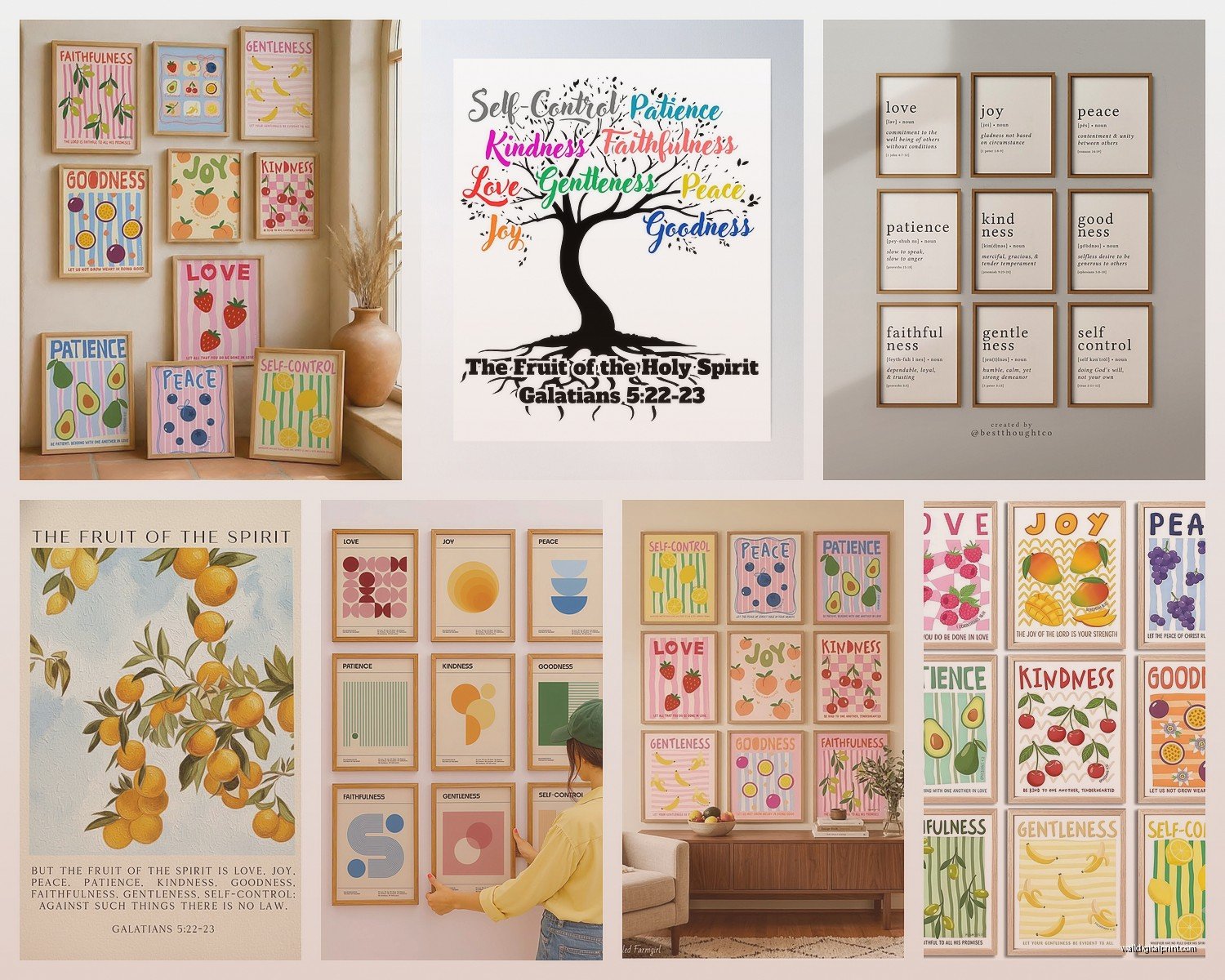
If you want color, pull shades that already exist in your room. Look at your throw pillows, curtains, or rug and match those tones. Don’t introduce a completely new color family just because the wall art is pretty.
Navy blue with gold lettering looks expensive and sophisticated. Great for dining rooms or studies.
Sage green with cream text feels fresh and calming. Perfect for bedrooms.
Black background with white text is dramatic and works well in modern spaces but can feel heavy in small rooms.
Arrangement Ideas for Multiple Pieces
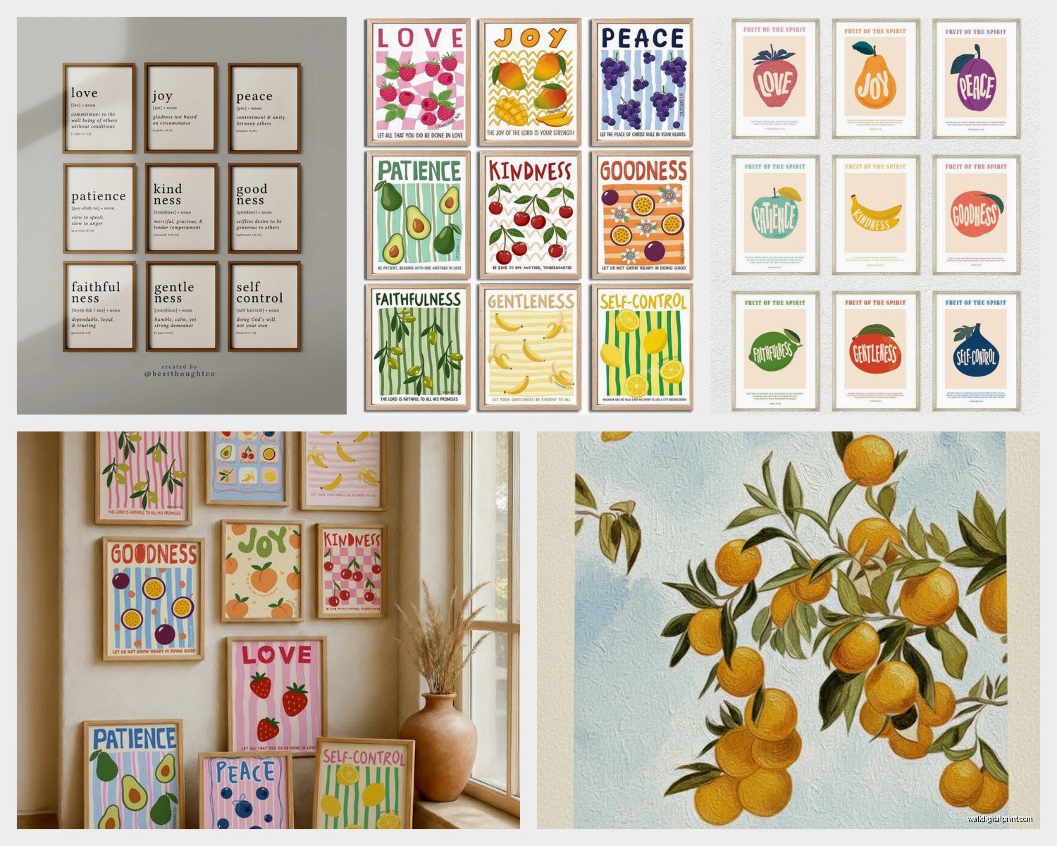
Instead of one large piece, some people do nine separate small prints, one for each fruit. This creates a gallery wall effect. You can arrange them in a grid pattern which looks organized and intentional, or do an asymmetrical salon wall which feels more collected and casual.
For a grid, keep spacing consistent – usually 2-3 inches between frames. Use a level and measuring tape, don’t eyeball it. I learned this after hanging seven frames that all looked slightly off and having to redo the whole thing.
You can also do a vertical triptych with three panels stacked, each containing three fruits. Or a horizontal arrangement above a long piece of furniture like a sofa or credenza.
Wait I should mention grouping them thematically. Like put “love, joy, peace” together as the emotional fruits, then “patience, kindness, goodness” as the relational ones, and “faithfulness, gentleness, self-control” as the character ones. This doesn’t have biblical backing or anything, it just creates visual organization.
Lighting Matters More Than You’d Think
A beautiful Fruit of the Spirit print in a dark corner where nobody can see it is pointless. If the wall doesn’t get natural light, consider adding a picture light above it or positioning a floor lamp nearby. The whole point is to see it and be reminded of these attributes throughout your day.
Avoid hanging it opposite a window where glare will hit the glass if it’s framed. Also don’t put it in direct sunlight if it’s a paper print because it’ll fade over time. Canvas and wood hold up better to sun exposure but will still fade eventually.
Where to Actually Buy These
Etsy – Best selection by far, tons of independent designers, you can message sellers to customize. Prices vary wildly. Read reviews carefully and check seller ratings.
Amazon – Faster shipping, easier returns, but less unique options. Lots of mass-produced designs. Good if you need something quickly.
Christian bookstores – Limited selection usually but you can see them in person before buying. Often overpriced in my opinion.
Local print shops – If you have a digital file, they can print it on whatever medium you want. Sometimes cheaper than online, plus you support local business.
Target and Hobby Lobby – Occasionally have decent options in their home decor sections. Very hit or miss.
I’m gonna be honest, I’ve had the best luck with Etsy for unique designs and Amazon for generic but well-made options. Just depends what you’re going for.
Budget Real Talk
You can do this for $20 if you print an 8×10 at home and use a cheap frame. Or you can spend $200+ on a large custom wood piece. Most people fall somewhere in the $50-80 range for a quality print in the 16×20 to 24×36 size range, framed or on canvas.
Don’t cheap out on framing if you go with a paper print. A nice frame elevates even a basic design, while a cheap plastic frame makes expensive art look bad.
The main thing is making sure this piece of scripture actually encourages you when you see it, not just filling wall space because you think you should have Christian decor. If it doesn’t resonate when you look at it, keep searching until you find one that does.
