Wall Art Guide, Wall Art Tutoriels
Wall Art for Guys Bedroom: Masculine Sleep Space Decor
Nov
So I’ve been helping guys figure out their bedroom walls for years now and honestly, it’s one of those things where most dudes just stick up a random poster and call it a day, but you can do SO much better without it feeling like you’re trying too hard.
Starting With What Actually Works in a Guy’s Space
Okay so first thing – forget everything you think you know about “masculine decor” being all dark and moody. I mean, it CAN be, but I’ve seen plenty of guys with lighter walls who still have that solid, put-together vibe. The key is picking art that doesn’t look like you grabbed it from a hotel lobby.
My brother actually made this mistake where he bought this massive generic “inspirational quote” canvas and… yeah. It lasted maybe three weeks before he admitted it was terrible. What worked way better for him was getting a large black and white photograph of the Brooklyn Bridge at night. Same wall space, completely different energy.
Photography Prints Are Your Best Friend
Real talk – photography is probably the easiest way to fill wall space without looking like you’re trying to be someone you’re not. I’m talking about actual good photography though, not just random landscape shots.
Things that consistently work:
- Architectural shots (bridges, buildings, urban landscapes)
- Black and white portraits with high contrast
- Vintage car photography
- Mountain ranges or dramatic nature scenes
- Sports photography if it’s done artistically (not just action shots)
The trick is getting them properly printed. Don’t just download something and print it at Staples, you’re gonna see the difference immediately. I usually send my clients to places that do giclée printing or at least high-quality photo prints on proper paper or canvas.
The Size Thing Nobody Talks About
This is gonna sound weird but most guys buy art that’s way too small for their wall. Like, you’ve got this massive wall above your bed and you put up a 16×20 print? It’s just floating there looking lost.
Here’s what I tell people: measure your wall space, then subtract about 12-16 inches from the width. That’s roughly how wide your art should be. So if you’ve got a queen bed that’s 60 inches wide, you’re looking at art that’s around 44-48 inches wide. You can go with one large piece or do a grouping, but the total visual width should be in that range.
My dog knocked over my measuring tape yesterday while I was doing a consultation and honestly it was the most excitement she’d had all week, but anyway – just measure your space before you buy anything.
Gallery Walls vs Single Statement Pieces
Okay so this is where guys usually get stuck. Gallery walls look amazing when done right, but they’re also way easier to mess up. Single large pieces are more forgiving.
If you’re going gallery wall style:
- Stick to a consistent frame color (black or natural wood usually)
- Keep your matting consistent too
- Mix sizes but maintain visual balance
- Layout everything on the floor first before hammering anything
I spent like three hours last month helping a client redo his gallery wall because he just started hanging things randomly and it looked… chaotic. Not in a good way. We pulled everything down, laid it out on his bedroom floor until it looked right, then traced the arrangement on butcher paper before hanging. Extra step, but worth it.
Frame Quality Makes or Breaks Everything
You can have the sickest print in the world but if you put it in a cheap frame with that thin plexiglass that warps, it’s gonna look budget. And not in a cool vintage way.
I usually recommend:
- Wood frames in black, walnut, or natural oak
- Metal frames in matte black or brushed steel
- Proper glass or acrylic (not the super thin stuff)
- Frames that are at least 1-1.5 inches wide
Target and IKEA frames are fine for smaller pieces, but once you’re going bigger than 24×36, invest in something better. Framebridge does custom sizing which is clutch when you’ve got weird dimensions to work with.
What About Posters Though
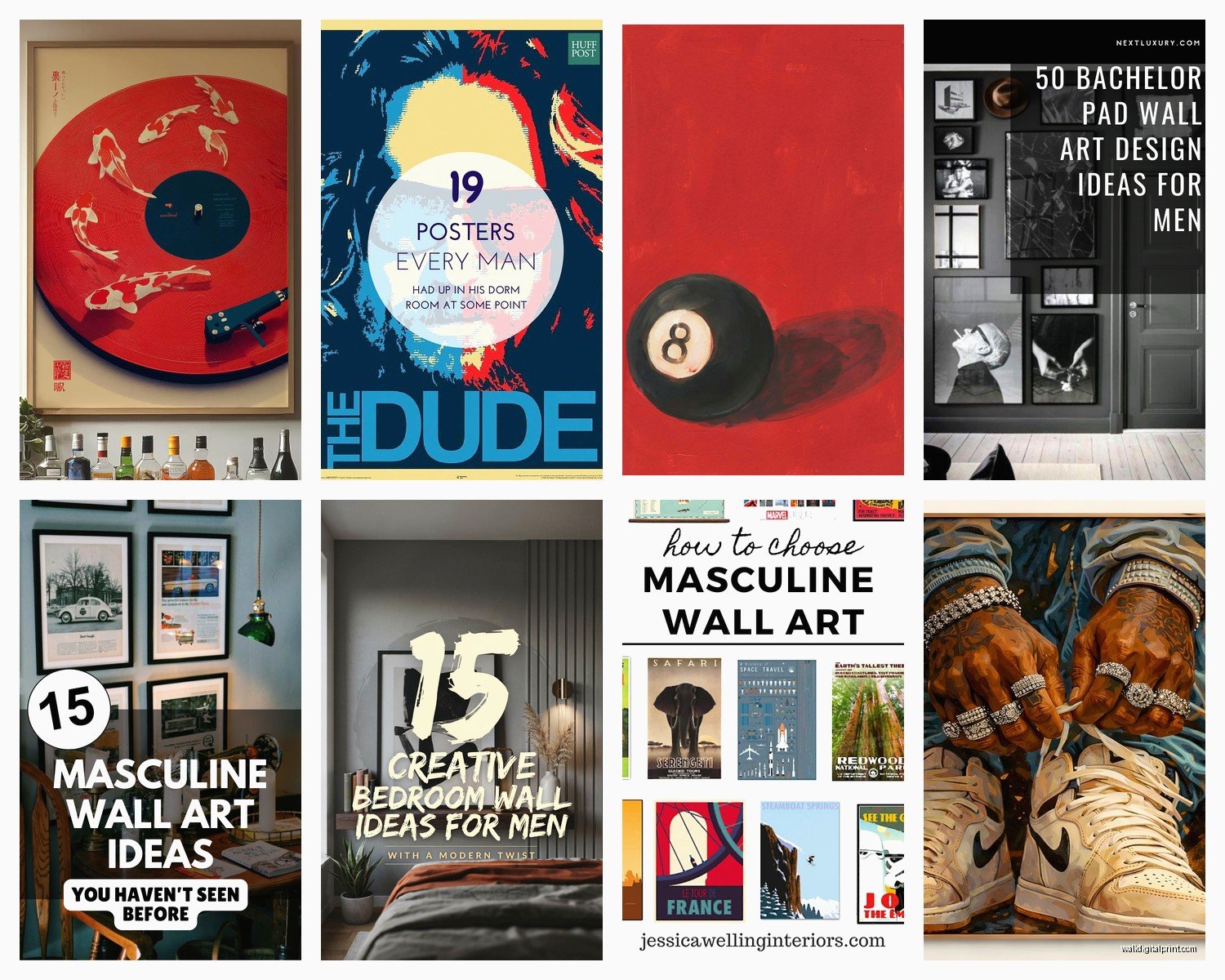
Look, I’m not gonna tell you to ditch your vintage concert poster or that movie print you love. But frame it properly. A cool poster in a quality frame automatically looks more intentional than an expensive print just tacked to the wall with thumbtacks.
I had this client who had original band posters from shows he’d been to, and we framed them in simple black frames with white matting. Suddenly they went from looking like college dorm decor to actual curated collection. Same posters, completely different presentation.
Alternative Wall Art That’s Not Prints
Wait I forgot to mention – you don’t have to stick with traditional framed art. There’s other stuff that works really well in a masculine space.
Metal wall art: Industrial-looking pieces, especially in matte black or raw steel. Think geometric shapes, topographic maps, or abstract designs. Just don’t go too literal with like… metal guitars or whatever unless that’s genuinely your thing.
Wood art: Three-dimensional wood pieces, carved designs, or even floating wood shelves that you style with a few objects. I’ve seen some really cool wooden topographic maps that add texture without being too busy.
Textile hangings: Yeah I know, sounds weird for a guy’s room, but hear me out. A large woven wall hanging in neutral colors (think black, grey, cream, tan) adds warmth and texture. It’s especially good if your room has a lot of hard surfaces.
Shelving as art: Floating shelves where you display actual objects – vinyl records, vintage cameras, plants, books. This works if you’re someone who actually has cool stuff to display and will keep it looking intentional rather than cluttered.
Color Schemes That Don’t Feel Boring
So everyone defaults to black and white for masculine spaces, and yeah, it works, but you can branch out without things getting weird.
Color combos that consistently work:
- Navy blue and brass/gold accents
- Forest green with natural wood tones
- Charcoal grey with rust orange or burnt sienna
- Deep burgundy with black
- Tan/camel with black and white
The key is keeping your color palette limited. Pick like two or three colors max and stick with them across all your wall art. This is how you get that cohesive look instead of things looking random.
Where to Actually Buy This Stuff
Okay so funny story, I was watching this renovation show last week and they were talking about “sourcing unique art” and I’m like… just tell people where to shop? So here’s where I actually send people:
For prints and photography:
- Society6 (tons of independent artists, lots of styles)
- Minted (higher quality, more curated)
- Etsy (great for vintage stuff and unique finds)
- Saatchi Art (if you wanna invest in original pieces)
- Local art fairs and photography shows
For frames:
- Framebridge for custom stuff
- IKEA RIBBA frames for standard sizes
- West Elm for mid-range quality frames
- American Frame for serious framing needs
For alternative wall art:
- CB2 has cool metal and wood pieces
- Urban Outfitters (I know, but they actually have decent wall decor)
- Wayfair for variety, though quality varies
- Local metalworkers and woodworkers if you want something custom
The Technical Stuff Nobody Wants to Deal With
Alright so you’ve gotta actually hang this stuff properly. I’ve seen too many pieces come crashing down at 3am because someone used the wrong hardware.
For lightweight frames (under 10 lbs): Regular picture hanging hooks are fine. The ones with the nail that angles into the wall.
For medium weight (10-25 lbs): Use proper picture hangers rated for the weight, or toggle bolts if you’re going into drywall without a stud.
For heavy pieces (over 25 lbs): You need to hit a stud or use heavy-duty anchors. Don’t mess around with this.
Height matters too – the center of your artwork should be at eye level, which is usually around 57-60 inches from the floor. Above a bed, leave 6-10 inches between the top of your headboard and the bottom of your frame.
Lighting Your Wall Art
This is something people skip but it makes such a difference. If you’ve invested in decent art, light it properly. Picture lights, track lighting, or even LED strips behind floating frames can totally transform how your art looks.
I installed some basic plug-in picture lights for a client last month and he texted me like three days later being like “why does my room feel so different now” and yeah, it’s the lighting.
Common Mistakes to Avoid
Real quick, things I see all the time that you should NOT do:
- Hanging everything too high (seriously, measure that 57-60 inch mark)
- Using command strips for anything heavier than a small frame
- Mixing too many frame styles and colors
- Overcrowding your walls – empty space is okay
- Ignoring the scale of your furniture
- Buying art that doesn’t actually mean anything to you
That last one is important. Don’t just buy stuff because it looks “masculine” or “trendy.” If you’re not into abstract art, don’t force it. If you love maps or vintage travel posters, lean into that.
Budget Breakdown for Different Price Points
Let’s be realistic about money because wall art can get expensive fast.
Budget option ($100-300):
Get one large print from Society6 or similar, frame it yourself with an IKEA frame. Or do a gallery wall of smaller prints in matching frames. You can totally make this look good if you’re strategic.
Mid-range ($300-800):
Mix of quality prints with custom framing, maybe one original piece or a nice metal/wood art piece. This is usually the sweet spot where things start looking really put together.
Higher budget ($800+):
Original artwork, custom framing throughout, maybe commissioned pieces. Professional installation if you’re doing anything complicated.
I’ve worked with all these budgets and honestly, you can make any of them work. The difference is usually in the details – better frames, larger sizes, more pieces, original vs prints.
Making It Feel Cohesive With Your Room
Your wall art shouldn’t exist in isolation. It needs to work with your bedding, furniture, and overall room vibe.
If you’ve got a lot of wood furniture, echo that warmth in your art choices or frame materials. If your room is more industrial with metal and concrete, lean into geometric or urban photography. Modern minimalist setup? Keep your art simple and graphic.
I had this consultation where the guy had beautiful mid-century furniture but all his art was super modern and geometric and it just felt… off. We swapped in some vintage-inspired prints and abstract pieces with warmer tones and suddenly everything clicked.
The best bedroom walls feel intentional but not overly designed. Like you collected these pieces over time because you actually liked them, even if you bought them all in one weekend. That’s the vibe you’re going for – curated but not trying too hard.