Wall Art Guide, Wall Art Tutoriels
White and Gold Wall Art: Pure Metallic Luxury Elegant Combo
Nov
So I’ve been obsessing over white and gold wall art lately and honestly it’s one of those combinations that can either look incredibly expensive or like you grabbed something from a hotel clearance sale, there’s really no in between.
Why This Combo Actually Works (When Done Right)
The thing about white and gold is that it reads as neutral but fancy. Like, my client last month wanted her dining room to feel elevated but she was worried about committing to color, and I told her white and gold is basically the safe choice that doesn’t look safe. The gold adds warmth that plain white or black and white art just doesn’t have, and the white keeps it from feeling too maximalist or gaudy.
But here’s where people mess up – they think any gold will work. I learned this the hard way when I ordered this “gold” piece online that arrived looking more brassy orange than actual gold. You gotta pay attention to the undertone of the gold you’re choosing.
Types of Gold Finishes You’ll See
- Champagne gold – softer, more muted, works if your space has warm whites and creams
- Yellow gold – traditional, bolder, what most people picture
- Rose gold – technically pink-toned but still metallic, really popular right now
- Antique gold – darker, more aged looking, less shiny
I usually go for champagne or antique because they’re more forgiving. The really shiny yellow gold can look cheap if the piece isn’t well-made, whereas the more subdued finishes hide imperfections better.
What Actually Looks Good vs What Looks Cheap
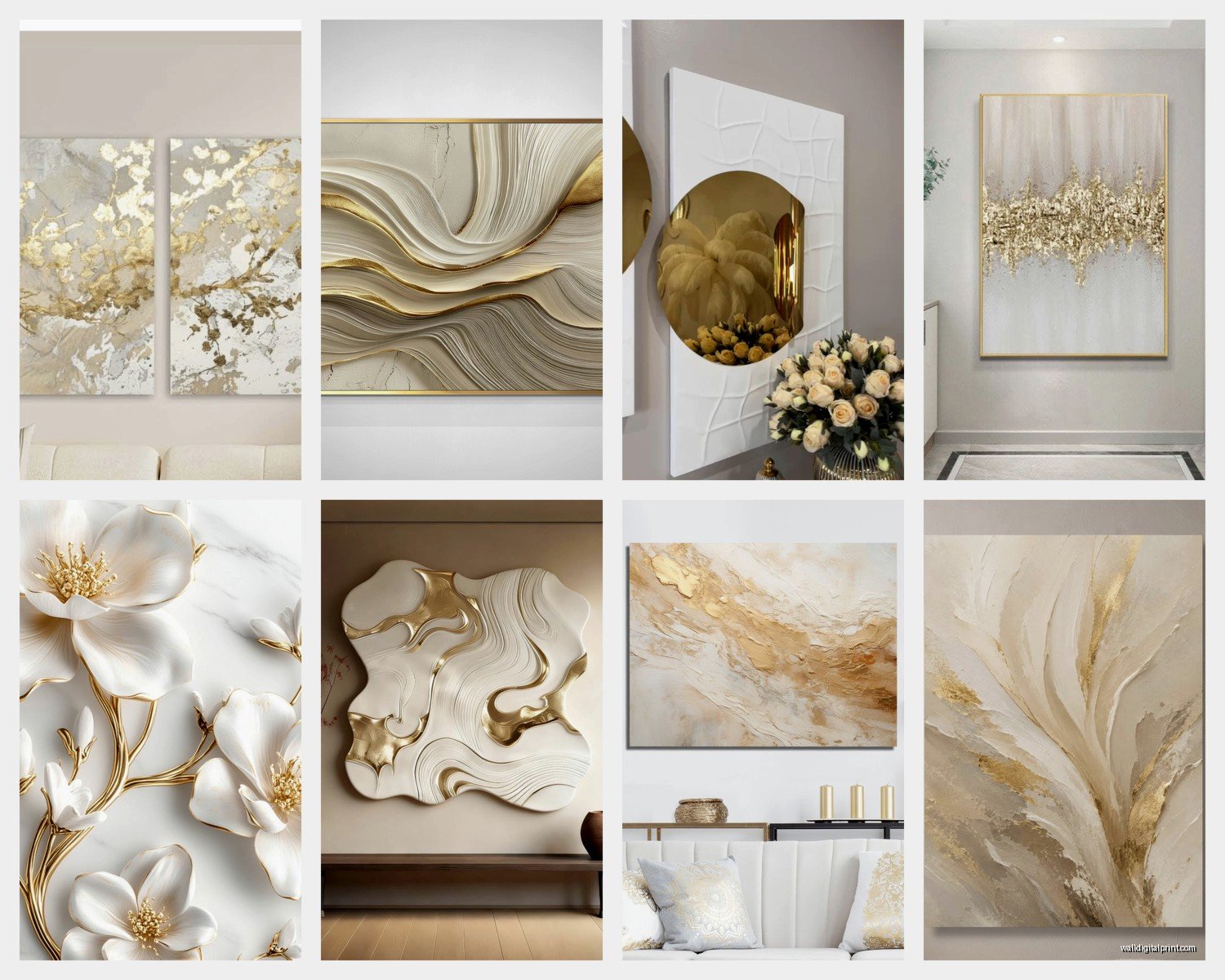
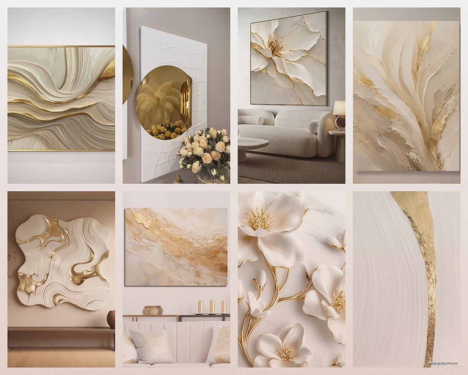
Okay so this is gonna sound weird but the secret is texture and dimension. Flat printed gold on white canvas almost always looks budget unless it’s a really specific graphic design piece. What you want is either actual metallic leaf, textured paint, or three-dimensional elements.
I have this one piece in my own hallway that’s white with gold leaf squares that are slightly raised – cost me like $180 but people always ask where I got it because it catches light differently throughout the day. That’s the thing with good metallic art, it changes based on lighting.
Wait I forgot to mention – if you’re buying online, check if they show the piece in different lighting conditions. If the seller only has one photo with perfect studio lighting, that’s a red flag. I got burned by this with a piece from Etsy that looked amazing in the listing but completely flat in my actual apartment.
Where to Actually Buy This Stuff
Budget-friendly options:
Honestly HomeGoods and TJ Maxx sometimes have decent white and gold pieces. You gotta dig and go regularly because their inventory rotates like crazy, but I’ve found some surprisingly good stuff there. The quality is hit or miss though – inspect it in person before buying.
Etsy is great if you search specifically for “gold leaf wall art” or “white and gold abstract art” but read the reviews carefully. I always look for shops that have close-up photos showing texture.
Mid-range:
West Elm and CB2 usually have a few options. They’re pricier but the quality is consistent. I bought a white and gold geometric piece from West Elm maybe three years ago and it still looks perfect.
Minted is another good one – they work with independent artists and you can get stuff framed which saves you the hassle. Their metallic prints are actually pretty impressive for not being original art.
If you wanna splurge:
Original art from local galleries or art fairs. I know this sounds obvious but if you’re gonna invest in one statement piece, make it an original. The texture and quality difference is huge. My cat knocked over a print once and it was whatever, but I’d have cried if it was the original piece in my living room.
DIY Option (Actually Easier Than You’d Think)
Oh and another thing – you can make your own if you’re even slightly crafty. I did this for a client who wanted custom sizing and didn’t wanna spend $500. Got a white canvas from Michael’s, some gold leaf sheets, and mod podge. The whole thing took maybe two hours and cost under $50.
The trick is to not overthink the design. Abstract geometric shapes work best. I literally just used painter’s tape to section off triangles and squares, applied the gold leaf, and peeled the tape. It looked intentional and expensive because the gold leaf has that authentic metallic quality.
You can also do a textured approach with white textured paste (also from craft stores) and then add gold acrylic paint in certain areas. Less fancy than gold leaf but still dimensional.
Styling It In Your Actual Space
This is where I see people struggle. They buy a gorgeous white and gold piece and then stick it on a wall by itself with no thought to what’s around it.
What works:
Pair it with natural materials like wood, marble, or brass hardware. The warmth of wood especially makes the gold feel more organic and less “trying too hard.” I staged a condo last fall and put a large white and gold abstract above a walnut console table with brass drawer pulls – the whole vibe just clicked.
Layer it with other metallic accents but don’t match them exactly. Like if your art has champagne gold, maybe your throw pillows have brass zipper details or your lamp base is aged gold. Matching everything exactly looks catalog-y.
Keep the surrounding decor relatively simple. White and gold art is a statement on its own, so you don’t need a bunch of colorful stuff competing with it. I usually do white or cream walls, maybe some greenery, and let the art be the focal point.
What doesn’t work:
Putting it in a room with too many other metallics. I had a client who had silver frames, chrome hardware, and gold art all in one room and it just looked confused. Pick your metallic and commit to it for that space.
Hanging it too high. This is a general rule but especially with metallic art because if it’s above eye level, you lose the way it catches light. Center it at about 57-60 inches from the floor.
Using it in really dark rooms. I mean you can, but the whole point of metallic is how it reflects light, so if your room doesn’t get much natural or artificial light, you’re not getting the full effect.
Size and Scale Stuff Nobody Talks About
The bigger the piece, the more the white and gold combo makes sense. Small pieces can look like decorative accents, but a large-scale white and gold abstract or geometric piece reads as serious art.
For over a sofa, you want something that’s about 2/3 the width of the sofa. I know everyone says this but I still see people hanging tiny pieces over massive furniture and it throws off the whole room.
Gallery walls are tricky with white and gold. It can work if you’re doing all white and gold pieces in different sizes and styles, but mixing it with other color schemes gets messy fast. I tried doing a gallery wall with white and gold mixed with black and white photos and it never looked cohesive. Ended up separating them into different walls.
Maintenance Real Talk
Gold leaf pieces are delicate. Don’t touch them with your fingers because oils from your skin can tarnish the gold over time. I learned this when I kept adjusting a piece and noticed it was getting duller in the spots I’d touched.
Dust with a super soft brush or microfiber cloth. Never use glass cleaner or any liquid on gold leaf – it can damage the finish.
If it’s behind glass in a frame, way easier to maintain obviously. But then you lose some of that dimensional texture quality.
Keep them out of direct sunlight if possible. The white can yellow over time and some gold finishes can fade. I have blackout curtains in my living room partly for this reason, though I’m probably being overly paranoid.
Specific Styles That Work
Abstract geometric: This is probably the most popular and for good reason. Clean lines, modern, works in almost any contemporary space. Think triangles, circles, hexagons in white with gold accents or vice versa.
Marble effect: White with gold veining that mimics marble. Super trendy right now, very glam. Works great in bathrooms or bedrooms where you want that luxe hotel vibe.
Botanical/organic: White background with gold palm leaves or abstract florals. More feminine, works in boho or transitional spaces. I’m watching this show while I write this and they just used something similar in a bedroom makeover, looked really good actually.
Minimalist line art: Simple gold line drawings on white – faces, bodies, landscapes. Very Scandinavian minimal. Can look really elegant or really basic depending on the execution.
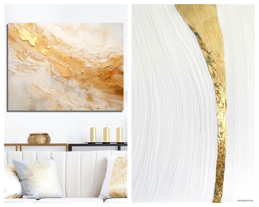
Textured abstract: Heavy texture in white with gold highlights. This is my personal favorite because it has the most dimension and visual interest. You almost wanna touch it.
Common Mistakes I See All The Time
Buying a piece just because it’s white and gold without considering if the style actually fits your space. Like putting ultra-modern geometric art in a traditional farmhouse room – it’s gonna look off no matter how pretty the colors are.
Going too matchy-matchy with frames. If you’re doing multiple pieces, vary the frame styles a bit. All identical gold frames in a row looks stiff.
Forgetting about the backing and hanging hardware. I’ve seen beautiful art that people hung with cheap wire that’s visible from the side, or backing that’s torn and messy. Spend the extra $20 to frame it properly if needed.
Not considering the room’s existing color temperature. If your room has cool-toned grays and silvers, warm gold might clash. You’d want to go with cooler champagne gold or even consider white and silver instead.
Oh and positioning it where there’s glare. Metallic surfaces reflect not just light but also whatever’s across from them, so if you hang it directly opposite a window, you might just see window reflection instead of the actual art.
Look, white and gold wall art isn’t rocket science but there’s definitely a difference between doing it right and ending up with something that looks like you grabbed it from a corporate office clearance. Pay attention to quality, think about your space’s existing vibe, and don’t be afraid to spend a bit more on one really good piece instead of several mediocre ones.
The combination itself is forgiving enough that even if you make small mistakes, it’ll probably still look decent. But if you follow this stuff, it’ll look intentional and expensive, which is the whole point really.