Wall Art Guide, Wall Art Tutoriels
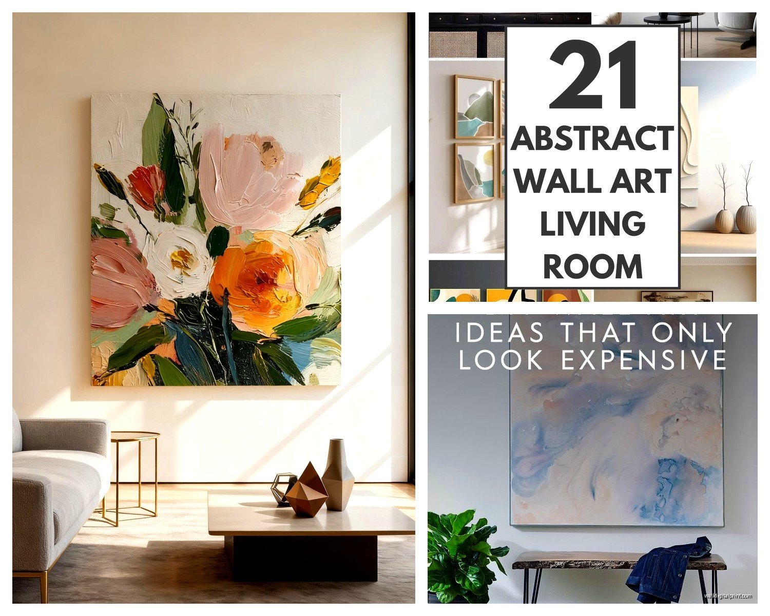
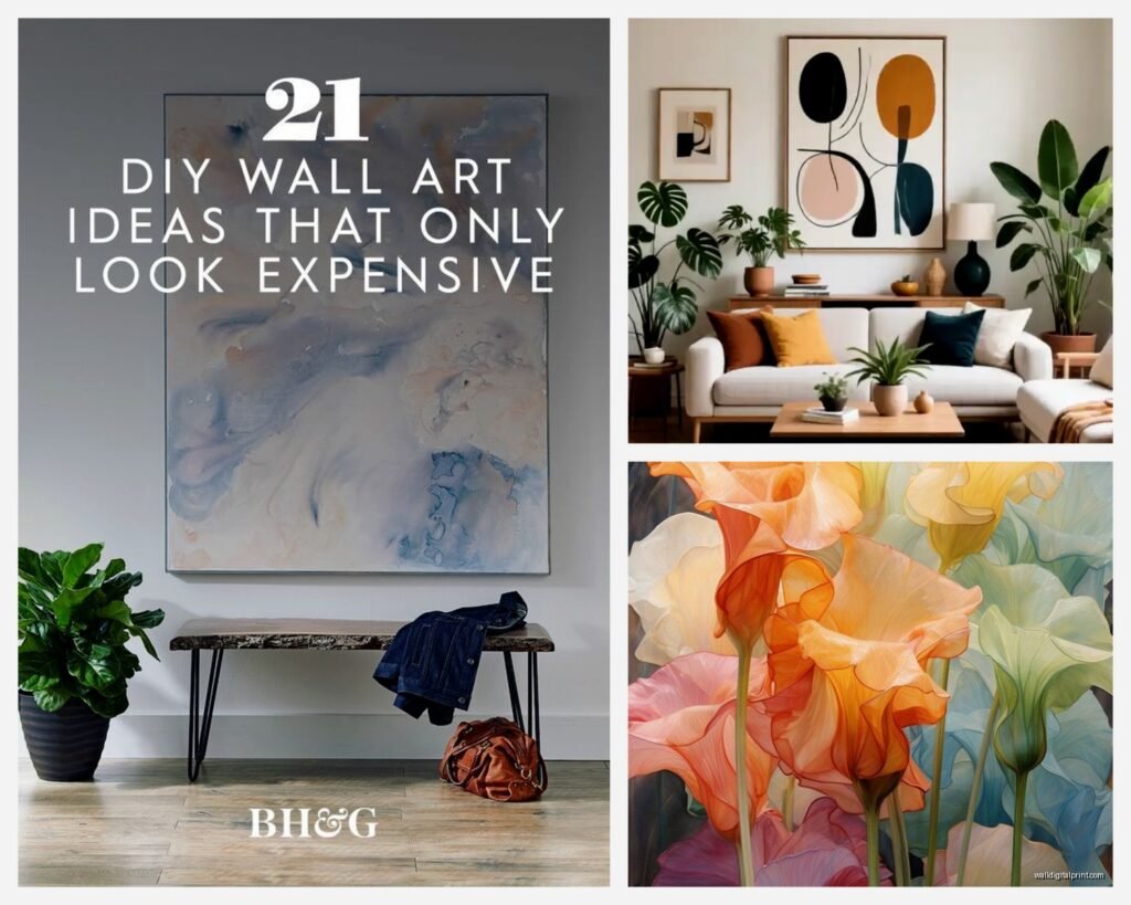
Abstract Wall Art for Living Room: Contemporary Designs
Apr
So I’ve been going down this rabbit hole with abstract art lately because like three clients in the past month have asked me about it and honestly? It’s such a minefield if you don’t know what you’re looking for. Let me just dump everything I’ve learned because I literally just finished hanging a massive piece in someone’s loft yesterday and my arms are still sore.
Canvas Types Actually Matter More Than You Think
Okay so first thing – the material itself. Most abstract pieces come on either stretched canvas, rolled canvas, or they’re printed on alternative surfaces. Stretched canvas is what you want if you’re lazy like me because it arrives ready to hang. The canvas is already wrapped around wooden stretcher bars, usually 0.75 to 1.5 inches deep. Gallery-wrapped edges (where the image continues around the sides) look way better than stapled edges, trust me on this.
I tested both cheap and expensive stretched canvases and here’s what I found: anything under like $50 for a large piece will probably arrive with loose canvas that ripples. The wooden frame inside matters SO much. Pine stretcher bars are fine for smaller pieces but they warp with humidity changes. Kiln-dried pine or poplar is better for anything over 30 inches.
Rolled canvas is cheaper to ship but then you gotta frame it yourself which… yeah unless you’re actually gonna do that, don’t buy rolled canvas. It’ll sit in your closet for six months. Ask me how I know.
Print Methods Because Apparently They’re Not All The Same
Giclée prints are what everyone talks about but let me break down what that actually means. It’s basically high-quality inkjet printing using archival inks on museum-grade canvas or paper. The inks are pigment-based instead of dye-based which means they won’t fade for like 100+ years if you’re not hanging them in direct sunlight.
UV-cured prints are newer and honestly pretty impressive. The ink dries instantly under UV light so there’s zero smudging and the colors are VIBRANT. I hung one in a south-facing living room two years ago and it still looks exactly the same.
Then there’s the cheap stuff – poster prints or standard inkjet on regular canvas. You can spot these because the colors look flat and they start fading within a year near windows. My neighbor bought one from a random Amazon seller and it literally looks sun-bleached after eight months.
Acrylic vs Canvas vs Metal
Wait I forgot to mention alternative surfaces. Acrylic prints (where the image is printed on the back of clear acrylic panels) have this incredible depth and the colors just POP. They’re contemporary as hell and work amazing in modern spaces with lots of natural light. But they’re heavy – like you need proper wall anchors heavy. And expensive.
Metal prints give you this sleek industrial vibe. The image is infused directly onto aluminum sheets. Super durable, won’t fade, easy to clean. I love them for minimalist spaces but they can feel cold if your room isn’t styled right.
Size Isn’t Just About Your Wall Dimensions
Okay so funny story, I had a client insist on a 72×48 inch piece for their living room and I was like “that’s gonna overwhelm the space” but they didn’t listen and yeah… it overwhelmed the space. Here’s my actual formula that I use:
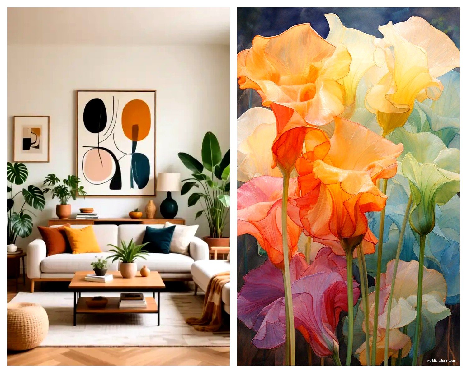
For the wall above your sofa, the art should be roughly two-thirds to three-quarters the width of your sofa. So if you’ve got a 90-inch sofa, you’re looking at 60-68 inches of art width. This can be one large piece or a grouping.
Ceiling height matters too though. Standard 8-foot ceilings? Keep large pieces under 48 inches tall. If you’ve got 10-foot ceilings or higher, you can go bigger and actually should because small art just floats awkwardly up there.
The bottom of your frame should sit 6-8 inches above your sofa back. I know everyone says different things but I’ve tested this extensively and this range just works visually. Any lower and it feels like it’s sitting ON the furniture, any higher and there’s this weird disconnect.
Multi-Panel Sets
Triptychs and multi-panel abstracts are having a moment right now. I’m gonna be honest, they’re easier to work with than single large pieces because you can adjust the spacing to fit your exact wall width.
The sweet spot for panel spacing is 2-3 inches apart. I’ve seen people do 6+ inches and it just looks like separate artworks that happen to be near each other, not like one cohesive piece.
Pro tip: buy sets where the panels are the same size. Those trendy sets where panels are different sizes are SO hard to hang level and they rarely look as good in person as they do online.
Color Theory But Make It Practical
Everyone gets stuck on colors and I get it. Here’s how I actually approach this instead of getting paralyzed by choices:
Look at your existing room palette and pick either a complementary or analogous scheme. If your room is mostly warm neutrals (beiges, creams, warm grays), abstract art with warm tones like rust, terracotta, gold, or warm blues will feel cohesive. Cool-toned rooms (true grays, whites, cool blues) pair well with abstracts featuring navy, emerald, cool purples, or black and white compositions.
Or – and this is what I do more often lately – use the art as your accent color source. If your room is neutral, pick an abstract with one bold color you want to pull through the space, then add 2-3 accessories in that same color. Suddenly your room looks professionally designed.
Neutrals Are Not Boring
Black and white abstracts, grayscale pieces, beige and cream abstracts… these work in literally every space and you can change your decor around them. I have a client who’s redecorated twice in four years and kept the same large-scale neutral abstract both times. It worked with her boho phase AND her current minimalist thing.
Textured neutral abstracts are even better because they add visual interest without color commitment. Look for pieces with visible brushstrokes, palette knife work, or mixed media elements.
Frame or No Frame Is Actually A Style Decision
Okay so gallery-wrapped canvas without frames is very contemporary and casual. It works great in modern, transitional, and eclectic spaces. The thicker the edges (1.5+ inches), the more substantial it looks unframed.
Floating frames (where there’s a small gap between the canvas edge and frame) are super popular right now and honestly they do make art look more expensive and finished. Natural wood frames warm up a space, black frames add drama and sophistication, white or metallic frames keep things light and modern.
For abstract art specifically, I usually skip ornate frames. Simple, clean lines let the artwork be the focus. Unless you’re doing like a maximalist eclectic thing, then go wild I guess.
Where To Actually Buy This Stuff
I’ve ordered from pretty much everywhere at this point so here’s the real tea:
Etsy has amazing independent artists and you can often get custom sizes and colors. The quality varies wildly though so read reviews carefully and look for shops that show actual photos of their prints, not just mockups. Processing times can be long – I’ve waited 4 weeks for custom pieces.
Society6 and Redbubble are print-on-demand so the artist uploads the design and it gets printed when you order. Quality is decent and consistent but not amazing. Good for budget-friendly options under $200.
Wayfair and Overstock have huge selections and frequent sales but it’s mostly mass-produced stuff. I’ve gotten some surprisingly good pieces here though, especially larger sets. Just avoid anything with suspiciously low prices – you’ll get exactly what you pay for.
Minted has beautiful curated abstract art from independent artists with really good print quality. Pricier but worth it for statement pieces. They also do custom framing which is convenient.
Oh and another thing – local art fairs and galleries. I know it sounds precious but I’ve found incredible pieces this way and you can actually see the texture and colors in person. Plus supporting local artists feels good, my cat knocked over my coffee while I was typing this sorry.
Hanging Hardware That Won’t Destroy Your Walls Or Your Art
Wire hanging systems are standard but honestly? I hate them for heavy pieces. The wire can stretch over time and your art ends up tilting. For anything over 20 pounds, use D-rings or sawtooth hangers mounted directly to the frame.
Wall anchors are non-negotiable for anything large. Drywall anchors rated for at least 50 pounds if you’re hanging heavy canvas or acrylic. Toggle bolts for anything over 30 pounds. If you hit a stud, even better – use wood screws directly into the stud.
Get a level. Like a real one, not the app on your phone. I’ve re-hung too many pieces because the phone app was off by half an inch and it drove me crazy.
Picture hanging strips (like Command strips) work for lighter canvas pieces under 10 pounds but they can fail in humid environments or if your walls aren’t perfectly smooth. I use them for renters who can’t put holes in walls but always with the weight limit in mind.
The Two-Person Rule
Anything over 40 inches wide, you need two people to hang it properly. I’ve tried doing it alone and you just can’t get it level while also holding the weight. Save yourself the frustration.
Lighting Makes Or Breaks Abstract Art
Natural light is beautiful but direct sunlight will fade your art over time, even archival prints. If your art wall gets direct sun for more than 2-3 hours daily, either use UV-protective glass (for framed pieces) or choose UV-resistant prints.
Picture lights are classic but I’m obsessed with track lighting or adjustable can lights positioned to wash the wall. You get even illumination without the hardware showing. Aim for 3000K bulbs (warm white) for a gallery feel.
The worst lighting mistake I see is overhead lighting that creates shadows on the art. If your ceiling fixture is directly above the wall, the light hits the top of the frame and casts shadows below. You need angled light from slightly in front of the art.
Mixing Abstract Styles In One Space
This is gonna sound weird but you can totally mix different abstract styles as long as you have a connecting element. Same color palette with different styles works. Or same style (like geometric abstracts) in different color schemes.
I did a living room last month with a large organic fluid abstract over the sofa and two smaller geometric abstracts on the adjacent wall. Connected them through a shared navy blue color and it looked intentional instead of random.
What doesn’t work: mixing cheap printed abstracts with original or high-quality pieces in the same sightline. The quality difference is too obvious and makes everything look cheap.
Trends I’m Seeing Right Now
Organic shapes and fluid forms are everywhere – think paint pours, watercolor effects, abstract landscapes. Very calming and works in modern organic interiors.
Geometric abstracts with bold lines and shapes are still going strong, especially in mid-century modern and contemporary spaces.
Textured abstracts with visible brushstrokes or mixed media are huge because they photograph well but also look expensive in person.
Minimalist line art abstracts – single line drawings, simple shapes – perfect for Scandinavian or minimalist spaces.
Earth-tone abstracts in terracotta, sage, ochre, and rust are having a major moment with the warm minimalism trend.
What To Avoid
Those motivational quote abstracts that are like “Live Laugh Love” in swirly fonts over abstract backgrounds. Just no.
Overly matchy-matchy sets where the colors perfectly match your throw pillows. It looks staged and catalog-like instead of collected and intentional.
Tiny art on big walls. Scale up or create a gallery wall. A single 16×20 print on a 10-foot wall just looks sad and lost.
Super trendy specific colors that you’ll hate in two years. That millennial pink abstract might feel dated sooner than you think.
Look I could keep going because there’s so much more about gallery walls and seasonal rotation and cleaning methods but honestly you’ve probably got enough to make a decision now. The main thing is just pick something you actually like looking at because you’re gonna see it every single day. Don’t overthink it to the point where you end up with blank walls for another year.